Google releases its last Pixel 3 security update
Pixel 3 and 3 XL review: Google’s hardware takes a backseat to software
The latest flagships offer few surprises but are still very good.

Even if they hadn’t been leaked to death before their official announcement, the Pixel 3 and 3 XL probably wouldn’t surprise anyone. The hardware has barely changed (at least on the outside). And there’s no difference between the two handsets apart from size — you no longer have to spring for a bigger, more expensive phone for the best features. From more powerful camera algorithms to a smarter Assistant, the standout features on this year’s models are almost all in the software. The question, then, is this: If all the best stuff about these phones is basically software updates that even older devices will ultimately get, is there a point in shelling out for the new hardware? The answer, surprisingly, is yes, but only if you can live with a giant notch.
Pixel 3
10 reviews
57 reviews
Pros
- Brilliant display
- Powerful cameras
- Premium build
- Capable performance
- Clever Assistant features
- Cheaper than the competition
Cons
- Not all software ready at launch
Pixel 3 XL
6 reviews
44 reviews
Pros
- Powerful cameras
- Premium build
- Capable performance
- Clever Assistant features
- Long-lasting battery
Cons
- Polarizing notch
- Some software not yet ready
Camera updates
![]()
The majority of the updates to the Pixel 3 revolve around photography — specifically, the new Top Shot, Photobooth, Super Resolution Zoom and Playground. Although the camera interface has been tweaked to make it easier to access popular modes like Portrait and Panorama, most of these new features won’t be obvious at first glance.
Top Shot is pretty straightforward — the Pixel captures a few frames before and after you press the shutter and suggests the image it thinks is the best. You just have to make sure to enable Motion from the top of the viewfinder to save animated versions of your photos in order for this to work. If you don’t like a shot that Google picked, you can swipe up on the image to see your other options. Dots on top of the row show you which ones the phone thinks are better, so you can quickly find good alternatives, but you can also choose to export any of the dozens of frames.
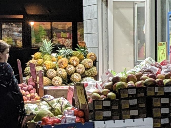
Super Resolution Zoom is designed to help take close-ups of a subject from a distance, for times when you’re being a sneaky stalker or at a large concert or sporting event. There’s no mode to activate here. When you zoom in, the Pixel 3 automatically measures every tiny movement and shake of your hands to compensate for the blur and combines multiple frames to make your shot clearer.
Gallery: Google Pixel 3 camera samples
It didn’t seem particularly effective until I compared the zoomed-in photos from my Pixel 3 to some from my Pixel 2. The amount of noise in shots taken with the new phone is drastically lower. It isn’t perfect, lines are still soft and details are muddy, but, all things considered, the results are impressive.
Another addition is some Google Lens features built right into the viewfinder. No more firing up a separate mode just to scan QR codes. Simply open your camera, point it at things around you and long-press to see search results. I was expecting this integration to happen within the same screen, but instead it opens a separate Lens mode. Then, you’ll have to tap on little circles of things the system found. Sometimes it was accurate — like when the Pixel 3 recognized a MacBook in our office. But then it mistakenly identified my Pixel 2 as a Samsung Galaxy. For shame, Google!
The other new stuff is less about utility and more for entertainment, like Photobooth and Playground. Launch Photobooth if you’re feelin’ cute and want to get into a selfie session without fumbling around for physical or onscreen buttons. It’ll automatically snap pics when it detects a smile, which makes it useful for hands-free picture taking, but useless if you don’t smile (like me). The Pixel 3 was good at capturing shots when I did stop being a grouch. But it also occasionally picked up false positives, resulting in some embarrassing, derpy pictures.
Playground is a new AR sticker feature that puts characters like Marvel’s Iron Man in the scene with you (or your subject). I was impressed by how naturally integrated the characters were. But it wasn’t easy to position them in the rear camera, and if you’re taking a selfie in Playground, you can use only the primary lens, not the wide-angle one.
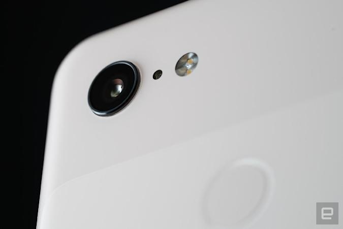
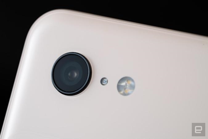
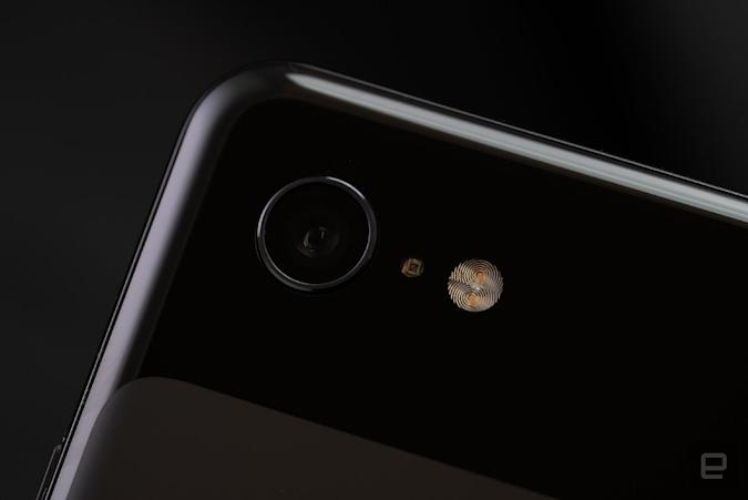
By the way, that new wide-angle lens is one of the obvious physical differences in the Pixel 3. It’s pretty great, too. I easily squeezed more friends into a frame, as well as more of my outfits during my #OOTD photoshoots.
Having that extra space in my selfies also gave Portrait Mode some room to apply background blur. Now you can even edit the amount of bokeh after the fact, and Google’s algorithms here are pretty sharp. My pictures of food, co-workers and more food came out clear, with subtle blurring that looked natural.
Something Google isn’t talking too much about, but which I found quite helpful, is the new flicker sensor. I noticed that banding on my laptop’s screen through the Pixel 3’s viewfinder actually disappeared after a second or two. Not that I recommend anyone take pictures of their screens, but if you do, you’ll get a clearer image. Google also updated the camera’s dynamic range at the hardware level and added a new spectral sensor, both of which help the phone get more accurate colors over a wider range.
Thanks to these tweaks and its HDR+ smarts, the Pixel 3 takes well-exposed pictures. The camera even does pretty well in low light, and that’s without the upcoming Night Sight feature. The image quality isn’t a ton better than on the Pixel 2, but I still appreciate its color accuracy and crisp details. Plus, pictures just look so much better on the new Pixel’s gorgeous screens than on the Pixel 2’s, but I’ll save all my lovin’ for that till later.
Evan Rodgers / Engadget
Smarter software
Other non-camera software features are mostly what you’ll get with the Android 9 Pie update, though something we haven’t seen is Call Screen. I’ve seen some people claim that it’s basically voicemail and, sure, it’s a way to ignore calls when you can’t or don’t want to answer.
But it’s much more than a voicemail box. Assistant transcribes what your caller says in real time, then suggests relevant follow-up actions based on what they said. It’s also interactive, letting you decide what to do with the call as it happens, like ask for more information or hang up. I was very impressed by the accuracy of the transcription, as well as Assistant’s ability to recognize spam callers. I also appreciate that Assistant identifies itself to explain what it’s doing, similar to how it does with Duplex.
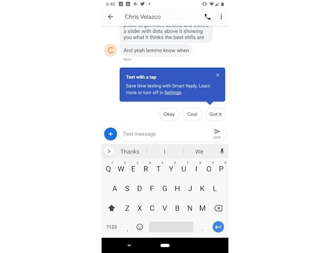
Google’s smarts also come in handy when you’re replying to emails. Smart Compose on the Pixel 3 suggests autofills for your sentences as you’re typing replies, and so far I’ve found it pretty helpful.
Gallery: Google Pixel 3 and 3 XL screenshots
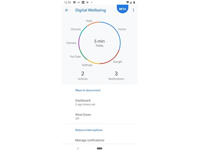
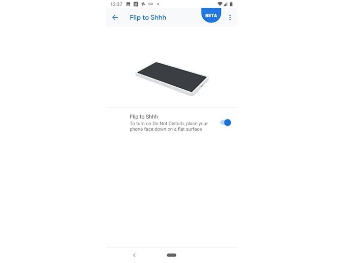
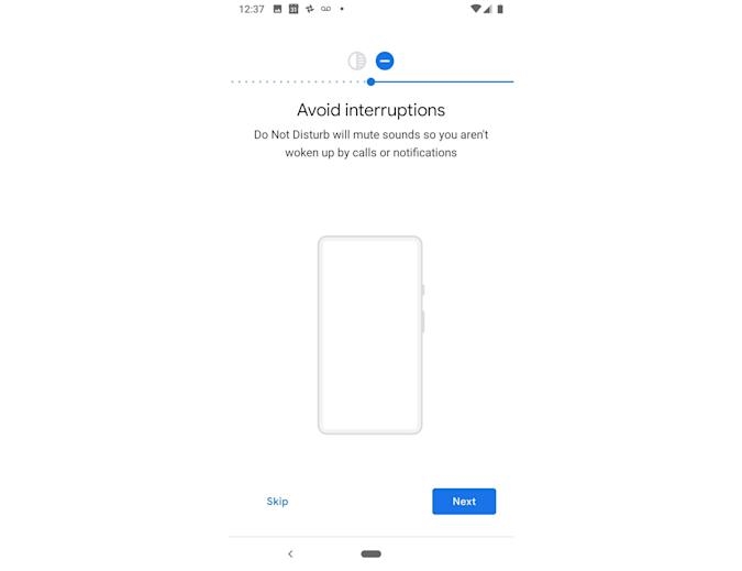
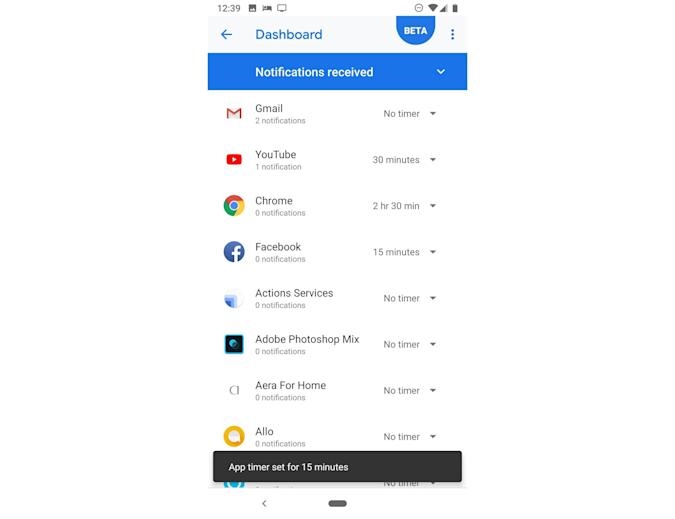
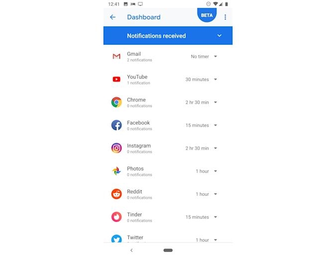
Other new features, like Do Not Disturb and Flip to Hush, will be familiar to people already using Android Pie. If you aren’t on the Digital Wellbeing beta yet, this will be one of the biggest changes. I set time limits for apps like Twitter, Instagram and Gmail to keep myself from constantly being tuned in to the horrors of our society, but I was surprised to see that I actually used some other apps a fair amount, too.
According to the Digital Wellbeing dashboard, I spend a lot of time in my Photos app, no doubt scrutinizing my selfies or vacation pictures for the most Instagram-worthy options. It’s nice to get some insight on how I use my phone, but I haven’t found this dashboard very useful.
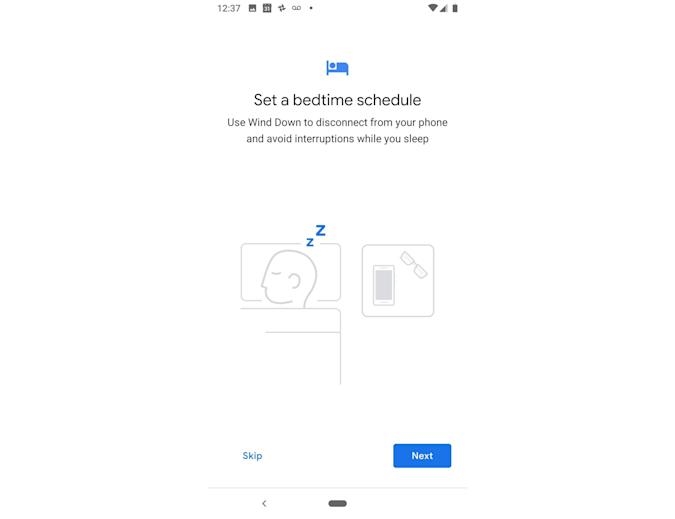
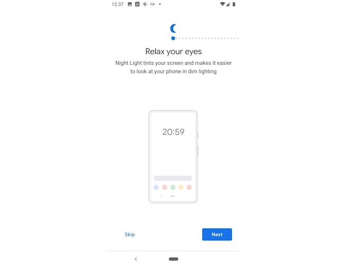
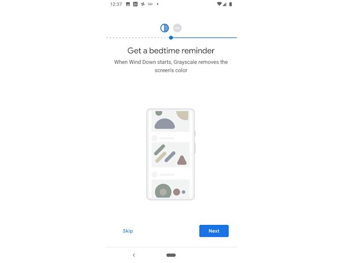
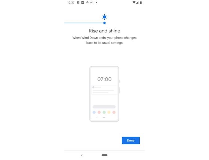
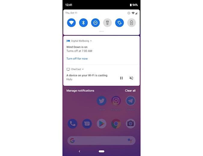
Wind Down, however, which turns your screen black and white when it’s near your bedtime, is more effective at reminding me to put my phone away. Although I often ignore it anyway.
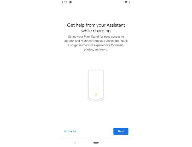
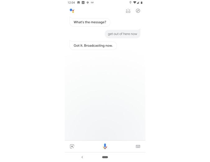
There’s also a new lock screen, which tries to be more helpful by showing things like the music playing around you and longer previews of your incoming messages. But it took a few days before the interface actually started appearing for me, even though I had run all the updates. I was also excited to try out the Pixel Stand interface, which turns the lock screen into a helpful dashboard when you place it on the wireless charger. I had some issues getting it up and running, and it seems I’m not the only one. Google has a few kinks to work out, apparently.
Hardware
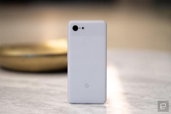
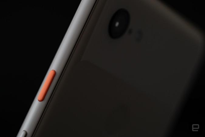
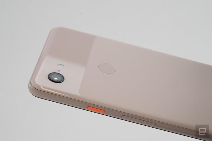
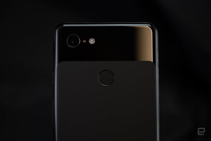
Simplicity seems to be Google’s strategy when it comes to hardware design. Externally, there isn’t very much new with the Pixel 3 and 3 XL, save for a controversial notch that we’ll get to later. The company made little changes to streamline the look of the devices, like moving the SIM tray from the side to the bottom, next to the charging port. These are small touches that you probably won’t notice every day, though. What you will notice is how exquisite the Pixel 3 is to hold.
Gallery: Google Pixel 3 and 3 XL review
I’ve fondled a lot of phones in my life, and in general all flagships have grown to feel equally high-end — especially in the past two years. The Pixel 3 joins the ranks of Samsung and Huawei phones this year with its glass-covered body, which feels polished and dense (in a good way). Its design isn’t groundbreaking, though — it almost feels like an iPhone 8 except with more curves. But that’s not a bad thing. The 3 XL, meanwhile, feels similarly sturdy and looks gorgeous — that is, until you turn it on.
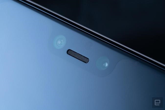
When you do that, you’ll see the controversial notch. It’s not for everyone, and is larger than on the iPhone XS and other full-screen phones. Thankfully, Google lets you mask it in developer settings. It’s just sad that you’ll then be left with bits of screen sitting around doing nothing. Frankly, if you don’t need the larger screen, you’re better off getting the regular Pixel 3.
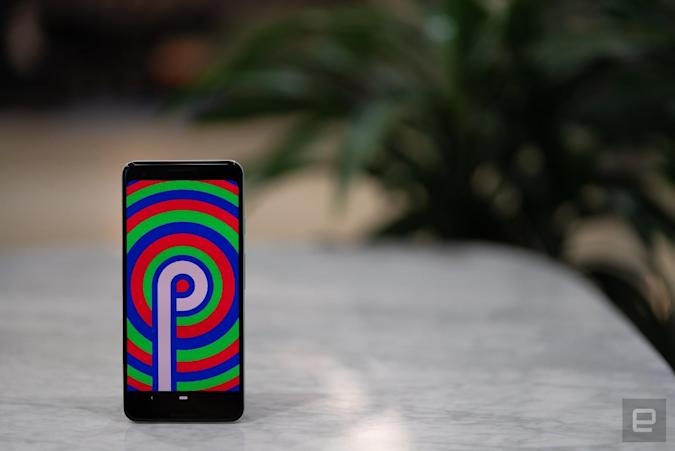
The smaller handset’s display is, surprisingly, my favorite thing about the new phone. It’s significantly better than the Pixel 2’s, offering a sharper image with brighter, richer colors. By default, the Pixel 3’s screen is set to the new “Adaptive” mode, which Google says provides a mix of vibrant yet natural colors that “most users prefer.” You can switch this to regular sRGB or “Boosted” (sRGB + 10 percent) for more muted colors if you wish, but I liked its default setting. I haven’t seen any blue shift yet, and though colors like gray sometimes seem a little purplish or red, I’m just so taken with the Pixel 3’s full HD+ HDR screen I don’t even mind. It’s a huge step up from the Pixel 2, and somehow feels even better than the Pixel 3 XL.
![]()
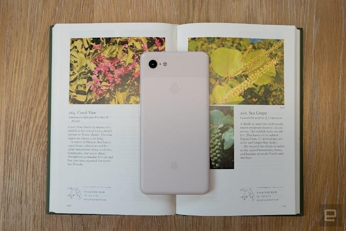
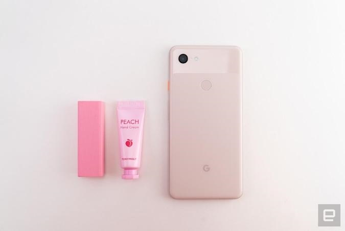
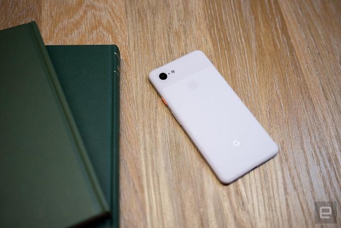
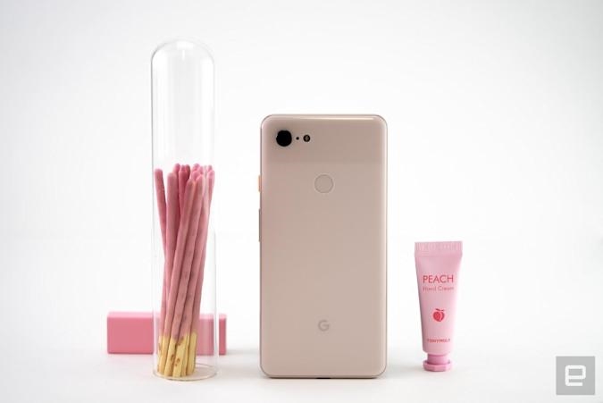
Another thing I loved about both the regular Pixel 3 and the XL was the new color option, and the question everyone’s been asking is “Just how pink is Not Pink?” Frankly, the shade here is subtle — it definitely isn’t a version of “rose gold.” The color leans more toward pastel, and is so barely pink I’d even call it off-white. On a scale from pork chop to Piglet, the Pixel is definitely closer to the other white meat.
Performance and battery life
Both phones use a Snapdragon 845 processor with 4GB of RAM, which seems a little stingy. But Pixel phones product lead Peter Prunuske believes it’s sufficient, especially since the new devices have dedicated chips for image processing and security (Pixel Visual Core and Titan Security, respectively).
The Pixel 3 smoothly rendered complex spreadsheets and several rounds of my favorite game (Gordon Ramsay’s Diner Dash, okay?) while a screen-recording app was capturing what I was doing. So far, it’s pretty speedy. Downloading apps or Spotify playlists, scrolling web pages and loading the camera on the Pixel 3 all felt as fast as on my Pixel 2, if not slightly quicker.
On that aging handset, though, my battery tends to drain overnight. The Pixel 3, meanwhile, generally sipped power more slowly at night, partly because Wind Down and Do Not Disturb keep notifications from sucking energy. The Pixel 3 can typically sustain me through a full workday and the next morning, though I’d have to quickly plug it back in when I get to the office. Meanwhile, the Pixel 3 XL clocked about three hours more than its smaller brother on our battery test, and it generally hangs out half a day longer, too.
![]()
The competition
The year’s biggest flagship phones are out, and the Pixel 3 is mainly up against the iPhone XS and Galaxy S9. The Pixel 3 XL, on the other hand, contends with the iPhone XS Max and the Galaxy Note 9 (or S9+). Obviously, if you’re an iPhone fan, you’re better off sticking with Apple and iOS. Plus, the new flagships have improved cameras that rival the Pixels. If you just want the best pictures, though, Google has Apple beat.
Android fans who want a large notchless phone will find the Note 9 or S9+ compelling options. They both take very good pictures and offer a Dual Aperture mode to make low-light shots brighter. The Note 9 comes with a stylus that doubles as a remote so you can set your phone down to take pictures from farther away, too. But you won’t get the Pixel UI and clever Assistant features like Call Screen and Smart Compose.
All these phones also cost about $200 more than the Pixel 3. In the same price range, though, is the iPhone XR. We haven’t reviewed that device yet, but our early impressions have us feeling optimistic.
If you want to spend less money, also consider the OnePlus 6. It offers flagship-esque specs for hundreds less and a decent dual rear camera setup. The OnePlus 6 and the iPhone XR might not match the Pixels on photo quality, but they should offer performance that’s pretty close, thanks to the powerful processors they pack.
Evan Rodgers / Engadget
Wrap-up
Google’s proven it can deliver premium hardware with its Pixelbook and Pixel C. But its phones haven’t quite lived up to those same standards. That’s okay, though, since the company’s true expertise lies in its software, and it has delivered with the Pixel 3 and 3 XL. The thing is, since the majority of the updates are coming to older phones, it might not seem like there’s a real need to shell out for the new devices. I will say, though, that the smaller Pixel 3 is well worth the upgrade. Its sumptuous display alone will make your photos and videos look like you actually live in 2018, not some sepia-tinted era. The Pixel 3 XL, however, is not for notch haters.
With the Pixel 3 and 3 XL, it doesn’t feel like Google has made great leaps on hardware, nor is it making as big a splash as it did with last year’s cameras. And yet, it’s built a solid foundation where its software can shine.
(17)


