Furious about the fall of Roe v. Wade? Here’s how to design a protest sign that goes viral
Ever since a draft leaked, suggesting the Supreme Court is poised to overturn Roe v. Wade, protests have erupted all over the country, both online and on the streets.
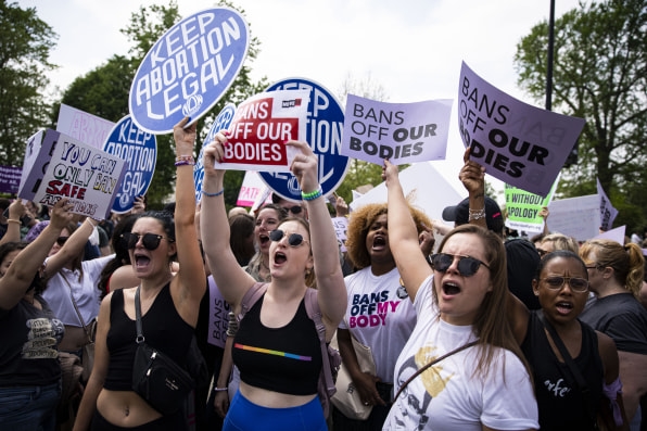
The court’s final decision is expected next month, and while there’s no amount of marching that can change the outcome of a Supreme Court opinion, there’s a lot at stake. The shattering news comes as politicians are gearing up for midterm elections: if Roe falls, Congress could theoretically legalize abortion in every U.S. state, but when the House of Representatives voted to approve the legislation last year, the evenly divided Senate, hindered by Joe Manchin, voted it down. All of this puts pressure on Democrats to win congressional elections in the autumn, giving people even more fuel to protest.
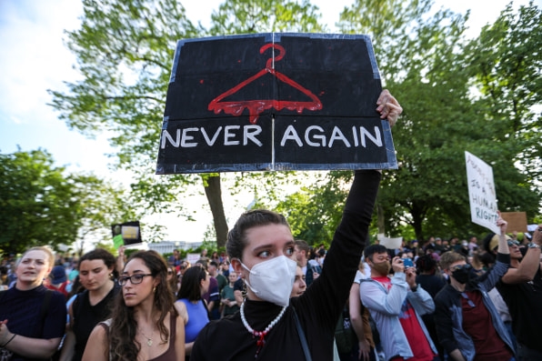
One of the greatest protest tools we have at our disposal is the power of art to rally people around a common cause. Already, the streets are brimming with protest signs that read “My Body, My Choice” and “Never Again.” If you’re thinking of joining the crowd, there are a lot more emotions you could channel into visually striking posters.
In this day and age, the power of a protest sign may start on the street, but it has to resonate on social media, too. That’s why we gathered some insights from three designers and artists who know a thing or two about how to use posters to elicit emotional reactions—and help you go viral.
Choose bold colors and legible typography
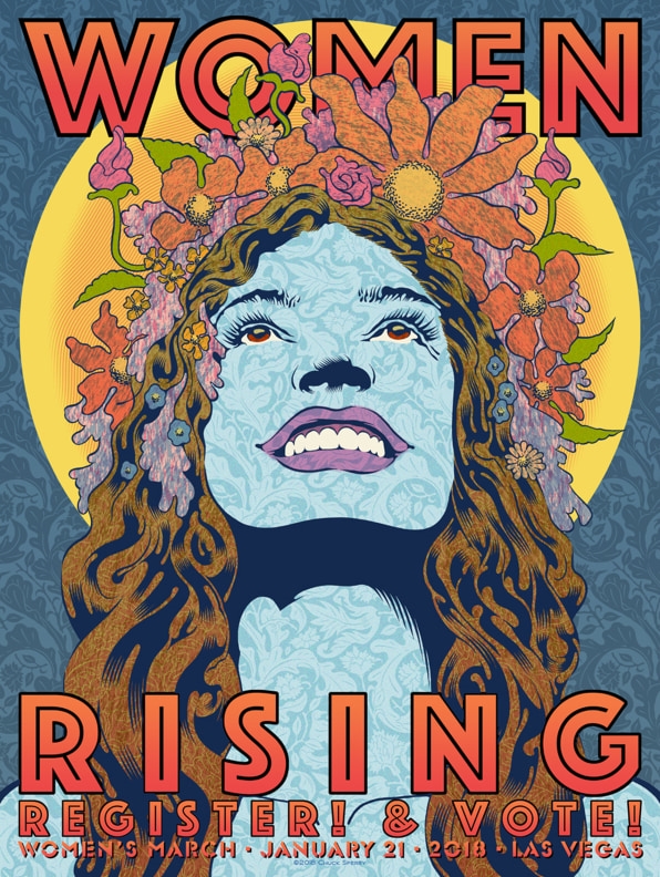
“A successful protest poster can be seen and read easily at 100 feet away,” says Chuck Sperry, an American visual artist who has designed posters for Black Lives Matters protests and the 2018 Women’s March on Washington.
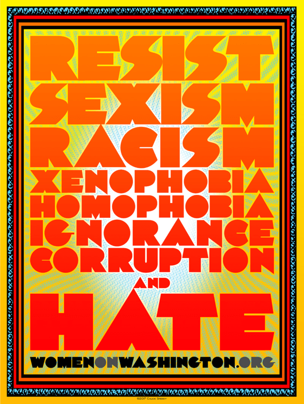
When Trump was inaugurated, more than one million people filled the streets of Washington, D.C., and other cities around the world. Sperry’s response was a standout poster that read: “Resist Sexism, Racism, Xenophobia, Homophobia, Ignorance, Corruption, and Hate.” The poster relied on legible typography and a contrasting color palette: blood red for the words; lemon-yellow fading into white for the background. “The red words jump forward, and these are strong words,” says Sperry.
Channel your outrage into a powerful symbol
Social media has been ablaze with artists and designers protesting the Supreme Court’s decision with strong visuals. Perhaps the most recurring symbol is the coat hanger—a reference to the dangerous method women used to terminate a pregnancy before Roe v. Wade was decided in 1973. But distilling complex social issues into a simple image isn’t always easy.
For Nicole LaRue, the Utah-based artist who designed the now-famous Women’s March logo, it’s all about striking a balance between words and symbols. “Too much is always too much, more so when it comes to poster design,” she says, advising would-be designers to be extremely selective about the image they choose. “A uterus, graphically represented, would be a great symbol for our current situation. It’s not just a situation for women, but anyone with a uterus.”
Consider the tone of your messaging
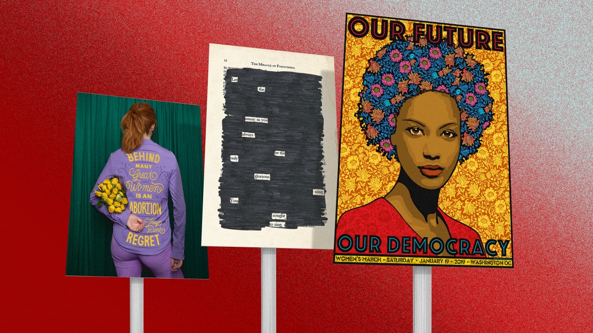
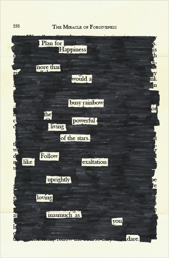
In her latest art collection, titled You Could Have Said Something Beautiful Instead, LaRue turns hateful religious texts from The Miracle of The Forgiveness, into positive messages of hope: She blacks out most of the page, using gaps to spell out uplifting sentences. “I have never understood the need to fight hate with hate, and I think you have a better chance of reaching people who don’t think like you if you come at it with something good,” she says. “I truly think protest posters can absolutely follow this thinking. Why yell at someone who is already yelling?”
Think about how your design will live on social media
Back in the day, in-person protests were one of few ways to make yourself heard. Now, you can use social media to amplify your voice and give your posters a longer shelf life. “Ultimately, a great message will travel far and wide, even if it’s as simple as a tweet format,” says Jessica Walsh, a graphic designer and founder of creative agency &Walsh. “However, if there’s a beautiful execution or smart symbolism that can enhance the message, or is true to the artist and their voice, that can help with the audiences they share it with.”
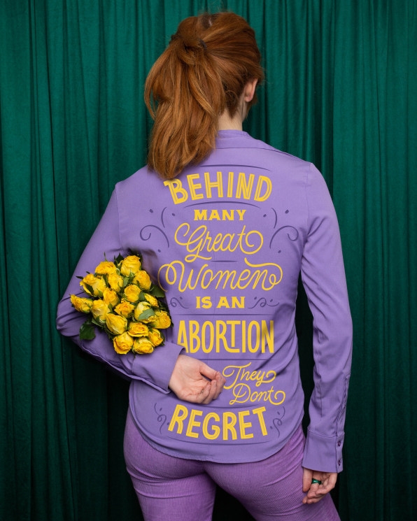
Walsh’s own poster on Instagram shows a woman donning a purple outfit—a color long associated with the feminist movement—adorned with yellow lettering that spells, “Behind Many Great Women is an Abortion They Don’t Regret.” Her pro tip: Think about how to distill your design into a digestible tweet or an impactful meme.
But no matter where you are protesting—whether it’s on Instagram or Capitol Hill—the process for designing a standout poster is the same: “It must demand your attention quickly, and deliver the message effectively,” says Sperry. But if you end up sharing your poster online, he suggests making a free downloadable link for others to use, as well: “To make it an awesome protest poster, make it bold,” says Sperry. “Then take it to the streets, and put it online.”
(84)


