Exclusive: YouTube’s new redesign is built to feel more like TV
There’s no experience quite like watching a movie in the dark. Whether it’s the TV in your living room, or a big screen in the theater, the world disappears into shadows as the colorful content takes over your consciousness. Now, designers at YouTube are attempting to capture that same phenomenon on your phone and laptop.
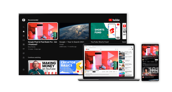
The update is just part of a wider-ranging design refresh of Google’s YouTube platform—shared exclusively with Fast Company—which will be rolling out to its 2 billion users over the next few weeks. The changes include newly rounded buttons to like and subscribe, along with the option to pinch-to-zoom in to the fine details of a video. While the changes will look subtle to some, they are the result of over 100 distinct concepts, and also mark an important strategic shift for the ubiquitous streaming service.
“The thing from my perspective is . . . we’re a very quantitative company,” says YouTube product manager Matthew Darby. “We’re good at focusing on growth and engagement metrics . . . but [we don’t] do so well with some subjective qualities. What’s the subjective experience of watching a video, and did we lose some of that by optimizing a clickthrough rate on a button?”
That concern was born largely from YouTube’s blocky, utilitarian UI, which Google designers agreed had grown stale. That hunch was only confirmed by the company’s ongoing user research. “[Users] talked about how useful, easy to use, and helpful YouTube is, but we weren’t hearing as much like ‘vibrant’ or ‘attractive’—some words we heard in other contexts,” says UX director Nate Koechley. Especially for the “significant” number of people who end up viewing tiny videos in portrait mode, Google designers agreed that rethinking the interface, which dominates a majority of the screen, could offer more immersion.
So, through a series of design sprints and meetings, the YouTube team narrowed down 100 concepts to a dozen, then to one. Following 30 separate user studies, they ultimately opted to release what you see here.
The TV-inspired redesign
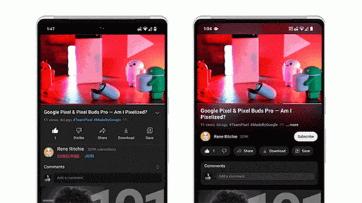
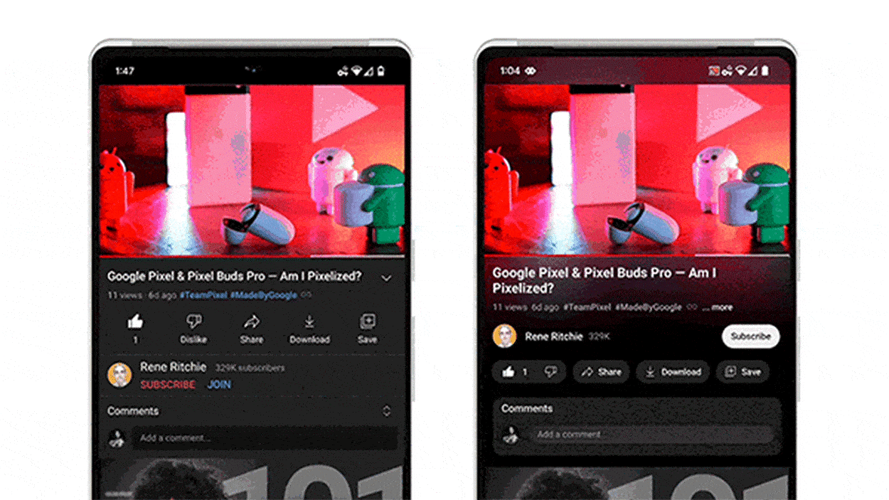
YouTube’s dark mode, formerly a deep gray, is now a deep black. That choice was strategic. YouTube’s designers say they witnessed just how dark dark modes have become since YouTube launched the feature in 2018, and they wanted to keep the platform on trend. The deeper black is also a psychological hack—built to exploit the Bartleson-Breneman Effect, a perceptual theory that states that as a background becomes darker, an image appears lighter. Modeled after how TVs are often built with dark frames that recede into the background to make colors pop, YouTube’s new interface is meant to make every bit of content on the platform more vibrant and immersive. (Fun fact: While you can’t tell with your naked eye, the black on YouTube’s new interface is not quite a true black. True black will actually turn off the pixels on an OLED screen, creating an odd latency when a user scrolls.)
However, the interface is far more than a black frame. Look to the video’s border, and you can actually see color subtly spilling out from the viewing window. “This was very much inspired by the observation that screens project color or cast light into a darkened room,” says Darby. Called Ambient Mode, this color-bleed strategy is reminiscent of Philips Ambilight TVs and its Hue light strips, both of which use LEDs to project light from a screen onto a background wall. In YouTube’s case, you can even see the color leaking through some of its buttons, much like it does in Google’s Material You design in Android. This ambient UI feature is notably the first that Google tested in its new, qualitative user testing setup for this project—measuring the three new metrics “modern, clean, and appealing”—and the results were “off the charts in positive,” says Darby.
Still, the feature took quite a bit of back and forth to get it right. At first, the color spill was in sync 1:1 with the video on the screen, but that overt perfection was actually distracting. “It’s trying to balance something cool right now, but also 100 hours from now,” says Koechley, “that doesn’t get annoying once you live with it too long.”
Streaming and processing extra video data was also just the sort of challenge that YouTube engineers prefer to avoid, given that its global users have vastly varying bandwidth and hardware. As a solution, Google replaced the background video feed with the same thumbnail files already being pulled for its scrubbing bar, blown up larger, and blurred into a soft bokeh, so the feature didn’t require any extra downloading to work.

Where engagement meets creature comfort
Aside from redesigning the experience of watching a video, YouTube’s designers also reprioritized the information hierarchy across the screen. Notably, the video’s creator has been moved up on the page and is now anchored prominently below the video, while the subscribe button lives alongside the name. Note how that subscribe button’s bright treatment almost jumps off the page, drawing your eye to tap. Meanwhile, the thumbs up and down buttons were buried a row down, where their low contrast makes them recede into the background. (I get the distinct feeling that YouTube is now less interested in your opinion than your subscription!)
The rectangular buttons and thumbnails inside the app have all received the rounded corner treatment. Yes, that rounding is relatively understated, but YouTube’s designers insist that subtlety is what people preferred. One beloved concept, internally dubbed Bloobtoob, pushed roundness to the extremes, with bubbly thumbnails and dropdown menus. The overall vision was polished, airy, and having seen it myself, what I’d describe as the type of modern app experience you’d expect of a hip salad chain.
“Initially, we thought, ‘that looks fine, let’s check it out!’” recalls Koechley. “We put it into testing, and we were wrong.”
Better reviewed were the many creature comforts that YouTube added to the interface. You can now scrub by holding the bottom bar with your thumb, without pulling up a bunch of other distracting controls. And for longer videos, which make precise scrubbing impossible because the slightest touch of your finger can fast forward by minutes rather than seconds, the company created a new “filmstrip view” that allows you to pick your landing spot with frame accuracy. Yet the most appreciated update might simply be that you can now pinch-to-zoom in to a video, to make out finer details as you watch, which I imagine will be equally as beneficial for cake decorating tutorials as it is bike repair tips.
“We’re talking to some creators, and one mentioned, ‘Maybe I could put easter eggs in my video . . . so it would be necessary to zoom in to find them,’” says Darby. That’s a notable sentiment. Because while Ambient Mode aims to make YouTube feel like lazily watching a TV on your couch, zooming and subscribing each beg for more interaction, attention, and engagement. It’s a reminder that the Tube is always powered by You.
(15)


