Pantone’s Color of the Year is ‘magentaverse’
The last two years have been difficult ones on planet Earth. As COVID-19 swept through the world, humans faced death, isolation, and social unrest. But as 2023 dawns, the pandemic feels like it is finally receding. Or at the very least, people are ready to plunge back into life with vigor and make up for lost time.
The experts at the Pantone Color Institute feel the excitement bubbling in the air. Today, it unveils its 2023 Color of the Year, which expresses a convivial mood. It is a vivid, audacious red called Viva Magenta. According to the company, the color represents the resilience, optimism, and creativity that many of us hope to feel as we enter the new year. But in a twist, the color also explores the interplay between the real world and the virtual one, which will become increasingly relevant as the metaverse looms larger.
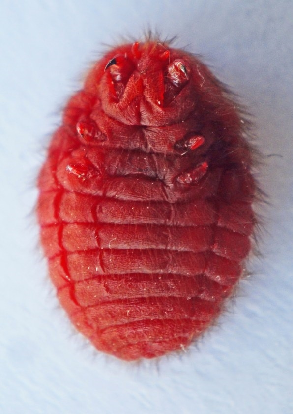
Viva Magenta was inspired, in part, by a humble insect. The cochineal is a 0.2-inch-long beetle, native to the Armenian Highlands, whose exterior is a striking red and blends in with similarly colored flowers and fruits in its habitat. While other species have gone extinct, the cochineal has survived for millennia, tenaciously offering its beautiful pop of color to the world. “This beetle shows us how to survive,” says Laurie Pressman, VP of the Pantone Color Institute. “That hardened shell speaks of bravery and fearlessness that many of us acquired over the last two years.”
Pantone Color Institute consists of dozens of interdisciplinary experts who study color from a range of perspectives, including psychology, fashion and interior design, and art. They began their research for the 2023 Color of the Year in March of this year, trying to get a handle on the zeitgeist from world events and trends in the marketplace. Pressman says it quickly became clear that the end of the pandemic, and the psychological impact it had on us, was the main theme. “Everybody acknowledged we are living in a very unconventional time,” she says. “It feels like in a few years, we’ve lived through decades, given the profound change that has happened.”
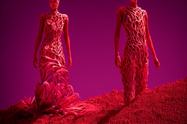
The team found the cochineal a compelling concept for this moment in time. Besides its resilience, the insect colorful’s exterior makes it appear bold and fierce. Many of us are eager to mimic that sentiment as we jump into 2023, and reengage with others, including in the way we dress.
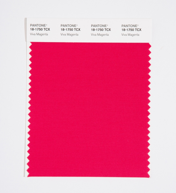
Indeed, according to the Pantone’s extensive color research, this color has already begun showing up in fashion over the last year. We see it in makeup trends and statement hair. Designers, including Jonathan Anderson for Loewe and Daniel Roseberry for Schiaparelli used the color in dresses in runway shows. And we’re likely to see Viva Magenta continue to pop up throughout the fashion world over the next two years. Historically, fashion labels have been quick to take note of Pantone’s Color of the Year, and incorporate it into their designs.
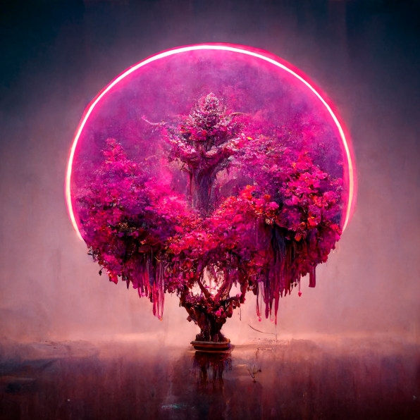
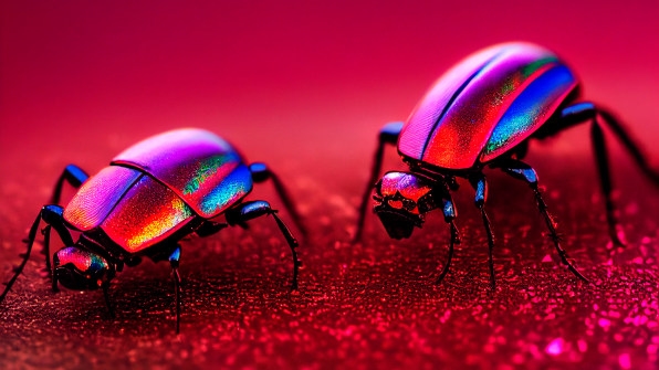
But one interesting thing about Viva Magenta: While it is drawn directly from colors in nature, it is so rich and saturated that it looks artificial. It’s a color that appears frequently in our digital universes, including video games. Pantone believes this color helps us explore the tension between the real and virtual worlds.
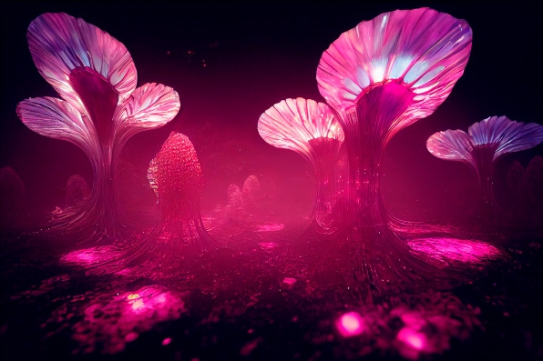
Pressman points out that we’re drawn to both realities. We love creating and inhabiting digital spaces, as is evident by the current fixation with the metaverse. But as we saw over the past two years, when we were stuck at home spending our time online, we also yearned to be part of the real world, which is why so many of us found such solace in nature. “During the pandemic, the adoption of technology accelerated,” she says. “But that made us appreciate the outdoors even more. This color is rooted in the primordial, invoking the force of nature.”
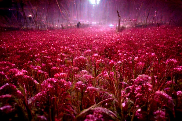
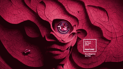
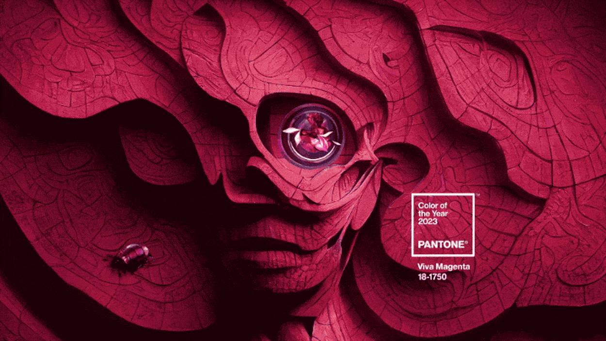
Pantone’s imagery around Viva Magenta encapsulates the interaction between the real and the virtual, perfectly intermingling photos of nature with computer-generated graphics. All of this suggests a future that involves a seamless blending of the physical and digital worlds, to the point where we may not even distinguish between the two. It’s a disquieting thought, but it’s one that many of us are already wrestling with as we spend more and more time online.
Given Pantone’s power as an organization, it doesn’t simply study trends, but also actively creates them. As this particular color starts popping up everywhere, it nudges us to move forward with optimism. “It gives you a feeling of lightness, like we’re walking into a new path, a new world,” Pressman says. “We can start writing a new narrative.”
(27)

