Why Pantone turned its 2023 Color of the Year into a $1 million immersive experience
“Viva Magenta” could’ve been a lyric plucked from a Coldplay song. Instead, it’s an expression of exclamation for Pantone’s Color of the Year 2023. “It’s like celebrating life,” says Laurie Pressman, the vice president of the Pantone Color Institute.
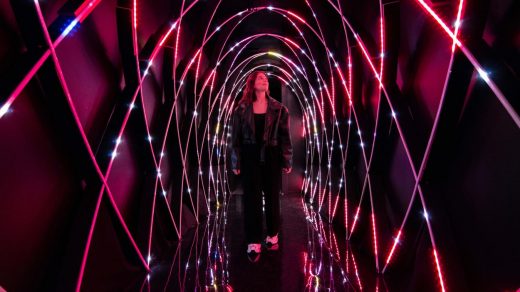
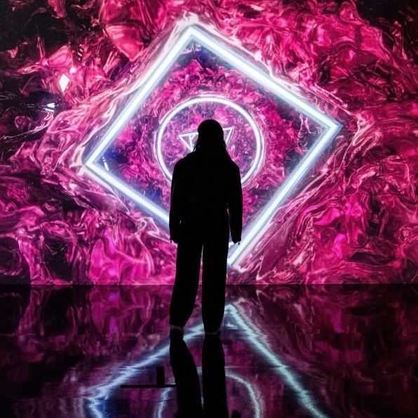
The announcement has already set in motion a well-oiled marketing machine. Motorola is rolling out a phone in the color. Sneaker brand Cariuma is launching six styles in magenta. There’s even a bright reddish rowing machine, courtesy of Hydrow. But the biggest activation came from Miami Beach, where Viva Magenta has taken the shape of a massive immersive exhibition during Art Basel—that’s 10,000 square feet and two floors dedicated to a single color meant to symbolize the “unconventional time” we’re living in, according to Pressman.
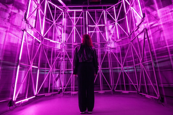
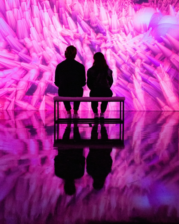
Designed by Artechouse Studio—the brand-new, in-house production team of Artechouse—the exhibition cost $1 million to produce. It’s a cornucopia of multisensory experiences to help visitors explore their own feelings and emotions associated with magenta. “Sometimes when we think about a color, we think about a swatch. For us, it’s about texture, sound, it’s gradients, it’s emotions the color can elicit,” says Sandro Kereselidze, one half of the founding duo behind Artechouse.
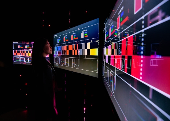
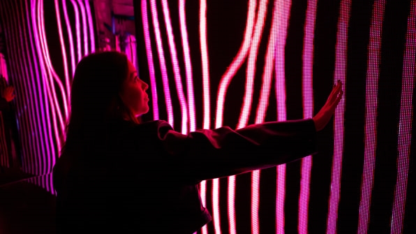
There’s a room inspired by NASA’s moon landing, and another room where the designers translated the magenta color into a series of LED animations. “It was about what the color is supposed to mean,” says Tati Pastukhova, Artechouse’s other cofounder. “It’s all about going beyond boundaries, exploration, discovery, and pushing those limitations.”
Pantone spends more than six months researching its next Color of the Year, scouring a vast array of markets from fashion to cosmetics to home decor. But for Pressman, this isn’t just about trend spotting and forecasting. It’s also about getting the social temperature right. “Color reflects a moment in time and what people gravitate to and what they engage in is a reflection of what they’re looking for,” she says. “Three years ago, this wouldn’t have been the color. You’re seeing it bubble up [now] because that’s the mood.”
The idea that a single color can capture the zeitgeist is both aspirational and simplistic—depending on how gracious or cynical you’re feeling—but it’s a concept that countless brands, from Benjamin Moore and Sherwin Williams to roofing, flooring, and even cheerleading companies, have capitalized on for years. The OG Color of the Year, however, belongs to Pantone. The company invented the concept in 1999, and they have flexed their muscles hard to keep reinventing the campaign over the past 23 years. Most recently, Pantone has done so with the help of marketing firm Huge, which they hired in the summer of 2019. “It’s a lot of pressure to make sure we’re tapped in,” says Pressman.
Pressman talks about the Color of the Year program like a parent talks about the immense potential of their youngest child. Armed with a Master’s degree in psychology, she understands the emotions that a color can conjure and the mirror it can hold to a certain moment; like in 2016, when it chose to embody the growing movement around gender fluidity with a spectrum of colors that range from a “Rose Quartz” to a “Serenity” blue.
From the very beginning, she says, the impetus for the program was “to engage people in a conversation around color,” which pre-social media, must have been a tall order. From the start, Pantone parlayed its Color of the Year announcements into a vast array of consumer products that were sold in iconic department stores like Galeries Lafayette in Paris. The first proper brand partnership went to cosmetics giant Sephora, which in 2012 launched a line of products in “Tangerine Tango” and hosted a weeklong pop-up in Manhattan’s Meatpacking District. “In the U.S., that was definitely the beginning of something,” says Pressman.
Throughout the years, Color of the Year has helped elevate the Pantone brand as “more than just a color standards company,” says Pressman, who sees the program not as an overt marketing tool that results in immediate profits for Pantone, but as a more indirect brand awareness campaign that has had an indisputable halo effect on the brand.
That may be so, but the underlying message behind the program—that color is a powerful reflection of the times—has become diluted by the market’s thirst for naming and creating lucrative trends. In some ways, Pantone has become a victim of its own success: So many other brands claim their own Color of the Year now that the original conceit no longer makes sense.
An immersive exhibition could help shift the approach from a consumerist-driven economy to a more experiential one. It helps that immersive exhibitions are so in right now that if you’re not doing one, you probably risk falling behind. This need to stay relevant is part of the reason why Pantone hired Huge in 2019.
Jason Schlossberg, who is global head of marketing at Huge, explains that Pantone already had the world’s attention when Huge became involved. What they didn’t have was the ability and tools to show the world that there is more to color than just color. “How do you use design, how do you use emerging technology, how do you use the tools that designers actually use to bring to life this color in a much more meaningful, dare I say, immersive way?” says Schlossberg.
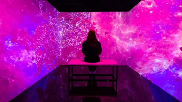
An immersive exhibition made sense. People could experience color in a multisensory way—what it feels like, what it sounds like. In 2020, Artechouse put together a trippy exhibit titled Submerge, inspired by Pantone’s Classic Blue. Then came an immersive color-reveal event (emphasis on the word event) dedicated to Pantone’s 2021 color combo “Illuminating + Ultimate Gray”; then another event around 2022’s Very Peri. But none of these was designed for the public to experience them long-term. Submerge was open for two weeks. The following two events were reserved for press and influencers only.
This year’s exhibit is the first official outcome of Pantone’s partnership with Artechouse. Tickets will cost $30, and the exhibition will run until spring 2023, before it travels to New York City and Washington D.C., where Artechouse has other exhibition spaces. (The companies declined to disclose who gets what portion of the revenue.)
Pantone’s move into the experiential economy is in keeping with the times. And what gets consumers going these days, is immersive everything. “People love Color of the Year, and the only way you can maintain that mass interest is by continuing to focus on the core [audience],” says Schlossberg. “If we’re not relevant and exciting to industrial designers, to product designers, to brand marketers, to retailers, then consumers are not going to follow.”
(37)

