7 reasons why Apple’s TV app is still a frustrating experience for film lovers
Like many out there, I love movies. As a child of the ’80s, I got sucked in with big screen spectacles like Star Wars and Raiders of the Lost Ark, and as I’ve grown older, my tastes have expanded into arthouse and world cinema. I’m also in the subset of movie lovers who are collectors—a hobby with a hefty price tag that results in a large personal library of titles.
But unlike many film collectors who prefer physical media (Blu-ray mostly, though you still do have your DVD and even VHS afficionados), I collect my films digitally, exclusively through Apple’s iTunes Movie Store. By some collectors’ standards, my library is small—just over 400 films—and others might find my digital preference an affront to good taste. But what can I say? Buying digital movies through the iTunes Movie Store comes with a huge benefit: Almost every previous movie that you bought there in HD is automatically upgraded to the 4K version for free when the studio releases it. With physical media, you have to rebuy past purchases if you want the resolution boost. And of course, buying my movies through Apple means my entire film collection is available at any time from any device—it goes where I go.
But for digital collectors like me, there is a big drawback to accumulating our movies through iTunes: the Apple TV app. To be clear, I’m talking about the TV desktop and laptop app for macOS and, now, Windows (Apple uses the “Apple TV” brand, confusingly, for its hardware, software, and services offerings). It’s the primary app that collectors use to organize and manage their iTunes-bought movies, though you can also do so, to a more limited degree, via the TV app for iPhone.
Unlike Apple’s other media management apps, which include Books, Podcasts, and Music, and which are capable, full-featured, and excellent repositories where collectors can manage their libraries, the TV app for Mac, despite being four years old, still feels like a bare-bones and frustrating experience for film lovers. These are our most common gripes:
1. The ‘TV’ name is blasphemous to film collectors
Okay, this is a tiny one, but it’s meaningful. Many people in the film community simply can’t get over the name that Apple chose for the app that holds all your movies. Why should any great works of cinema have to be lumped under “TV”?
Clearly, the TV app does more than just house your purchased movies; it also contains your purchased TV series, and even home videos if you want. And integrated into the app is the actual Movie and TV store, where you buy your content, and the Apple TV+ streaming service player. (See? All this “Apple TV” branding gets confusing.) You can also watch other streaming services you are subscribed to via the TV app.
So, I understand Apple’s choice of the “TV” name—the app holds content that can all be watched on a TV—but still, it rubs film collectors the wrong way. Yet, it should be noted that the TV moniker is more apt than the name of the former Mac app that housed your movie collection: iTunes.
2. The film genres don’t make sense
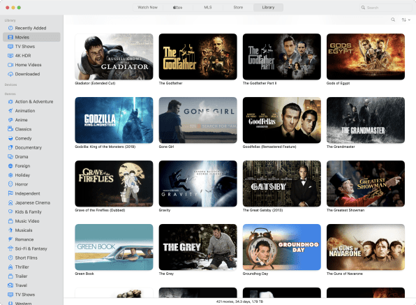
One of the most common ways collectors organize their libraries is by genre. Apple’s TV app ostensibly does this kind of sorting automatically (in the app, click the Library tab and you’ll see genre categories). The problem is that Apple TV’s genre categorization, at best, makes little sense, and at worst just seems broken.
For example, I own around a dozen films that are clearly regarded as “Japanese cinema” (they are made in Japan). Yet the TV app only sorts one of the 12 into the “Japanese Cinema” genre. Or take Musicals. The TV app sorts only four of the films from my collection into this genre, though I have more than a dozen of them (it doesn’t consider Annie or Moulin Rouge a musical, for some reason). Or take Classics: The TV app says I have only two, when I have dozens. For some reason, it doesn’t designate Roman Holiday (the movie that made Audrey Hepburn a star) or It Happened One Night as “classics.” Go figure. And the Animation category is even worse: Not a single animated film I have shows up in the “Animation” genre (only a cartoon TV episode does).
To be fair to Apple, this may be a problem not with the TV app, but with the way studios assign metadata to their films when uploading them for sale via the Movies store. Either way, the nonsensical genre categorization in the TV app is a frustrating experience, and Apple should take the necessary steps to correct this.
3. ‘Foreign’ genre categorization needs a rethink
This is related to the genre issue above. I’ve always disliked the term “foreign” film. It’s a relative categorization (if you live in Japan, Our Little Sister isn’t a “foreign” movie—Citizen Kane is).
Regardless, when it comes to categorization, “Foreign” is better than nothing, I suppose. And the TV app does have a “Foreign” genre (though my library shows only one film when I actually have closer to 50 “foreign” films). But the TV app also has a separate “Japanese Cinema” genre. It’s a regional-specific designation that is much more accurate and clear than “Foreign.” But oddly, the TV app does not have a separate “Chinese Cinema” genre even though I have many Chinese films in my library. Nor is there a “French Cinema” genre.
So why do some countries get their own categories while others are relegated to “Foreign”?
4. You can create playlists, but you need to download the movies first
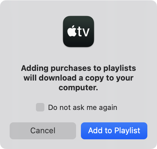
“Okay,” you may think, “the TV app’s genres are a mess, but I’ll just create playlists of films and categorize them myself.” Clever! And you can do that —it’s just that the TV app requires you to download the film to your computer if you want to add it to a playlist you’ve created. Then, if you delete the local copy of the film, it gets removed from the playlist.
Why did Apple make it so that playlists require downloaded films? Who knows, but that means collectors wanting to create organized collections of their movies need to download all of them to their Mac or PC first. My 400-plus-film library adds up to almost 1.8TB combined . . . nearly twice as much hard-disk space as my MacBook even has.
5. Search is very, very limited
One of the best benefits of digital collections is that their digital nature usually allows for robust search features. In the Apple Music app, for example, you can quickly search your purchased/imported music library by artist, title, album, and more.
But the search functionality in the TV app, when it comes to your movies library, is extraordinarily lacking. You can search by only four metrics: title, director, genre, or year. But as discussed above, genre isn’t reliable. As for the other three, great. But oftentimes, you may feel like watching a movie with a certain actor in it—say, Ethan Hawke. Despite the fact that I have 10 films with Ethan Hawke in my collection, searching for “Ethan Hawke” in my library yields no results.
And true film buffs often want to go further and watch a film that was shot by a certain cinematographer or penned by a specific screenwriter. Yet the TV app offers no method for searching your purchased library for such key players.

6. The info screen for a movie lacks information or flair
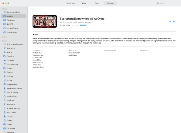
When you click on a movie in your library, you’re taken to its main information screen . . . which looks like a barebones webpage from 1995 that Apple gave up on. You are shown the tile of the movie (Apple’s version of its poster image), its year, rating, and a few more technical stats. You also get a short text description of the movie, as well as a cast and director list and (sometimes) the names of screenwriters or producers.
But the page is positively skeletal. It’s mainly white space with very small text. You can’t see the original movie poster or any other cool information about the movie you shelled out $20 to buy. It would be amazing if you could click on any of the actors’ or screenwriters’ names IMDb-style and see if you have other films of theirs in your collection—but nope.
You can’t even see the Rotten Tomatoes rating for the movie. If you want to view it, you need to manually search for the movie in the Movies store the next tab over (and there’s no easy right-click option to “Show movie in iTunes Store”). Why not just show us all the film’s information in our libraries?
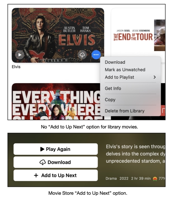
7. Where’s the ‘Add to Up Next’ option?
A final gripe many film lovers have is that you can’t add a movie directly from your library to the app’s “Up Next” queue. This is your personal watchlist, which appears on the home screen and is synched across your devices, whether they’re Mac, Windows, iPhone, Apple TV (the hardware), Xbox, or others.
Collectors frequently browse their library of films, finding ones they haven’t seen in a while, and want to quickly add it to their Up Next queue, so they can remember to watch it later. You would think you would be able to right-click on a film in your library and do this, but the drop-down menu that appears lacks this basic feature.
Instead, again, Apple forces you to find the movie in the Store section and add it to your Up Next queue from there. It takes multiple extra steps to do this and seems like Apple is excluding basic features from the TV app’s Library to force users to have to navigate the Store to use. This makes many film collectors feel like Apple has designed the TV app less as a great content manager for movie collections and more as a way to keep going back to the storefront as much as possible.
Still, there’s promise . . .
I have no idea why the TV app seems to have been so neglected compared to Apple’s other content management apps, such as Books, Music, and Podcasts. Many in the film-collecting community had thought that Apple had been waiting to expand features until it introduced the Windows version of the TV app. But now that that milestone has been reached, with no new enhancements, they remain puzzled.
Yet strangely, I have hope for the TV app’s future. There are some recent glimmers of brilliance here and there that tell me that the people who work on the app might actually be film lovers. Ironically, the best example of this can be found in the much-maligned genres feature.

While the genre categorization is a mess, Apple has taken the time to design clever little icons for each genre. Some are generic (a snowflake for the “Holiday” genre), but others contain small references to films in the genre itself. For example, the “Horror” genre icon is a hockey mask—a reference to the Friday the 13th series. The “Thriller” icon is the best: the head of a shark pointed upwards—a homage to one of Hollywood’s most defining films of the twentieth century, Jaws.
It’s still months from Apple’s next Worldwide Developers Conference, when the company previews its upcoming software. Here’s hoping the TV app finally gets a much-needed update for film lovers everywhere.
(16)

