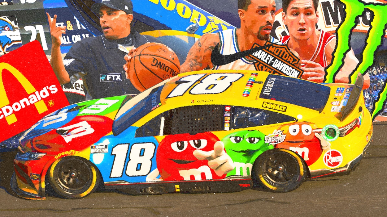
Sports ads are about to get more aggressive—here’s what they could learn from Nascar
By James I. Bowie
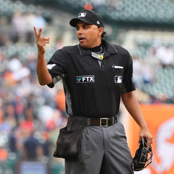
We’re about to see a lot more advertisements in sports in 2023—and some fans are already annoyed. After Major League Baseball added the ill-fated FTX logos to umpire uniforms in 2021, the league is now set to debut 4-by-4-inch patches featuring commercial logos on the sleeves of player jerseys this season, a move that the NBA and NHL have adopted in recent years. The new patches are already drawing the ire of traditionalist fans who resent this commercial intrusion onto one of the most important expressions of their hometown teams’ identities.
More sports have also started using technology to digitally insert new forms of advertisements into their television broadcasts. It hasn’t always gone smoothly; beyond occasional technical glitches, the ads have disrupted the sports in unforeseen ways. The NBA’s Milwaukee Bucks discovered that they can no longer wear their cream-colored uniforms because they confuse the advertising software. And the NHL’s introduction this season of digital ads on the boards surrounding the ice has been off-putting to many fans who find them distracting and unnatural-looking.

Some of these sports could learn a thing or two from Nascar, which, when it waves the green flag on Sunday to start its 75th season at its biggest race, the Daytona 500, will present a visual spectacle of sport and advertising in a way that its rival professional sports leagues are unable to match. Long derided by fans of other sports as a cavalcade of billboards on wheels, Nascar has mastered the inclusion of commercial elements into its sport just as its competitors have begun stumbling to follow in its footsteps.
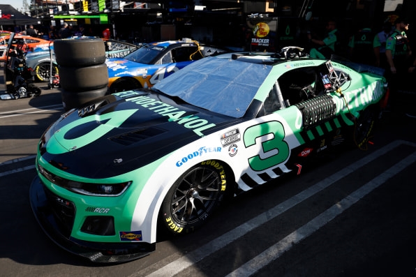
As the “billboards on wheels” gibe acknowledges, Nascar has always been blessed with prime real estate for the display of commercial imagery on the car itself. Unlike the newly trendy Formula 1, where the cars’ insectoid and variegated chassis leave little room for sponsor logos, Nascar’s stock cars have multiple flat surfaces ideally suited for advertisements, and Nascar has recently become more sophisticated in its use of this space.
In 2018, Nascar began to discontinue its use of contingency decals, the multiple small and virtually illegible sponsor logo stickers that had long cluttered the sides of its cars, opening up space for slicker, more coherent ad messaging. And last year, with the debut of its Next Gen car, Nascar moved the car numbers forward from their traditional spot in the middle of the door, freeing even more room for sponsor visuals.
And those visuals have been increasingly eye-popping, leveraging design to integrate advertising into the sport in a way that the other leagues haven’t begun to approach. Just look at Alex Bowman’s number 48 Ally Bank Chevrolet, resplendent in both its “day” and “night” versions, or Joe Gibbs Racing’s Interstate Batteries Toyotas, pure eye candy.
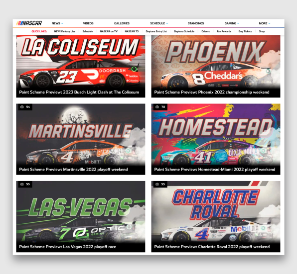
These car designs are known as “paint schemes,” and while an undoubtedly cooler-sounding term than F1’s “livery,” it’s an anachronism, as today’s cars no longer require paint; the designs are put together on computers and applied to the cars in the form of a vinyl wrap. This approach allows Nascar to present a variety of creative and appealing designs that take advantage of the clean canvas that each car now represents. The designs can vary from race to race, resulting in an ever-changing lineup that draws the interest of fans; Nascar presents a “paint scheme preview” before each race to indulge this curiosity.
Representing a wide range of commercial sponsors, these paint schemes can occasionally verge on the absurd, a characteristic that Hollywood has had fun with at times, as evidenced by the Wonder Bread and Perrier cars in Talladega Nights, or Chick Hicks’s hostile takeover Bank paint scheme in Pixar’s Cars. It’s refreshing, though, that Nascar does not take itself so seriously that it won’t run a Velveeta car like the one Ricky Stenhouse Jr. drove at the Clash.
At the heart of these paint schemes are the car numbers, which essentially serve as the “logos” of the various drivers and racing teams, and consequently are held dear by race fans, so pushing them out of their usual place initially ruffled a few feathers. But due to Nascar’s longstanding heavily sponsor-driven culture, such pushback died down much faster than, say, it likely will for baseball this season.
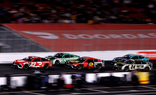
The design of these numbers is interesting to consider. Almost 90% of the cars competing in the Clash at the Coliseum exhibition race earlier this month sported numbers leaning to the right, or toward the back of the car when viewed from the driver’s side. These italicized numerals seem to exclaim, “I’m going so fast, I can’t stand up straight!”
By contrast, only 3 of the 36 cars featured numerals leaning forward, suggesting an aggressive posture befitting the most famous of such numbers, the iconic 3 of the legendary Dale Earnhardt, “The Intimidator.” This 3, now appearing on Austin Dillon’s Richard Childress Racing team Chevrolet, is the new plus ultra of number designs, with an unmatched visual appeal stemming from its perfect proportions and rakish forward pitch. Only one car at the Clash, Harrison Burton’s 21 Ford, used straight-up-and-down numerals, a classic design employed for decades by his Wood Brothers racing team. The variety of number motifs on the track represents another way that Nascar has incorporated design into its spectator experience.
Commercialization’s march into the American sports world seems unstoppable, no matter how many fans seem to abhor it. But as the cars circle the Daytona International Speedway on Sunday in a bacchanalia of color and graphics, we’ll be reminded that in Nascar, the commercialization is a feature, not a bug.
James I. Bowie is a sociologist at Northern Arizona University who studies trends in logo design and branding. He reports on his research at his website, Emblemetric.com.
(29)


