7 Painful Blunders Killing Your Digital Content Usability
7 Painful Blunders Killing Your Digital Content Usability

While digital content creators focus on the “bones” and “meat” of their assets, worrying about the info comprehensiveness and other factors critical for visibility and higher rankings in search engines, they often forget about its “skin.”
Yes, content is king in digital marketing, but it’s the retinue that makes the king. Speaking of digital content, this retinue or “skin” is web typography.
How much attention do you pay to content formatting? Do you go beyond headings, short paragraphs, and visuals throughout the text? Did you know that math proportions in a web page influence usability and can hold visitors off when imbalanced?
Below are tiny yet critical mistakes in text formatting that can ruin a positive impression of your content, no matter how deep and helpful its subject may be. Let’s learn some math that improves the reading experience and helps your website visitors better perceive your content, even if it’s AI-written.
7 Killers of Digital Content Usability
- Wrong align
- Wrong spacing
- Hard-to-see headings
- Poor color-contrast ratio
- Wrong font size
- Complex text structure
- Large text fields
1 — Wrong Align
It’s crazy how many websites don’t care about aligning or continue aligning their text content center. Some try to align words by hand, while others apply a full justification. None of these methods works for stellar formatting:
Words are of different lengths, and even if you adjust the text to your device — it will fail at other screen resolutions. As for the justification, it leads to unlikely word spacing. As a result, your content looks amateurish and hard to read: Users “stumble” over that random spaces, the text flow suffers, and it brings nothing but frustration.
The best option is to align your digital content left.
First, it’s natural for most users to read texts left to right. Second, it fits the F-shaped pattern online users consider when scanning your page and deciding whether they want to read it.
Frayed right-hand margins serve better usability than the random spacing between words. The latter doesn’t allow readers visually perceive the information you share in the content.
2 — Wrong Spacing
This blunder is about spacing before and after subheadings in your digital content. While it seems insignificant, and most web admins don’t pay attention to this detail when choosing a website theme, here’s the rule:
Spacing before a subheading should be wider than spacing after it.

Such formatting helps users understand what paragraph the subheading represents. Plus, it makes the whole content asset visually clear.
3 — Hard-to-See Headings
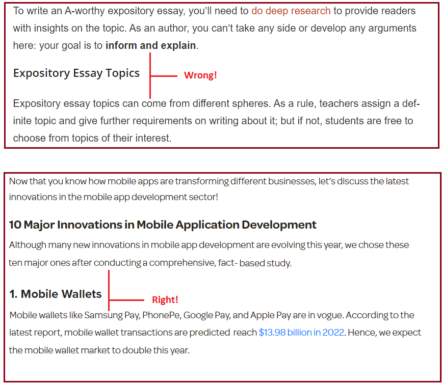
Digital writers know their content is useless without good headlines. Not only do they help with SEO writing and serve better visibility in search engines, but they also assist users in scanning your content to understand its context.
Back to the F-shaped pattern here:
Users need 10 seconds to check through the content and see what it is about, and subheadings serve this purpose best. They won’t encourage web page visitors to keep reading if they are poorly composed and hard to scan. For better usability, design your subheads as follows:
- Use a different font size or color.
- Make them bold.
- Write informative subheadings for readers to understand the outline of your content.
- Make them concise and clear.
- And yet, do your best to craft subheadings that will be intriguing enough to motivate visitors to keep reading.
4 — Complex Text Structure
Let’s face it, it’s super challenging to create original content today: Competition is crazy, and everyone tries hard to craft comprehensive assets that meet E-A-T (Google’s factor of expertness, authoritativeness, and trustworthiness) and user search intent and serve as ultimate guides to answer all questions.
But there’s a catch:
Chasing high-quality 10x content, creators craft long-form assets with complex structures. These structures include many subhead levels, hurting usability and making it challenging for readers to perceive all the information. Instead, they’ll get lost in your content.
Today, the attention span is shorter than ever, and online users won’t spend hours investigating your text blocks. The more steps they have to take, the bigger are chances they’ll leave your web page fast, therefore hurting its dwell time, bounce rate, and overall behavioral factors.
Let’s compare:
- Title – H2 – H2 – H2
- Title – H2 – H3 – H3 – H3 – H2
- Title – H2 – H3 – H4 – H4 – H3 – H2 – H2
The first text structure is concise and clear, so it works best. The second one is also fine: Readers understand the flow and each text block’s belonging. The last one is harder to grasp, requiring readers to concentrate and remember what and where they’re reading each moment.
For digital content usability, follow the rule, “the simpler, the better.”
5 — Poor Color-Contrast Ratio
It stands to reason you won’t place yellow or red text on green or blue backgrounds. However: The color-contrast ratio is critical in web page design as it improves readability, helping users perceive information.
Too little contrast and wrong color combinations exhaust readers, frustrate them, and make them leave your website, no matter how informative and persuasive content you have for them. How to prevent that:
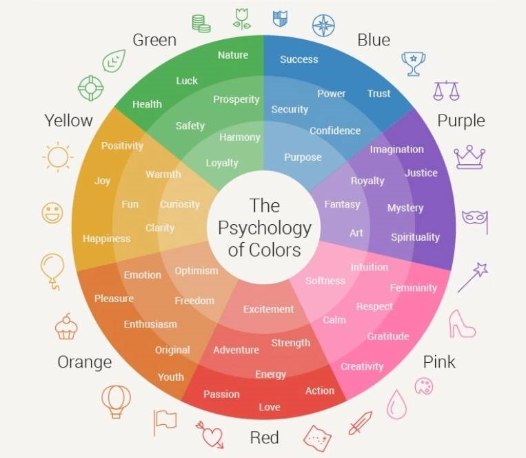
- Regardless of your brand colors or those you consider for your website based on color psychology, choose a light, calming color for the pages’ background. It will make it comfortable for users to read your digital content.
- Use instruments like GitHub to adjust the correct color-contrast ratio to your web pages. Make it no less than 5:1. Why do you think black texts on white backgrounds look best? There’s the greatest color-contrast ratio between black and white.

6 — Wrong Font Size
Users won’t read your digital content if they have to take pains for that. Too small fonts on your website — 12px or less — is a surefire way to demonstrate disrespect to visitors.
General rules to follow here:
- Use 14px font size (minimum). Some experts insist that 16px to 18px (editors dotcom) is the best for the web, but the content readability doesn’t depend on the size itself: The balance of font, line height, and light width matter (more on that — in the #7 blunder description).
- Avoid placing more than three font sizes on one web page.
- Consider fonts that reflect your brand’s personality: According to typography psychology (nickkolenda dotcom), different fonts evoke particular associations and emotions from readers, so it’s your chance to influence their perception.
7 — Large Text Fields
And last but not least detail many web admins ignore when formatting pages:
The line height and length for text blocks.
It’s a web typography rule based on the golden ratio: All three dimensions (font size, line width, and line height) should relate and look pleasing to the human eye. It improves usability and reading experience by far!
The golden ratio is 1.618, but you can calculate the perfect one for your website based on the font size you use. Consider GRT calculators for that: The bigger size, the wider and higher lines you need to use. Another formula comes from Robert Bringhurst, the author of The Elements of Typographic Style:
Your font size (x) 30 = a golden ratio for your web page.
The optimal line length for a text column is 50–75 characters. A longer one makes it hard to focus on the content and gauge where it starts and ends, and a shorter one makes the eye travel back too often, hurting the reader’s rhythm.
Another problem with too long lines is they look like there is more work to do, thus scaring readers. Too short lines may also stress visitors: They begin on the following line before finishing the current one, thus skipping essential information you wanted to share.
Those who learn to blog also use a line width trick by Derek Halpern from Social Triggers:
If you can’t make the full text’s line short enough, you can still hook readers in the text’s introduction. Half-width images below headlines can help here, like this:

Large text fields can also be a result of writing too long paragraphs. Web writers know that it is among the key indicators of readability for users: Visitors scan a text and consider it unstructured and challenging to perceive if they see too massive text blocks.
Most websites struggle with this problem by keeping paragraphs no longer than 3-4 sentences or even 1-2 sentences. It’s a nice rule to follow if you don’t have the resources to calculate the above-mentioned golden ratio for your web pages. (the above dimensions: font size, line width, and line spacing).
But the optimal number of sentences in your paragraphs depends on your page’s font size, line width, and line spacing.
Takeaways
Digital content subject and quality matter for users, but webmasters and designers shouldn’t also underestimate the role of its usability. No matter how expert and comprehensive your texts are, no one will read them if they are visually displeasing and challenging to perceive.
Content moderation is a must. And a little math behind web text design is worth considering for better content usability and conversion. For that:
- Align your texts left.
- Pay attention to spacing before and after subheadings.
- Avoid complex text structure.
- Make all the subheads visible.
- Ensure that the color-contrast ratio of your text and web page’s background is no less than 5:1.
- Use a minimum 14px font size for text content.
- Calculate the golden ratio for your web page based on three dimensions: font size, line height, and line width.
Yes, we all know that everything of genius is simple. But only those who make fewer mistakes win.
Featured Image Credit: Provided by the Author; Pexels; Thank you!
The post 7 Painful Blunders Killing Your Digital Content Usability appeared first on ReadWrite.
(40)


