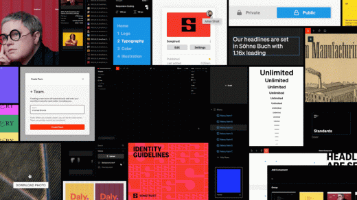
This new tool fixes one of design’s most pain-in-the-ass tasks
Back when he was an associate partner at Pentagram, Hamish Smyth worked on a lot of brand standards—those guidelines dictating everything from how to use a logo to acceptable typefaces, color palettes, and all design ground in between.
“The first one you do is really amazing,” Smyth says. “But by the 50th one, you’re kind of like, OK, here we go again. . . . ”
As anyone who has ever developed a set of standards knows, it can be tedious, lobotomizing work. Smyth would find himself manually typing out endless color codes, baffled as to why there was no button to simply automate the process.
It’s a problem that never really went away. So, at their studio Order, cofounders Smyth and Jesse Reed began building a digital guideline tool to use internally around 2018—“and quickly figured out it might be useful for others, too.”
They were right. Upon announcing the project, 28,000 people signed up for their waitlist—and today, Standards has officially launched to the public. The customizable web platform allows anyone to input core brand assets and quickly create a comprehensive set of sleek guidelines that are easily updatable and live online for everyone in an organization to access.
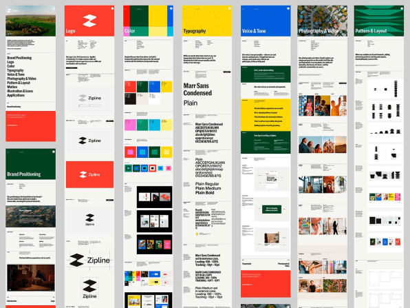
Part of the site’s immediate popularity is likely due to the fact that Smyth and Reed represent the brand guidelines zeitgeist perhaps more than any other living designers. They founded the publishing imprint Standards Manual in 2014, resurrecting editions of the NASA Graphics Standards Manual, the New York City Transit Authority Graphics Standards Manual, and more delightfully fetishized design artifacts.
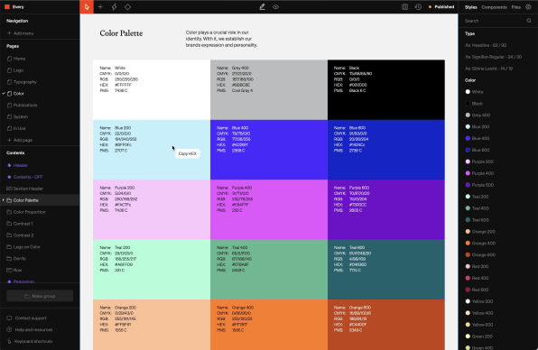
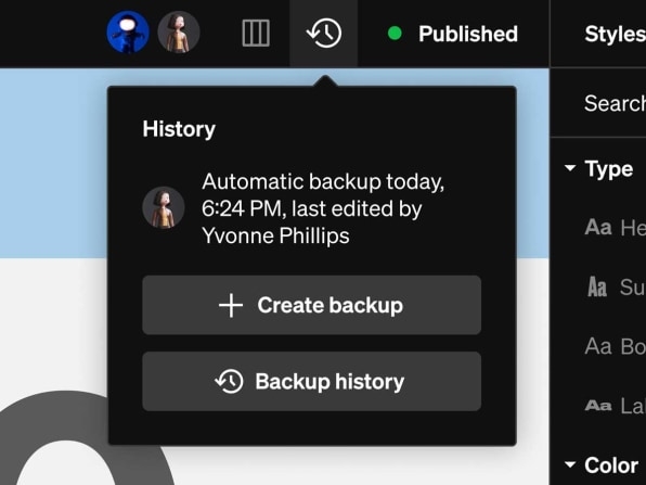
But there’s another reason for the big wave of interest: For the most part, brand guidelines have not evolved from those static tomes of yesteryear, Today, most guidelines take the form of PDFs—an inflexible capsule that is not easily updated, does not account for motion elements and other modern facets of branding, and is beset by multiple versions floating around companies.
Moreover, per Smyth, “When people talk to me now, especially larger studios and agencies, they say, ‘between us, we’re embarrassed that we’re delivering a PDF. We charge a lot of money, we do all this work, and then we send them a folder on Dropbox and a PDF. It’s time to change that.’”
In October 2021, Order and its development partner on the project, Shore, kicked off an alpha phase with 500 spots, and Smyth says it filled up in three minutes. The alpha lasted around a year, and the team took their learnings and overhauled the site for the beta launch, inviting around 250 people a week as they worked their way through that waitlist. On the eve of the full-scale launch today, Standards boasts more than 10,000 users—at companies including Herman Miller, Skillshare, Rivian, Headspace, . . . and NASA, which in many ways is a full-circle homecoming for Smyth and co.
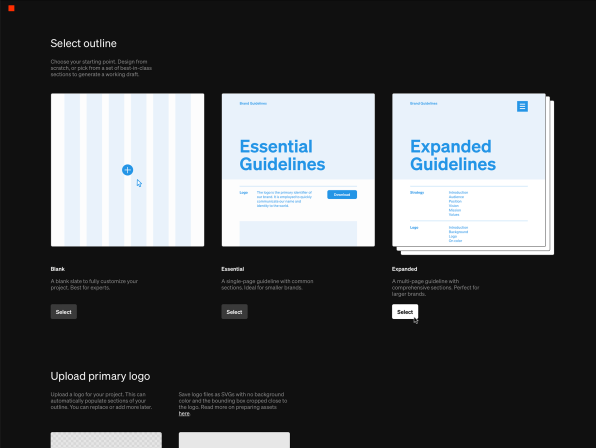
Smyth says the biggest challenge has been finding the right balance between simplicity and complete user control in all its complexity—the line between the templated ease of Squarespace and the infinite choices of Figma. Their target was to land somewhere in the middle, given the wide range of users Standards appeals to, everyone from branding pros accustomed to the latest tech to those coming from a world of PDF guidelines. Smyth says the overall base consists of roughly one-third studios, one-third agencies, and one-third in-house teams.
As for how they appeal to all at once, Smyth is like a kid in a candy shop as he whirls around the site in a demo of its features. Designers who want complete customization can build their guidelines from the ground up on a 12-column customizable grid. For those who want a bit of an assist, there are Outlines and Automations, which function a bit like templates that take raw input and transform it into a set of guidelines covering all the essential bases and modern expectations.
For both groups, there is modular design courtesy of the Components feature, which allows users to save brand elements and redeploy them elsewhere, thus freeing them from the repetitive hell inherent in crafting a set of guidelines. There’s responsive type. Integration of video or animation. And, of course, one no longer has to spend their time slowly tapping out those color values.
After a couple minutes of input, Smyth clicks Finish, and a set of guidelines emerges whole cloth.
“I suppose I’m biased, but if you had showed me this 11 years ago when I was doing that color palette, I probably would have thought you were from the future,” he says. “I would think that it’s sorcery.”
How much will said sorcery run you? There’s a basic tier that’s free for one editor and one project, with 300 megabytes of storage. The Plus plan costs $10 per month, and includes more storage, custom domains, and additional projects at $10 each. The Pro plan, meanwhile, costs $40 per month for two editors (more can be added for a fee), hosting, and unlimited published projects.
In an era frozen in PDFs, Smyth says he believes good branding equals good guidelines—and his team’s larger goal is to move this subset of design forward.
“We want to reignite that passion that people in branding had when they did their first guidelines and had that responsibility thrown at them. And we want to make guidelines an enjoyable thing to do.”
Ultimately: “We want to evolve the craft.”
Graphic standards may be a niche—but as that wait list proves, it’s a sizable one. And one apparently ripe for a redesign.
(36)

