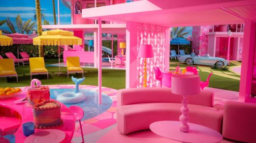
How the ‘Barbie’ set designers created an oversize world for toys
It is tempting to dismiss the new Barbie movie as a frivolous Hollywood moneygrab. The film, after all, is about a maybe-sexist-maybe-liberating mass-market toy doll with a complicated history and massive marketing reach. And while the brand partnerships and marketing behind the project have set it up to be one of the biggest films of the year, Barbie is the kind of movie that could feel more like a business calculation than an expression of art in the wrong hands.
But take a closer look at the movie’s sets, and you’ll see that for all its existential absurdity, Barbie is actually a deeply interesting design challenge.
“It was one of the most intellectually challenging films I’ve ever worked on,” says Sarah Greenwood, Barbie‘s production designer.
Greenwood is a celebrated designer who, with longtime collaborator Katie Spencer, has been nominated for six Academy Awards for set and production design on such films as Pride & Prejudice, Anna Karenina, and Beauty and the Beast. Unlike those rich and textured period pieces set in actual places with real historical reference points, Greenwood and Spencer’s assignment with Barbie was to create a world of make-believe inhabited by toys.
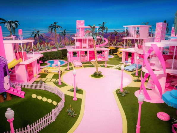
Barbieland, the incredibly pink and plastic world in which much of the film takes place, was up for artistic interpretation. The few guiding references the designers had for shaping this world were the Barbie Dreamhouse playhouses that toy manufacturer Mattel has produced serially since the 1960s. As the primary architectural space of the Barbie doll’s realm, the Dreamhouse formed the design language of Barbieland.
Greenwood and Spencer came into the project with few preconceptions of what that should mean. “Neither Sarah or myself had ever had a Barbie or Dreamhouse. The first one we got was on the show,” says Spencer. “And then we played with it.”
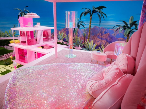
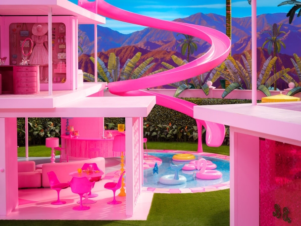
This was an essential part of the design process, as it forced the two to reckon with the script’s emphasis on Barbieland being inherently toy-like. As if moved by the hands of playing children, the Barbies in the film float down from the tops of their homes instead of walking down stairs, making them unnecessary. Many domestic items are actually just two-dimensional images, like decals affixed to a dollhouse. And just like the cutaway Dreamhouses, the Barbie homes in the film have no walls, “which architecturally makes it kind of tricky,” Greenwood says.
Designing a film set differs from designing a building in that only what’s seen by the camera really matters. If a character never walks through a door, there need not be anything behind it. But in the Barbieland created for the film, the lack of walls meant the designers had to plan around the foreground action of each camera shot while also not overwhelming the scene with whatever is going on beyond. “You’re looking out. Your wallpaper and your background are the other houses, the other Barbies, the mountains, the rest of Barbieland,” Greenwood says. “To get a clarity of a look is much harder than it would be in a normal film,” says Spencer.
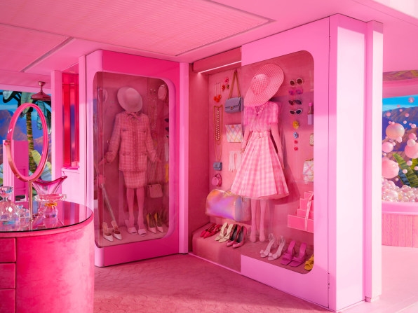
The lack of walls was only part of what made this a very abnormal film from a production-design perspective. Unlike their work on Pride & Prejudice, a story set in a 19th century English countryside that actually existed, Greenwood and Spencer’s design for Barbie created sets for spaces that either never existed at all or only existed in plastic toys measuring just a few feet tall. To make Barbieland feel truly doll-like, Greenwood and Spencer scaled down all the rooms by 23%, making the actors in the film look slightly oversize. But as the designers found, scaling everything down made the sets look cartoonishly small. Furniture, like tables, chairs and countertops, were kept to their typical size, but the actors could easily reach up and touch the ceiling.
Though Greenwood and Spencer had Barbie Dreamhouses to use for inspiration, they say the design of the homes in the film’s Barbieland are more interpretations than recreations, and called on references far beyond the toy store. “We didn’t refer to a specific period or a specific house,” Greenwood says.
Midcentury modernism, the poolside socialite 20th century photography of Slim Aarons, and architect Richard Neutra’s Kaufmann House built in Palm Springs in 1946 were some of the designers’ visual touchstones. Surprisingly for a film so invested in color, all the images the designers used as references were black and white, which they say was a way to focus on the essential architecture that could make up the set. “The bones of it had to be really good,” Greenwood says. “There’s a beautiful simplicity to it. [Director and cowriter Greta Gerwig] did want it to be beautiful. Not from our sophisticated grownup point of view, but from a child’s point of view.”
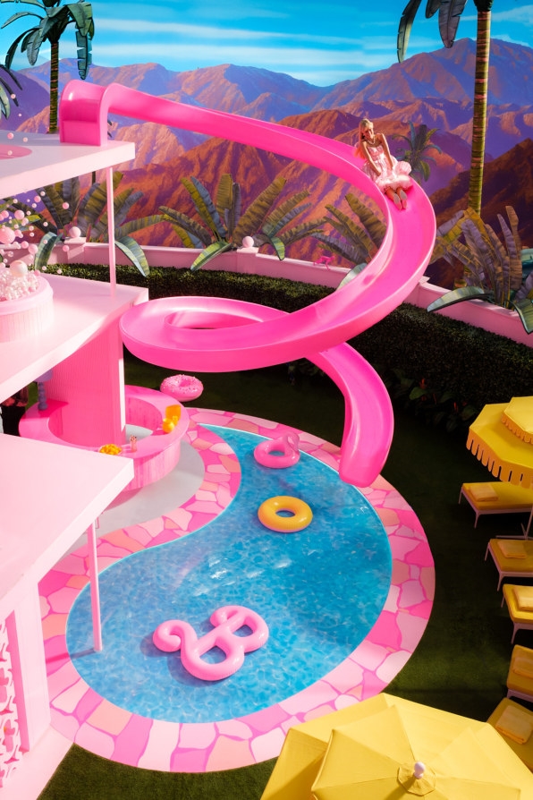
The sets created for the film pop with a color palette consisting mostly of shades of pink. (Greenwood told Architectural Digest that the film’s excessive use of pink paint caused a global shortage.) And while the brightness of the film was a departure for Greenwood and Spencer, whose period films tend more toward the patina than the pink, they took it as an opportunity to embrace the overall vibrancy of the palette. “Normally, it always gets dialed down,” says Spencer. “But this color was allowed to be what it is.”
(27)

