Manischewitz gets a logo refresh (but the gefilte fish stays the same)
Manischewitz gets a logo refresh (but the gefilte fish stays the same)
Your seder guests won’t be able to stop talking about the new Manischewitz branding.
The legacy brand Manischewitz has been stocking kosher food shelves in grocery stores in this country since 1888, when Rabbi Dov Behr Manischewitz opened a small bakery in Cincinnati and went on to invent the now-iconic square sheets of matzo. In the 130 years since its founding, Manischewitz has cultivated a loyal following of people who observe the Jewish holidays associated with their products as well as those for whom something like matzo ball soup or gefilte fish reminds them of childhood holiday dinners. Now, Manischewitz wants to bring its beloved foods to a mass market audience—and to do it, they’re embracing a whole new look.
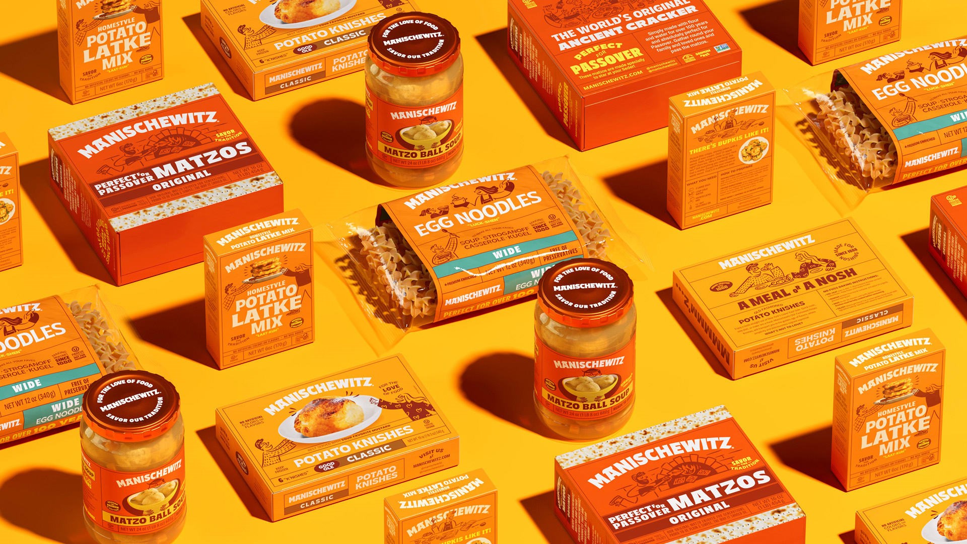
Designed by the creative agency Jones Knowles Ritchie (JKR), Manischewitz is debuting its rebrand just in time for Passover, when it’s been known to sell enough matzo annually to span the width of the U.S. It’s the first time in more than two decades that Manischewitz has adopted a fresh visual identity, which features a bold orange logo, custom typography, and bright packaging together with a cast of illustrated characters and an updated social media presence.
A new Manischewitz look
While most shoppers discovered Manischewitz’s eye-catching new packaging on shelves at the end of March, plans for the rebrand have been in the works since 2019. That was the year Manischewitz was acquired by Kayco Kosher Foods, another family-owned business focused on the kosher category. Kayco CMO Shani Seidman says Manischewitz was well-known among core customers at the time, but it wasn’t as visible to a younger Jewish audience or to non-Jewish consumers. Through this rebrand, Seidman hopes to introduce Manischewitz to a wider audience while maintaining a deep connection to its Jewish-American heritage.
“We want to be steadfast in this tradition that we have in Jewish food and culture and offer these new products both to our core consumers and [to the mass market]—a core consumer’s grandkid, and their friend, and someone who’s culturally curious,” says Seidman. Her goal is for the brand to appeal to new consumers as a reliable traditional Jewish dish. “We feel that Manischewitz has the authority to say, ‘Come to us. Try our matzo ball soup.’ In a sense,” she says, “we make the kosher aisle a destination for the culturally curious consumer who’s seeking that authenticity.”
Data from the market consulting firm Lubicom, which specializes in tracking the kosher category, suggests the sector is growing. In 2022, kosher foods were a $ 12.5 billion industry. As some of the factors driving the trend, Seidman cites an increasing Jewish population in the U.S., a larger share of health-conscious consumers, and a greater diversity of kosher products.
“The category was so beige”
Before Manischewitz’s rebrand, shoppers who were unfamiliar with kosher foods might have passed right by the shelves of Manischewitz products. According to Lisa Smith, global executive creative director at JKR, there’s a simple reason for that.
“The category was so beige,” Smith says. “It lacked the craveable comfort of what this food is.”
Manischewitz’s new branding is anything but beige. The central color—a vibrant orange—calls back to earlier versions of the brand’s packaging, but dialed up in intensity. Accents include a range of reds and creams designed to grab shoppers’ attention and project a sense of comforting nostalgia.
In recent years, many legacy brands have ditched their serif logos for simpler, more Gen Z-approved designs, but Manischewitz opted for an even bolder wordmark. Typographer Simon Walker helped JKR create a range of playful custom fonts for the rebrand, including the logo itself, which has a retro feel and flourishes inspired by Hebrew letters. Smith says the wordmark looks so energetic, “it almost shouts.”
“One of the things we felt with the brand is that [the team] is bolder than life; they’ve all got oodles of personality,” Smith says. “So we wanted to make the logo much bolder and richer. This is not a brand that needs to lose character; you need to add character.”
To accompany the friendly look of the new logo, JKR also worked with illustrator Maria Milenko on a series of characters inspired by beloved New Yorker cartoons. Across Manischewitz’s new packaging, illustrated characters can be seen carrying platters of cake, opening steaming pots of egg noodles, and hugging bowls of matzo ball soup. Most of the illustrations are accompanied by photos of the real food, which were shot by photographer Yechiel Orgel. When Seidman’s team first saw the characters, she says, they knew the project was headed in the right direction.
“They’re not competing with the color; they’re not competing with all the other tidbits on the package,” says Seidman. “But when you pick it up, you start noticing them and you want to stick around because you have so many fun things to look at. It adds another layer to the packaging and to the storytelling that we just couldn’t do with anything else.”
Beyond the packaging, Seidman and Smith wanted Manischewitz to have a distinct voice for consumers, which they describe as a combination of an affectionate “bubby” (Yiddish for “grandma”), an enthusiastic foodie, and a Jerry Seinfeld type. Smith says they were able to achieve this with a familiar, sometimes humorous tone throughout the rebrand’s written copy.
Since the launch, Seidman has been hearing overwhelmingly positive reactions from loyal consumers. “I personally have memories of Manischewitz, and I think everyone has individual memories,” she says. “But all of a sudden, this communal nostalgia popped up. A real joy and familiarity with our rebrand came to the surface.”
(10)
