The deliciously imperfect Sriracha Display was made with the real chili sauce—and it brings the heat
Your favorite condiment is now a tasty font.
Sriracha is great on stir fry or pho, but it turns out the condiment can be just as delicious as a font.
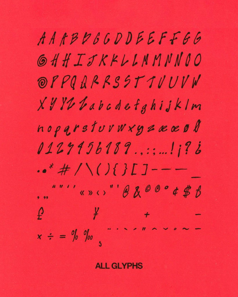
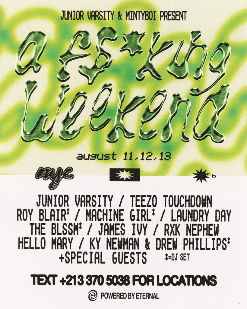
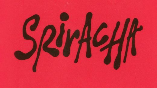
So learned Andrey Azizov, a designer and musician who recently launched Sriracha Display, a font literally made out of the spicy chili sauce. The irregular letterforms, which he made by squeezing sriracha out of bottles, is perfect for collateral like posters and videos that could benefit from unique type.

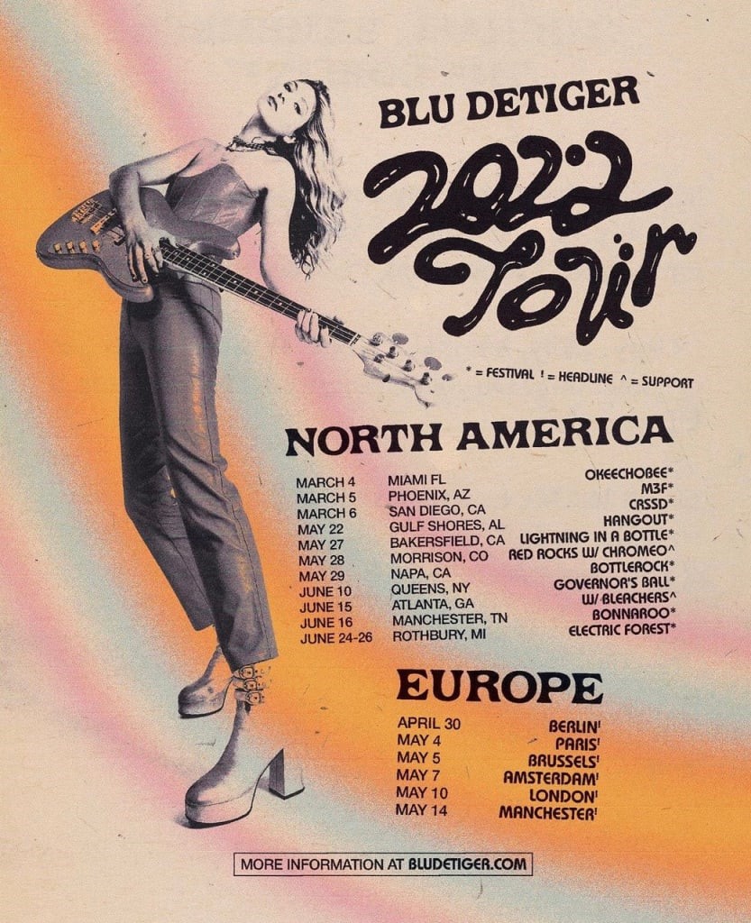
Azizov tells Fast Company he started writing with sauces after seeing GQ‘s March 2022 issue with Robert Pattinson, which spelled out the cover lines in liquid silver letters. (Azizov has some crossover in the culture and design worlds as well; he designed the title card for Sabrina Carpenter’s “Please please please.“) Inspired by the GQ effect, he first used Sriracha as a spicy, font-making inkwell back in 2022 for a tour flyer for musician Blu DeTiger.

“Since then I’ve used it whenever I want to add some fluid typography to a design,” Azizov says in an email. Azizov drew the organic letterforms that would become Sriracha Display on paper while on his rooftop, using a few bottles of the sauce, a medium he says is “genuinely a ton of fun to work with.”
“The unpredictability of it can be really inspiring as it’s solid enough to control, but liquid enough to create really fluid lettering,” he says. “I find that when you’re designing things digitally, since everything can be so perfect, adding some element of imperfection and unpredictability can lead to some beautiful results.”

Analog design approaches are more broadly on the rise, with terms like “scrapbook” skyrocketing on Canva, as designers look for ways to give their work a more human touch. A font made by hand out of food certainly fits the trend. Inconsistencies and imperfection are the point.
Azizov says he “selfishly spent some extra time” on the letter A, given his name, as well as S and R, since they’d be featured heavily in a font named after Sriracha Display. It was originally supposed an all-caps font, he says, but after experimenting with lowercase letters using the remaining sauce, he felt “they were too good not to include.”
To make the final typeface, Azizov uploaded iPhone photos of the letters he’d drawn with sriracha into Adobe Illustrator and then converted the letters into vector shapes. “At that point I edited each letter shape to match the sizes, angle, smooth them out, give them some more balance, and just overall make them more usable as a font,” he says.
The shapes were then sent off to type designer Wayne Fearnly, who helped with production and scripting of the font files. The end result comes with 157 glyphs, including alternate uppercase letters, numbers, and most symbols, and select 3-D letters to give it a little extra pop. The result is a slightly irregular and expressive display font that stands on its own, whether or not you know its pantry cupboard provenance. Spicy.
ABOUT THE AUTHOR
Fast Company
(2)


