10 Colour Palettes to Give Your Video a Filmic Look
Colour influences us all the time, often without us even realising. Using it with purpose in filmmaking can be a hugely effective storytelling tool; through lighting, art direction, wardrobe and colour grading.
This blog article is going to take you through some key colour combinations and hopefully give you a better understanding of how we plan to create colour palettes that will not only look great on screen, but also help to tell your story.
The Colour Wheel
Firstly, before we dive into the world of colour palettes we should introduce you to a handy tool used by colourists, artists and designers everywhere; our trusted friend… the colour wheel.
The colour wheel is commonly used for colour theory and in short it is a visual representation of colours arranged according to their relationship with each other. By following the colour palette rules below you can create beautifully balanced colour schemes that enrich your story.
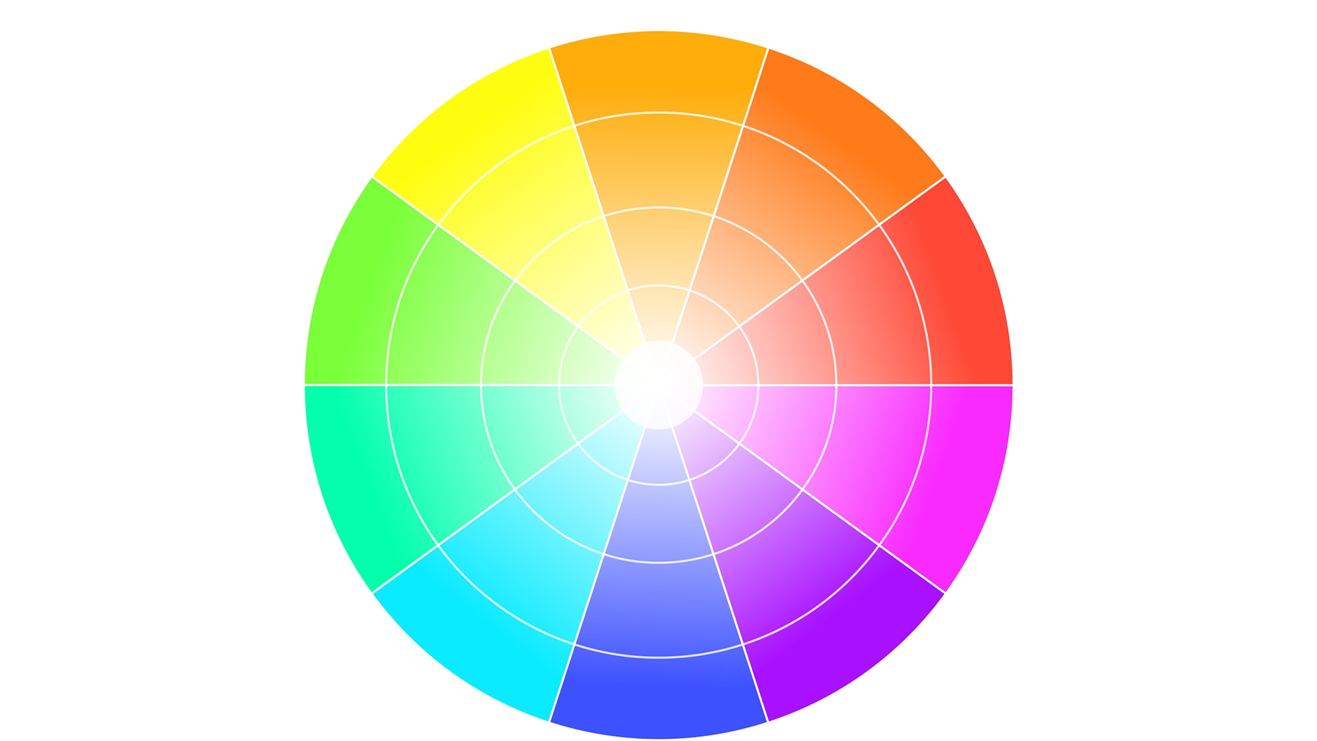
Tip – the colour wheel not only relates to colour grading, but design too. Next time you’re decorating your house why not revisit this handy blog article.
Black & White Palettes
A black & white palette doesn’t need much explanation. It’s a classic look. Being selective about when and where you introduce colour however, can be a very useful addition to storytelling.
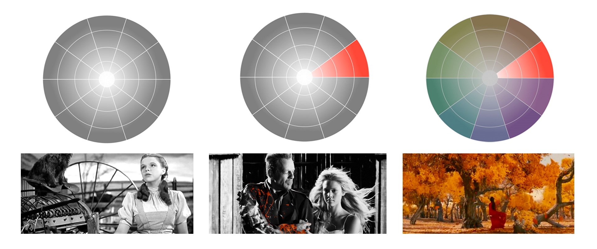
Black & White
We should start with the classic black and white palette, a complete desaturated image. A great use of the black and white palette would be in the Wizard of Oz. The black and white world represents Dorothy’s real life, but when she enters her dream world she is surrounded by bright saturated colours.
Selected Saturation
A black and white palette, except for one focal object that is saturated in one colour. This is a very stylised look and is an extreme and efficient way of telling the audience exactly where they should be looking. A great example of this colour palette is Sin City.
Monochrome
Similar to the selective saturation palette, pick a spot on the colour wheel and stick to it, except here every part of the scene is saturated with that colour. You may differ in tone and levels, but there’s a clear dominant colour. A great example of this would be in Hero.
Colour Harmony Palettes
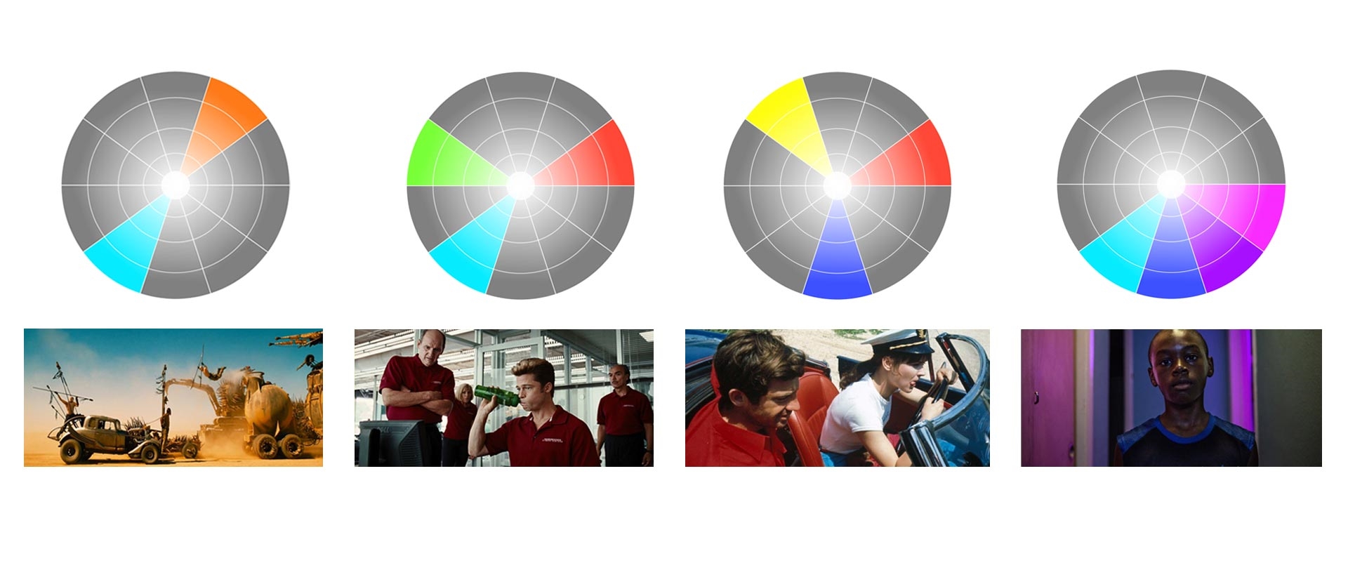
Colour harmony palettes are created by picking certain colours on the colour wheel based on their relation to each other. Then enhancing these colours and removing the remaining colours through art direction and colour grading.
Complimentary
Probably the most popular choice of palette, you take one colour on the wheel, pair it with the opposite and you have a very filmic scheme. The most popular example of this would be the ‘teal and orange’ look. While probably overused, it’s popular because it best emphasises human skin tones.
Split Complimentary
Very similar to a complimentary colour palette, but instead of using the direct opposite colour it uses the two colours adjacent to the opposite. Creating a softer approach with the same contrast. In the Coen Brother’s film Burn After Reading they use a combination of red, green and teal.
Triadic
Three colours evenly spaced around the colour wheel (e.g, red, blue, and yellow). Triadic is one of the least common colour palettes along with it’s brother tetradic (4 colours), because it can look stereotypically ‘colourful’ as if no ‘look’ has been applied, but when used properly and with considered art direction it can look very appealing.
Analogous
Analogous colours sit next to each other on the colour wheel. They match well together and create a nicely balanced image. One colour will normally be the dominant colour while the others will be used to enrich the scene. An analogous palette is very similar to a monochrome palette, but the addition of similar colours offers more nuances.
Lightness & Saturation Palettes
Selecting colours isn’t the only way to create a palette; you can also create a colour palette by using certain levels of lightness and saturation. This is very often used in films to emphasise the story.
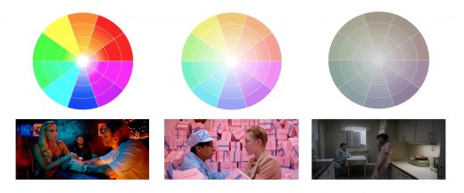
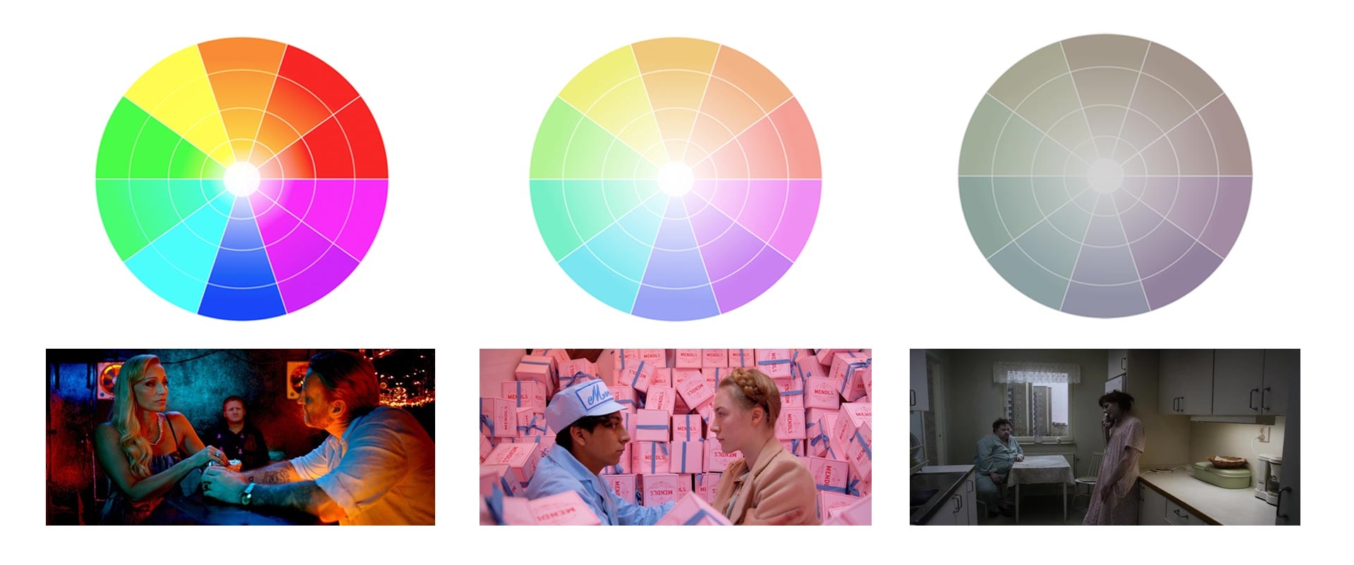
Neon
Multiple colour here, but all very saturated and neon. A great example of a neon colour scheme is in Only God Forgives. None of the colours are subtle, they are harsh and violent, much like the plot of the movie.
Pastel
The opposite of the neon palette, a washed out, milky, natural look, we have the pastel palette. Soft, gentle, forgiving colours, never neon and rarely primary. Wes Anderson masters this in The Grand Budapest Hotel.
Muted
Hovering just above black and white we have the muted palette. It’s de-saturated, a little bit bleak, but a fantastic palette for the right film. Roy Andersson masters this look in a few of his films, but in A Pigeon Sat On A Branch Reflecting On Existence he takes it to a new level. His sets are lit with no shadows and as little contrast as possible in order to create this ‘bland’ world.
Once we know how to balance an image correctly through colour palettes we can start to be selective about the certain colours we choose, based on the psychology of colour theory. Ever thought about why when someone is jealous we describe them as “green with envy” or when someone is angry we describe them as “seeing red”. By tapping into the emotion of colour we can influence the way viewers feel when watching our video and in turn help communicate the message we are trying to portray.
Digital & Social Articles on Business 2 Community
(13)

