10 Examples of Winning Email Design and How To Make Your Own
— August 20, 2019
Around 40% of B2B marketers say email newsletters are one of the key features to their content marketing success.
There are tons of statistics that prove just how profitable emails can be for your business. What the numbers don’t show is that there’s a lot of testing and tweaking that goes into the email’s design and layout that allows the sender to get massive rewards.
What makes a successful email or email campaign? One of the major elements in the design and layout that draws people in and grows your click-through rate.
Today, I’ll be showing you ten examples of winning email design and how to make your own.
1. Use Colors & Images in Your Email Designs
Color has the power to affect the viewer’s mood and actions. Adding a bit of color to your email can go a long way.
1. Tock
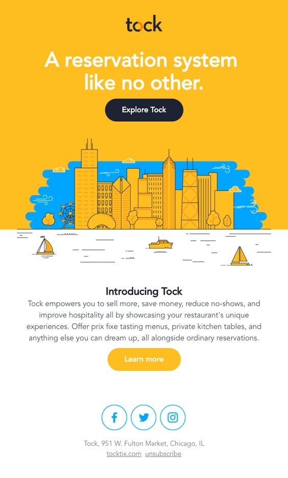
Why this works Copy: Right off the bat, Tock places itself as the best choice to book reservations for readers by speaking to the different aspects of their product, and the solutions it offers.
Design: Contrasting colors like yellow and blue grab the reader’s attention, in this case they also happen to be Tock’s brand colors. At the center of the email is a simple illustration of the city to highlight the hustle and bustle of the life surrounding restaurants. They decided to match the color of their button or designs to their brand’s colors, with the help of a contrasting background color for yellow and dark blue and yellow and white.
Placement: Two CTAs are placed in the emailer: “Explore Tock” and “Learn more.”
If someone’s ready to use Tock’s services, they’re more likely to press the first CTA.
If they’re still in the awareness stages of getting to know the brand, then they’ll most likely keep reading more on what Tock has to offer. They’re using one email design to speak to two types of readers both in the first stage of their welcome email.
You can also change an email design’s color based on new product, season or to match a marketing campaign’s new look and feel.
2. Harry’s
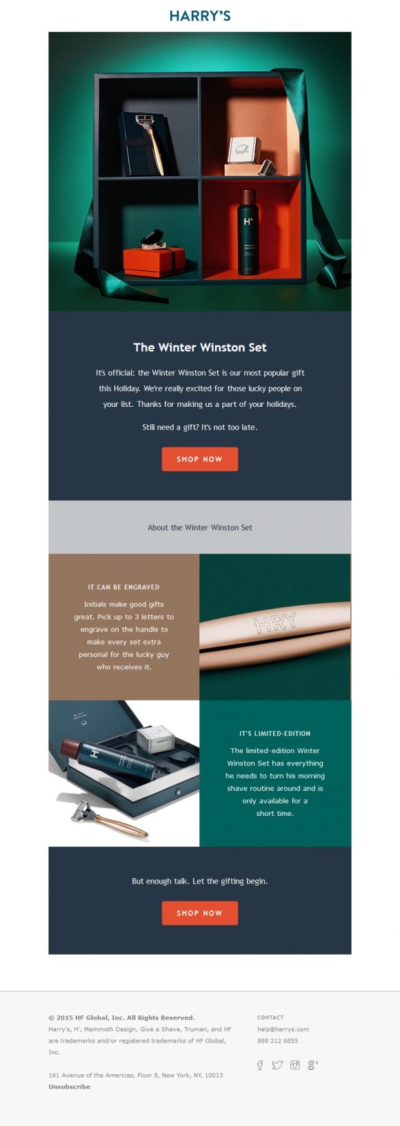
Why this works Copy: The copy for this email is more focused on the person than the product itself, which is a great way to soft sell your products. This allows the potential buyers to imagine what it might be like to own or gift this item.
As you scroll down further in the email, it starts to speak to the benefits of buying this product as a gift, such as the option to engrave the initials for the lucky recipient. The end creates a sense of urgency by using the words “Limited Edition”, and reminding the reader that it’s only available for a short time because winter only lasts for so long.
Design: The email imitates a product marketing funnel system, bringing the reader towards each CTA with “Awareness, Consideration, and Action” as the main stages. Harry’s used a color block design to guide the reader through each step of the email. Color blocking helps to guide the reader through your copy, making it easy to read with a pleasing layout.
Placement: There are two CTAs, one at the top of the email and one at the end of the email. Again, this is a good practice when you have a heavily designed email. The first CTA works best for readers who might be impulse shoppers, and the second CTA is for the reader who has taken the time to read through the email and might have missed the first CTA as some readers tend to skim over details.
You can also consider using monochrome in your email design if the play on colors seems a bit too much.
3. Miss Selfridge
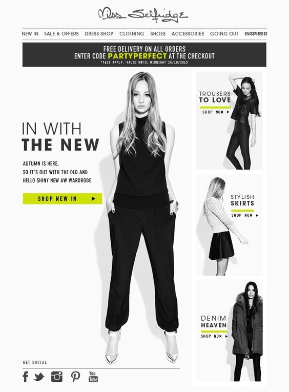
Why this works Copy: There’s a lot of copy in this email, which isn’t necessarily a bad thing. Each text is custom to a product image along with a CTA. The code for free delivery is placed in yellow to contrast against the monochrome look to draw in the reader’s attention.
Design:Using limited colors in your emails means that you have to use your colors wisely. Miss Selfridge made sure to add colors to highlight their offers and “Shop New In” CTAs so that they didn’t blend in with the rest of the email.
Placement: From top to bottom and for each clothing item promoted, there was a CTA in place to carry the reader to their preferred product. This is an effective way of making sure that if you’re introducing more than one product in your email, the reader can easily be redirected to the item or category without having to search your website.
4. Beauty Bay
Why this works Copy: Sometimes less is more. Beauty Bay found a fun way to lead readers to their website with a one-line header, “This way, follow me, come on. ” Automatically pointing the direction with the lipstick moving around the page.
Design: The GIF and copy go hand in hand, leading down the email. Why this email works? The element of surprise. How often do you open an email with an adventurous lipstick? Not very often.
Placement: The email is designed with only one CTA, placed at the end. Again, the animation, copy, and placement go hand-in-hand, guiding you to the end of the email to click, click, click.
Add Some Animation to the Mix
GIF email designs aren’t new, but they are more popular with B2C emailers. They give emails readers a different kind of experience when compared to static images or text.
Every day your subscribers have more and more emails competing for their attention. Today studies reveal that marketers have just 10 seconds to grab an audience because their attention spans are getting shorter and shorter. So it’s time to roll up your sleeves and get creative by adding some GIFs and videos.
Emails that include videos or GIFs can increase your open rate by 19% and click-through rate by 50%. That’s because videos are 12 times more likely to be watched than text is to be read. With video, you’re able to convey a feeling or message much faster than text so readers can take action more quickly.
5. Hunter Original
Why this works Copy: Let your GIF do most of the talking so your copy can get straight to the point. This email copy simply tells the reader that Hunter has a new water product, time to shop.
Design: The GIF shows the different colors shoppers can get their raincoats in, so they can easily decide which color they’d like to make their own.
Placement: Since most of the email is a GIF, it’s already eye-catching. The copy and CTA are placed in the center of the email so the reader can quickly find and take action without much searching.
Ready to make your own GIF email design?
Here are two helpful guides to learn how to create a GIF in Photoshop or Canva.
Taking animation in your emails a step further, you can try and gamify the design of your emails. Hear me out; gamification is incorporating an element of a game in your email, motivating users to do something for a chance to win a discount or a reward.
If you’re an email marketing geek, check out EmailMonk’s gamified email. They were the first to design a gamified email, including a maze.
6. EmailMonk
If you’re an email marketing geek, check out EmailMonk’s gamified email. They were the first to design a gamified email, including a maze.
Taking animation in your emails a step further, you can try and gamify the design of your emails. Hear me out; gamification is incorporating an element of a game in your email, motivating users to do something for a chance to win a discount or a reward.
7. HD Brows

Why this works Copy: If you’re a shopaholic like me, nothing brings you comfort like a brand that knows you want to shop. Adding a CTA copy to sweeten the deal stating, “You deserve it.” Even if you didn’t intend to shop, you can’t help but click.
This copy perfectly speaks to its target audience of new and current shoppers, using the tone of a friend rather than a marketer. Having a personalized brand voice in your emails goes a long way.
Design: The design of the email is very clean and simple, with product images and copy colors that complement the white spaces. Going a step further to place their best seller below for ease of shopping.
Placement: The placement of the email reads as an upside-down “T” shape with the copy and CTA is placed in the dead center since the text is the most important aspect of the email. Best seller products have their own CTA for ease of shopping.
Creatively Place Your Copy & Typography
No rule of thumb says that you can’t use words to design your email. You can use text to entertain and inform readers about your brand and products. You can also design your letters typography to give the reader a sense of urgency without using too many copy tricks or CTA’s.
8. Nordstrom

Why this works Copy: Nordstrom doesn’t waste any time with their copy. Readers can tell off the bat that there’s a clearance sale and they can save up to 40% off purchases.
Design:The color red captures any reader’s attention. Red is associated with emotion, passion, danger, energy, and action. In this email, red was used to drum up excitement and bring the focus on Nordstrom’s sale.
Placement: The use of copy and color complements each other; this is an excellent example of how to use typography in your email design without making the reader feel overwhelmed.
At a loss for words? Take an ingenious approach to use emoji’s or symbols or punctuation marks. That’s what J.Crew did with their email design.
9. J.Crew

Why this works Copy: There is no copy! That’s the genius of this design. Just a large exclamation mark that takes you on a scrolling journey to your friendly CTA.
Design: Black and white with the uncomplicated look and feel that gets the job done. A simple and daring copy that piques the reader’s interest instantaneously, leading them to J.Crew’s website.
Placement: Adding a mix of urgency and a touch of mystery is what makes this simple but effective design a winning email.
10. What Do All These Winning Emails Have in Common?
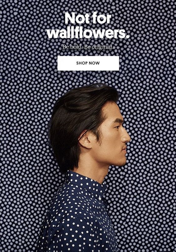
Here are some key takeaways you may or may not have noticed with these winning email designs. Grab a pad and take some notes!
- Pick one main message, one theme, and one benefit that you want your email design to focus on. Try to do more than one and your email design is going to oversell or confuse your readers. One is enough (two only if you’ve already mastered your email design).
- Lay out your copy logically and aesthetically, especially if there’s a lot of copy. For every piece of text have an image or color, so your readers don’t get bored or your click-through rates will start to suffer. Treat your email layouts just like landing page layouts; the same rules apply because both aim to convert viewers into buyers.
- Spend time on your email design; the color, images, appropriate sizes, and use of spaces. People get 10-20 emails each day; once they make it past your email subject lines, you only have one click to make a good first impression, make it worth their while.
- The secret sauce to creating a winning email is A/B testing the design and layout until you get maximum results. Without testing your email, you won’t know what’s working and what’s not. Stop shooting blindly in the dark and start A/B testing your emails.
Summary
I’m not going to lie to you, this isn’t a one-size-fits-all guide. If you want to see results, you have to take each point from this article and make it your own.
What I can promise you is that once you start to practice good email design and copy, it’s like riding a bicycle.You won’t forget the basics, and you can only get better.
What were your favorites from our 10 winning email design examples and why? Comment below – I’d love to hear from you.
Digital & Social Articles on Business 2 Community
(44)


