10 Persuasion Principles From Top-Performing Clickbank Sales Pages
— April 3, 2019
Are you familiar with ClickBank?
If you’re into internet or digital marketing, you probably have at least a passing awareness of this marketplace.
For some, it’s one of the best ways to sell their digital information products and build up an army of affiliate marketers.
For others, it’s a slimy haven of questionable products.
For us conversion copywriters, it’s a rich source of potential learning.
You see, a sales page is much more than just the sum of its words. The offer, structure and design all play a huge part in persuading prospects to click the “buy” button.
And while there are A LOT of crappy ClickBank sales pages floating about, the high performers – pages pulling in tens or even hundreds of thousands every month – are places copywriters can study and learn from.
With that in mind, here are 10 persuasion principles that top-performing ClickBank sales pages are using to get more people to open their wallets (or purses).
1. Big Claim + Curiosity = Winning Headline
Take a big claim or benefit, mix with curiosity, and you’ve got the formula for an eye-grabbing headline.

The highlight catches the eye, then curiosity-inducing language draws the reader in.
2. Highlight to focus attention
Use highlighting to put the reader’s spotlight on something you want them to see, but don’t overuse it.
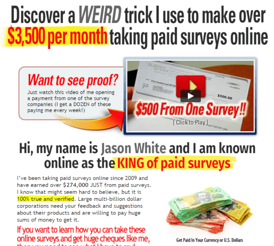
It’s possible to over-do highlighting, which should be used for a focused effort.
3. Plaster your sales page with images
Build interest and desire with prospects by including a bucketload of relevant images in your sales page, especially in the first half of the page.

The sales page for Teds Woodworking has photos, blueprints and other images used all throughout the page.
4. Show digital products in physical form
If you have a digital product, boost a sense of “real” ownership by displaying it in a physical form.
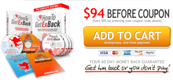
How To Get Ex Back is 100% digital, but shows buyers what they’re “getting” as a physical product.
5. Make readers at home with localization
Tweak pages with little inclusions like flags, country references and currency images to make it more familiar to readers.
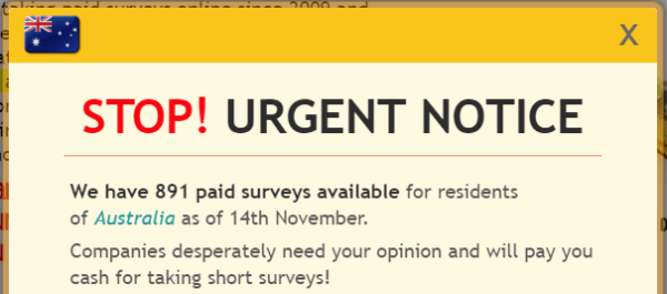
The Take Surveys for Cash exit pop-up includes tiny details like the prospect’s flag and their country name to provide a more “personalized” selling experience.
6. Tap into our penchant for video content
Video is a powerful medium, so if your product or promo fits the bill, don’t hesitate to use a video sales letter (or VSL).
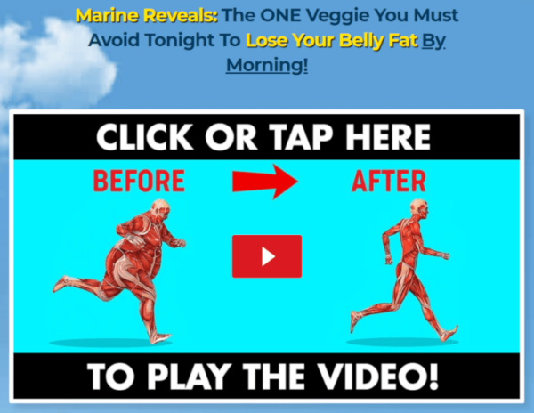
Fat Decimator uses a combination of curiosity in the headline and a classic Before & After image to get people to watch.
7. Load your page with plenty of proof
Like any sales page, you won’t get far if you can’t back up your claims with proof… so be sure to include plenty.

No Nonsense Ted sells a weight loss product, where Before & After images are a powerful proof element.
8. Use an exit pop-up to lure prospects back
While annoying for prospects, you can sometimes lure them back with an irresistible offer in your exit pop-up.

The sales page for Your Wealth Magnet has an exit pop-up chock full of persuasion elements, including bonuses, a discounted price and a bold call to action button.
9. Don’t show your CTA until the prospect’s ready
Present your offer and call to action at the point in the page where you think your prospect is ready to act on it, and not a moment before.
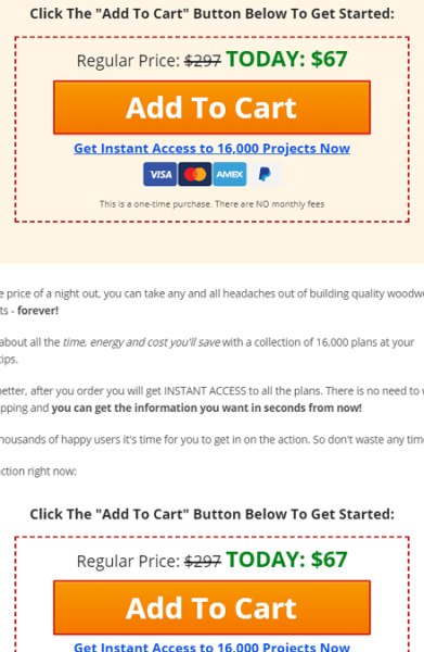
Once you move into the second half of the Teds Woodworking page, the calls to action come thick and fast.
10. Your CTA is much more than a button
A call to action can be more than just a button. Don’t be afraid to add elements like microcopy, icons, seals and images to make your CTA irresistible.
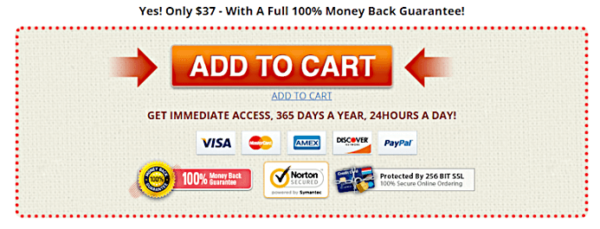
The No-Nonsense call to action section is jammed with elements to convince prospects to click.
A Final Word: Don’t Forget the Fundamentals
All these tactics help you dial up the persuasiveness (and conversion) on your page, but without solid fundamentals in place, they’re mostly wasted.
- A first-class product that stands out from the competition
- A compelling, “I’ve got to have that!” offer
- Message hierarchy that leads readers to the point where buying makes sense
- Evocative copy that doesn’t just deal in dry facts, but stirs emotion and desire
If you want to explore these tactics in more detail, you can get the full analysis (complete with infographic) right here.
Digital & Social Articles on Business 2 Community
(31)

