14 Product Photography Tips to Make You Look Like a Pro
— March 6, 2019
Does your idea of photography still include the wind-up disposable cameras at summer camp? Would you consider your experience taking selfies to be the bulk of your photography skills? Well, you’ve come to the right spot!
If your boss has requested some “high-quality” product photographs to promote your business or to use in online advertising, do not break out in a panicked sweat! I’m confident you can learn everything you need with these fourteen tips and techniques to help you become a professional-looking product photographer in no time.

But why should you listen to me? Well, not to brag or anything, but I did receive AP college credit for my dark-room photography skills back in the day. I studied studio art in undergrad, and I’ve continued to enjoy photography during my spare time. My tool of choice is no longer film or even my DSLR, but my iPhone, which is typically attached to my hand (sad, I know). It’s wild how far camera phones have come. Nowadays, your iPhone already has a built-in, high-quality camera, so you don’t even need expensive equipment to get the job done.
And once you get that job done, your boss will be blown away – and your products will fly off the shelves. For ecommerce businesses, high-quality product photography is a key to sales: 93% of consumers consider visual appearance to be the key deciding factor in a purchasing decision. So let’s dive into some simple techniques that will take you from novice selfie photographer to almost-professional business photographer.
Product Photography for Beginners
Between optimizing your Google Shopping data feed and crafting high-converting Amazon product descriptions, chances are you don’t have much time to study the art of photography.
As such, we’ll kick off this guide to product photography with five basic tips for beginners.
#1: Use proper lighting
Let’s start with product photography lighting. Without proper light, neither your product nor your background is going to appear how it does to you in person. “A white background without light doesn’t appear white in the photo, it appears grey,” says Tony Northrup in an article for the Digital Photography School.
There are two options for product photography lighting: studio lighting and natural lighting. The product that you’re photographing, the purpose of the photo, and the platform on which you’re advertising it will help you decide which setup to go for. Natural lighting can work really well for product photographs featuring edible items, people, and clothing, and these natural looking photos can work well in social media contexts, like Instagram.
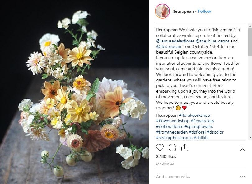
Flowers look great in natural light. Via @fleuropean
If you’re photographing inside, you will want to set up your product facing a window so that you are gaining all the natural light that comes through. On the other hand, if you are able to photograph your products outside, do it! The best times to do this are early morning and late afternoon when the sun is out, but is not too harsh. Slightly overcast days are also preferable. If you take out your shoe inventory at noon when the sun is beating down, you are going to get a lot of glare in your snaps.
On the other hand, if your product is primarily used indoors (e.g., cookware), features small details (e.g., artwork), or is being sold on Amazon and Google Shopping, then artificial lighting is preferable to show off your product. Luckily knowing a few basics and building a simple studio setup can help you get over your intimidation of light.
Using artificial studio lighting may seem intimidating, but it’s necessary for those of you advertising on Amazon and Google Shopping. For tips, check out this guide from Light Stalking and this (food-specific) one from Pinch of Yum.
#2: Use a tripod
Tripods might sound like a nerdy, unnecessary piece of technical equipment, but they make a huge difference in the clarity and quality of your product photography. And they are not necessarily expensive or difficult to use!
Tripods are essentially stands that stabilize your camera from your shaky hand. Using a tripod will ensure a reduction of blur, which is critical if you want your product photographs to look professional and high-quality.
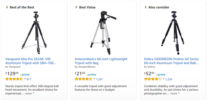
Whether you are using a fancier DSLR or a simple iPhone, there are many tripods on the market in varying price ranges for every type of camera out there. Go on Amazon and get one for your camera. It is 100% worth taking the extra minute to set up a tripod for better looking product photographs.
#3: Shoot for the edit
Have you ever stayed up late, half-awake, to write a paper and thought, “I can just edit this in the morning.” Then, once the morning arrives, you have to start the entire assignment over, because your first draft is so sloppy that it’s taking more time to edit than it would to just scrap it.
This is what happens to lazy photographers. If you think you can throw together some sloppy product photographs and work your magic on them in Photoshop, think again. While photography editing is a skill that can make a substantial impact on the quality of a product photo, these edits can only go so far. I like to think of editing as making small touch-ups to enhance an already beautiful piece of art. If you need to change the background or completely crop something out, this is a problem.
When shooting your photographs, try to shoot for the edit. With this mindset, you’ll shoot knowing that you plan to do minimal editing that will simply enhance the photograph without completely changing it. This will make for a far more desirable result.
#4: Take a basic photo editing class
While editing should be minimal in most cases, it’s still a necessary skill to have in your product photography handbook. Making some small edits – like tweaking the saturation or even masking small flaws within your photograph – can make a real difference to the finished product.
The trouble with editing is that there are SO many things that you can do that it becomes quite overwhelming if you are attempting to do it on your own without any formal training. Especially if you are using a tool like Photoshop, you will want to learn some foundational knowledge from the pros so that you don’t get completely overwhelmed as you attempt to edit your photographs.
If you’re not open to shelling out the big bucks for a photo editing course, don’t worry! Simply head to YouTube. There are plenty of free tutorials that will teach you the basics of the editing software of your choosing.
Product Photography for Instagram
According to insights released by Facebook in February 2019, 83% of Instagram users say the platform helps them discover new products and services. Plus, 79% of users said they searched for more information after seeing a product or service on Instagram.
Evidently, ecommerce advertisers need to get on Instagram. Here are five more tips.
#5: Take inspiration from brands you love
It is always helpful to look to others for inspiration. You likely already have some brands in mind that you love. Take a look at their product photography and ask yourself how a similar shot or technique could work for your products.
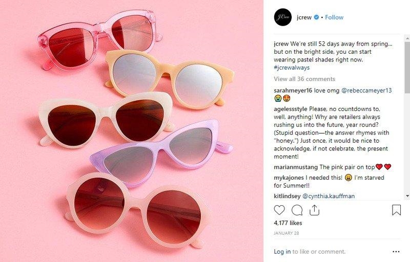
For instance, imagine you’re operating a local women’s boutique. Look up your favorite women’s clothing brands on Instagram and reflect on what you love about their product images. Perhaps you love the post from JCrew below. The monochromatic color scheme and simple background really highlight the product – can you create something similar with your own products?
#6: Get to know the rule of thirds
Most introductory photo classes, as well as many art classes, teach the rule of thirds, because it is a powerful tool. This rule teaches you to visualize your canvas as nine equal segments, like the example below.
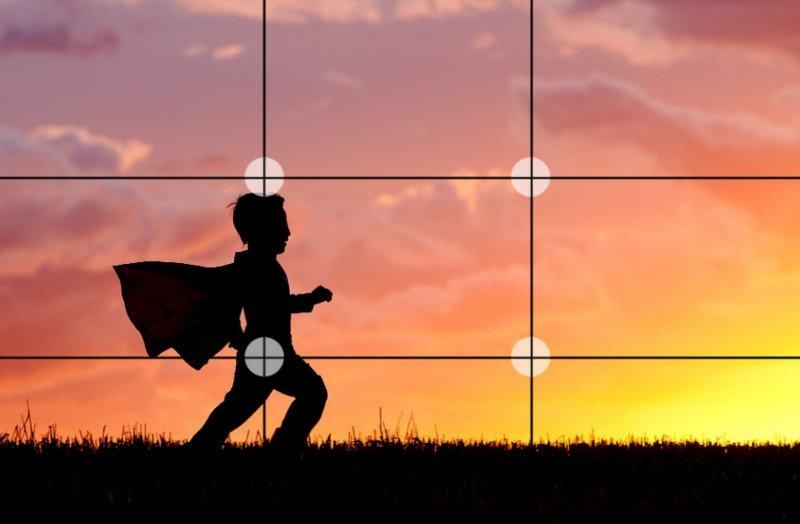
The rule of thirds was designed to help artists create a well-balanced composition in each piece. It’s also useful to determine where to place the focus of your piece – your product. Your goal is to have your product positioned along the lines, optimally at the point where two lines intersect.
“Studies have shown that when viewing images that people’s eyes usually go to one of the intersection points most naturally rather than the center of the shot,” says founder of Digital School Photography, Darren Rowse. “Using the rule of thirds works with this natural way of viewing an image rather than working against it.”
#7: Use simple props
When it comes to props, do not get overly ambitious! Remember, the main focus of each product photograph should be the product. With that said, props can be welcome and help brighten the photograph for your viewers.
So how do you decide what props to use? I always recommend erring on the side of light when it comes to props: keep them simple, aligned with the color scheme, and relevant to the scene or your product.
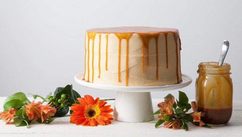
Take the example below from Erin Clarkson, a baker I follow on Instagram. To show off her new cake recipe, she used a plain white cake stand, a container of caramel (which is relevant as it is a component of the recipe), and beautiful fresh flowers for a subtle pop of natural color. Even without the flowers, this photograph could stand on its own with the caramel sauce as a prop, but I love her use of these items to enhance the beauty of her finished product.
#8: Take multiple shots from varying angles
If you have a fairly large line of products you need to shoot, it might be tempting to just take one or two of each product, then move along. However, this is not going to help with shooting for the edit (as discussed in tip #3!). Taking multiple shots from a variety of angles will show your customers exactly what your product looks like. Plus, it will help give you options when it is time to edit, and you won’t be left thinking, “Should we re-do this one completely?”
Whenever I photograph food that I’m trying to post, I like to shoot from above and from a few different side angles.
Sometimes I’ll have an idea in my head as to which angle will work well, and I’ll be surprised to find that what I expected to chose would be the complete opposite. The beauty of photography is that you have the ability to take several shots and then strategically chose the best one.


#9: Put your product in context
It’s important that your prospective customers are able to envision themselves using your product. After all, if someone sees your product online and can’t easily picture herself using it, why would she buy it?
Typically, before anyone with limited disposable income buys something, he or she needs to feel confident that the product will improve daily life in some way.
It’s difficult to envision yourself using certain products when they’re removed from context. For example, someone who’s in the market for a couch to furnish his new apartment likely can’t see himself using one that’s advertised simply sitting against a blank background.
Alternatively, he can very easily envision himself using a couch that’s advertised in the context of a home, as seen here:

Product Photography for Amazon & Google Shopping
Considering Amazon and Google are the leading (and, to be frank, only) search engines consumers use to look for new products, it doesn’t make sense to create a guide to product photography that doesn’t include a few tips specific to them.
#10: Follow the product photo specifications
Amazon and Google Shopping provide tremendous opportunities for ecommerce advertisers like you. In exchange, of course, you have to follow some platform-specific rules when it comes to your product photos.
Amazon Product Photo Specifications: No Variant Code or MAIN Variant
- You must submit product photos as TIFF (.tif/.tiff), JPG (.jpg/.jpeg), GIF (.gif), or PNG (.png) files.
- Each product photo file name must follow this template: product identifier (e.g., UPC) followed by a period and the appropriate file extension (e.g., .jpg). For example, a product photo file name could be F000345123.jpg.
- Product photos must be professional. No illustrations allowed.
- You cannot add other products or objects to the photo.
- If you’re selling a book, a CD, or a DVD, the product photo must consist entirely of the cover art. All other product photos should take up at least 85% of the frame.
- The background should be white. No additional text, graphics, or images are allowed.
Amazon Product Photo Specifications: All Other Products
- The photo must be professional and pertinent to the product that’s being sold.
- Other products and objects are allowed for the sake of demonstrating scale.
- Cropped photos, close-up photos, backgrounds and environments, text, and demonstrative graphics are allowed.
Google Shopping Product Photo Specifications
- You must submit product photos as TIFF (.tif/.tiff), JPG (.jpg/.jpeg), GIF (.gif), PNG (.png), or BMP (.bmp) files.
- You accurately portray the product you’re selling. No stock photos allowed.
- You cannot include promotional text, watermarks, or borders.
- Non-apparel product photos must be at least 100 x 100 pixels in size. Apparel product photos must be at least 250 x 250 pixels in size. You cannot submit a photo larger than 64 megapixels or scale up an photo.
- A white, gray, or lightly colored background is very strongly recommended (and, for all intents and purposes, required).
- The photo URL must link to the main product photo and it must be crawlable.
#11: When in doubt, stick to a plain white background
When I took a food photography course in college, I quickly learned how powerful plain backgrounds are. When photographing something like food, the worst thing you can do is put your prop against a patterned, busy background. Your delicious plate of pasta or beautifully decorated cake should be the star, but it gets lost in the distracting scenery.
Keeping your background plain and simple will ensure the product you are trying to sell doesn’t get lost in the shot. While other light colors like pale blue, pink, and yellow can often work well, white is always a great option to ensure your product is the star against a crisp and clean background.
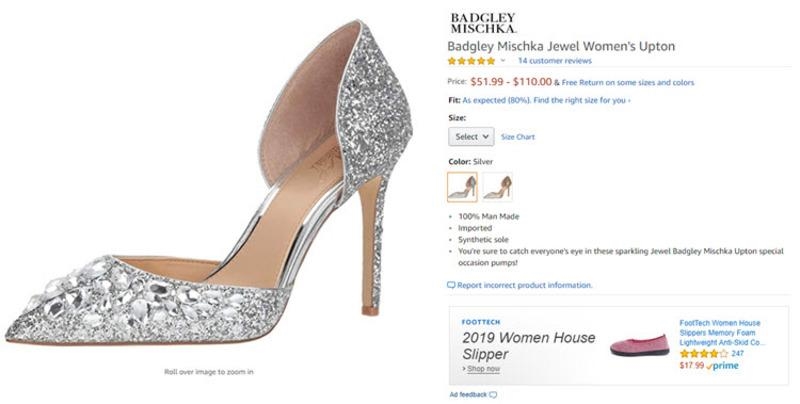
Choosing a white background is a good tip if you’re using your product photos beyond social or your website, and it’s a requirement if you’re using these photos for product listings on Amazon. For Google Shopping ads, this white background isn’t a requirement, exactly, but it’s a strongly encouraged best practice.
#12: Display the details
You can verbally describe the nitty-gritty details of your product as much as you want, but there’s no guarantee that doing so will truly get the message across to your prospective customers.
Although some people can simply read a couple bullet points and create accurate mental images in their own heads, many others need visual guides to help them absorb information.
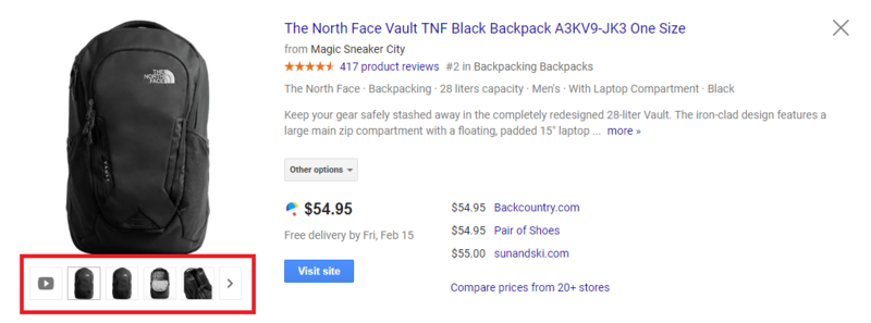
To ensure that even the most visual learners get a complete idea of what your product has to offer, take the time to snap photos of each important detail. That way, nothing is left to the (often inaccurate) imagination.
For example, if you sell backpacks, your product listing should include photos of all the best features—mesh pockets on the exterior, a laptop sleeve in the interior, ample zipper pockets for supplies, etc. Providing these photos gives your prospects a much better idea of what it is your selling, thus making it more likely that they’ll buy.
#13: Create a diagram
This tip is primarily geared towards those of you who sell products with features that can’t be fully explained through standard photos. It goes without saying that people won’t buy your product unless they understand how it works.
A basic diagram is an effective way to clearly identify the individual details of your product and to succinctly explain what each contributes to the product as a whole.

Here, the seller zooms in on the mattress and breaks it down into four parts. As such, any consumer who previously didn’t know what differentiates memory foam mattresses from standard mattresses now understands.
In other words, you’ve used a diagram to demonstrate the unique value your product offers to the consumer. You can’t ask a product photo for much more than that.
#14: Show off your range
Many of you sell several products within the same product category. For example, those of you who sell dinner plates probably sell more than just one plate in particular.
This is important because your prospects have unique personal tastes. Across all the consumers who search for dinner plates, very few have the exact same idea of the plate they’re looking for.
As such, in the pursuit of your goal to drive clicks from interested consumers, it’s wise for you to show off the range of your products. That way, your product photo appeals to a wider array of personal tastes.
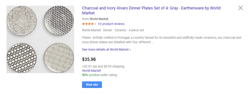
This seller has the right idea. By giving equal prominence to each of the four plates within the set, they appeal to a relatively wide range of shoppers. Each plate will grab the attention of different people, thus driving far more clicks than the ad would drive if it only featured one plate in the photo.
Business & Finance Articles on Business 2 Community
(55)

