3 clever ways Google bucks design conventions with the Pixel 6
I’m holding the Pixel 6 Pro—the first, high-end flagship phone produced by Google—admiring its “Sorta Sunny” finish. It’s a good-looking phone, intended to make someone feel optimistic just looking at it.
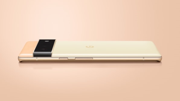
Does everything suddenly feel right in the world? Not quite! But I’ve never seen a phone quite like it. Heck, I’ve never seen a device quite like it. The entire recycled aluminum exterior—which reads more like ceramic than metal—feels closer to a vintage makeup compact or a piece of jewelry than a 5G phone hiding a machine learning processor and 4x optical zoom camera.
The Pixel 6 and Pixel 6 Pro come out on October 28 for $599 and $899, respectively. And whether or not you’re the type to ever leave Apple and iOS, this new line of Pixels features three specific design details that are pushing smartphones forward.
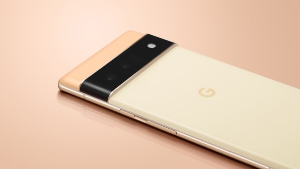
The camera bar
Most major smartphones these days have several individual cameras, which inevitably get stuck into a corner of the device like the barrels of a gatling gun. While most of us have adjusted to the look, it’s easy to forget how absurd this idea seemed when Apple took it mainstream with the iPhone 11. There were memes. (Now, of course, the cameras feel downright normal.)
As Ross explains, Google wanted the new Pixels to “celebrate the camera,” albeit with a cleaner look. But with three individual cameras in the Pro, Google engineers and the design team worked together to figure out a cleaner approach.
“We just wanted to clean up our act, and really contain and hide all the cameras under the single design element,” says Google VP of design Ivy Ross.
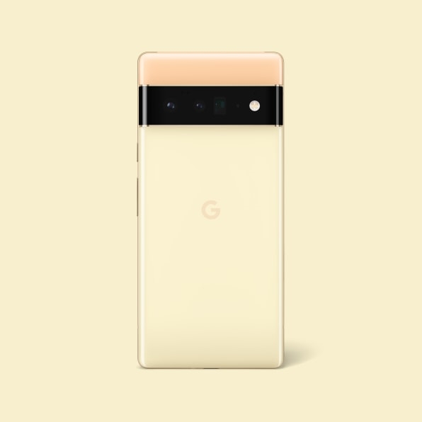
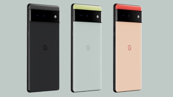
In the past, Google has used a black square in the corner of the phone to hide the lenses, almost like a pirate eye patch. For the Pixel 6, it built the cameras into a wide black glass bar that cuts through the back of the device. The team played with the proportions and positioning of the bar, but ultimately decided its single camera element removed “visual noise” on the device, according to Ross.
The bar also created a design opportunity to turn the back of the Pixel into a blocky series of colors, like a Rothko painting.
Color coordination
Leveraging that camera bar as a visual divider, the Google CMF (color, material, and finish) team played with various approaches to color. Ultimately, they decided to use the thin, top block of the device to convey a brighter color pop (something Google has reserved for tinier elements like power switches in the past), with the bottom of the device using a toned down color.
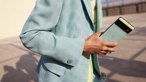
When I note to Ross that early Pixels took a similar, two-tone approach, she agrees, noting that “As you produce more lineage of children, there’s still some DNA left.”
Google’s approach to CMF is always interesting, but the deeper color story is that the company has been translating its industrial design approach to color into Google’s own Android interface.
As we previously wrote about, Android 12 has a new design language called Material You. As part of that, each colorway of Pixel will come with its own matching wallpaper (Google commissioned photographers to take photos highlighting their own colors). Furthermore, the Android 12 UI will match these wallpapers and the device colors, too.)
The point is that Google wants to blur the lines between the Pixel’s physical industrial design and its digital interface design. And the only way to do that is to make software match hardware.
“When you look at screen-based devices, half the object is a screen!” says Philip Battin, design manager of advanced concepts in Google hardware. “We’re trying to create this cohesion of what’s going on inside and outside devices.”
As it turns out, Google’s CMF designers actually trained software to analyze photos, and pull swatches of colors out of them with a similar logic Google’s human designers use. These are “color recipes” according to Battin, which you can choose between to use in Android 12.
“How do we train a machine to approach color in the same way as a CMF designer? How do they think about contrast, accents and neutrals?” says Battin, who notes that sometimes clashing the right color is just as important as matching. “That was one of the most fun parts.”
If you ditch Google’s preset wallpapers, Google’s color algorithm will still work for you—building UI elements to match whatever personal photo you might have as your phone’s background.
Testing the tool out myself with a portrait of my wife in fall, the main buttons turned taupe, while small elements like the Google Assistant microphone icon picked up a rust color—likely from a barn in the background—and a blue seemingly from her jacket. A muted yellow—seemingly conjured from thin air—rounds out the color scheme as a quiet contrast. My phone suddenly felt less like a digital newspaper, and more like a tightly curated full color sidebar in a magazine. Google has even programmed its own icons to match these same colors of your UI, if you’d like, minimizing their noise on your home screen.
“Most people have family photos and dogs [as their wallpapers],” says Battin. “It feels good not to have stark black or white typography on it. It’s more color neutral.”
The case mea culpa
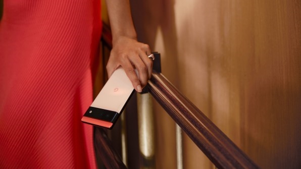
Since the Pixel 2, the Pixel line has offered some of the most beautiful smartphone cases on the market—with eco-friendly, colorful textiles. But putting any case onto a smartphone is something of a contradiction for designers. They put so much work into a phone’s design, only to have it covered up.
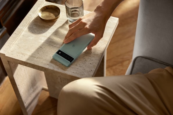
Which is why new cases for the Pixel 6 buck this trend, and go transparent.
“We finally decided, when you look at the stats, 80-something-percent of people have cases, that has to be factored in as we design the phone,” says Ross. “We just have to accept that and work with it.”
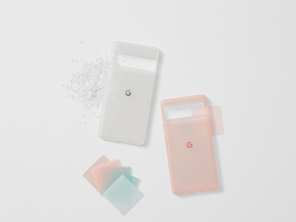
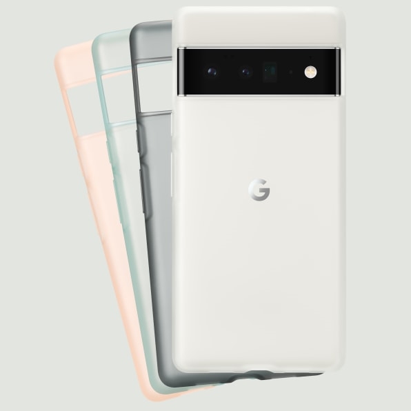
Google’s new Pixel cases are frosted plastic, made mostly of recycled materials. They aren’t completely clear (like this one from Apple), and all of them are tinted (though one is tinted white). Notably, the entire middle of the case is open. It’s built like a puzzle piece to let the camera bar stick right through, taking photos without obstruction.
The entire effect is something like one of those transparent phones from the ’90s. You feel like you’re getting a peek inside the guts of your device, even though you aren’t. But I’ll admit I felt like I lost the best of the Pixel Pro 6 Sorta Sunny colors and finish underneath a blue-tinted case. The plasticky hand-feel also seems at odds with the posh phone itself. In other words, I’m not certain Google has solved the case-phone conundrum just yet. But the company is, at least, working on it.
Fast Company , Read Full Story
(28)

