3 Core Psychological Reasons Nobody Is Clicking Your CTA
The call to action is the critical point in a lead’s journey from a member of the audience to becoming a customer. It is the central bottleneck of your business, the place where the action takes place.
Nowhere in your marketing is an understanding of psychology more vital.
So why aren’t your leads clicking?
Here, I’ve isolated three psychological forces at play that I feel are central to the success or failure of your CTAs. Let’s take a look.
1. Not Understanding, Building, Or Subverting Expectations
A branch of psychology known as perceptual set theory is based on the idea that the human mind:
- Selects information from the enormous number of inputs it is receiving. The sheer amount of information presented to our senses is far more than the brain can handle at any given time. So, based on our needs and the context of our situation, we carefully select which information to pay attention to and which to disregard. This process is almost entirely subconscious.
- Infer what we can expect based on the information that is being presented to us. Based on a mixture of correlative and causative relationships from our previous experience, we make predictions about what we might expect to see or experience next.
- Interpret what is happening based on a synthesis of the information we are selecting and how it aligns with our inferences based on prior experience. Essentially, we take our present experience and place it into a context based on categories of prior experiences.
How does all of this effect the way we deal with calls to action?
When we select information, we may disregard and not even notice a call to action because we have trained ourselves to ignore them. This depends heavily on context. For example, if we visit a landing page looking to download an eBook, we will actively select the CTA. If, on the other hand, we are trying to read a blog post, we will actively select against parts of the page that we have trained ourselves to understand as distractions, places where we would typically see advertisements.
This means we need to be careful to understand what our visitors are expecting and trying to accomplish when we present them with a call to action.
When we visit Instagram’s landing page, it is built entirely to play into our expectations:

It speaks the language of landing pages that we are all familiar with. The way it is layed out, we don’t really need to read anything on the page to know that if we fill out the form and press the “Sign up” button, we are going to join Instagram.
But playing into expectations isn’t always what we want to do. Consider Brian Dean’s blog post on “The Skyscraper Technique.” As is typical for a blog, there is a CTA in the right-hand navigation inviting people to join the newsletter:
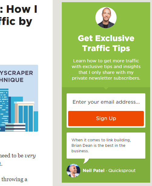
By now, this is an expectation for most people. But we also tend to automatically select against these when we visit a blog. We know that this CTA is usually off-topic and not as directly relevant to us as the content of the blog post. It’s good to have a CTA like this, because the people who are actually looking for the place to sign up for the newsletter are going to start here. But everybody else won’t even notice this CTA. They infer from prior experience that it is irrelevant and select against it.
But Brian Dean doesn’t just anticipate our expectations, he subverts them:
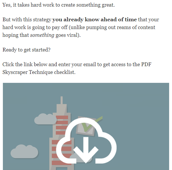
This is at the end of his blog post. Notice how the CTA, starting with “Click the link” is right in the context of the blog post, with no special formatting, no special placement, and nothing to announce to the world “I am a CTA!”
I’m not saying you should be trying to trick your audience into reading a CTA in this manner. Notice that the CTA also conforms to our inferences and interpretations based on previous experience. The CTA actually is relevant to the subject of the blog post and the reason we visited the page.
The point is, we automatically read this CTA because we are already reading the blog post. We do not select against it. Our expectations are somewhat subverted, while being fulfilled at the same time.
2. Bad Visual Psychology
Visual perception theory is split into two camps: the top-down and bottom-up processing theory, with most modern research indicating that both views have some merit.
The top-down approach suggests that about 90 percent of visual information has already been filtered out by the time it reaches the brain, and that what we perceive is actively constructed based on our prior experiences.
The bottom-up approach instead argues that perception is driven by innate mechanisms, that since perception is necessary for survival, it is driven more by evolutionary biological forces than things we have learned within our lifetime.
There’s some debate about which view is more correct and in which proportion, but one thing seems to be very clear from the research: the top-down approach seems to work better on short time scales and when visual information is confusing.
In other words, the more context and the less clear the stimulus, the more we rely on previous experience to identify what we are looking at.
When it comes to CTAs, we need to keep our eyes open for areas where top-down processing theory can work for or against us:
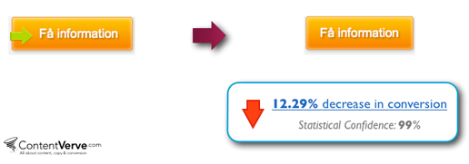
- Immediately recognizable visual cues like arrows tell us where to look based on prior experience. For example, the button with the arrow below performed 12.29 percent better than the button without one:
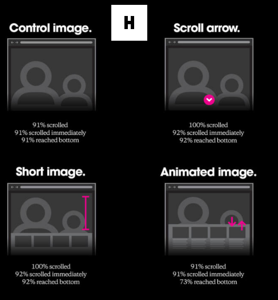
- Watch out for the “false bottom.” Using heat map tools can be especially beneficial here. A false bottom is a place where users think that the page has ended when there is actually more information. Consider this experiment by Huge Inc, which showed that while most people scroll, large hero images cause some people not to, unless a scroll arrow or a smaller image is used:
- Our tendency to follow somebody else’s gaze to see what they are looking at is so immediate that it’s probably not even top-down perceptual theory, it may be biologically hard-wired. We can take advantage of this in landing page design. Look how When I Work takes advantage of following this man’s gaze directly to the CTA headline:

- Visual cues can also draw our attention in the wrong direction. Consider this CTA:

While this landing page was almost certainly directing people’s attention toward the words in the CTA with the woman’s gaze, this next CTA actually boosted conversions by 72 percent:
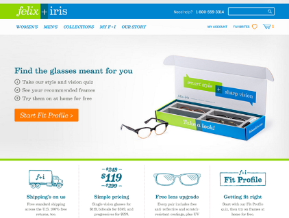
While this new CTA might not be using as obvious a visual cue, it is better at visually communicating what the product is.
3. Not Capitalizing On Curiosity
According to a scholarly review on the science of curiosity, it is “influenced by cognitive variables such as the state of one’s knowledge structures but may, in turn, be one of the most important motives encouraging their formation in the first place.”
The conclusion of the research is that curiosity is motivated by an information gap, not by a violation of one’s understandings. Put another way, curiosity doesn’t motivate us because of simple external reward and punishment, but because the promise of information to fill a gap in knowledge is motivating in its own right.
This should highlight not just how powerful curiosity can be, but how it can be misused and misapplied when it comes to developing a call to action.
We often try to incite curiosity by promising secrets, tips, and tricks and then focusing on the rewards those secrets will offer us. But the information-gap model of curiosity suggests that it’s not the rewards we anticipate alone that creates our drive for curiosity. On top of those rewards, it’s also the promise to fill in those information gaps that is itself motivating.
Does this mean our CTAs shouldn’t be promising a reward? Of course not. The promise of reward is an incredibly important part of why we take CTAs seriously. It’s just that focusing entirely on those rewards is failing to fully capitalize on the motivating power of curiosity.
To really take advantage of curiosity, we need to ride a thin line where the promise of information is highly specific, but those specifics themselves are not given away in the call to action.
Let’s look at a few examples, starting with Groove:
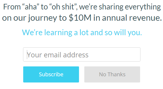
Think about how else this might have been presented. They could have said they have a list of secrets that will earn you money, but that isn’t their approach. Instead, they very specifically state that they themselves are making $10M in yearly revenue, and that they are going to tell you exactly how they did it.
Rather than dangling the word “secrets” and the promise of some reward for knowing those secrets, Groove creates a very clear knowledge gap in our minds. We now know that Groove makes $10M in annual revenue and that they went through a series of ups and downs to reach that point, but we don’t know how.
Unbounce’s current blog popup CTA works for similar reasons:
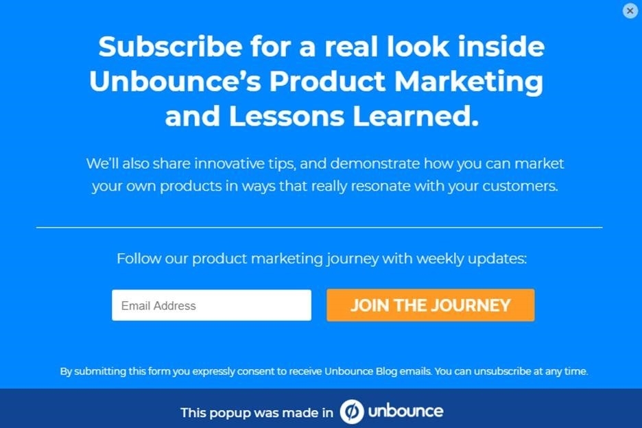
The CTA is specific enough to say that they are sharing specifically how they themselves are marketing their own products and lessons they have learned along the way, with less emphasis placed on the reward of marketing that resonates with customers, which itself also creates a specific information gap.
What separates these heavily tested and highly successful CTAs from run-of-the-mill attempts at capturing curiosity is that they don’t try to incite curiosity by being purposefully vague, which is the obvious and least effective approach.
Let’s consider another example. Your title tag is your CTA in the search results, and research by Conductor suggests that specificity reigns supreme there as well:
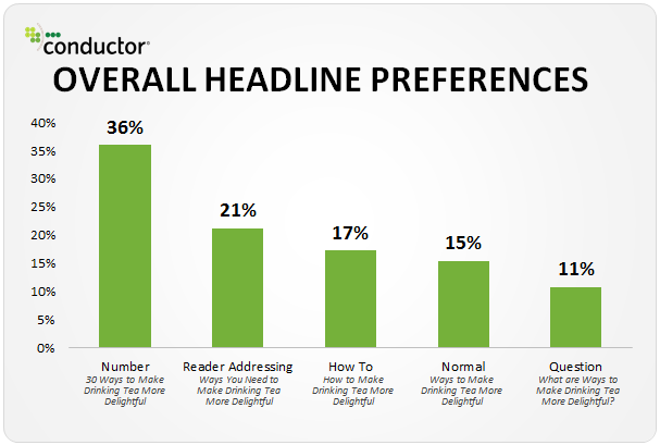
The specificity of a number builds more curiosity than any other method they tested, while putting a question mark in the title was, perhaps paradoxically, actually the least effective way of inciting curiosity.
This seemed to be the overall lesson we learned looking at several studies published about headlines in a post published at SEMrush. The specificity of the promise in the headline was the best predictor of clicks, while words like “trick” and “easy” just seem to put people off.
Here’s another example, from Wishpond:

Look at the specificity of what is promised. We know that we will see real world examples, we know explicitly that the goal is to increase customer loyalty with email, and we know that we will learn how to incorporate data-driven strategies. We know all of this but we don’t know precisely how all of this needs to be executed.
Again, let’s ask ourselves how somebody might have tried and failed to incite curiosity with this. They could have placed too much emphasis on rewards by saying something like “How to use email to increase revenue,” or worse, “Secrets to boost revenue,” but those are less specific and likely wouldn’t be as effective.
In short, what makes curiosity motivational is the actual promise of information, and the best way to do that is to get very specific about the information people will receive. Focusing too much on being “enticing” is actually working against the curiosity impulse.
Conclusion
In many ways, the call to action is central to the success or failure of your business. While a business can survive with a weak CTA if it successfully builds an audience that supplies a continuous flow of new leads, the performance of a CTA has a lot to say about how well you understand your business and the psychological forces that turn consumers into your customers. The sooner you get a handle on your CTAs, the deeper you will understand what really makes your business tick and how best to solidify a future for it.
The post 3 Core Psychological Reasons Nobody Is Clicking Your CTA appeared first on Search Engine People Blog.
(53)


