3 Design Trends Hiding In The New Nest Thermostat
What might appear to be a minor product update hides trends in industrial and interactive design to come.
Nest has just announced its third-generation thermostat. And at first glance, it’s tough to see how it’s different from the last generation. After all, it’s only about 1mm thinner, and it features the same rounded steel and glass design of its predecessors. Sure, its homescreen is 40% larger. But is that it?
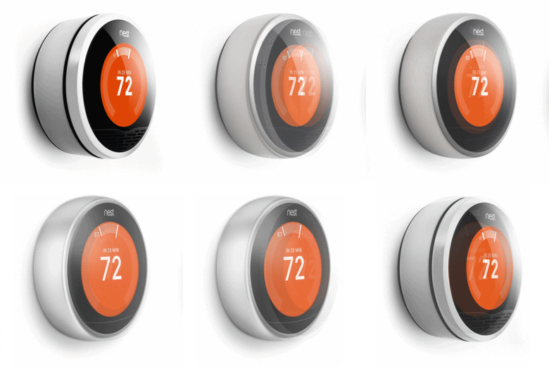
In actuality, the new Nest is a perfect example of positive, iterative design—how a top tier product is honed to stay at the forefront of user experience. And if you look beyond the bigger screen, you’ll see how it’s quietly paving the way for the industrial and interactive design to come.
The User Interface Reacts Dynamically—To More Than Touch
The old Nests used a proximity sensor to notice when you were close, and light up in response. “We thought, wouldn’t it be great if the thing could display when you were farther away,” explains Scott Mullins, Engineering Manager at Nest. “[So] when you’re far away, you can absorb some info; when you’re close, you can absorb more.”

Display from far
Don’t all displays do that? Not exactly. The latest Nest has a new feature called Farsight. Basically, it can detect if someone is far away or if they’re close and adjust the UI accordingly. If you’re standing across the room from Nest, it can be set to display the temperature or the time in large, discernible glyphs. But as you move closer—about three to five feet away—it will transition to a new screen that’s more info-dense. The new display will show the temperature, sure, but also information about the weather and icons for a calendar and settings.
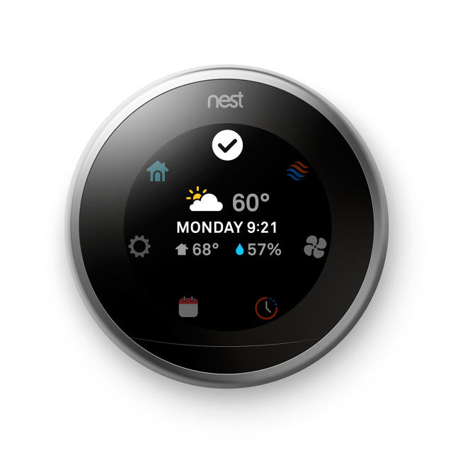
As of today, we’ve seen smart lighting systems turn on and off lighting depending if people are present, and apps like Aviate actually shift the UI of a smartphone homescreen depending on the context it’s in (whether you’re, say, driving your car to work or in your bed at night). Farsight teases how more of our domestic devices, from TVs to refrigerators, could react differently based upon proximity.
Round Screens Are Everywhere
In a word once dominated by rectangular screens, the Moto 360 smartwatch made headlines for its circular LCD screen, and more and more, we’re seeing curved, thin-bezeled LCDs in products like the Samsung Galaxy S6.
Nest, too, has featured a round screen since the original model. But unlike its contemporaries, Nest fakes the feature. In versions 1 and 2, it featured a rectangular screen, covered in a rounded mask, to create the illusion of roundness.
“In terms of the guts, this is where the difficult things happen,” Mullins says. “You know we have a circular product. There aren’t many circular displays.” Traditionally, LCDs for everything from smartphones to televisions are cut from massive factory-produced sheets, and cutting them into rectangles maximizes the yield. But as you might suspect, a rectangle doesn’t fit inside a circle very well, which is why the Nest has always had a relatively tiny display in relation to its body. “To make the screen larger, we had to go to an octagonal display.”
If you were to take apart a new Nest—available today, by the way, for $250—you’d find an LCD screen shaped like a stop sign. By masking this shape rather than a four-sided rectangle, the Nest’s screen can appear as a circle, but also maximizes geometric real estate when sheets of LCD are being produced.
Of course, just cutting an LCD into an octagon rather than a rectangle comes with its own costs. Simply put, the edges require more cuts, and the more cuts, the more likely that the edges of the screen will chip. A screen that’s chipped at the edge will eventually fail on the consumer. This raises both costs and manufacturing complexity, meaning that, while round displays are on the way, even the shortcuts are tricky.
Every Design Will Be Smartphone Design
With a larger screen, the Nest team had to completely rethink the arrangement of the internal chips of the Nest. In particular, the radio antennas that had once been embedded on a circuit board had to be moved outward, just inside the rim of the device. But in making this move, the antennas received interference from the device’s metal rim.
It’s the sort of micro-engineering problem that’s totally new for domestic consumer electronics, but old hat for the smartphone industry. As Mullins points out, antenna functionality, in particular, is why your iPhone has all those subtle lines around its edges. And this is the level of design expertise that we’ll need in the future of even very simplistic smarthome devices.
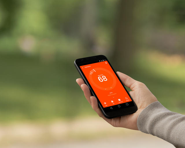
That said, there are limits. “One thing we see on our side: the smartphone market keeps going and going, but our architecture and chips don’t work that well with the architecture. And that’s because the smartphone is about computing, graphics, gaming—there’s a lot of high-end capability you need to put in,” Mullins says. “We have to conserve energy—we are on a power-constrained socket.”
In this regard, it’s easy to forget that even battery-powered smartphones, recharged once a day, actually operate with the luxury of a lot more power than many devices in our homes. And so while the devices of tomorrow will need to be designed with all the care of an electronics-dense smartphone, many of the same rules of engineering will not apply.
Fast Company , Read Full Story
(103)

