Happy. F**king. Monday.
Be honest, this morning sucked, right? Sunday night seemed so peaceful. You thought maybe the weekend would never end. And then, suddenly, the screeching alarm.
But what if you’d woken to the sound of a child’s giggles?
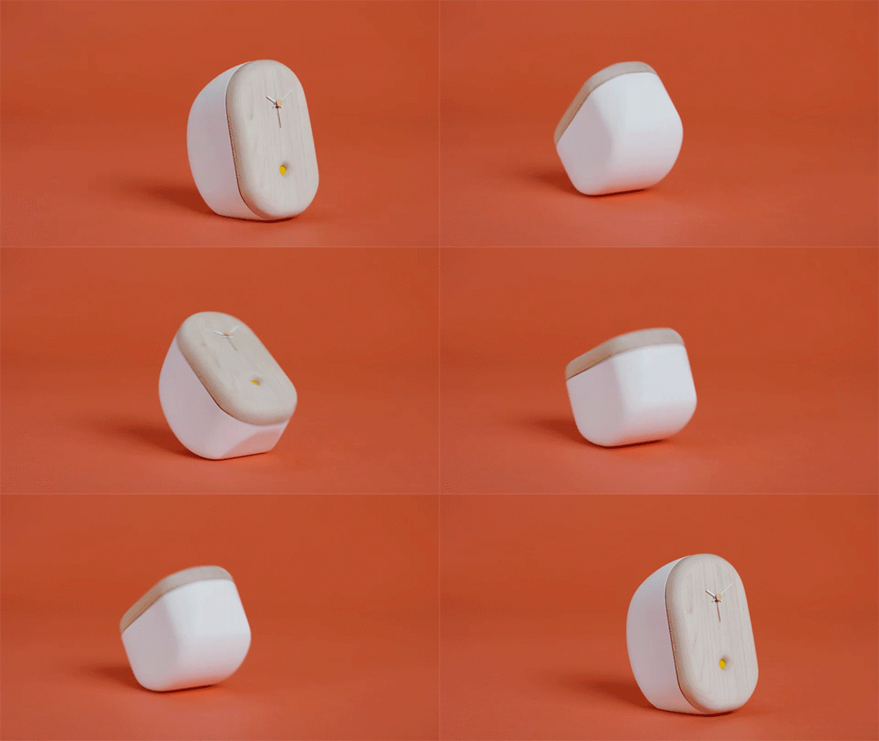
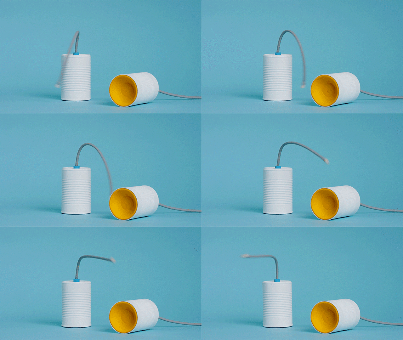
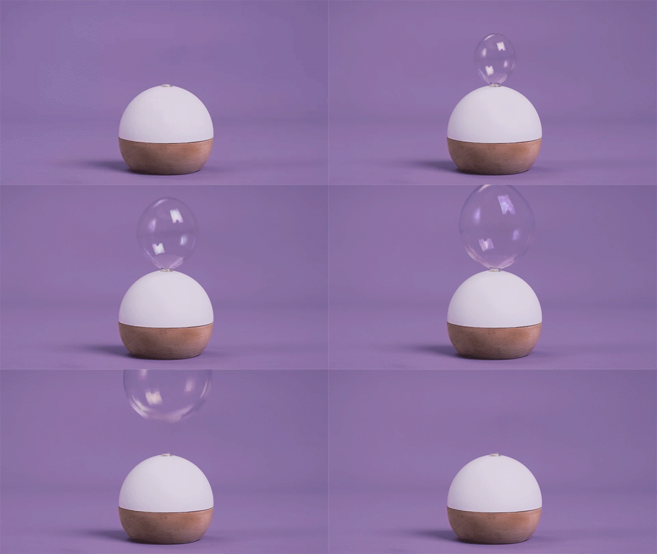
This is the philosophy of Monyay, a series of three concepts Ideo and the WNYC show Studio 360 created to make Mondays a little less horrible. It includes an alarm clock called Lolzzz that you tickle, a tin can communication device called Sincerely that wags its tail with nice messages, and a gadget called PopUp that pings you with notifications by blowing big poppable bubbles.
“The place that we were looking here was at this really painful moment, that moment that marks the transition between your weekend and your week,” says Ideo design director Ingrid Fetell Lee. “I think the intention was to find a way to bring a moment of whimsy and put you in another kind of headspace. The natural place to go in that moment is a sense of dread and loss. What we wanted to create was a sense of positivity, joy, and abundance.”

Each object is a masterpiece of interaction design. Take Lolzzz. Yes, it’s an alarm clock that giggles you awake. But it’s more than the equivalent of a fun ringtone. When you walk over to the device to turn it off, the object is rocking on its back with belly laughter. And when you tickle it, the alarm just doesn’t stop. The laughter gets louder. The UX actually lures you into a moment of happiness.

Sincerely is like an updated version of the old two tin cans and a string telephone. Every Sunday night, a connected app prompts someone to leave a nice message about you. On Monday, shortly after you wake, you’ll see the can. But it’s not blinking or buzzing like your phone. It’s, for lack of a better term, wagging its tail like a happy dog. Pick it up, and hear something nice about yourself.
If novel interactions in the industrial design world are rare, novel interactions created specifically to make us happy are even rarer. Lee points to our own habituation as the culprit.
“I wouldn’t say that design is stagnant, but I would say, there are patterns, and assumed forms of the small daily objects we interact with every day, that we don’t question,” says Lee. “And there are a lot of things designed with a very different set of considerations in mind than what makes us feel good.”
It’s true. Teapots. Speakers. Pens. Chairs. Televisions. They’re all objects that pretty much work one agreed-upon way. Even a modern smartphone—an object known for massive amounts of app-driven UX experimentation—will give us notifications through a relatively universal language of chirps, buzzing, or blinking lights.

Contrast that smartphone approach to notifications to the way Monyay’s PopUp handles them. Instead of blinking, it blows a bubble. Why a bubble? Lee says that research shows round shapes induce joy, but even more so, it passes her own observational baby testing.
“If you have an infant, and they smile at something they’ve never seen before, that’s a good indicator there’s something unconscious [going on],” Lee says. “If you watch babies and bubbles, there’s a universal attraction and joy. I’ve never seen a baby burst into tears over a bubble.”
If you like the Monyay concepts as much as we do, you might also wonder, why aren’t more objects designed as much for joy as they are for utility? Why don’t we surround ourselves with lamps that waggle their tails, and refrigerators that blow bubbles?
“You don’t want a circus!” Lee says. “I don’t think I’d ever suggest that we should design a circus, and overload on this…that’s the thing about joy, it’s not meant to be lasting, it’s a wave. You feel it, and it peaks.”
For 7 Steps to disarm a miserable Monday, watch this video:
An earlier version of this story referred to “Ingrid Fetell Lee” by her maiden name of “Ingrid Fetell.”

Fast Company , Read Full Story
(102)