4 major barriers to being linkable
Columnist Julie Joyce explores some of the most common issues that interfere with naturally attracting good links.

When it comes to being unlinkable, there’s a lot more to consider besides boring content, poor quality writing and low-end design. Of the many issues that could cause users not to want to link to your content, here are four major ones that I see all the time: intrusive intersitials, gated content, excessive pagination and avant-garde design.
You can find someone to argue for and against all four of these barriers, and I’d probably see some of those points in the last three cases, but I’m not sure much can change my mind about interstitials.
Intrusive interstitials
It’s only been a few months since Google rolled out the mobile intrusive interstitial penalty, so I’m still not surprised to see them being used occasionally, but they really are annoying, in my opinion. Intrusive interstitials are annoying on mobile devices and on my laptop.
Forbes.com definitely has to be among the most notable offenders here, with their “quote and countdown” interstitial.

Their quotes don’t offend me or anything, but if I click on a link, I want to see the site — not wait three seconds (an eternity!), and then have to click another button to say that I really, truly do want to go to the site. That’s like emailing to confirm that I really did want to unsubscribe from your email newsletter.
I am pleased to say that I do think most sites are paying attention. In doing some research for this article, I visited several sites that had been listed as having intrusive interstitials (in various articles surrounding the topic), and most of them were no longer using them.
Gated content
Speaking as a business owner who has to deal with a lot of “tire kickers” from web leads, I love the idea of narrowing down to the serious customers. However, an as SEO and link builder, I prefer the benefits of not putting content behind a gate. There’s a great piece on when to gate vs. when not to gate that lists six good examples for each. Of course, you want to gate content such as a live demo or anything that’s proprietary, but gating content like a normal blog post is silly. No one should have to enter their email before reading your latest blog post.
In my case, the only gated content that I have is an e-book where you have to enter your email address to get a link to the download. If I did on-site quotes, I’d gate that area, too. If I had a blog or a video where I was explaining our process, I would not gate that.
While there are some good guidelines about when to gate content and when not to, it still comes down to what you want from your content. Conversion rate optimization, usability and SEO don’t always seem so black and white.
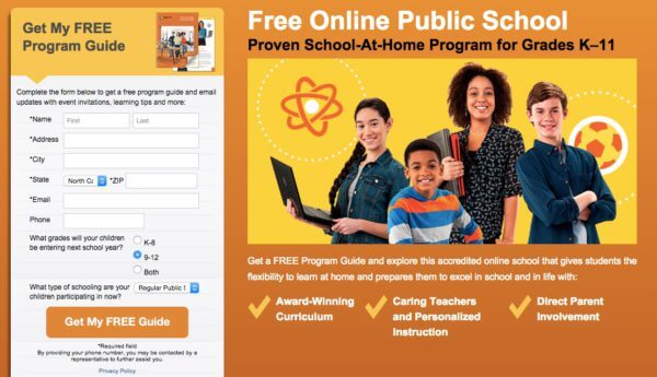
I was recently looking at potential homeschool/online school resources and ran across this site: http://northcarolina.connectionsacademy.com/
Their guide is a physical guide that will be mailed to you. That obviously costs money for printing and shipping, so in order to get it, you have to give them some information, including your phone number. While I totally understand that, I can’t really see anything that I want to see without getting the guide. I can’t access content behind the main links on the home page, as all they do is take me to a form to request the guide. That’s not a great use of gated content. Maybe I am just browsing around, kicking tires, but why can’t I see an example curriculum or read a few success stories?

Want to guess how many referring domains link to them? TWO.
Excessive pagination
I love to blow time by looking at ridiculous things like photos of cats attacking toddlers and Siberian huskies being weird. In cases like that, I expect to have to click through page after page. However, when it comes to finding a source to link for an article that isn’t about vicious cats or funny dogs, there’s no way I am going to waste my time clicking around pages in order to find one to link to. I bolt immediately when I come to those sites.
Google has guidelines for paginated content, and that’s good for sites that need to paginate. I don’t have an issue with an article that is in four parts. I do have an issue with a piece of content that requires me to click 20 times in order to reach the end of it. When content exists to show ads and make money, I’m just not a big fan — and I’d definitely hesitate before linking to it.
Here’s an example from WebMD of foods that dogs shouldn’t eat. This piece has 25 slides to view! Why can’t it be a list?

If I’m looking to point users to a resource for foods that dogs shouldn’t eat, I’d rather link to something like this ASPCA article on the no-no foods. It’s a nice list — no need to click “Next” 24 times, and no chance to view 25 different ads.

Looking at the links to each example above, the ASPCA page has 1.3K referring domains, while the WebMD has 404 referring domains. I’m sure there’s more to it than just the annoying pagination, but it’s interesting to note nonetheless.
Avant-garde design
Years ago, my friend and I went to New York City and ended up having to call the hotel staff to come help us figure out how to put the plug in the sink. While he was up there, I realized we also didn’t know how to turn on any of the lamps. As the trip wore on, it became obvious that the bathtub placed right in front of the bed, protected only by a sheer curtain, was really not as cute as we first thought. Oh, and let’s not forget that the only reason we even found this hotel was that I recognized a potted tree that was at the entrance, as I’d seen a photo of it on the web. Cool designs for everything overall, but I’ve never been back.
Do you see my point? When a cool design hides basic functionality, it’s not that beneficial unless you’re a site that exists to sell cool designs that hide basic functionality. I tend to bounce right off those types of sites. If I did stick around to look through one, I might link to something internal if I found a good resource — but in my experience, if the site is that difficult to navigate, I’m not likely to find what I’m looking for.
These sites may contain fantastic information presented in various formats, and maybe that’s all they need. So I’m certainly not saying that they’re not good sites for content consumption. I’m just saying that, in general, I would only link to one to use as an example of a site that wasn’t very linkable. Isn’t that ironic?
Final thoughts
While there are other irritations that would prevent me from wanting to link (like making link text blend in with the background, or making it stand out in glaring colors), I do find these four to be the major offenses.
I also recognize that not everything is about links; not everyone considers linkability a top concern when making a choice about their site or content. However, links still make you rank, and they bring you traffic — so if something is preventing you from getting the links you deserve, it’s worth taking a second look at how you can fix that.
[Article on Search Engine Land.]
Some opinions expressed in this article may be those of a guest author and not necessarily Marketing Land. Staff authors are listed here.
Marketing Land – Internet Marketing News, Strategies & Tips
(73)


