5 ways Apple is thinking beyond the touchscreen
Apple’s iPhone changed everything when it debuted in 2007, with its handy touchscreen that introduced totally new concepts such as pinch-to-zoom. But it’s easy to forget in the age of iPhones that UX is about a lot more than a touchscreen. It’s about making real-world gestures, touching physical buttons, and sometimes looking away from a screen entirely.
As user experience guru Don Norman wrote in 2015, Apple forgot about some of its more nuanced approaches to UX after launching the iPhone. Apple’s quest for minimal, visual simplicity hid core functions and made it harder for people to recover from their own errors. Even more importantly, touchscreens trapped us all inside 5-inch worlds, a space that was inherently narrow in both our inputs and our experiences. UX became small, and in a sense, life followed.
At today’s Spring Loaded event, Apple showed off its willingness to dust off some of its best, old ideas and experiment with new UX moves that have little to do with tapping on a screen. Apple seems to be thinking about its devices with fresh eyes. Its devices are not merely being treated as containers for apps, but as functional tools in our lives that we can use in all sorts of ways to respond to any given moment.

The AirTag Compass
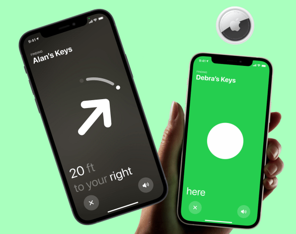
Okay, my first example is on a screen, but hear me out. Apple’s new AirTags can be attached to items around your home that you might lose (such as keys) so you can find them with your phone. But the way you find them is interesting. The first option is that the AirTags have a tiny speaker inside (much like the AirTag-predecessor Tile trackers do) to emit sound when you’re looking for them. The second option is to turn your phone into a compass. That’s right—a giant arrow appears on the screen and points your way to the object. As you turn the phone, the accelerometer inside knows your position and adjusts the arrow accordingly. As a result, the hunt for a lost item resembles a search for buried treasure.
Apple TV calibration
You might have the latest and greatest TV that money can buy. But there’s a catch. As any expert will tell you, your TV isn’t going to deliver its best image until you calibrate it. Color, contrast, and brightness need to come together in harmony to get the perfect picture. And to do that, expect to dig through message boards, and find the settings other people have posted, for your exact model of television.
The latest Apple TV offers another option. If you hold your phone (and specifically, your phone’s camera) up to your TV, the system will analyze your image and adjust the Apple TV’s video stream to optimize the image that appears on your display. Now, it doesn’t appear that Apple TV is adjusting anything on your actual TV. And there are limits to what Apple can do by tweaking the signal rather than your actual TV settings. But I’ve certainly never seen such a simple or surprising way to calibrate a screen.

Image: Apple]
The click wheel is back!
The iPod’s click wheel was one of Apple’s greatest moments in interface design (though it was technically inspired by Bang & Olufsen). By rubbing your finger across a wheel, you could spin your way through songs. It was effortless and satisfying, like the world’s first and only fidget spinner that actually accomplished something. Now, Apple is bringing that beloved idea back to its maligned Apple TV remote. The new Apple TV remote has been refreshed so that it’s basically an iPod on top, allowing you to spin and scrub your way through movies in a way that’s as quick as it is fun. Sorry, fast-forward—your days are done.

The iMac’s stupid simple cable
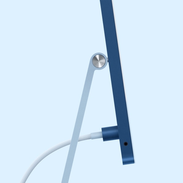
The iMac got a refresh in a rainbow of colors today. What you may miss in the redesign sits behind the screen. It’s a new cable that connects to the back of the iMac with a magnet (Apple brought back its “MagSafe” magnetic attachments last year). The value of a magnetic cable is that it plugs in more easily to a device, literally pulling right out of your hand to plug in. Some MagSafe products will also unplug automatically as soon as there’s tension on the line to stop your computer from flying off the desk.
As an added bonus, this new cable doesn’t just carry power. You can actually attach Ethernet, via a brick that sits on the floor, to send your internet signal through this same cable. That means the cable replaces the cord frenzy behind most computers. I’d love to see Apple offer the option to work USB and other cables into this system too.
Center Stage videoconferencing
At first glance, Apple’s new iPad Pro doesn’t look so different from any other iPad. But its updated camera hides a great new feature called Center Stage. Center Stage lets you set up your iPad for FaceTime, but as you move or walk around your space, it will follow you to keep you in the frame. (Whereas today, if you walk out of the frame, you just disappear.) If someone else steps in, it will frame up the two of you. This sort of auto-tracking is an idea that competitors have played with before, going all the way back to the Microsoft Kinect’s video-chat function. However, it will be more than a little welcome in the iPad line, because iPads make great screens for teleconferencing. Here’s hoping the feature comes to MacBooks and iMacs in the future, too. Because while video chat has become part of our daily lives, being glued to one spot all the time while talking just stinks.
Fast Company , Read Full Story
(20)


