7 tangible ways to make vaccine websites more accessible
Across the U.S., online registrations for the COVID-19 vaccine are failing to consider some of the most vulnerable groups of people: seniors, those with disabilities, and certain racial and socioeconomic groups.
The online registration processes were launched quickly (rightly so) in response to the rushed vaccine rollout. Usually, rapidly spun-up sites cater to the general public—the mythical “average users”—not these specific groups.
But these groups are the main users of government vaccination registration websites, at least initially. Seniors face confusing, inconsistent, and frustrating registration processes that leave them scrambling to find help from family members, as an NPR story detailed earlier this month. New York, for instance, has a 51-question registration process that leaves many seniors overwhelmed.
It’s not just seniors who are being left out. A blind woman in Alexandria, Virginia, who has additional health conditions that qualified her for the current phase of vaccination, was unable to get updates on the registration because it was inaccessible to her screen-reader. She turned to Facebook for help getting information. Her case is far from unique. A recent Washington Post op-ed discussed the exclusion and challenges of those with visual impairments looking for vaccine appointments on registration sites.
Pre-pandemic, do you remember when the hottest concert tickets would be released online? You just had to be at your computer, repeatedly refreshing your browser to get through. That’s how vaccine registrations are opening in some communities—and you know who’s getting them due to more flexible work environments? White, middle-to-upper-class populations, often leaving Black and Hispanic users unable to secure available doses, further widening the digital divide that this pandemic has exacerbated.
In New York City, wealthier neighborhoods are getting the first dose of the vaccine at four times the rate of those in poorer neighborhoods, a fact New York mayor Bill de Blasio acknowledged was about “underlying painful disparities. Folks who have more privilege are best able to navigate this process.”
In Chicago, meanwhile, USA Today found that the vaccination rate for majority-Black and -brown neighborhoods averaged 5%, while majority-white neighborhoods averaged 14%, despite the fact that Black and brown communities have been some of the hardest hit.
So what do we do? We can become more intentional and thoughtful about how we are designing our online experiences and be mindful of who is being left out. I’m not suggesting we shut down all the COVID-19 registration pages and start over, but rather look at making iterative improvements that extend the reach to diverse audiences.
This means taking steps toward inclusive design, which “considers the full range of human diversity with respect to ability, language, culture, gender, age and other forms of human difference,” according to the Inclusive Design Research Centre. With this approach, there’s not a one-size-fits-all solution. It’s best to offer multiple methods of making content and experiences accessible.
How to reassess registration sites
Knowing we don’t have to start over is both comforting and motivating. The best first step that digital experience professionals can now take is to recognize and eliminate habitual design and development decisions that may have the unintended consequence of leaving groups of users out. While these improvements are targeted at seniors and vulnerable communities, they would benefit everyone engaging with the site.
Enhance color contrast of text: No more gray on light gray. This is all too common. Use high-contrast pairings of text and background colors. Use a color-contrast analyzer tool such as Color Safe or Coolors Contrast Checker to find the next best option.
Check text size: Ensure the important information is sizable enough, at least 14 points. Anything smaller should be commentary, not critical details.
Make sure touch targets (buttons, links) are big and/or spacious. Reduce accidental, erroneous clicks by making targets larger and with more spacing. Targets should be at least 44 x 44 CSS Pixels (WCAG 2.5.5 Target Size).
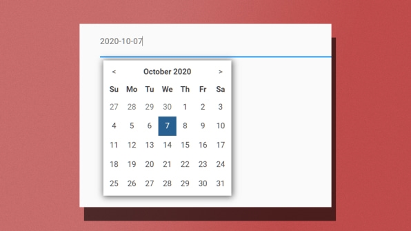
Allow for multiple “ways” to complete a function. For example, let users select a date by typing it in or by using the calendar picker/slider. Don’t make it either/or.
Offer multiple ways to get help. Not everyone may be able to complete the form online. Presenting alternate ways for help, such as clearly displaying a phone number or email, provides a way to reduce frustration if someone is blocked.
Simplify and show progress. Help users get through quickly and keep them motivated by showing where they are in the process. Right now, the bare minimum is to get the right people registered at the right time. Ask for follow-ups later or after the registration form is submitted. New York State should take note: 51 questions may not be necessary to book a spot; priority and eligibility can be figured out in far fewer questions.
Determine if the field is really required. Ensure the process doesn’t shut out people who may not have “everything.” For example, at the digital product agency where I work, Phase2, we worked with one of our healthcare clients to recognize an unintended barrier: required fields for opting in for COVID-19 alerts. The challenge was that both email and cell phone were set as required fields, which is problematic because 15% of seniors don’t have a cell phone. Ultimately, the dual-field requirement was removed.
A closer look at Florida
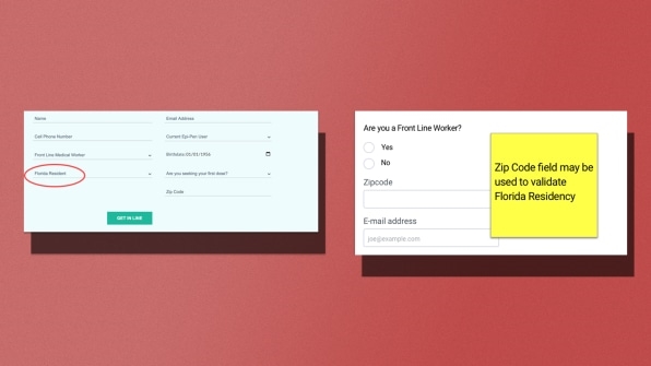
As governments create these forms, it’s important to display choices to help with context, scanning, and comprehension. Here is one example from Florida, which has a number of challenges:
Name: What if this person just enters their first name? Consider a First Name field and a Last Name field.
Cell phone number: 15% of seniors don’t have a cell phone. Is there a way to let seniors select their notification preference so that they have more peace of mind if they have to leave the mobile field blank?
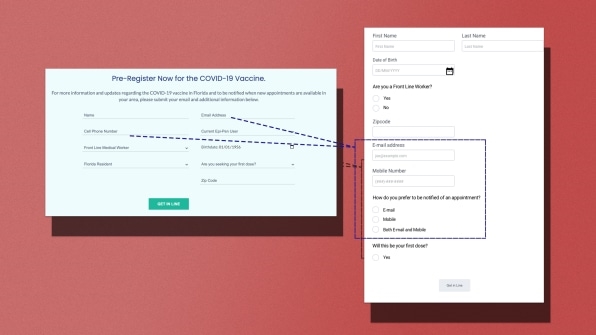
Current EpiPen user: What does this have to do with getting vaccinated? Why would this data point be necessary? If it isn’t, then it should be removed and provided as a follow-up question. If it must be asked in order to secure a vaccine appointment, include a tool tip to provide the rationale.
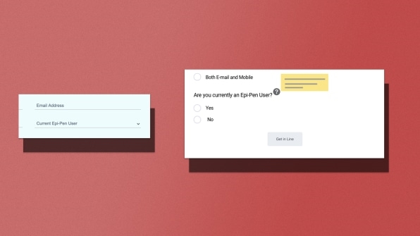
First dose: Consider changing to “Is This Your First Dose?” to support selection using radio buttons (like checkboxes on a form, except they’re circles that you select with a dot). Updating the phrasing will also help down the line with the single-shot doses by Johnson & Johnson.
Florida resident? Why have this question when the ZIP code field can validate this?
Become mindful and start small
The digital experience is now woven into our social fabric, but these design decisions could mean life or death. Booking appointments to see a doctor, making telemedicine accessible, and registering for a vaccine are all experiences that everyone should be able to do without hitting roadblocks.
The only way we can improve and adapt is to become mindful of these exclusions, act upon them, and prevent those repeated barriers the next time a new site or microsite is launched.
Examine closely if you are providing ways for your users to get help. Could form fields be converted from unseen drop-down options to visible radio-button options? Also, look at the content: Can it be simplified, scannable, and understandable? Big improvements can be made without touching code. Those improvements can get more users through the vaccine registration process.
These incremental improvements lead to more vaccine registrations, then more shots in arms, which gets us all safer, healthier, and closer to herd immunity.
Catharine McNally is the accessibility lead at Phase2. McNally lost her hearing to meningitis at 8 months old and has been a technology pioneer since receiving one of the first cochlear implants as part of FDA clinical trials in 1986. McNally weaves accessibility into the digital experience for Phase2’s public sector, commercial, healthcare, and nonprofit clients.
(17)


