7 Tips to Create the Perfect Product Onboarding Checklist
7 Tips to Create the Perfect Product Onboarding Checklist

Product onboarding or user onboarding can feel like a daunting task, but it doesn’t need to be. Making a user onboarding checklist is easier said than done. Ultimately, you want your customers to understand your product, and to see the value in it. Customer onboarding can ensure both of these goals are reached. Here are seven tips to create the perfect product onboarding checklist.
With the right checklist and tools, you can achieve an exceptional and memorable onboarding experience that attracts loyal customers.
Check out our top tips to create the perfect product onboarding checklist.

What is product onboarding?
First things first: what is product onboarding?
Product or user onboarding is a process that shows users the benefit of using your product. It’s meant to be an intuitive and seamless system with step-by-step tutorials, guidance, and milestones throughout. It’s one of the first touchpoints a user has with a product, which is exactly why a great onboarding experience is imperative to your success.
We’ve all experienced an app, a website, an online form, or an onboarding system that was difficult to navigate, or overly complicated. Chances are you probably did what most people would do in that situation – you exited it and never returned. This is exactly where a lot of companies lose potential clients.
6 tips for the perfect product onboarding checklist and experience.
1. Simple and snappy
We’ve all heard the acronym, KISS – keep it simple, stupid. This is precisely the attitude you want to take when creating the perfect onboarding checklist and experience for users. It’s important to quickly showcase your brand and a product’s value. One of the most difficult aspects of great onboarding is breaking down large goals into manageable and bitesize tasks.
Break steps down into simple, compelling, and manageable steps that effectively engage the user. If the process is not clear in the first few seconds, they’ll likely click off. It’s important to make a lasting impression, so make sure you hook your user and get straight to the point.
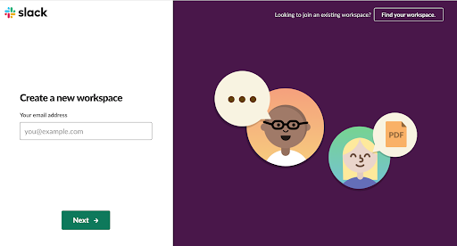
Take Slack, for example, they’ve gone through a number of user onboarding iterations. They’ve successfully pared down their content so users can quickly familiarize themselves with the interface.

Here are just a few things to keep in mind to simplify your process:
- Predictable and seamless elements, such as buttons
- Effective navigation, such as clearly labeled icons
- Frictionless and invisible interactions
- Purposeful and clear tasks or goals
- Guided behavior with design patterns, and clear hierarchy and readability
- Key features that catch the user’s attention
Users are familiar with completing tasks step-by-step, so this is often recommended and preferred. Group similar components together, and make sure each completed step is clearly indicated.
2. Copy that resonates with your user
Less is definitely more when it comes to word count. Showcases your product or explain the platform and set user expectations with short, clever copy that resonates with your target audience.
Copy grabs users’ attention.
Your copy should grab the users’ attention in a few words or short sentences, and thus, it should convey the essential message and your unique selling proposition, quickly and simply. Content that is short, clear, and in line with your target audiences has a much better chance of making an impression.

Provide detailed steps.
Avoid vague wording, such as “customize your profile.” Instead, be specific and show the user the steps -exactly- that need to be taken. Focus on an action you want your users to take, and make that action crystal clear. Some examples include:
- Enter your email address
- Add a profile picture
- Create a user name
- Choose a password
Provide the why in the steps.
Take this a step further by providing the user with a reason. Simply asking a user to perform an action won’t motivate them. Back your tasks up with stats, or other motivating factors. You should know exactly who your target user is, what they are familiar with, and the intended end goal.
What are they trying to accomplish, and what are their expectations? Taking the time to identify these means you can appropriately solve their problem by creating a process that guides and motivates users seamlessly through a series of tasks.
Informal language, emojis, etc., can help showcase your brand’s personality and make your checklist more user-friendly.
Snappy content and a simple call to action that gets straight to the point, means you’ve got the ingredients for a great user onboarding experience.
3. Measure your user’s progress
Seamlessly guiding and leading your user through the user onboarding process is imperative. Don’t leave your user in the dark – show them their process and clearly map out their journey.
During a lengthy or unique process in onboarding.
If your user onboarding process needs to be a bit longer, provide a progress indicator so users have a visual for how long the form will take, or how many steps they have left. Think of it as showing them the light at the end of the tunnel and eliminating distractions along the way.
The light at the end of the tunnel can be done in a few ways. Provide a simple progress bar with icons or a slider, or divide your form into shorter steps, such as Amazon’s checkout process. When contemplating features or elements, always consider if it’ll enhance or diminish your users’ experience.
Start with what’s absolutely essential and ensure that every feature has a purpose. Only include and add features that you can clearly defend the need for. Design cues play a major role in how a user will interact with your design, so make sure they’re communicated clearly.
Even the tiniest tweak to your user onboarding process can have a massive impact.
For example, increase the chances of your user staying on task by removing site navigation. Keep in mind that humans are visual creatures, which is exactly why certain designs resonate, while others go completely unnoticed. Even the shape of your button can predict whether or not someone instinctively understands how to accomplish a task.
4. Rewards and little wins
When we perceive a task as difficult, or time-consuming, we’re more likely to procrastinate and put it off.
Alternatively, if we feel motivated, see the value in something, or receive a quick win, we are more likely to begin a project, task, job, or so forth.
Providing users with a quick win upfront is a great way to get them started. Make sure it’s an integral part of your onboarding process. Duolingo for instance, asks its user what language they want to learn and provides them with a list of options as well as the number of learners for each option.
Don’t present it to the baby.
Keep in mind that oversimplifying can become tedious and overbearing. Once you’ve built up a user’s confidence and they have become familiar with your interface, you can begin rewarding the user by reducing the amount of guidance and instructions you provide.
Incorporate more innovative and abstract ways to move users through tasks, quickly. Implement elements, such as keyboard shortcuts, to accomplish tasks more seamlessly, while simultaneously making your onboarding process more user-friendly.
5. Motivate users with gamification elements
Building off the idea of little wins and rewards, every application or experience must present its user with some sort of motivation to engage or to give them purpose, like engaging in something that is bigger than themselves.
Most people require some level of challenge in their lives to stay motivated.
Whether you’re challenging yourself, a friend, or completing tasks to win some sort of reward, winning feels satisfying when you’ve been sufficiently challenged. Take video games, for instance, video games get a bad rap for being extremely addictive, and mind-numbing, but it takes hard work to complete a difficult game.
Users enjoy challenges, whether challenging themselves, working to win awards, or competing with others. It turns out that nothing makes us happier than hard work. We all like to be challenged, especially if we are rewarded.
Gamification elements are a great motivator.
Gamification design increases user engagement because it’s rewarding and motivating. Seamlessly including a few relevant elements, such as leaderboards and badges, into an existing system allows designers to tap into the same benefits of playing a game.

When users feel that they are making progress, developing skills, or overcoming challenges, it provides them with a sense of accomplishment.
Gamification is notorious for being difficult to implement well, as gameplay elements can appear completely out of sync, distracting, and may even deter users that don’t respond well to it. Earning a trophy is only satisfying if it is the result of successfully overcoming a challenge.
Every element used needs to optimize and motivate people’s feelings in order to make tasks fun and engaging experience. The key is understanding your users and identifying their motivations, which will vary according to the task, objective, and player.
When done well, game elements set clear tasks that lead to awards when they successfully accomplish the tasks. When a clear goal is attached to a task, it provides users’ with a sense of purpose, motivation, and a reward to look forward to.
Challenging the user to try something that’s incrementally harder than the previous task provides that sense of progress, challenge, and reward.
6. Add visuals, videos, or GIFs
We live in a world of imagery and videos to help improve customer engagement and understanding.
Creating videos with a screen recorder and GIFs with a gif-maker will improve the onboarding process. Product how-tos can be quick to make and provide more value than just text alone.
7. Test and revise
Once you’re done, it’s time to test your user onboarding process. A great user onboarding process is all about trial and error, which means it’s an ongoing process that may need revising. User onboarding is conversion-oriented, and thus crucial to any business, as they’re the tool that turns leads into buyers. You can’t afford to have a poorly designed user onboarding process that doesn’t create a positive, painless experience.
The best way to learn how your audience will respond to your user onboarding is with thoughtful A/B tests. A/B tests provide the perfect opportunity to determine which features convert the most leads.
Tailor your onboarding process to create a great experience that encourages them to keep coming back.
You want your onboarding process to be a great experience, a process that fits your brand, fulfills your business needs, boosts conversions, and makes a lasting impression on your users.
Target audience
Get clear on who your target audience is so you can speak directly to them. We also suggest always staying open to feedback, testing regularly, and revising it to ensure you continue to meet your goals.
Instantly test the effectiveness of your product onboarding checklist with users and get invaluable insight based on direct input and real user interaction with CloudApp.
Comparing slightly tweaked variations is one of the best ways to create a successful onboarding process and get concrete data on which variation attracts more customers. Simple changes can help you analyze different results and optimize accordingly.
The post 7 Tips to Create the Perfect Product Onboarding Checklist appeared first on ReadWrite.
(37)


