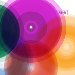
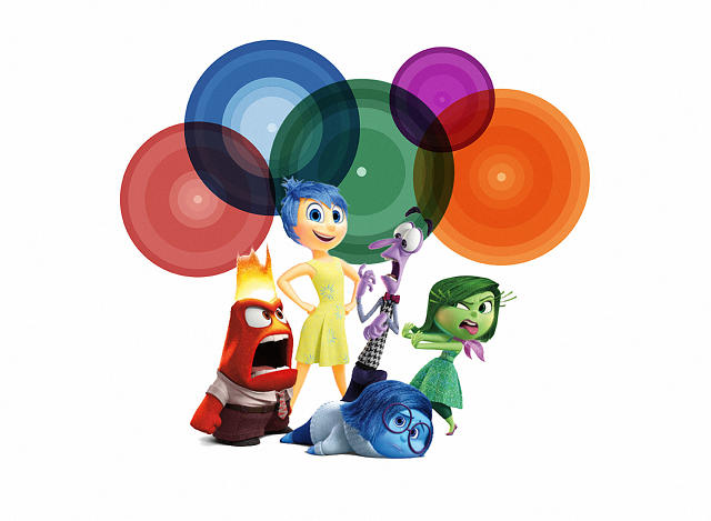
The five circles slowly pulsing on my screen are meant to visualize the entire core of human emotion. Fear. Disgust. Anger. Sadness. Enjoyment.
Reductive? Yes. But that’s exactly the point of the Atlas of Emotions, a compelling new data visualization commissioned by the Dalai Lama. Based on psychology research and rendered by Stamen, one of the top data visualization firms in the U.S., the atlas was designed to “increase understanding of how emotions influence our lives.” It launched last weekend and has already been viewed by 170,000 visitors around the world.
“The Dalai Lama and I have had a series of dialogues—we’re up to about 60 hours of one-on-one conversations—and in one of them, he said to me, ‘When we wanted to get to the new world, we need[ed] a map to get there. Could you make a map of emotions so we could get to a calmer state of mind?’” researcher Paul Ekman says. “When I realized this wasn’t just a passing fancy—he does have many passing fancies—but something he was seriously asking for, I took it on.”
Ekman is a prominent psychologist whose studies on universal human expressions—the smiles and scowls we share across cultures—became foundational for the modern era of emotion research. Working with his daughter Eve, who is also an accomplished researcher, Ekman polled more than 200 scientists who study emotion to learn—egos, academic grants, and papers aside—what did they believe to be true about the human emotional states?
The results became those five “continents” you see on the site today: fear, disgust, anger, sadness, and enjoyment. (If they seem strangely familiar, you probably recognize their cartoon cousins in the Pixar film Inside Out, on which Ekman was a consultant.)
But they aren’t purely empirical. “I don’t have evidence for everything in the map, but it’s what I’ve been considering and focusing on for a lifetime,” Ekman says. “So some of it represents very agreed upon evidence. Some of it represents things that only I have observed. Some of it represents my best guess. Give me another 50 years of life, and I’ll get research evidence for every aspect of it. It’s not ephemeral. There’s just only so much I can do in one lifetime.”
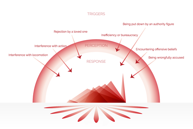
In the atlas, the emotions are clinically detached from the viewer. It starts with five “continents” of emotion that sit upon several strata of information. Click into an emotion, and you get a graph of “states” within that emotion. Click into states, and you’ll find actions that emotion might cause. Click into actions, and you’ll find out the triggers that could incite the emotion. Each layer of knowledge is just another click away.
As soon as you load the site, you’ll see that the five core emotions seem to ebb and flow with a certain randomness, like planets that may or may not be influencing one another with their gravitational pull. Every time you reload the site, you’ll see the positions change, so that you don’t put too much stake in their interdependent relationships.
This five-orb approach wasn’t immediately obvious. In fact, Ekman met with the data visualization firm Stamen Design every week for two years, giving feedback, and occasionally completely rethinking the direction of the project, as he went.
At first, Stamen turned to the Buddhist tradition for aesthetic inspiration. “Originally, we’d tried to make a mandala of emotions, and have them arranged precisely next to each other,” says Eric Rodenbeck, CEO and creative director of Stamen Design. “Paul rejected a lot of those ideas, because it was too crisp and clear. It would read like fear was halfway between disgust and sadness.” Eventually, these orbs, floating in an intriguing but largely meaningless way, become the new direction.
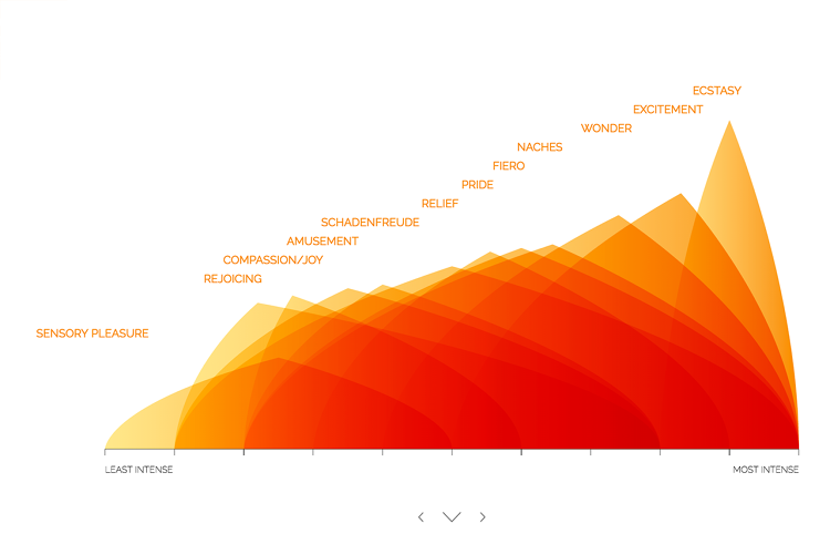
Click into an emotion, and new graphs appear, breaking emotions into their many states. Anger, for instance, becomes divided into violent spikes, including annoyance, frustration, vengefulness, and fury. Meanwhile, the states of sadness look like blurry tears.
The atlas never relies on a single rendered gimmick. “We originally had [emotional states] as a bar chart, and it looked boring,” Rodenbeck says. “For disgust we thought of piles of poop—let’s make it a little icky. To do that programmatically was super fun.”
For viewers, the visualization encourages introspection. Exploring the various states of enjoyment, I can’t help but consider how sensory pleasures in my life—like a good meal—differ from sensations like pride or wonder. I’m surprised to see schadenfreude categorized under enjoyment. I think of enjoyment as such a positive force in my life, but taking joy in the misery of others puts a dark spin on my happiest emotion.
And there are practical implications here. Whether or not you subscribe to the Buddhist practices of mindfulness, psychologists have found that cognitive behavioral therapy—being able to recognize your emotional states and take a proactive view of understanding their causes—can be an extremely effective way to manage day-to-day stresses. In this regard, it’s easy to imagine the atlas as a sort of prescription for mindfulness. And indeed, Ekman hopes its effectiveness as a clinical tool might be studied into the future.
Cover Photo: Darko Sikman via Shutterstock
Click on any of them, and you’ll be taken to a breakdown of that emotion, into “states.”
From there, you can see triggers.
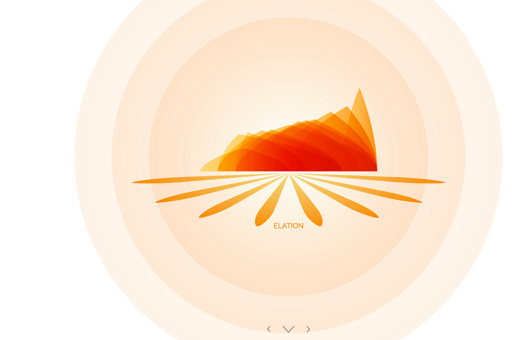
Note that every emotion is depicted a bit differently–these aren’t just bar graphs, but abstract interpretations of emotions.
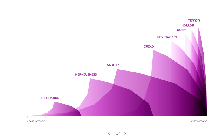
And as you dig through the visualization, things only become more abstract, as they become more theoretical.
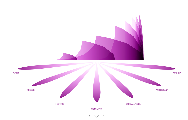
That’s by design. This too is not a scientific paper.
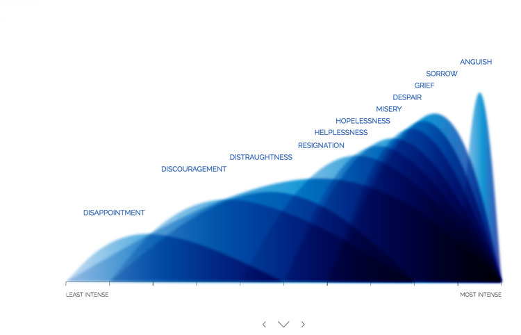
Instead, it’s a way to learn about your emotions–a map for mental stability.

Fast Company , Read Full Story
(62)