A Practical Vision For The Hyperloop Experience
Why should high-speed tubes look all that different from high-speed flight?
In 2013, Elon Musk unveiled a radical idea for high-speed transportation: a metal tube that fired passengers to their destinations in canisters traveling 760 miles an hour. The Hyperloop, as he called it, could make a trip from San Francisco to Los Angeles in just 35 minutes.
Musk published his vision as an open-source white paper, leaving the design details for others to consider (see various interpretations, some more rooted in reality than others, here). One of the greatest challenges: choreographing the travel experience itself. How would people board the Hyperloop efficiently, and what would they look at inside the tube other than gray walls? What about the creature comforts? The bathrooms? The corridors? Trapped in a confined space, these aren’t luxuries but essentials. So the Austin-based design consultancy Argodesign decided to take on a side project, imagining how the Hyperloop could become, not a sci-fi fantasy, but a comfortable way of traveling.
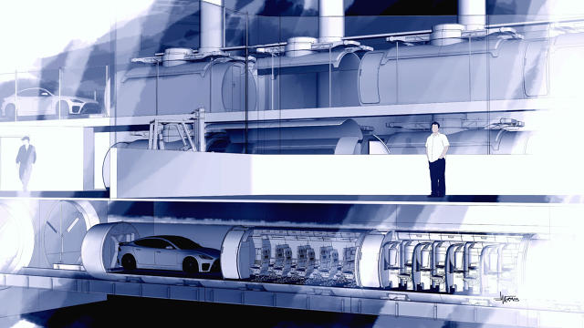
“Everything we’d see pictured the experience as an amusement park ride. Something you get in, move super fast, and get out,” says Argodesign CEO Mark Rolston. “There was almost no attention paid for what it would be like for ordinary citizens to take this as a daily commute.”
The resulting renderings are merely conceptual, but they attempt to take into account the limitations Musk outlined in the white paper. Namely, cars are made of metal, as is the tube they ride in, which means that riders are trapped in the equivalent of big soda cans with no views to the outside world. To make matters worse, the canisters have no way of stopping and letting people off between stations. So the baseline experience is as claustrophobic as a submarine. Even more than a plane, you’re trapped inside. There’s no parachute exit. But four cars can link together to create 80-foot trains, with optional pass-throughs from car-to-car.
A “Jukebox” Setup
Within these parameters, Argodesign managed to develop something downright civilized. The designers started by considering, not just one cabin design, but what lead designer Chipp Walters calls a “jukebox” setup that would make every Hyperloop train customizable. A large robotic arm moves capsules between a three-part loading zone. The top zone parks vehicles inside the canisters (each canister is just large enough to squeeze in a medium-sized car). The second zone allows commuters to climb in. And the third zone—the track itself—loads the train.
A Familiar Place
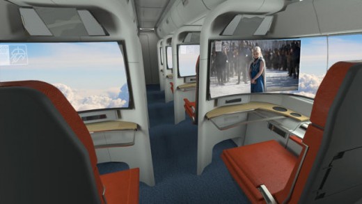
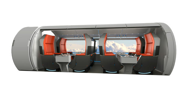
There are five types of canisters in all—a vehicle canister, a cargo canister, and three levels of passenger canister: executive, business class, and coach. The interiors of the passenger canisters take many of their design cues taken from the world of aviation. Both the overhead storage and stock seating—with screens built into chair-backs—could be straight off any airline you know.
Familiarity is important when you have a lot of people in a small space, Rolston insists. “As soon as you start packing a lot of people in a design, no matter how futuristic you want to be, it drives you toward a highly optimized experience you’re familiar with from an airline,” he says.
A Better Windowless World
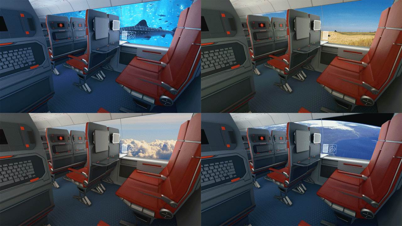
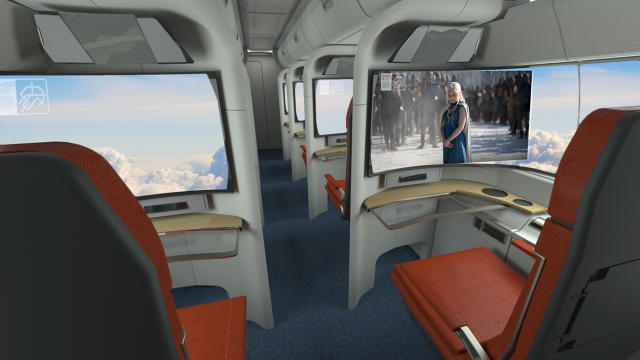
As for Hyperloop’s windowless cocoon: The designers imagine digital experiences beyond the limitations of tiny portholes carved into the walls. Business class passengers could have a screen wrap from their side around the front of their seat, simulating a front-row view of the world, as if they were in the Hyperloop’s cockpit. Hyperloop operators could curate the screens’ content, and it could range from a 700-mile-per-hour journey along the California coast to a completely wild trip with no firm grounding in reality. During your 8 a.m. work commute, you could take a rocket to space and back to Earth again, while on the 5 p.m. trip home, you might travel under the sea.
“Especially when something comes out like this, it’s got to be a bit premium, it’s got to be exciting,” Rolston says. “You could argue that the [virtual] trip scenery has to be there because people won’t deal with the claustrophobia of no windows, but it’s also part of the attraction.”
Coincidentally, Elon Musk and Space X just announced a new design competition to imagine the design of a Hyperloop pod. Learn more on that here.
[All Images: courtesy Argodesign]
Fast Company , Read Full Story
(288)

