Adobe released a super icon to combat misinformation. It may just confuse things more
By Mark Wilson
It looks like a wayfinding pin. Something you might see marking the nearest coffee shop or 15-minute oil change. Yet it has nothing to do with telling you where to go. Rather, it tells you where an image or video you’re looking at has been.
Called the “icon of transparency,” this new icon, logo, mark, sticker—whatever you want to call it—has been designed to sit atop or alongside images and videos to verify their provenance, in response to a world where the images we see feel less trustworthy every day. Its two letters, “CR,” are a play on “credentials.” This icon doesn’t actually verify if an image is real or AI generated. Rather, it’s there to flag if the work has been altered after its creation.

Soon, you will start seeing the logo appear on or around Microsoft Bing’s AI-generated images, photos from Nikon and Leica cameras, and marketing materials produced by Publicis Groupe—the world’s second largest communications agency that boasts clients like Nestlé, Walmart, and P&G. That’s right: This logo could be coming for your chocolate and deodorant.
“We think and hope it’ll become as ubiquitous as the copyright symbol, or the Creative Commons symbol,” says Andy Parsons, senior director of the content authenticity initiative (CAI) at Adobe.
The logo itself was developed by Adobe and BBC, cochairs of the C2PA UX task force. The C2PA is formalizing a standard for a related group, the Content Authenticity Initiative, a collection of nearly 2,000 companies, nonprofits, and individuals that have teamed up to promote a shared and open industry standard to authenticate digital media.
Its participants include tech titans like Qualcomm and Microsoft, camera companies including Nikon and Leica, and publishers like The New York Times Company (Adobe is the most outspoken, and perhaps involved, member of the group—and the icon of transparency was actually revealed at their yearly MAX conference).
So, what does the icon actually mean when you see it? That’s a question that’s harder than it should be to answer.

What an ‘icon of transparency’ really means
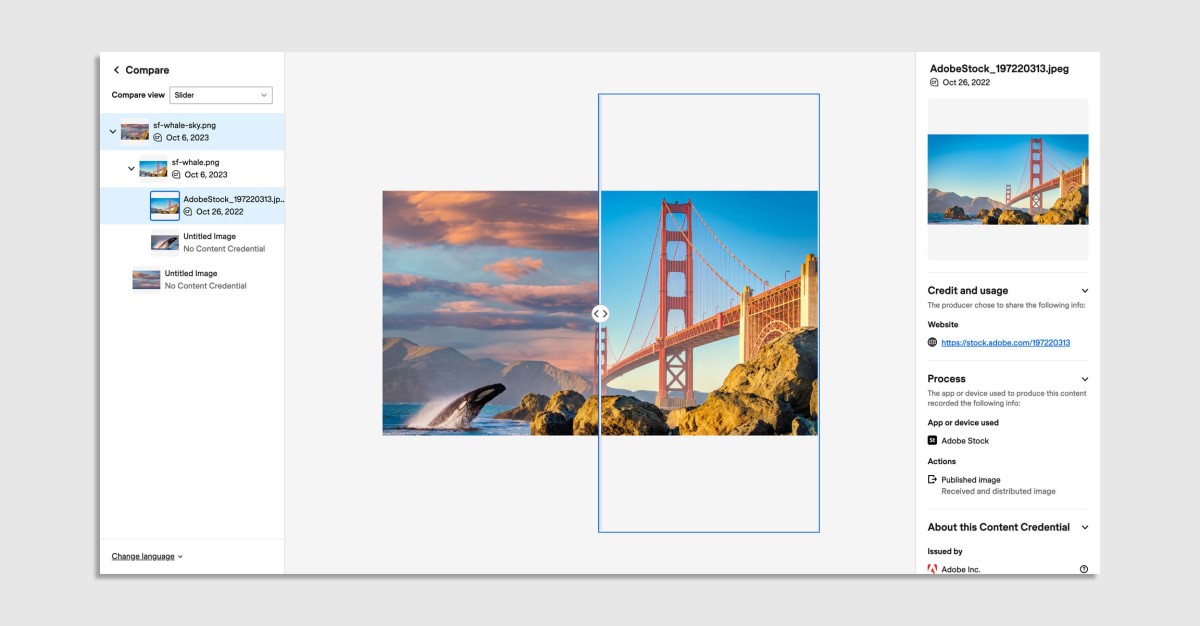
At its core, the logo certifies that an image is using Content Credentials, which is a series of open-source, opt-in metadata that can be attached to media. These credentials are already an option for Firefly and generative features like Generative Fill, and they are free for anyone to code into to their software or website. Content Credentials are what the group likens to a “nutrition label” for digital content, explaining the origins of and edits made to an image that you see.
Through some slick technology, Content Credentials can leave two types of marks on images: invisible watermarks printed into the pixels themselves, and/or this new icon. Watermarks can be erased, of course. “There are plenty of tools that can do that like Content Aware Fill from Adobe,” says Parsons. In contrast, this new icon is actually generated by a site or application so that it’s much harder to erase. Content Credentials metadata can signal to a website or app that any given media asset is credentialed—like an ID-check on the internet—and in turn, make this icon appear on or alongside the image through javascript.
Three years in the making, the core intent behind the icon is to battle misinformation and confusion around the origins of media. But exactly what these credentials mean may be confusing at first, or even second, glance.
“[We’re] hoping it doesn’t focus on authenticity, but transparency,” says Parsons. “This is not a blue Twitter check mark that says, ‘this is a photo of [whomever].’ We want to say ‘this is an authentic photo from a Leica camera.’”

But authenticity and transparency are ideas that Parsons himself conflates several times during our conversation—and to be fair, I can understand why. Each idea implies, but doesn’t replace, the other. In the case of a hypothetical chicken restaurant called Conrad’s, Publicis Groupe shared a concept of how the icon of transparency could appear atop an ad for a hyperbolic chicken sammie with two donuts for buns. “Could this heavenly delicacy possibly be real??” the audience might wonder. Well, there’s the tiny CR logo in the corner! It certainly implies that Conrad’s really is selling this chicken sandwich. But all it really denotes is that this image was produced on a certain date by certain software by a certain entity using Content Credentials.

What doesn’t work
Certifying media feels like a necessary movement, but it’s hard to ignore most certain capitalist overtones of the project—which I believe currently distort the functionality and clarity of this verification mark in its current state.
Of course, at the most surface level, there’s something that’s very tail-wags-dog about a fast food chain feeling like they need to declare, for the whole world to know, “this chicken sandwich with two donuts for buns is a verified real image by our company! Be sure to always check the logo before ordering!” But more broadly, I’m worried that these standards could consolidate power in media and business at a time when AI has the potential to positively challenge the status quo.
Consider how the icon functions if the original credentialed image is edited in four different ways:

To a user, if they see a red, they are likely to think, “Wow, this image is dubious!” It’s an alert after all! But all that red X really means is that this image was edited without someone signing it or tracking changes, all while keeping the original Content Credentials standard attached. That seem a bit odd, since dubious actors are more likely to simply erase the metadata anyway—meaning for the worst offenders, there may be no icon flagging the image at all.
Beyond that point, allow me say, for the record, that it’s okay to edit corporate images—a practice that’s generally protected by the law as an extension of our freedom of speech. Heck, Adobe basically built their entire business on the idea that unchecked visual creativity was a good thing. But the red X introduces a sort of punishment for some situations—edit this Content Credentialed item in a competitor’s app that doesn’t support the standard? Red X!
As for Publicis clients, like Cartier and Procter & Gamble, they are likely more concerned about verifying supply chains and distinguishing from knockoffs than enabling the wider community leeway to remix their work. And that shows right in the icon of transparency. Make a change to corporate-stamped work without signing your name on it and it’s—red X!—wrong. But strip away the metadata, and it’s a moot point because nothing will show.

The other very confusing thing about the icon of transparency is that AI-generated images can have this stamp-of-approval, too. So, you may have images being shared by National Geographic photographers (a member of CAI) stamped with the icon, and you also have Bing and Firefly hallucinations stamped with the icon. Yes, the symbol is just to verify provenance, not authenticity, but I’m not sure that the on/off, icon or icon-with-X symbology that the CAI has adopted properly resolves this nuance. Who cares if you technically can find out more information by tapping down into links and popup menus if you confuse a large number of viewers first?
To make this more tangible: The way Adobe and partners have set this up is such that I could theoretically AI-generate a hamburger or watch in a way that looks like it belongs to a big corporate brand, that can be credentialed. It’s in the clear! But if I edited a real hamburger or watch that belongs to a credentialed brand, even just changing a single pixel without signing my name on the file, it’s flagged. In other words, the smallest adjustments made to real images can be flagged as more questionable than completely made up pictures.

Finally, if we are marking reality with the same stamp as AI-generated imagery, then aren’t we simply accelerating on our path where distinguishing fact from fiction is impossible? Have we actually enabled a behavior that we’ve intended to eliminate? Will this symbol of clarity only drive more confusion?
To be clear, I have no doubt that the people behind the initiative—a full four painful years in the making—have the best of intentions. And I agree that a system to trace provenance of media is vital (if possibly futile) for our future. But the largest mistakes that design can make are those of unintended consequences and exclusion, and in its current state, this logo raises flags on both fronts for me.
We have updated this story to accurately explain when the Content Credentials red X appears.
(21)

