Amazon is updating Kindles to make them easier to navigate
Amazon Kindle review (2019): The Paperwhite gets a run for its money
Let there be light.
Like many gadgets, the Kindle line follows the “good, better, best” marketing strategy. A few years ago, this would mean the difference between features like a touchscreen, better contrast on the display or a much-needed front-lit screen. Today, the distinctions between Kindle models are subtler. When Amazon recently announced that the “All-New Kindle” (that’s the basic, non-Paperwhite, non-Oasis model) would come with a front-lit screen, the last big deal-breaker for the most basic e-reader was finally dissolved (unless waterproofing is a must have). For less than $90 (with “special offers”), there’s finally a Kindle you can read in the dark, that has a touchscreen, and supports Audible over Bluetooth. I’d wager that for a large slice of Kindle readers, the reasons to spend extra on a Paperwhite are getting more specific.
Kindle (2019)
9 reviews
1 review

Pros
- Finally a front light screen on the lower-end Kindle
- Improved contrast display
- Smaller and sleeker design
Cons
- Only one storage option
- Recessed display will catch dust and dirt
- Not waterproof
The big news here is clearly that illuminated display. There was a time when even the premium Kindle meant reaching for the reading light (much as I loved my Kindle Keyboard, I also like reading at night). In fact, for about five years after the first one, all Kindle owners were consigned to squinting when the lights went down — that is until the Paperwhite arrived in 2012 with its four LEDs in tow. Since then, those LEDs have likely been the main reason to make the leap from the budget model to the Paperwhite.
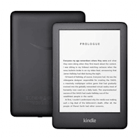
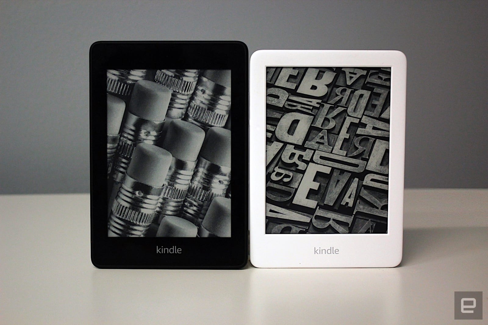
Of course, that’s not all that’s new here. Amazon gave the latest Kindle a modest redesign, even if that’s mostly a matter of smoother edges and a different logo embossed on the back. (No “Amazon” text, but the trademark smile/arrow remains.) The device is also slightly smaller than the model it replaces, by about 2mm (barely 1/8th of an inch) in both depth and width. Despite the sleeker footprint, it gains a little weight — an additional 13g, or just under half an ounce. The size difference is more noticeable when you place it beside the Paperwhite. Also, I find the proportion of the bezels around the display less attractive on the Paperwhite, but that’s entirely subjective.

The screen density remains the same as the previous model at 167ppi, but the contrast is much better than on older models. The E-ink panel used is similar to that in earlier Paperwhites (E-Ink Carta 1.2 for those asking). Of course, the pixel density is lower (the current Paperwhite offers 300ppi), but depending on what you like to read (or rather, how graphical it is), I don’t know how much that will matter.
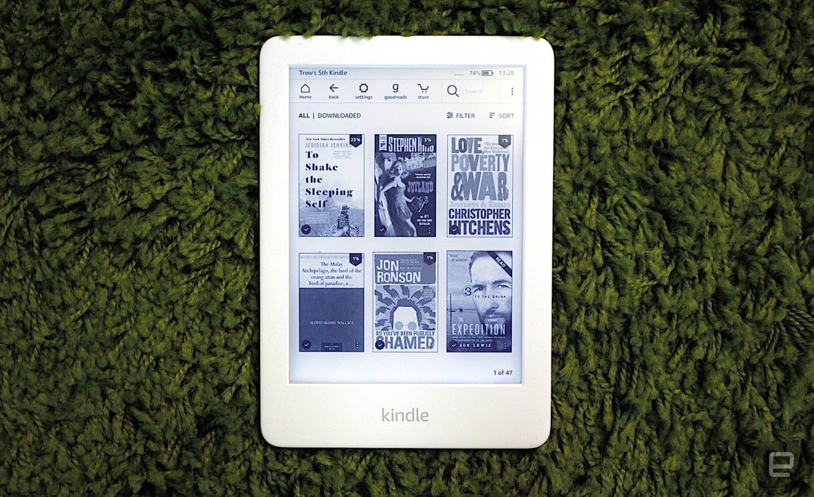
When I compared the home screens of a current Paperwhite to the All-New Kindle, the difference in quality is visible. The small images of book covers show less detail on the new budget model than the Paperwhite. Other tells include when you download something, and the spinning circle in the corner pops up; it’s much “smoother” on the Paperwhite. But once you open a book to a full page of text (i.e., when you’re actually reading), the difference in sharpness is less obvious. And given that reading is mostly just text, this lower resolution might not bother you much, if at all.

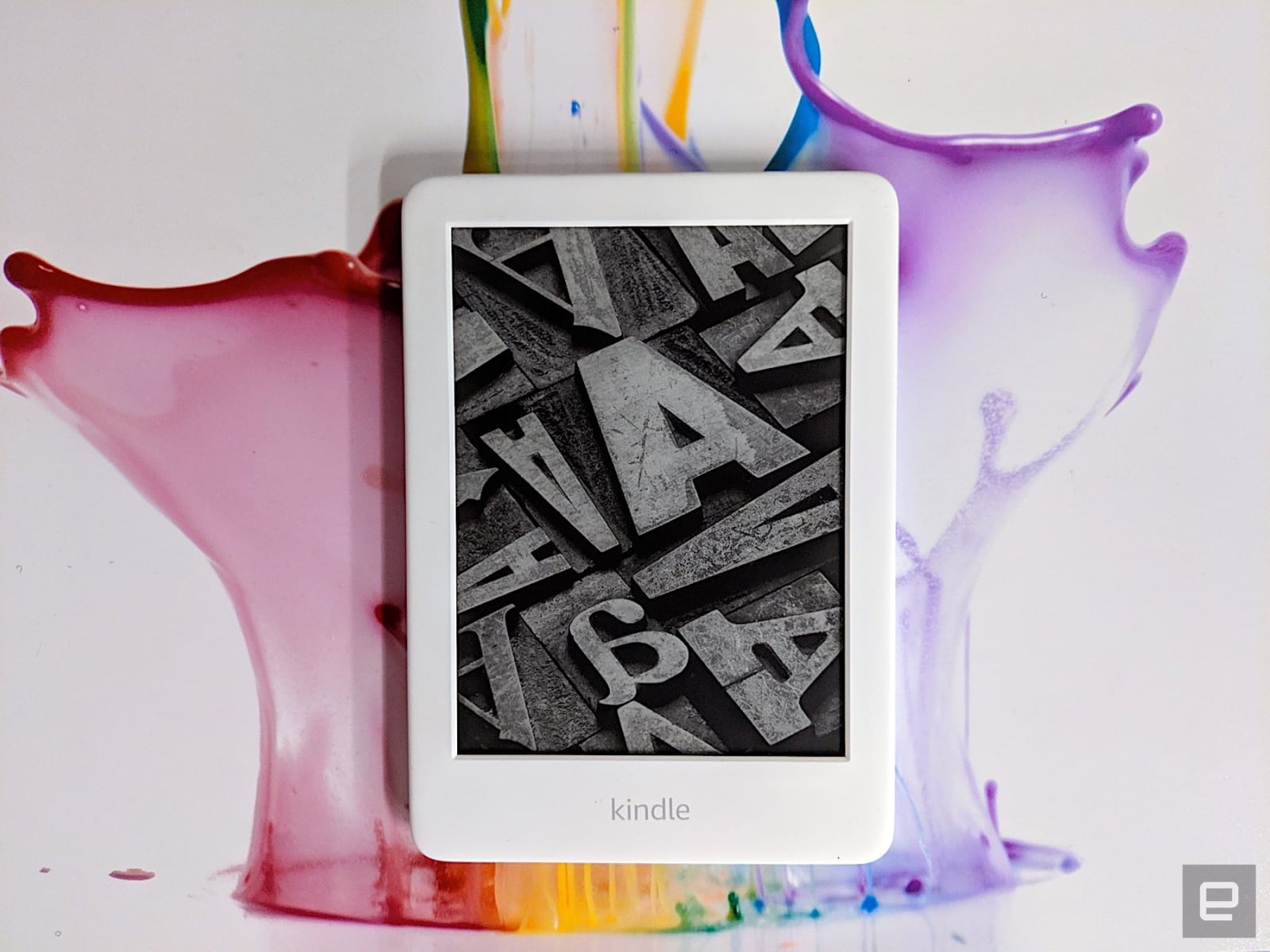
As for that contrast, I almost think the cheaper Kindle goes toe to toe with the Paperwhite, though I always found the “white” in Paperwhite to be more like “Paper-a bit less gray.” I keep checking the two next to each other on the same page of the same book, and while there is a difference, it’s not significant in my opinion.
There are two things about the display here that I’m less thrilled about. One of the more underrated aspects of the latest Paperwhite screen is how it sits flush with the bezels. A small detail, but one that prevents lint, dust and small hairs getting trapped in the lip where the screen meets the bezel. That said, I can see that some might find that a flush screen means it’s also easier to accidentally rest your thumb on the display, causing unwanted page turns. I’ve never had that problem, though, so the presence of a lint trap here is a small grumble. In a similar vein, some might prefer physical page turn buttons, but those folks are out of luck here.
The other thing, based on my testing so far, is that I often have to tap twice to turn a page, as my first try isn’t recognized. This might be how I am holding it, or the slight change in weight and dimensions, but I have noticed it enough to mention it. Perhaps the lack of muscle memory for the extra millimeter or two my finger needs to travel to hit the recessed screen is causing it? Hard to say.
The Paperwhite’s flush screen serves another practical purpose: waterproofing. That’s not a feature shared with the new budget model. Waterproofing is definitely a big “nice to have,” but for the amount of time I spend reading near water, I personally can live without it. If it’s important to you, you’ll definitely want the Paperwhite, which has had waterproofing since the latest model came out back in November.
I’m particularly interested in this Kindle as I’ve always opted for the higher-end models, mostly because of that front-light. If I’m going to spend a lot of time with this thing in my hand, anything that makes the experience better seems like money well spent. I’ve never felt the need for the Oasis, though, but that’s as much about the curious form factor as anything else. My wife has an older, basic Kindle with physical buttons and no LED-illuminated display. Her reading habits are different from mine, and it works for her, but I always find it a bit restrictive when I use it. Harder to read in changing light conditions, and pecking in text with a four-way button is just no fun.

The detail-oriented might have spotted that the display on the All-New Kindle only has four LEDs, compared to the Paperwhite’s five. It’s hard to quantify how much of a difference this makes, but when I tried various brightness settings on both (side by side), I didn’t spot any gaps in light coverage or even much difference in how bright they were. Battery life also doesn’t seem to be affected either way; after several hours of reading, I’m still well over 70 percent.
If you can live with one less LED and a lower (yet perfectly legible) text resolution and don’t mind the lack of waterproofing, you might think this is a no brainer. And for most people, it probably is. The only other major difference worth noting is that the All-New Kindle only comes with one storage option: 4GB. The Paperwhite starts at 8GB, with an option for upgrading to 32GB. Again, this is something that won’t faze a lot of people as the average ebook doesn’t take up much space and reading takes time, so even with a dozen books stored you’re probably okay for a while.
But if you read long, graphically intense books and definitely if you love Audible, this lower amount of storage might start to feel restrictive. In many ways, it’s the new “big difference” between the lower end and the Paperwhite. For those who rotate the library on their Kindle infrequently, it’s not an issue, but for everyone else, it’s something to consider.
Kindles last a good few years if you treat them well or (ahem) don’t keep leaving them on planes. (I’ve done it three times and counting now.) So for most people on an older Kindle, now is a very interesting time to upgrade. The gap between the All-New Kindle and the Paperwhite has never been smaller in terms of key reading features, while the price gap remains more or less the same.

There’s a reason I haven’t spent much time comparing the previous-generation basic Kindle and this one (the illuminated display makes that a no brainer). It’s whether the All-New Kindle is going to eat some of the Paperwhite’s lunch, and I think it might.
Of course, things get complicated thanks to Amazon’s special offers (ads) pricing. Opting out of the offers bumps the All-New Kindle up to $110, putting you just $20 away from the Paperwhite (with the offers). So the real decision then becomes how averse you are to being advertised to during your reading time. For me: very.
Like for like, however, there’s a good case to be made for the All-New Kindle being the best choice for most people. It’s small, comfortable to hold, easy to read and now it’s also bedside ready. It’d be nice to have the option of more storage, without making the leap to the Paperwhite, but I guess Amazon needs to hold something back for next time?
(43)


