Amazon Prime’s UX works disturbingly well as a dating site
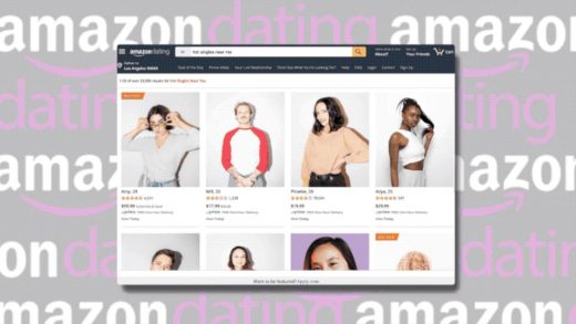
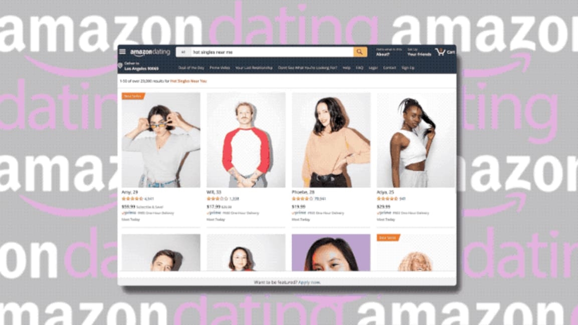
With Valentine’s Day coming up in less than two weeks, singles may be despairing. Luckily, Amazon Prime is letting you order a date with a “hot single near you” as easily as you might snag a bulk pack of toothbrushes and cat litter.
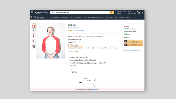
The parody, developed by creatives Ani Acopian, Suzy Shinn, Morgan Gruer, and Thinko, shows how Amazon’s UX design would work as a dating site. Each singles page resembles a product page, listing personality traits. Thirty-three-year-old blonde and tattooed Will (three stars), for example, “believes that Epstein didn’t kill himself” and “recently started a podcast (exclusively on Patreon™).” He will write me poetry in the style of Rupi Kaur. That’s a hard pass from me, Will.

Customer reviews are also included: A reviewer by the name of Andrew J. Homan gave 20-year-old blue-haired Soho-house member Nollie two stars, cryptically commenting, “I almost never write a bad review, subscribing to the adage ‘if you can’t say anything nice, don’t say anything at all,’ but this is like drinking warm, brown water.” Ouch.
Amazon has really committed to the bit, giving you a number for your order, publishing additional documents including a “non-ghosting agreement,” and partnering with micro-influencers on Twitter. Singles can also apply to be on the page by filling out a questionnaire. An FAQ attached to the website will answers users’ most pressing questions: “Q: Is this for real? A: No. Q: How does it work? A. It doesn’t.”
AmazonDating is obviously a joke, but it’s not as far-fetched as it should be. Another major tech company, Facebook, has already embraced online dating, and Amazon’s UX is remarkably well-suited to the cold efficiency of online dating. The company already supplies almost everything a person might need in life. Why not order a date with Matan, who “recently quit the juul”?
(34)


