Amazon’s Appstore is finally working again on Android 12
Android 12 review: Living in a Material (You) world
My eyes love the visual refresh, and surprisingly so do my fingers.

Android is forked. There are so many versions of it around: From stock Android to Google’s own Pixel-first edition to Samsung’s One UI 4 overlay, there are enough variants to overrun the Time Variance Authority (Loki, anyone?). That means that writing a review of Android 12 is a complicated task. With so many branded and device specific tweaks, it can be hard at times to differentiate core Android features from the window dressing.
The land of Android is messy, but we’re going to keep this review of Android 12 simple. If you want an idea of the Pixel-only features, head over to our Pixel 6 Pro review where I covered things like Live Translate and Magic Eraser. Features like HDR Net videos and white balance controls are also exclusive to Pixels, though that doesn’t mean they won’t one day roll out more widely.
Android 12
Pros
- Material You provides a refreshing and beautiful change
- More transparency over data use
- New animations make system feel more responsive
Cons
- Confusing charts in battery and privacy dashboards
- Audio-coupled haptic feedback still absent
- Too much variation across ecosystem means uncertainty over what features will be available to all
Material You everywhere
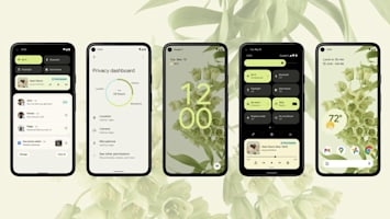
Functionally, that means there isn’t much obviously different for those on other devices upgrading to Android 12. The biggest change will be the new Material You design, and how much of that makes its way to your particular handset will depend on your phone’s maker.
On One UI 4, for example, you’ll get something similar to Material You by way of Samsung’s “whole host of new Color Palettes,” which like Google’s version will apply to menus, buttons and icons. But these aren’t automatically generated by the phone based on your wallpaper, and have a distinct Samsung-y cartoonish style that Galaxy users will find familiar. One UI 4 and Android 12 both also offer new widgets that look much better and offer more customization options than before.
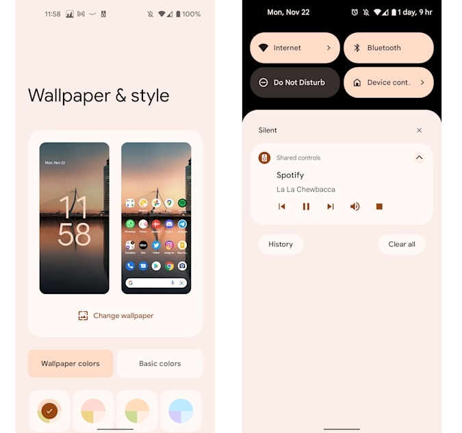
So Android 12 is a nice visual change, but it does go beyond aesthetics and affects how you interact with the system. Sliders and buttons are larger than before, which some might find ugly compared to the cleaner, thinner options of Androids past.
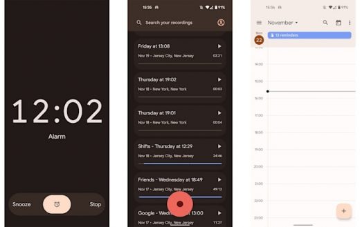
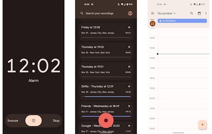
After living with this new style for a few months, I’ve gotten used to the extra chonky navigational elements. In fact, in some apps, like Clock, the bigger targets are easier to see, and I can hit the Snooze slider more easily from bed. They even look pretty thanks to Material You, which beautifully infuses everything from the Settings shade to keyboards and numpads. I also like that the new lock screen clock takes over the whole display when you don’t have any notifications.
There’s plenty of little things that Google added throughout Android 12, like new animations across the interface and updated limits to toast dialogs. Those are the little boxes that pop up at the bottom of the screen when you copy text to your clipboard, for example. I’ll focus on just a few of the more obvious changes, starting with the quick settings panel and notification shade.
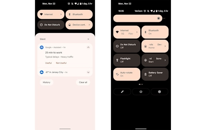
In general, Google’s been busy decluttering. It removed the redundant “Conversations” and “Notifications” headers from the notifications list that took up extra lines, while using a background color in this area that’s close to the cards, making everything blend more smoothly. The Quick Settings area up top has a black background and just four buttons compared to the six from before, which means you’ll now need an extra swipe to access things like Battery Saver or Auto Rotate toggles. Of course, you can rearrange these to put your favorites first, but you’ll only be able to pick four.
This is a bummer, but at least when you make that extra swipe in Android 12, you’ll see eight settings shortcuts as opposed to just six. The net convenience lost or gained here is… kinda zero.
I also don’t love that Android 12 will default to summoning the Google Assistant when you long press the power button, but at least you can revert it to show the restart, shut down, lock and emergency buttons.
One of the most common ways I interact with my phone is by tapping the search bar at the bottom and typing either the name of an app I want or the show I’m about to watch. Nothing’s changed here since Android 11, you’ll still see your recent entries and suggested apps when you hit the text field. But if you use the search bar in the All Apps drawer, which requires a swipe up, you’ll get Android 12’s universal search. This will let you find things on your phone, including not just apps and contacts, but conversations within supported apps as well.
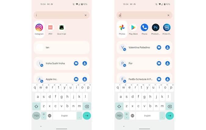
I randomly hit “D,” and was shown a row of suggested apps, like Discord and Discovery+. Below that was a list of people from various apps, like my colleague Devindra on Gmail, as well as conversations with some guys named Dan and Dylan from Hinge. It also showed actions from specific apps, like “Submit a Front Desk instruction” in my building’s portal and “Connect with Mat Smith” on Duo. When I typed “the,” I got suggestions to order from “The Old Spot” on Uber Eats and quickly hail a ride to “The Westin Grand, Berlin” on Uber. Both are places I’d saved as favorites.
Finally, at the bottom, you’ll find an option to submit your query to Google’s search engine. Chances that I’ll scroll so far down the list are slim, but at least it gets shorter the more letters entered.
More privacy and battery information
Most of the changes in Android 12 I’ve described so far are in your face, and you’ll see them as you interact with the system. Others, like the new Privacy Dashboard, are things you’ll have to look for in Settings.
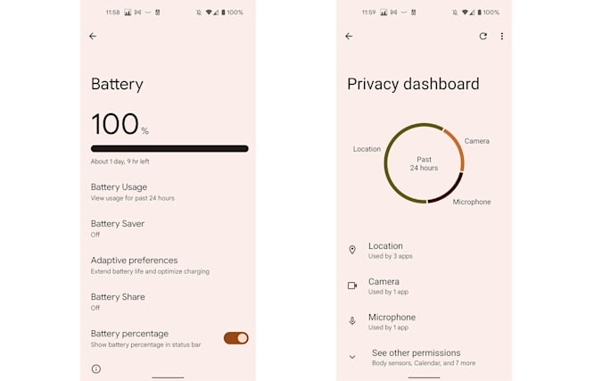
That means they’ll be less impactful on your daily use, but they are, for the most part, informative. The Privacy Dashboard helped me realize that my camera and mic are activated a ton and showed the apps I most often use that require them. And speaking of, Android 12 also provides new indicators for when your mic and camera are being used (a green dot appears in the top right corner of the screen). This is basically the same as on iOS, except Google requires one more tap on the dot to see which app is accessing the sensor.
While the Battery Usage page isn’t new, it’s now more prominently featured as the first option in the Battery settings panel — you won’t have to tap a separate three-dot button to find it. Google did appear to update the graph showing your power levels for the last 24 hours, with the horizontal axis now poorly labeled with just the numbers 1, 7, 1, 7 and 1 (or 13, 19, 01, 07, 13 on the phone I set to military time) instead of “xx hr ago” and “xx min left”. I found myself ignoring this chart most of the time, since it isn’t all that helpful.
In the months I’ve been using Android 12, I’ve seen more apps ask for permission to access my specific or approximate location. I almost never selected the latter, but it’s nice to have the option for things like the weather app. In general, though, I relied on the “Allow this time” or “Allow while using” choices as a way to grant limited permissions to apps. Google will also tell you, after some time, which apps you haven’t used in awhile. It’ll automatically revoke permissions for those, which is nice. None of these apps were things I used often enough for this to be a problem.
That’s… pretty much it for the major new Android 12 features. I’m still waiting to see an app that uses the new audio-coupled haptic feedback, since I enjoy the sensation it adds to games I’ve played on the iPhone 13 Pro. But there don’t appear to be any at the moment. Google is also constantly pushing out security and stability updates for Android 12, so maybe there are still more features to come.
Wrap-up
Ultimately, the biggest things Android 12 brings are Material You design and more privacy tools. That might seem minor on paper, but the visual refresh and faster animations throughout the system make it feel drastically different. Plus, Google continues to drop feature sets every quarter or so, meaning each version of Android doesn’t have to be as major of an upgrade. But if you’ve been looking for a fresh face for your phone, Android 12 is a fun, satisfying update.
(52)

