Amazon’s Kindle Paperwhite drops to $110, plus the rest of the week’s best tech deals
Kindle Paperwhite Signature Edition review: The best e-reader. Period.
A bigger screen with smaller bezels makes the Paperwhite better than ever.

One thing you can definitely say about Amazon’s Kindle: It’s not the kind of device you need to upgrade often, even if you’re an avid reader. I’ve been using the same one since late 2015, and it’s still going strong. But Amazon caught my attention with the 5th-generation Paperwhite. For the first time since the original came out, Amazon increased the display size to 6.8 inches from 6 inches, and it has narrower bezels than before. It also now uses 17 LED backlights (up from only five) and an adjustable “warm light” to reduce eye strain at night. Amazon has also finally switched to USB-C for charging.
Those are some notable new features, but Amazon is also offering a “Signature Edition” (SE) this year, which has 32GB of storage (the standard model only has 8GB), an automatically adjusting backlight, wireless charging and no ads on the lock screen. And it’s still waterproof, can play Audible audiobooks over Bluetooth and has tremendous battery life. At $190, it’s not cheap; nor, at $140, is the standard Paperwhite. But, if you’ve been using yours for as long than me (or longer), there’s a lot to like here. It doesn’t radically change the Kindle experience, but does make it a lot nicer.
Kindle Paperwhite Signature Edition
Pros
- A bigger and more responsive screen
- Tiny bezels
- USB-C charging and wireless charging
- Plenty of storage
- Automatic brightness and warm light options make the display better than ever
Cons
- Signature Edition is expensive
If you’ve used a Kindle at all in the last decade, you’ll be familiar with the new Paperwhite’s design. Like other e-readers, the Paperwhite is dominated by an E Ink touchscreen that has gentle backlights you can turn on or off and adjust to fit your reading conditions. Like earlier Kindles, the rest of the device is soft-touch plastic that picks up fingerprint grease a little too easily.
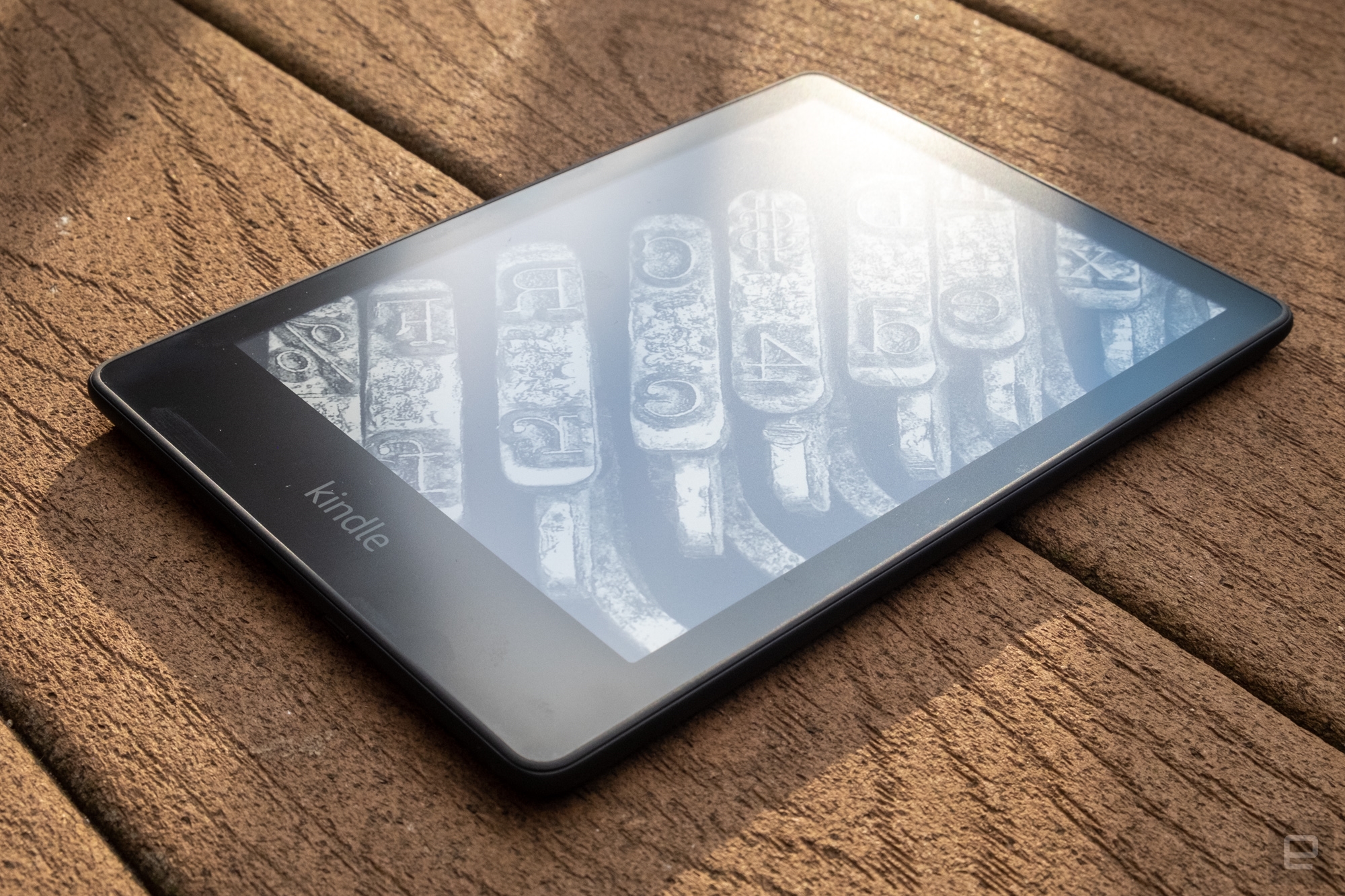
Also like the 2018 Paperwhite, the screen here is flush with the front of the device, rather than being slightly recessed like it was on previous models. Coming from an older device, I loved this change. It makes swiping the touchscreen to turn pages much more pleasant, and having the display a little closer to your eyes feels better, too. It’s simply a higher-quality experience – but if you have a 2018 Paperwhite, or the more expensive Kindle Oasis, you know this already.
More significant is the larger screen size. Amazon kept the same 300 pixel-per-inch density here, so the display looks as nice as ever. There’s just more room for your books and navigating the Kindle UI. Between the extra screen space and some changes to the interface, using the device is much more comfortable than it used to be. It is worth knowing that the new Paperwhite is ever so slightly wider and taller — so if you have small hands or already found the Kindle to be a little too large, this might be an issue. But, for me, the larger screen is a massive improvement, and it isn’t diminished in the least by the slightly bigger body.
The screen bezels are also significantly smaller as well. The bottom bezel is on the large side, presumably so you can rest your thumb on it while reading, but the ones on the top, left and right are all very thin. The smaller bezels, larger display and lack of a recessed screen all combine to make this hardware feel more premium than previous Kindle Paperwhite models.
A less impactful change is the new LED front lighting system. There are 17 individual LEDs that give the Paperwhite its gentle glow that lets you read in poor light, up from five that were in the previous model. That sounds like a big improvement, but I can’t say I notice a major difference. The Old Paperwhite already had a very smooth front lighting system, and it looks great on the new model, too, just not dramatically better.
These LEDs do have a new trick, though: “adjustable warm lighting.” It’s similar to the Night Shift feature Apple added to its products a few years ago; it adjusts the color temperature of the display lighting to a more amber hue. The Kindle’s blighting system never felt too blue to me, and since we’re not dealing with a glowing LCD, they’ve always been less likely to disrupt sleep. But being able to adjust the screen’s color temperature is still handy.
As with other devices, you can set two different color temperatures, one for during the day and a warmer setting for after the sun has gone down. There’s also an automatic schedule that uses location services to automatically and gradually change the color temperature based on sunrise and sunset in your current location.
I appreciate the multiple ways you can customize the warmth of the Paperwhite’s screen, but it’s also a little confusing. When you pull down the settings shade, you’ll see sliders for both brightness and screen warmth. Then, when you dive into the section where you can set a schedule, there’s another slider to set the warmth for the scheduled time. It took me a bit to realize that one slider covered the warmth outside of the scheduled time and another was only in effect during the schedule.I eventually I got everything sorted out, though. And if you don’t care about scheduling the screen’s color temperature, you can just pick a setting that looks best to you and forget about it.
You’ve been able to set different brightness levels on the Kindle for years now, but the Paperwhite Signature Edition can automatically adjust to the ambient light. Smartphones have had this feature for years, and the more expensive Kindle Oasis has had it for a while, too. Here, it works pretty quickly and reliably. I first manually set the brightness to a comfortable level for the room I was reading in, and then put my trust in the auto brightness feature. I could definitely notice it kicking on in brighter rooms and turning things down in my dimly lit bedroom when I was getting ready to crash for the night. It’s not an essential feature, but it is nice to have.
Come to think of it, “nice to have” describes most of the difference between the standard Kindle Paperwhite and the Signature Edition. The standard version comes with 8GB of storage, versus 32GB in the SE. The SE also has wireless charging, which works quite well – I dropped the Paperwhite on a few Anker chargers I have around the house, and it charged up quickly and reliably. But given how long the device’s battery lasts, most people will be fine charging it with any old USB-C cable once a month or so. (I haven’t mentioned it yet, but the Paperwhite has a battery that lasts weeks, just like all the other Kindles.)
The SE also has an ad-free lock screen. The fact that Amazon has long charged a premium to get a device without ads on it that try to sell you more stuff from Amazon is about the most Amazon thing ever. And my desire to not have ads shoved in my face makes the Signature Edition pretty appealing. A $50 price difference is significant – but given the fact that I generally use a Kindle for five years or more, why not get rid of those ads and get a few extra features while I’m at it? Given that the standard Paperwhite without ads is only $30 cheaper than the Signature Edition, this is an upsell that I’d probably go for.
Things like storage capacity, the number of LEDs, wireless charging and so on only really matter in service of one thing: reading. Fortunately, the new Kindle Paperwhite is the best e-reader I’ve ever used. I’ve never had a big issue with how E Ink screens need to refresh when you turn the page, but the Paperwhite refreshes so quickly and smoothly that this device feels more pleasant to use than my 2015 model.
Beyond the refresh rate, the touchscreen is extremely responsive; I rarely had my taps or swipes go unrecognized. When I use the keyboard to search for books, I just plow ahead and don’t get caught up waiting for a key press to register. There are still times where you need to wait for the screen to catch up, though. That’s mostly when you’re navigating more complex layouts, like the Kindle Store.
In some regards, the new Kindle Paperwhite changes nothing; Amazon has had a stranglehold on the e-reader market for years, and the previous Paperwhite was the device to get. The new Paperwhite is still Amazon’s best e-reader. It’s not as expensive and fancy as the Kindle Oasis, but it offers a far better experience than the basic $90 Kindle. The bigger screen and higher resolution are reasons enough to choose the Paperwhite if you’re anything more than the most casual of readers.
The other question is whether the $190 “Signature Edition” is worth the $50 premium over the standard model. For most people, the answer is probably no. The two devices are essentially the same in every significant way. Wireless charging is a bonus, but given how infrequently the Paperwhite needs to be charged, it’s not a huge upgrade in convenience. More storage is never a bad thing, but 8GB can still hold literally thousands of books. The extra space is really only important if you use Audible on the Kindle, because audiobooks can quickly eat through your storage.
The auto-adjusting light is probably my favorite of these Signature Edition features. Almost every other display in your life can do that, And having it here makes sense, especially if you power up your Paperwhite in the middle of the night. Plus, it’s hard to overstate what a relief it is to not have to see an ad every time you pick up the device.
Ultimately, if I were buying the Kindle Paperwhite for someone as a gift, I’d probably get the standard edition. If I was buying for myself, I’d get the Signature. But either way, I’d be buying a Kindle Paperwhite. It remains the best e-reader on the market.

(26)

