American Cancer Society Revamps Brand, Launches Impact Campaign
American Cancer Society Revamps Brand, Launches Impact Campaign

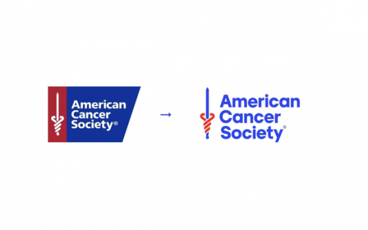
New logo (right), freed from the trapezoid shape that was “really difficult to work with.”
Ever heard of Hope Lodges, the free housing for families near cancer-care facilities in 30 markets that the American Cancer Society (ACS) has funded since the 1970s?
If not, no problem. Neither had Kymm Martinez when she interviewed to become ACS’ chief marketing officer earlier this year.
“Unfortunately, it has been a little bit of a best-kept secret,” the now-CMO tells Pharma & Health Insider. Indeed, Martinez says, “We have a lot of boots-on the-ground, patient-support programs that people don’t know about.”
That’s now changing as a newly rebranded ACS launches a national fourth quarter paid ad campaign from creative agency Havas New York and media agency Trombas.
With ads stressing the lives and relationships of people affected by cancer — and TV spots specifically homing in on Hope Lodge — the “Meant to Be Together” campaign follows by less than two months a Havas-led update of ACS’ positioning and visual identity, including a new logo, typeface, colors, tagline — “Every Cancer. Every Life” — and vision: “To end cancer as we know it, for everyone.”
The new campaign, Martinez says, is as much about ACS’ revised positioning as it is a brand campaign, with ads focusing on the impact of ACS programs instead of just the programs themselves — or, to put it another way, brand benefits rather than just features.
“If we were to focus on Hope Lodge in the past, we’d focus on what we do: we offer free lodging,” she explains. But now, the focus is on “the impact of having that free lodge — there is a home away from home that brings people closer to cancer care.”
Media include a :30 TV spot, in English and Spanish versions, along with a :15 cutdown; live-read radio spots; digital display, social, search, and out-of-home.
ACS’ Q4 budget is “30% more than what we would have spent last year,” Martinez says. “We’re definitely leaning in and putting our money where our mouth is. Most of the time, it’s donor dollars that we’re spending, so we have to believe that what we’re spending money on is ultimately going to impact and help people with cancer and their families.”
The current ads include a donation call-to-action message, because “Q4 is such a key fundraising period,” Martinez says, but the ads will stretch beyond the quarter because they’re “very versatile.” For example, “we can swap out the ‘donate’ call-to-action for a ‘learn more’ call-to-action, and we can use these also in PSAs, which [allow] us to stretch our dollars.”
The new ACS logo, which modernizes its look without “throwing the baby out with the bathwater,” allows the brand to break free of the trapezoid it has been trapped in over the past couple of decades, Martinez explains.
“That shape was really difficult to work with,” particularly when it came to pairing the ACS logo with such “big equity platforms” as “Relay for Life” crowding the space. “It’s possible that you could go to an event and not realize it was an American Cancer Society event.”
The challenge for the new logo, she continues, was to “stand out, be easier to manipulate, look more modern and be brighter.”
Martinez joined ACS as chief marketing officer this past March, after marketing exec stints at a university, and before that, nearly 20 years with General Mills.
A key difference from her earlier gigs is that in CPG marketing, “you have all the final decision-making power,” she says. “Moving over into higher ed and nonprofit, it’s much more about leading through influencing, the importance of ‘the why.’
“So when we launched this brand refresh, as an example, one of the most important things I did was make sure people understood why are we changing, and why this is a good investment of our dollars — what is it we’re trying to achieve.”
(40)


