An Exclusive Look At Instagram’s New App Icon
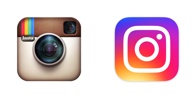
While almost every app-maker has embraced flat design, Instagram has remained firmly stuck in iOS circa 2007: the very definition of a skeuomorph, colored brown and meant to evoke a Polaroid camera, with a shiny glass lens and a black viewfinder up in the corner. (Remember those?!). You knew a redesign had to be coming. Today it finally has: Instagram is releasing both a new app icon, and an updated app.
“It’s a lot closer to the cameras that people use these days,” explains Ian Spalter, Instagram’s newish head of design, who hails from YouTube and R/GA, where he worked on Nike Plus.
Simple as that seems, it was a high-stakes decision for Instagram, given that this one tiny icon represents so much of company’s identity—not to mention the fact that it has to serve a functional purpose, as a tappable icon for hundreds of millions of people. The team labored over it for nine months. At first, Spalter was most concerned with figuring out what elements people recognized most about the admittedly very complex and highly detailed Instagram logo. So he started by asking the whole company to draw the logo from memory in 10 seconds or less. “That gave us a sense of what was burned in,” Spalter says. What emerged were the camera lens, the rounded shape of the icon, and, surprisingly, the little black viewfinder in the top right corner.

Translating the outline of the old icon was simple enough, as was the camera lens itself—but there’s a subtle detail happening in what used to be the viewfinder. Instead of being another miniature black lens, it’s actually now just a white dot. When paired with the circle of the lens, the dot and circle evoke a smartphone’s lens and light sensor, rather than a Polaroid camera’s lens and viewfinder. Which is a shift that manages to quietly evoke how much photography has changed in the past decade or so.
Of course, the main thing that you’ll notice is the bright rainbow gradient behind the icon—an eye-grabbing detail meant to leap off the home screen, and add gravity to an icon that might be easy to miss if it were duo-tone. As Spalter explains, that’s an echo of perhaps the most beloved part of the old Instagram logo, the rainbow stripes on the top left that used to sit above the “Insta” logo script.

Spalter says the trickiest part was wading through almost 300 variants and versions. “The most difficult part was once you decide to move on from a beloved icon, how far do you go?” he says. “A lot of the process was figuring what to keep and let go. Are you evolving far enough or not enough, so that you’ll just end up revisiting it in a year?” After months of design work, they spent months more doing qualitative research into whether people could recognize the icon as Instagram, and to see if it evoked the upbeat chumminess of the old icon—a slow, painstaking process meant to root the entire design in a logic that the entire company could grok. “The company had to see that it wasn’t designers working in a corner on whatever they liked,” says Spalter. (It’s telling that the video announcing the new icon is mostly devoted to going through all the discarded icon concepts—a subtle cue to anyone that watches, which says, “Hey, we did a ton of work and this didn’t happen by accident!”)
The team then had to worry about how scalable the app icon was—they had to make sure that the glyphs could work in the myriad flavors that the Instagram logo comes in, from Twitter favicons to web embeds. Then they extended the icon to an entire family that encompasses Instagram’s other creativity apps, Boomerang, Hyperlapse, and Layout. The logos more clearly represent what the apps actually do—from looping videos to arraying multiple photos on a grid.
As far as the app design itself, the UI changes are easily recognizable to anyone on Android or iOS. That was the point. Rather than trying to create a design language that was recognizable as Instagram’s own, the UI designers opted to create buttons and action screens more evocative of the UI standards native to iOS and Android, so that the app on each platform felt instantly familiar. Perhaps the biggest change is that the filter screens are now white—which again marks a change in how we consume photography. While photographers traditionally prefer to view images on black, so as not to be distracted by any light except that of the image, the new filter screens are white, to reflect the actual context of how the images will be viewed: against the white backdrop of a user’s feed.
One of the biggest questions now is how users will react. Spalter, when asked if he’s ready for the vitriol that can attend the redesign of such a familiar icon, laughs “Maybe I’ll take a vacation,” he says. “In a bunker.”
The new icon more resembles a smartphone’s camera, with a lens and a light sensor, while the rainbow helps the icon stand out.
![]()
The logo extends to a family of icons for Instagram’s creativity apps: Layout, Hylerlapse, and Boomerang. Each symbolizes what the app does.
![]()
The UI for both the iOS and Android app now reflects the native patterns, so that the app itself feels more in synch with its platform.
![]()
Fast Company , Read Full Story
(102)


