Analysis of Users of Applications for macOS
Analysis of Users of Applications for macOS

User research is essential because it helps to study people’s behavior, needs, and motivations. UX designers are often responsible for a clear interface. However, product managers and marketing departments also need to study user habits and help designers improve the interface.
Products are developed primarily for the users. We analyze what options they use, why they chose this product, what they don’t like about competitors’ products, etc. They constantly interact with the product and pay attention to completely different things than we previously thought in the company. Although there is no universal list of questions to understand the needs of users better, there are specific points that we would advise you to consider.
This article is based on the Nektony software development company’s experience developing Mac cleanup applications. In this article, we will tell you how we selected users for in-depth interviews and analysis of our applications and what we changed in our products thanks to the data we received.
A common mistake when analyzing users
In the past, when we made some changes to products, we often relied on our own subjective opinions of what would be better for the users. However, product usage scenarios among company employees can be very different from the usage scenarios of real users. When you work with a product for a long time and know all its options and capabilities perfectly, you look at the interface, usability, etc., differently. Therefore, firstly, it is necessary to study the pain points of customers and ask them about possible changes in the product.
How to choose interviewees
At the beginning of the product analysis of Nektony apps, we showed the products to everyone we knew, friends and colleagues from other companies, and asked them what they thought about the apps. But, as I noted above, this is not the right approach. Later, we started working only with real users who once contacted our technical support service.
Among the letters in support, you can find many users who may be loyal to the company.
- First, it’s not cold contacts we’re reaching out to. We already communicated successfully with them; they contacted us, and we solved their problems; that is, they remained satisfied customers.
- Secondly, people who write to technical support to solve a question (rather than go, for example, to some forum and complain) – usually this is a special category of people who are ready to share their thoughts, spend their time to make the product better for own use in the future. So, such people willingly agree to become interviewees.
- Third, these are real users, not hypothetical ones. Interviews with such users provide more accurate data on what exactly they like and what they don’t like, which options are used more often, and which are not clear.
Stage 1: Gathering contacts to whom we will write about the interview
We sell our apps through the App Store and our website worldwide. However, we did not select respondents by country. The main criterion for collecting respondents is the level of their loyalty to the company, which characterizes the level of their willingness to agree to an interview. In our case, the support service always adds the client’s loyalty tag after communicating with him when solving issues. So, downloading a list of such contacts was not a problem.
Stage 2: Sending letters and preparing for the interview
We prepared a letter asking you to agree to an interview and help us make our product better. We sent these letters individually, not through a mailing service, because personalization is important. In general, we experimented with the content of the letter. We changed it depending on the history of interaction with the person, as well as on the results of responses to my previous letters to other people.
You can immediately offer a bonus to the user for the time spent, for example, another app as a gift or a discount on the next purchase. But my personal opinion is that it is better to give a gift to the user after the interview as a pleasant bonus. From experience, those people who agree to provide an interview, not for a bonus, are usually more interested in the results of the interview. They are certainly more loyal and open — more willing to talk about the pros and cons of the application for them personally, etc.
Before starting the meeting with the respondent, it is vital to prepare a script. It can change a little depending on the person. The respondent should be relaxed, and the entire conversation should be in a friendly atmosphere.
Stage 3: The interview
Approaching the interview itself — The primary goal and all our questions to respondents consist of understanding the following:
- Who is a user of the application?
- How will users be divided by types? (Like scenarios of behavior, depending on age, type of activity, interests, etc.)
- How exactly do people use our apps? (launch frequency, most favorite options, why they chose our product, etc.)
- What is the product’s most significant value to users?
Now, we will briefly talk about the scenario of communication with the respondent according to the pre-prepared script. It is also important that you open a document or have a paper where you will take notes.
- Introduction: greetings, remembering to say thanks for their time, and asking some short questions of the person to collect information about the country of residence, type of activity, age, etc. Of course, you don’t need to ask directly about all this; for example, you can mark the approximate age of a person (understand visually), or if they tell you how they spent the weekend with their family — you know their family status and lifestyle. At this stage, I also asked how long the person has been using a Mac because, in our case, it is very important. The person’s user habits may depend on this.
- Permission to record a video. Of course, we were making notes, but the video recordings allowed me to go back to the interview, study it more deeply, and make a transcript of the conversation.
- Studying the application usage scenario. We asked the person to run our app and use it in their normal mode without my comments. In the process, you can ask the person questions — but ensure that you do not distract them from the usual actions in the program.
- Question. After observing the user’s actions, we asked them additional questions: open and closed questions. Here are some sample questions:
Open questions:
- How did you find Nektony programs, and why did you choose them?
- When was the last time you used MacCleaner Pro, and what functionality did you use?
- Which option was difficult for you to understand and why?
Closed questions:
- Was this or that functionality in the program useful for you?
- Would you like us to change the app’s interface?
- Is it possible to get back to you after some time for a re-interview?
To sum up. At this stage of the interview, you can ask the interviewees if they have any questions for you. Listen! And give a bonus gift as a thank you to them for their time.
Unexpected results from interviews
Many of the user responses came as a complete surprise to me and the entire team as a whole. Things we never paid attention to and thought that users didn’t need at all turned out to be a significant part of their interaction with applications:
- Sound effects. People like it when apps have sound effects when they launch or press buttons. It wasn’t important to anyone on our team, so we didn’t even think about it before.
- Welcome window and results. People like the animations when the program starts and also after some action, such as cleaning the disk. People wanted to see a window with congratulations on their successful results (to show the completion was done correctly). On the contrary, we always tried to simplify the program and get rid of unnecessary windows and user clicks.
- Texts. People don’t like to read. Previously, we tried to always add an explanatory text to one or another option so that the user could familiarize himself and be sure of his actions when cleaning the Mac. So, we shortened all these texts and left only the mandatory ones. It is important to make the names and icons of each option clear so that everything is intuitive without text. At the interview — it turned out that not all option icons were understandable to users.
- Expectations. The user sometimes expects something completely different from the program or a certain option. Before adding any new features, it is better to conduct interviews and test your hypotheses. Our company keeps a list of all wishes from users. Before adding a new feature, we first analyze this letter, sort by the number of requests, see how many people are looking for such a feature, and only after that make a decision about the need to add a new feature.
Stage 4: First prototypes and repeat interviews
It is important that after analyzing the necessary changes in the programs, prototypes should be made and re-shown to users. As we said above, sometimes you may encounter unreasonable user expectations. Here are my next steps before finalizing product changes:
- Preparation of prototypes. There can be many prototypes. In my case, I made more than 20 prototypes until we chose the most convenient version of the interface.
- Demonstrating the prototype to users. This stage is a repetition of all our previous steps, where we observe precisely how the users use the application at the first launch, how much everything is clear to them, which options they saw at first, and which they overlooked. It happened when the users used the options — they chose differently than we intended. Then, we redesigned the product.
- Final decision-making. When we finally find an option that is understandable to users, we can hand over the task to the designer and the entire development team. That team then works on the changes in the programs.
Examples of changes based on interview results
Using examples of the interface of some of our programs, we wanted to show what changes occurred in them, thanks to the analysis of user needs through interviews. This process must not only be about UX design but also must consider rethinking some options and the need to show these options to users.
App Cleaner & Uninstaller
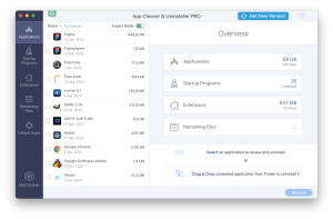
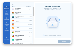
Previously, at the first launch, the user saw the information about the number of programs on their Mac, the number of service files, and extensions. We found that this information scares many non-geek users who do not understand what service files are used for. We also added the Expert Mode Option, and only in this mode can the users see the list of service files that will be deleted when uninstalling programs. The average user does not want to see these files; they only want to click on one “magic” button — and for the program to solve their problem immediately.
| Before
Unneeded information in the right panel. The main option below this information is in the blind spot. |
After
The main function for which this app is downloaded is now in the right panel. |
 |
 |
Duplicate File Finder
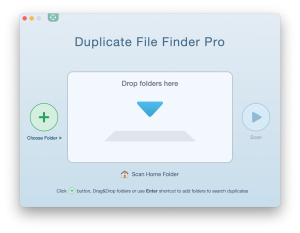
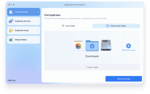
During the interview, it became clear that each user has their own goals when using the application. Some users want to find only duplicate photos in the Photo Library; others run the program to merge their folders with duplicates. We always guide them according to the scenario of searching for all duplicates they are comfortable with.
Previously, they had to take extra steps to reach their goal. So we completely changed the first window and added different functions to it — immediately — according to groups of user needs.
| Before | After |
 |
 |
Disk Space Analyzer
During the interviews, it became clear that people are more familiar with and understand when the application interface is similar to the interface of system programs on macOS. For example, people find it easier to click on folders and explore their contents, as they are used to doing in the Finder, rather than clicking on a chart. So we’ve added a Folder Outline file view as done in the Finder.
| Before | After |
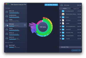 |
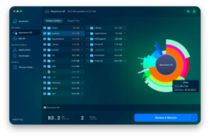 |
MacCleaner Pro
It is important for users to see animations, beautiful pictures — and a minimum of text. Thanks to the fact that we took all this into account in the new design (after the interviews), we managed to make the application more understandable for the user and increase purchase conversions after downloading the trial version.
We also added the “magic” that users asked for — cleaning all junk files in one click.
| Before | After |
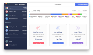 |
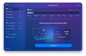 |
Final recommendations
I recommend transcribing each individual interview and then using the Value Proposition Canvas to identify user values and needs. This topic needs a separate article, but you can google it and find a lot of information about this process. Take the time to do the following for the best success.
- Exchange experiences with other product managers and show them the product. Yes, these managers are not your users, but sometimes they can give you valuable advice, depending on their experience.
- The user likes to be led by the hand and told what to do next after each step.
- Make the command names and icons as straightforward and clear as possible to be immediately understandable without additional text.
- Combining functionality and showing extras, like additional options where the user does not expect to see them, is a bad idea.
- Bring the main functionality of the program to the start window (as shown above in the Duplicate File Finder example).
- Be very careful with letters to technical support. It is a storehouse of information from where you can get a lot of insights into what is important to users. Fast and good technical support is the loyalty of your users and the opportunity to further interact with them for the development of your company.
We hope that our experience and examples are helpful for you and give you many insights of your own.
Featured Image Credit: Provided by the Author; Thank you!
The post Analysis of Users of Applications for macOS appeared first on ReadWrite.
(25)

