Android 12 might debut on October 4th
Android 12 Beta hands-on: A fresh look with few major changes for now
You won’t miss much by waiting for the next version of the beta instead.

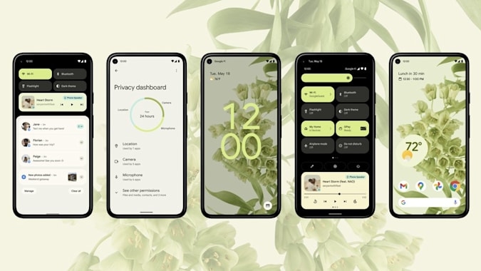
Google released the Android 12 public beta at its I/O developer conference (September 23, 2021) and those who don’t mind dealing with potentially buggy software can already try it out. The preview of the upcoming OS will be available on the company’s own Pixel phones as well as devices from OnePlus, Nokia, TCL, ASUS, Sharp and more. Though Google teased new features like adaptive themes, indicators and toggles for your camera and mic, as well as new permissions settings and shortcuts, few of them are actually available in this version. Most of the changes are visual at the moment. But it’s still a nice look at what we can expect when Android 12 officially launches later this year.
A visual refresh
This is the biggest refresh to Android’s look in years. Android 11 was pretty similar to Android 10 and, honestly, wasn’t a very exciting upgrade. But with the promise of new themes and interactive widgets, Android 12 should be a much bigger deal. For now, the beta doesn’t appear to have the dynamic palettes under Google’s new Material You design that change color scheme based on your wallpaper. I switched between wallpapers that were mostly blue, red, orange or pink and the text remained the same shade of bluish gray in each case.
What does look different is the new lock screen, which has updated font styles and neater notifications. When you have a string of alerts, the clock is relegated to the top left of the page. After you dismiss them all, the clock expands and moves to the center, making it easier to see. It’s a small but nice touch.
I have yet to see any of the changes Material You is meant to bring, like font or widget sizes adapting to each individual’s preferences. The widgets menu is better organized, but there appear to be few actually new options. The Notifications shade is certainly noticeably different, though.

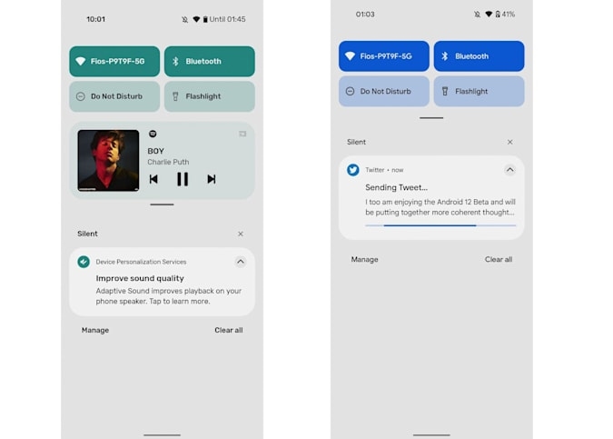
The biggest contrast here is the quick settings area, which shows four rounded rectangles for things like WiFi, Bluetooth, Do Not Disturb and Flashlight now. Even though it reduces the number of shortcuts available, I’m surprised that I prefer this to the older setup that had a row of six circles. Of course, after I spend more time with this layout I might find myself wishing there were more options immediately accessible.
There’s also less clutter in the notifications shade, something that bothered me in Android 11. Thanks to a color scheme that makes the distinction between each notification card and the panel behind it less noticeable, everything seems cleaner. There also isn’t the word “Notifications” between the Quick Settings box and, you know, your list of notifications anymore.
Settings sliders for things like volume and display brightness are also a lot thicker than before, which makes it easier to aim for them. They’re aesthetically congruous with the rest of the new UI’s slightly rounder and chunkier elements, but also take up space. Not everyone’s going to like this, but I guess it’s a balance between ease of use over a nicer look.
Most of the other “visible” differences are so minor you might miss them if you weren’t specifically looking out for them. Some animations have changed. For example, when you tap on some of the quick settings, the box will sort of sparkle in addition to flashing to a different color. Also, when you’re scrolling through a long list or article and you hit the end or beginning, the window stretches instead of glowing like before to show you’ve reached a boundary. I didn’t think I’d like this new animation, but so far I don’t mind it. Plus, to paraphrase Google’s engineer and developer relations executive Chet Haase from the “What’s new in Android” session at I/O, this lets you hit stretch goals when clearing your inbox.

Smaller, less noticeable improvements
Some other small changes (in addition to actual system improvements) are meant to make Android 12 feel faster. Google said it “recrafted the entire underlying system to make your experience more fluid and efficient,” promising better responsiveness and power efficiency overall through “under-the-hood improvements.” While that’s not something I can verify from the beta right now, there are other things that I can already see that might contribute to an overall swiftness.
The Android 12 beta certainly feels more fluid and it’s likely because Google seems to have added more animations throughout the interface so that something actually happens when you tap anywhere. This isn’t an actual CPU or systems improvement, it’s just a visual cue that something is happening so you don’t think your phone is lagging. One of these examples is the new splash screen for every app when they’re launched. Google is making these enabled by default for all apps in Android 12 and if developers haven’t made their own, the system creates a generic one by putting the app icon in the center of a blank page.
While some apps have their own splash screens, many don’t which results in a sometimes incongruous experience. Some apps will even show a generic Android splash first before transitioning to their own. The latter actually causes a bit more delay. It’s also somewhat counterintuitive to think that adding a splash animation at startup would make the system feel faster, but it’s better to see something — anything — appear to launch when you tap it, rather than wait a second or two while it loads up the main UI.
It’s small things like that throughout Android 12 that are likely to make for a more coherent experience, at least, once developers bring their apps up to speed. As we noted in our coverage of the Android 12 developer preview, changes are also coming to the way apps can send notifications and what Google calls “toasts” (the little dialog boxes that pop up at the bottom to tell you when a download is complete for example). These, combined with Material You design, should make Android 12 look and feel like a refreshing and more responsive update.
More functional updates coming
A lot of the stuff I was looking forward to check out don’t appear to be live yet. The Privacy Dashboard and Quick Settings toggles for the microphone and camera are missing. Long pressing the power button is supposed to bring up the Assistant eventually, but for now I’m still seeing the existing page that displays your Google Pay cards and smart home controls. I’ve also yet to see the option in permissions settings that let you limit the range and precision of your Location that apps can access.
According to Google, the approximate locations feature is available, but only for specific apps that are targeting it. This means I’ll have to hunt for them and I’ll report back when I encounter the setting. Google also told Engadget that the long-press for Assistant power button shortcut is coming in Beta 2, and that it’ll be an option that people using the Pixel 5 and earlier can enable in settings. Meanwhile, the privacy dashboard and the camera and mic toggles and indicators are not available on this beta.
Many upcoming features are also dependent on developers, who will have to code them into their apps before we can fully appreciate them. Things like audio-coupled haptic feedback, which could allow for more immersive gaming by generating vibration patterns based on the sound of rain or gunfire, for example. There’s also plenty more to expect from the final version of Android that I’m sure Google is saving to reveal at a later time.
Stability and bugs
Of course, since this is a beta release, the system is not guaranteed to be stable. I’ve already noticed a few issues, like Conversation Bubbles failing to work (not that they worked great to begin with). The Twitter app is fine if you’re reading your feed but it freaks out if you try to post something. These are pretty much par for the course when testing preview software, but worth noting if you’re considering installing the beta for yourself. Given the lack of actual new features at the moment, you’re better off waiting for a second or third version of the beta. But for now, the Android 12 preview has me excited for Google’s next mobile OS.
Update (on May 19th at 7:46pm ET): This article was edited to include Google’s confirmation to Engadget on what features are available in this beta and what aren’t.
(26)


