Android’s Back button is great, but makes gesture navigation worse
It’s been a few months since I started using Android’s take on gesture navigation, having enabled it on my Pixel 2 XL smartphone as a beta feature back in May. Now that the feature is out of beta alongside the rest of Android 9.0 Pie, I’m turning it back off again.
Compared to the iPhone X’s gesture navigation features—such as swiping up from the bottom to get back to the home screen, in lieu of a dedicated button for that purpose— Google’s version is far less intuitive. It doesn’t even free up extra space on the screen. If you have a Google Pixel or another phone running Android Pie, you ought to leave it disabled.
While it’s tempting to blame this on a few bad design choices, the real problem with gesture navigation on Android runs deeper: Too much of Android’s core functionality still revolves around a dedicated Back button. This is arguably Android’s best feature–even if it’s sometimes derided by design snobs–but it also gets in the way of a full swipe-based system, and makes keeping up with the iPhone X much harder.
Android gesture navigation explained
For most of its existence, Android has relied on three buttons—which, these days, are generally on-screen virtual ones—for getting around. The Home button returns you to the home screen, the Recents button lets you switch back to previously used apps, and the Back button mainly takes you back to previous menus within an app.
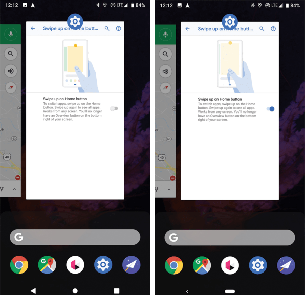
Gesture navigation (which you can activate on Android Pie phones by visiting Settings > System > Gestures > Swipe up on Home Button) replaces the Recents button with a system of swipe gestures. Swipe up from the bottom of the screen for a menu with recent apps, suggested apps, and the search bar; flick the home button to the right to reload the last app you were using; slide the home button gradually to the right to scroll through a carousel of recently used apps.
Most of these gestures are harder to use than the old system. Scrolling through apps with the home button requires a lot of precision, and it’s too easy to overshoot your target. Swiping upward for the recent apps menu takes more effort than pressing a button for the same purpose, and flicking the home button is no faster than the old method of double-tapping the Recents button.
The bigger problem, though, is that you can never be fully rid of pressing buttons instead of swiping. You still have to tap the Home button to return to the home screen, and more importantly, the Back button is still invaluable inside Android apps. As a result, you still need a thick navigation bar on the bottom of the screen, and now you have to juggle both tapping and swiping to get around. It’s disorienting, and doesn’t even save you any screen space like the iPhone X’s system does.
Defending the Back button
While Google could eliminate the Home button by replacing it with a swipe gesture, getting rid of the Back button will be more challenging. Some apps still don’t offer their own back buttons for exiting out of menus, and those that do tend to stick them in the upper-left corner, where they’re hard to reach on extra-large phones.
Besides, the Back button is a genuinely useful and defining feature of Android, despite its detractors. The main knock against the Back button is that it’s a form of “mystery meat” navigation. When you press it, you’re never quite sure if it’s going to take you back one menu layer, return you straight to the main menu of an app, or exit the app entirely.

This criticism, while fair, overlooks how useful the Back button can be. Press it while looking at a Facebook post, and you’ll go back to your feed. In Chrome, you’ll return to the last webpage. Press the back button from an email, and you’ll go back to the inbox. In a Spotify playlist, it sends you back to the app’s home screen. In the same way that the home button acts as “get out of jail free card” for exiting apps, the Back button is a universal, easily accessible way to exit menus within an app.
To rid itself of the Back button, Google would have to replace it with something else, such as swiping from the left side of the screen. Yet this would surely trample on apps’ existing functionality. Many already use edge swipes to bring up their own menus. Because most Android phones don’t run the latest version of Google’s software, getting developers to rework their code for gesture navigation would be an arduous task.
All of which might explain why Android Pie’s gesture navigation is buried deep in the Settings menu for Pixel phones, and is not enabled by default. While not explicitly labeled as an experimental feature, it might as well be one.
Fast Company , Read Full Story
(35)


