Announcing The Winners Of The 2016 Innovation By Design Awards
Year by year, the Innovation by Design Awards have grown. This year’s entries represented an astonishingly strong survey of innovation around the globe—more than 1,700 designs. In the eyes of our esteemed judges, the projects you’ll find below (and in the slide show above) were the best of the best. There were only 15 winners anointed in the entire competition; we also crowned 231 finalists. Each of those projects represents what’s best about design today: big ideas, meticulously thought-out details, and a clear viewpoint about how we live now—and how it could be better. We hope that you’ll dig in and be inspired.
Apps: Tilt Brush

Digital artists have embraced the screen-as-canvas, but the next medium to master is a touch more esoteric: virtual reality. The immersive experience is becoming more accessible to the masses, and Tilt Brush is Google’s tool to give everyone—VR pros and n00bs alike—the chance to create in 3D. Using room-scale tech, which tracks movement throughout a confined area, the app lets users paint in space with materials like fire, snowflakes, and a near-infinite palette of brushes and colors. When a work is complete, users can actually walk through their masterpiece, or welcome others into the brand-new world they created.
Apps: Adobe Experience Design CC
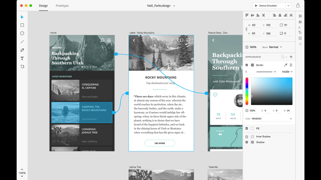
Adobe Experience Design CC (XD) is an all-in-one digital platform that provides the basic tools to both prototype and perfect UX projects. Rather than build this toolset on top of existing Adobe software, the company established an entirely new product development process, and thousands of independent designers were looped in to test early builds and provide feedback on pre-release programs—a uniquely nimble and transparent approach from an industry behemoth. The ever-evolving XD experience currently encompasses wire-framing, visual design, interaction design, prototyping, previewing, and sharing, and with the help of the creative community will become an even more robust destination for realizing websites and apps.
Branded Environments: littleBits Pop-up Shop
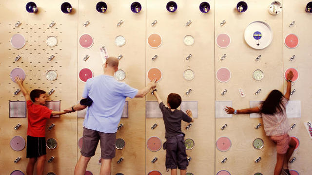
Since 2011, budding engineers have been developing their tinkering skills with littleBits kits; these inventions-in-a-box provide all the necessary gear to make tech- and code-based contraptions, but were only ever available via mail order. In 2015, the company debuted its first ever pop-up shop, a hands-on hub in the heart of SoHo that introduced visitors to the magical world of making. For six months, the brick-and-mortar workshop was open for business, welcoming creative kids (and curious adults) to interact with the products on-site, engaging with the full inventory of littleBits component parts while discovering and developing the little hackers that exist within us all.
Experimental: bioLogic
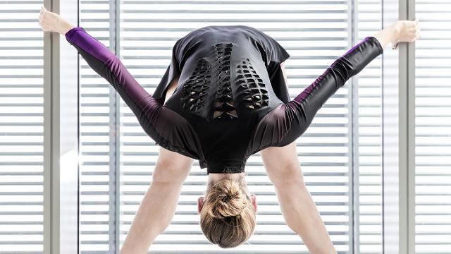
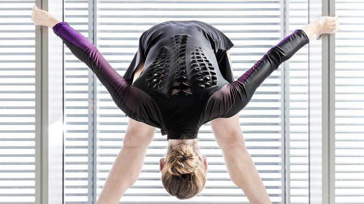
BioLogic: Nattō is an ancient, aggressively pungent Japanese dish made from fermented soybeans. Nearly 1,000 years after its accidental discovery by a traveling samurai, the bacteria required to produce this slimy cuisine is being manipulated by the mad scientists at the MIT Media Lab and turned into something entirely different: A synthetic bio-skin. Rather than manufacturing actuators, which convert energy into motion, and sensors, which are affected by physical stimuli, the team is actually growing them; those animate cells are then harvested and transformed into a responsive material that reacts to body heat and sweat. And this next-level material will have a second life out of the lab—New Balance is experimenting with turning the textile into sportswear.
Graphic Design & Data Visualization: When and How You Will Die
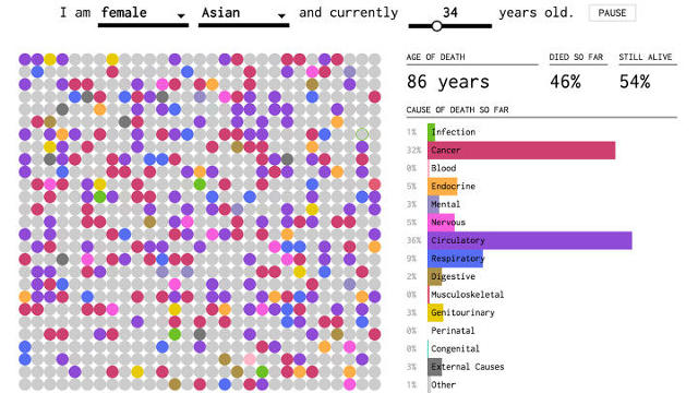
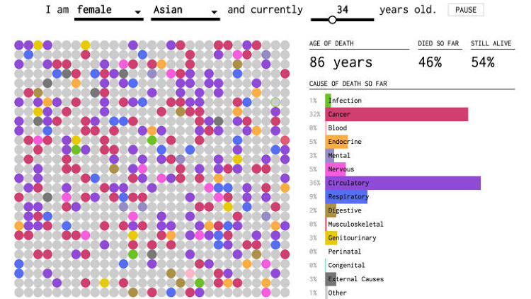
Death is inevitable, but the circumstances of any person’s pivotal moment of passing on are largely uncertain. When and How You Will Die is a macabre digital experiment that aggregates different demographic variables like gender, age, and average life expectancy. It combines that data with stats on the most common ways to perish (think cancer or congenital disorders), then generates an interactive visualization that predicts the potential cause and timeline for your own personal adios. It’s heavy stuff anchored in data, stats, and simulations that may or may not make you feel better about your impending mortality.
Health: Planned Parenthood Experience

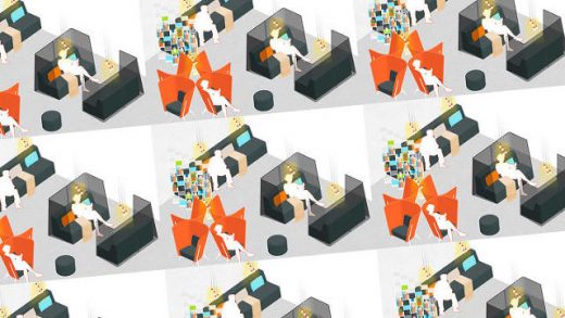
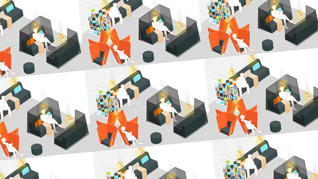
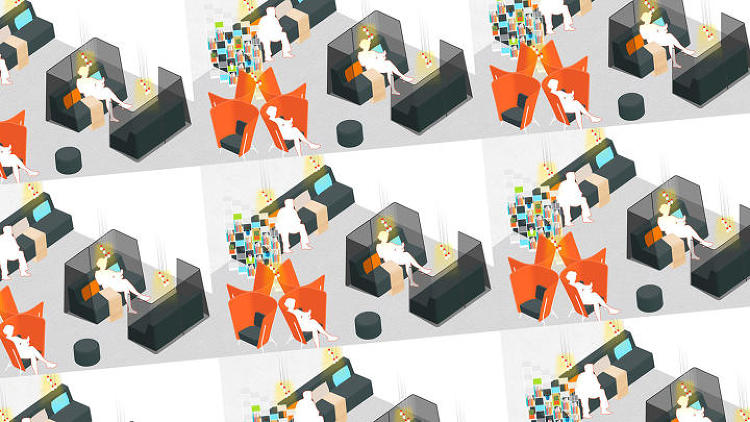
Providing—or receiving—essential health services should not be a political act, but Planned Parenthood’s stalwart role as a nonprofit resource for sexual and reproductive education and services has put it on the front lines during a contentious time for women’s rights. In order to ensure that the experience inside their clinics is welcoming, calm, and comfortable, Planned Parenthood enlisted Ideo to develop a new look and feel for waiting and recovery rooms. From the inviting, informational greeting zone, to the pre-procedure areas (more social, or solitary and reflective, depending on your mood), to the soothing after experience, everything was designed with empathy for patients in mind.
Products: GO Wheelchair
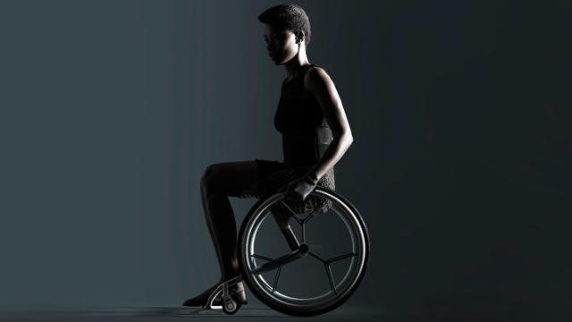
Wheelchairs are essential mobility devices for millions of Americans. GO hopes to transform the somewhat staid industry with a tech-driven approach to production, allowing users to create and customize their rides using personal biometric data on an easy-to-navigate app. Thoughtful advances like high-grip GO gloves and textured push rims will help reduce muscle strain and energy output, while the streamlined design just looks cool. LayerLAB teamed up with designer Benjamin Hubert and 3D-printed software titans Materialise to cut down turnaround time to three weeks—less than half than the standard two months—thanks to a set of standard components and two made-to-measure, locally 3D printed elements.
Products: Hubb Lifetime Oil Filter

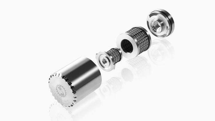
Every few thousand miles when car owners get their oil changed, the corresponding filter—often a paper-pulp contraption that clogs easily—is tossed in the trash, to the tune of about 400 million per year in the states, creating a lot of waste. The ultra-durable Hubb Lifetime Oil Filter is composed of two internal filter sets made from stainless steel mesh; the material is sized to capture debris while letting liquid flow through, while doubling the total surface area greatly increases efficiency and longevity. But perhaps best of all, it’s reusable. Rather than junk it during a service, the device can be cleaned on the spot and fit back into the vehicle, over and over again for 50 years.
Products: The Mover Kit
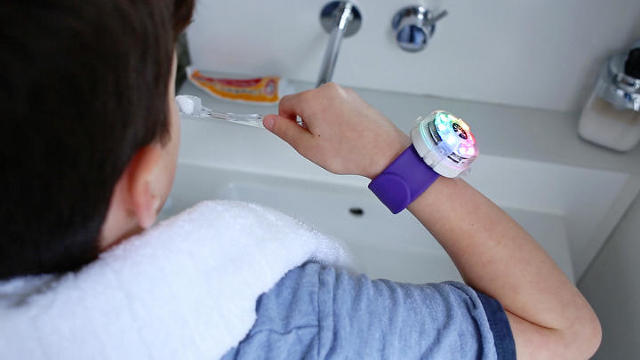
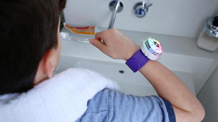
Kids can be crazy bundles of energy, but many younguns still aren’t getting enough physical activity in their day-to-day lives. The forward-thinking folks at Technology Will Save Us created The Mover Kit to make exercise feel like play, with the added educational bonus of programming basics. The pack includes a plastic watch-like wearable that snaps into place on wrists, arms, legs, and more; little users can hop online to customize their accessory on TWSU’s proprietary Make platform, coding it to track motion and direction, or to light up with rainbow LEDs.
Social Good: Fairphone 2

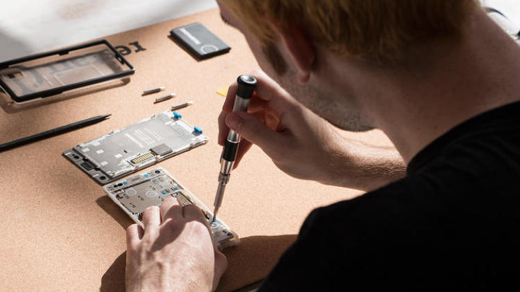
Planned obsolescence is a major problem in tech. Increasingly complex products are designed to degrade after a certain period of time; consumers keep buying new versions without considering how to fix their current model; and, as a result, the Earth is getting overrun with unnecessary e-waste. Fairphone 2 offers an alternative to that vicious cycle, with a durable, modular smartphone designed for ease of use (and re-use). Thanks to a streamlined hardware design with minimal component parts, users have the power to troubleshoot repairs with household tools, and in the process form a new relationship with their gadget. A broken screen takes less than a minute to replace, no tools required, and the camera, headphone jack, and micro USB connector can be fixed using a screwdriver.
Spaces, Places, Cities: Carmel Place
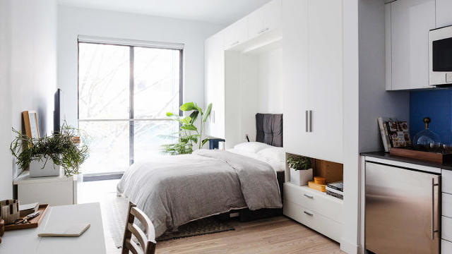
Prefab systems have long been touted, in some form, as the future of architecture; the promise of cheaper, faster, and more efficient construction methods makes the processes seem ideal, but scaling up from small single-family homes—the most common option on the market—has been slightly slow to catch on. In Manhattan, where real estate is precious and space is at a premium, Carmel Place offers an innovative take on urban development. Former mayor Michael Bloomberg tasked Brooklyn-based firm nArchitects to design a micro-units development, and issued a special mayoral override that allowed them to get around zoning codes dictating an apartment must have a minimum area of 400 square feet. Of the skyscraper’s 65 individual modules, 55 units are under 440 square feet; these are diplomatically dubbed residential micro-units, and the structure represents the first micro-unit apartment building in NYC. Each of these individual modules were produced off-site, then transported and stacked in place. Shared amenities like a gym and public roof terrace make smart use of communal space, while luxuriously decorated interiors and 10-foot ceilings prevent these homes from feeling too cramped.
Spaces, Places, Cities: Hunts Point Landing

Set over a former dead-end street on a once contaminated shoreline surrounded by an industrial zone, the community-minded park and pier at Hunts Point Landing proves that urban revitalization is not only possible, but can truly transform what is considered by many to be irredeemable blight. Mathews Nielsen Landscape Architects designed the 100-foot wide, 1.5 acre public space as part of the South Bronx Greenway Master Plan, and navigated the city’s numerous agencies and labyrinthine approval processes to ensure proper access and utility systems. The result is an outdoor retreat for locals that will only continue to grow into an integral part of the neighborhood.
Students: EM-Sense
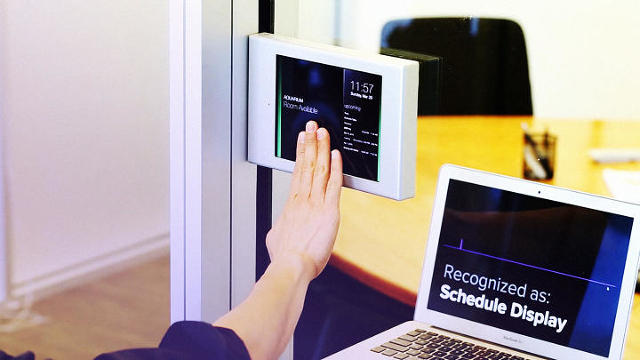
The Internet of Things has made communication between inanimate objects a reality. Em-Sense, developed by students at Carnegie Mellon University’s Human-Computer Interaction Institute, links people even closer into those instant connections through the power of physical touch. Everyday items like toothbrushes and doorknobs naturally produce electromagnetic noise (EM); when you make contact, those electrical signals circulate through your body (yes, you are conductive!). Imagine a maps app showing a shortcut on your smartwatch simply because you straddled a motorcycle. Em-Sense enables touch identification, authentication, and all kinds of custom DIY experiences.
User Experience: IKO Creative Prosthetic System

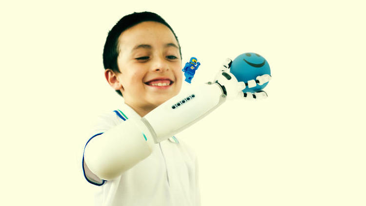
Navigating the world with a disability can be a physical and emotional challenge for kids. The IKO Creative Prosthetic System turns artificial body parts into Inspector Gadget-style imagination machines that transcend traditional uses with all kinds of attachments. Hand? Sure! Space ship? Why not! Blender? Yeah! This playful approach empowers little creatives to embrace the relationship between their bodies and the tools that help them live comfortably and confidently. By combining robotics, programming, and prototyping with Lego Mindstorms, IKO provides a learning experience for the young user, and allows them to share that knowledge with their peers.
Websites & Platforms: Kinduct
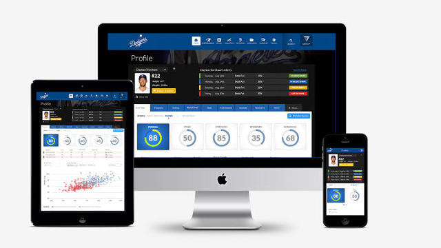
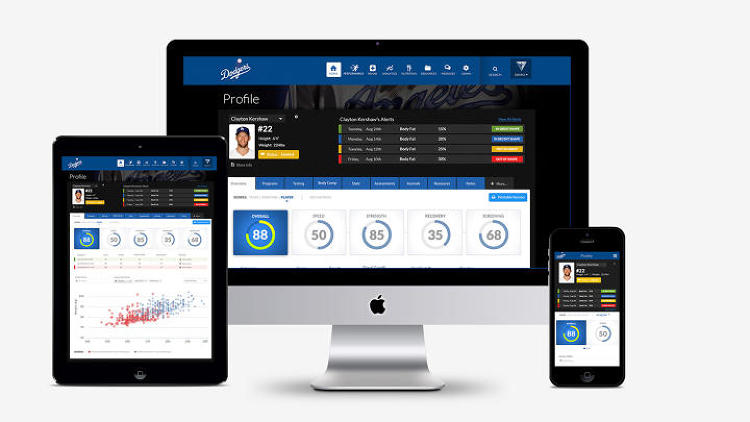
Kinduct is a responsive software system developed to optimize athletes’ performances. By aggregating data from external sources like electronic medical records, and combining it with proprietary assessment trackers, the platform’s visualizations and analysis can help determine the most effective training and treatment strategies for individual players, rather than a more traditional team-wide approach. The Golden State Warriors were one of the first NBA organizations to adopt the tool, and their consistent performance through the 2015 and 2016 seasons shows Kinduct’s vast potential.
See above for this year’s winners, and click here for the full list of 2016 Innovation by Design honorees.
A version of this article appeared in the October 2016 issue of Fast Company magazine.
Apps: Tilt Brush. Digital artists have embraced the screen-as-canvas, but the next medium to master is a touch more esoteric: virtual reality. The immersive experience is becoming more accessible to the masses, and Tilt Brush is Google’s tool to give everyone—VR pros and n00bs alike—the chance to create in 3D. Using room-scale tech, which tracks movement throughout a confined area, the app lets users paint in space with materials like fire, snowflakes, and a near-infinite palette of brushes and colors. When a work is complete, users can actually walk through their masterpiece, or welcome others into the brand-new world they created.

Apps: Adobe Experience Design CC. Adobe Experience Design CC (XD) is an all-in-one digital platform that provides the basic tools to both prototype and perfect UX projects. Rather than build this toolset on top of existing Adobe software, the company established an entirely new product development process, and thousands of independent designers were looped in to test early builds and provide feedback on pre-release programs—a uniquely nimble and transparent approach from an industry behemoth. The ever-evolving XD experience currently encompasses wire-framing, visual design, interaction design, prototyping, previewing, and sharing, and with the help of the creative community will become an even more robust destination for realizing websites and apps.

Branded Environments: littleBits Pop-up Shop. Since 2011, budding engineers have been developing their tinkering skills with littleBits kits; these inventions-in-a-box provide all the necessary gear to make tech- and code-based contraptions, but were only ever available via mail order. In 2015, the company debuted its first ever pop-up shop, a hands-on hub in the heart of SoHo that introduced visitors to the magical world of making. For six months, the brick-and-mortar workshop was open for business, welcoming creative kids (and curious adults) to interact with the products on-site, engaging with the full inventory of littleBits component parts while discovering and developing the little hackers that exist within us all.

Experimental: bioLogic. BioLogic: Nattō is an ancient, aggressively pungent Japanese dish made from fermented soybeans. Nearly 1,000 years after its accidental discovery by a traveling samurai, the bacteria required to produce this slimy cuisine is being manipulated by the mad scientists at the MIT Media Lab and turned into something entirely different: A synthetic bio-skin. Rather than manufacturing actuators, which convert energy into motion, and sensors, which are affected by physical stimuli, the team is actually growing them; those animate cells are then harvested and transformed into a responsive material that reacts to body heat and sweat. And this next-level material will have a second life out of the lab—New Balance is experimenting with turning the textile into sportswear.
Graphic Design & Data Visualization: When and How You Will Die. Death is inevitable, but the circumstances of any person’s pivotal moment of passing on are largely uncertain. When and How You Will Die is a macabre digital experiment that aggregates different demographic variables like gender, age, and average life expectancy. It combines that data with stats on the most common ways to perish (think cancer or congenital disorders), then generates an interactive visualization that predicts the potential cause and timeline for your own personal adios. It’s heavy stuff anchored in data, stats, and simulations that may or may not make you feel better about your impending mortality.
Health: Planned Parenthood Experience. Providing—or receiving—essential health services should not be a political act, but Planned Parenthood’s stalwart role as a nonprofit resource for sexual and reproductive education and services has put it on the front lines during a contentious time for women’s rights. In order to ensure that the experience inside their clinics is welcoming, calm, and comfortable, Planned Parenthood enlisted Ideo to develop a new look and feel for waiting and recovery rooms. From the inviting, informational greeting zone, to the pre-procedure areas (more social, or solitary and reflective, depending on your mood), to the soothing after experience, everything was designed with empathy for patients in mind.
Products: GO Wheelchair. Wheelchairs are essential mobility devices for millions of Americans. GO hopes to transform the somewhat staid industry with a tech-driven approach to production, allowing users to create and customize their rides using personal biometric data on an easy-to-navigate app. Thoughtful advances like high-grip GO gloves and textured push rims will help reduce muscle strain and energy output, while the streamlined design just looks cool. LayerLAB teamed up with designer Benjamin Hubert and 3D-printed software titans Materialise to cut down turnaround time to three weeks—less than half than the standard two months—thanks to a set of standard components and two made-to-measure, locally 3D printed elements.

Products: Hubb Lifetime Oil Filter. Every few thousand miles when car owners get their oil changed, the corresponding filter—often a paper-pulp contraption that clogs easily—is tossed in the trash, to the tune of about 400 million per year in the states, creating a lot of waste. The ultra-durable Hubb Lifetime Oil Filter is composed of two internal filter sets made from stainless steel mesh; the material is sized to capture debris while letting liquid flow through, while doubling the total surface area greatly increases efficiency and longevity. But perhaps best of all, it’s reusable. Rather than junk it during a service, the device can be cleaned on the spot and fit back into the vehicle, over and over again for 50 years.
Products: The Mover Kit. Kids can be crazy bundles of energy, but many younguns still aren’t getting enough physical activity in their day-to-day lives. The forward-thinking folks at Technology Will Save Us created The Mover Kit to make exercise feel like play, with the added educational bonus of programming basics. The pack includes a plastic watch-like wearable that snaps into place on wrists, arms, legs, and more; little users can hop online to customize their accessory on TWSU’s proprietary Make platform, coding it to track motion and direction, or to light up with rainbow LEDs.
Social Good: Fairphone 2. Planned obsolescence is a major problem in tech. Increasingly complex products are designed to degrade after a certain period of time; consumers keep buying new versions without considering how to fix their current model; and, as a result, the Earth is getting overrun with unnecessary e-waste. Fairphone 2 offers an alternative to that vicious cycle, with a durable, modular smartphone designed for ease of use (and re-use). Thanks to a streamlined hardware design with minimal component parts, users have the power to troubleshoot repairs with household tools, and in the process form a new relationship with their gadget. A broken screen takes less than a minute to replace, no tools required, and the camera, headphone jack, and micro USB connector can be fixed using a screwdriver.
Spaces, Places, Cities: Carmel Place. Prefab systems have long been touted, in some form, as the future of architecture; the promise of cheaper, faster, and more efficient construction methods makes the processes seem ideal, but scaling up from small single-family homes—the most common option on the market—has been slightly slow to catch on. In Manhattan, where real estate is precious and space is at a premium, Carmel Place offers an innovative take on urban development. Former mayor Michael Bloomberg tasked Brooklyn-based firm nArchitects to design a micro-units development, and issued a special mayoral override that allowed them to get around zoning codes dictating an apartment must have a minimum area of 400 square feet. Of the skyscraper’s 65 individual modules, 55 units are under 440 square feet; these are diplomatically dubbed residential micro-units, and the structure represents the first micro-unit apartment building in NYC. Each of these individual modules were produced off-site, then transported and stacked in place. Shared amenities like a gym and public roof terrace make smart use of communal space, while luxuriously decorated interiors and 10-foot ceilings prevent these homes from feeling too cramped.

Spaces, Places, Cities: Hunts Point Landing. Set over a former dead-end street on a once contaminated shoreline surrounded by an industrial zone, the community-minded park and pier at Hunts Point Landing proves that urban revitalization is not only possible, but can truly transform what is considered by many to be irredeemable blight. Mathews Nielsen Landscape Architects designed the 100-foot wide, 1.5 acre public space as part of the South Bronx Greenway Master Plan, and navigated the city’s numerous agencies and labyrinthine approval processes to ensure proper access and utility systems. The result is an outdoor retreat for locals that will only continue to grow into an integral part of the neighborhood.

Students: EM-Sense. The Internet of Things has made communication between inanimate objects a reality. Em-Sense, developed by students at Carnegie Mellon University’s Human-Computer Interaction Institute, links people even closer into those instant connections through the power of physical touch. Everyday items like toothbrushes and doorknobs naturally produce electromagnetic noise (EM); when you make contact, those electrical signals circulate through your body (yes, you are conductive!). Imagine a maps app showing a shortcut on your smartwatch simply because you straddled a motorcycle. Em-Sense enables touch identification, authentication, and all kinds of custom DIY experiences.

User Experience: IKO Creative Prosthetic System. Navigating the world with a disability can be a physical and emotional challenge for kids. The IKO Creative Prosthetic System turns artificial body parts into Inspector Gadget-style imagination machines that transcend traditional uses with all kinds of attachments. Hand? Sure! Space ship? Why not! Blender? Yeah! This playful approach empowers little creatives to embrace the relationship between their bodies and the tools that help them live comfortably and confidently. By combining robotics, programming, and prototyping with Lego Mindstorms, IKO provides a learning experience for the young user, and allows them to share that knowledge with their peers.
Websites & Platforms: Kinduct. Kinduct is a responsive software system developed to optimize athletes’ performances. By aggregating data from external sources like electronic medical records, and combining it with proprietary assessment trackers, the platform’s visualizations and analysis can help determine the most effective training and treatment strategies for individual players, rather than a more traditional team-wide approach. The Golden State Warriors were one of the first NBA organizations to adopt the tool, and their consistent performance through the 2015 and 2016 seasons shows Kinduct’s vast potential.
Fast Company , Read Full Story
(120)

