Another underappreciated part of the USPS? Its exceptional design
Among the many reasons to support the beleaguered United States Postal Service, add this: It has a rich history as a patron of graphic design.
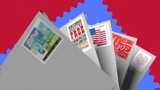
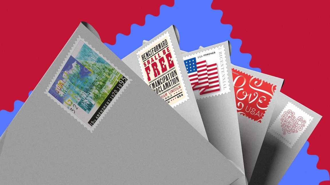
For decades, the USPS has tapped some of the world’s best designers to get creative on those 1-inch-by-1.25-inch canvasses. This has resulted in everything from Matrix-like abstract grids designed by Saul Bass to swirling calligraphy by typographers Louise Fili and Jessica Hische.
The USPS also designs many stamps in-house, with input from the public. A Citizen’s Stamp Advisory Committee, which has met quarterly over the past 60 years, sifts through about 40,000 stamp suggestions from the public each year. If they make it through the committee, stamp designs go to one of four art directors on contract with the USPS for consideration and further development.
Ethel Kessler, who has been under contract with the United States Postal Service for the past 22 years and art directed the Breast Cancer Awareness stamp, which has raised 91.1 million dollars since its release, has designed over 450 stamps since she started. I asked Kessler what the key to designing on such a small canvas is. “There has to be a clear focal point and the shapes that are in it have to be—I don’t want to say graphic—but somehow identifiable because then your eye can get into the image,” Kessler says. Here are just a few of the most iconic designs over the past 60 years—a potent, albeit small, reminder why the Postal Service is worth keeping around.
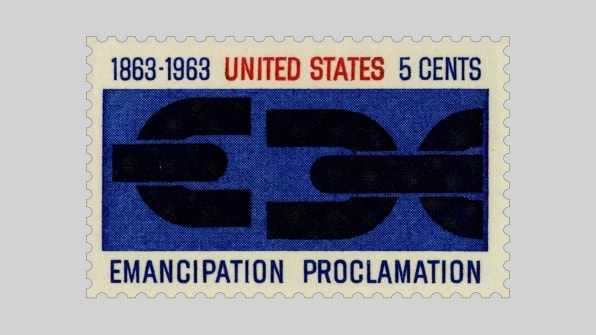
Georg Olden
This 1963 stamp by designer Georg Olden commemorated the centennial of the Emancipation Proclamation. Olden was the first Black person to design a stamp, according to the Postal Museum, and President John F. Kennedy unveiled the stamp design in a ceremony commemorating the date.
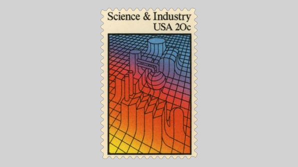
Saul Bass
An Oscar-winning designer who created title sequences and poster art for classic movies like The Man with the Golden Arm, Spartacus, and Psycho, Bass designed this USPS stamp in 1983. Called “Science and Industry,” Bass created an abstract design where smokestacks morph out of a grid to suggest the merging of the two disciplines. It was his first stamp.
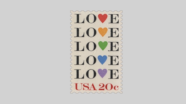
Bradbury Thompson
Thompson “was a master” of stamp design, according to USPS art director Derry Noyes, who has been with the agency for 30 years. This design plays on the meaning of the word in the typography itself by changing the “V” into a heart shape, and then repeats the word down the stamp with the heart in different colors. Thompson is credited with more than 90 stamp designs, according to the Rochester Institute of Technology.
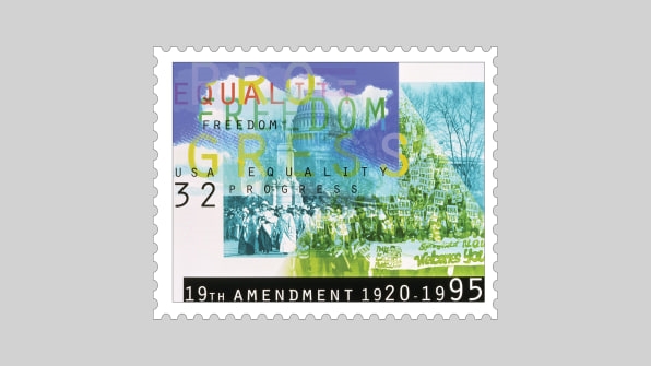
April Greiman
The renowned interdisciplinary designer designed these stamps commemorating the 75th anniversary of the 19th Amendment, which granted women the right to vote in the United States. The design overlaid a 1913 photo of women protesting at Woodrow Wilson’s inaugural parade with a 1976 photo of women protesting in favor of the Equal Rights Amendment at the Illinois State Capitol. The way Greiman overlaid the photographs and set the type was controversial at the time; the design was loved by some and hated by others.
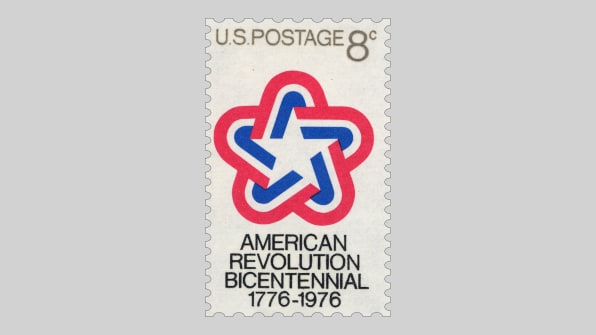
Ivan Chermayeff
Chermayeff, one part of midcentury branding powerhouse Chermayeff & Geismar (now Chermayeff & Geismar & Haviv), whose work includes the Environmental Protection Agency identity, the NBC peacock logo, and Chase bank, designed this stamp and logo marking the United States bicentennial in 1976. It was part of an entire brand identity, which appeared on products from the stamp to the Viking Lander, and at celebrations across the country.
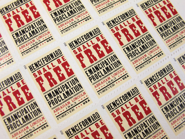
Gail Anderson
Anderson, a renowned designer and chair of the BFA Advertising and Design departments at the School of Visual Arts, designed this stamp to celebrate the 150th anniversary of the Emancipation Proclamation in 2013, which takes inspiration from wood block lettering. Anderson currently serves on the Citizens’ Stamp Advisory Committee.
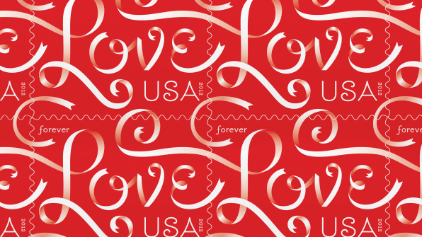
Louise Fili
The USPS issued the Ribbons Love stamp, designed by creative director and designer Louise Fili for Valentine’s day 2012. Another now well-known type designer, Jessica Hische, who at the time was a senior designer at Fili’s studio, illustrated the design. The stamp is “the smallest thing we have ever designed,” according to Fili’s website. It also claims the studio’s largest print run, with 250 million stamps printed, according to Fili.
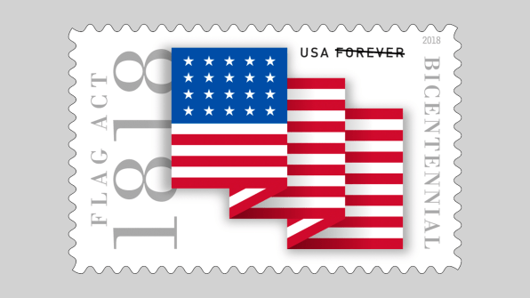
Kit Hinrichs
Famous designer and lesser known flag enthusiast Kit Henrichs worked with Kessler to design this 2018 stamp, which commemorated the bicentennial of the U.S. flag when five new states—and stars— were added to the banner in 1818. (President James Monroe signed an order indicating a new star would be added to the flag for each new state that year.)
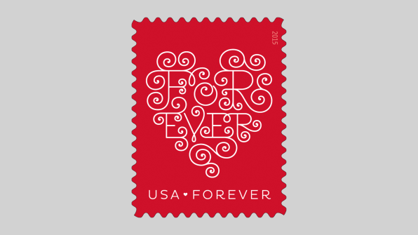
Jessica Hische
Three years after illustrating Fili’s Love stamp, handlettering artist Jessica Hische worked with USPS art director Antonio Alcalá to create the 2015 version, which swirls “forever” into a heart shape, as if made from curled ribbons. Using the word “forever” in the stamp design plays up a lasting, romantic vision of love, and the design doubles down on the feeling with the curved end caps of the individual letters, similar to Fili’s. And yet, look at the stamp at a distance and the composition is more abstract: You see the white heart shape against the red background. The design, though on a small canvas, is just as delightful close up as far away.
(33)

