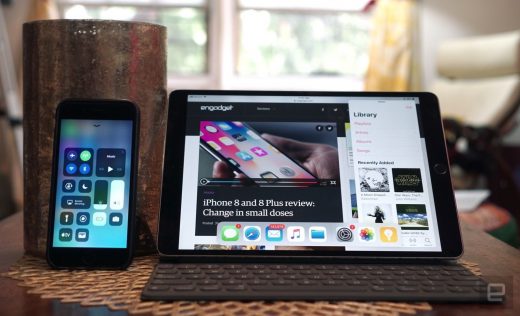
Apple iOS 11 review: A big deal for iPads, but not iPhones
When it comes to the iPad, iOS 11 delivers some dramatic changes. The most obvious one? Apple has now brought the dock, which first debuted in OS X, over to iOS. It replaces the bottom row of shortcuts that you’re used to on the home screen. The big difference now is that you can swipe up from the bottom of the screen in any app to make the dock reappear. That lets you easily jump between your shortcuts and running apps.
A longer swipe brings up windows showing off all of your apps, along with the Control Center on the right side of the screen. The new Control Center look doesn’t seem nearly as confusing on a big display as it does on the iPhone.
The dock opens up entirely new methods of multitasking in iOS. Now you can drag an app up and have it appear in a tiny window on the side of the screen. Even better, you can drag and drop text and images between those. It’s particularly useful with the new Files app, since you can easily save images and other files from the web. If you prefer the old split-screen multitasking code from iOS 9, you just have to swipe down on the smaller window.
Speaking of the Files app, it’s a particularly notable addition on Apple’s part. Previously, the company was dead set against introducing any sort of file management in iOS. But with Files (which also works on the iPhone), you’ll have an experience similar to what you’d find on Windows or MacOS. It also helpfully hooks into third-party storage services like Google Drive, Box and Dropbox. Finally, you’ll have an easy way to store documents downloaded from the web, as well as share files through email and Messages.
Apple has also reworked the iPad’s keyboard to be a tad more convenient. Instead of hitting the shift key to type out numbers and symbols, you can just flick down on existing keys to make them appear. If you have an Apple Pencil, you’ll also be able to start notes immediately just by tapping it on the lock screen. And on top of that, it’s easier than ever to mark up web pages and documents using the Pencil — there’s no need to jump into a special editing mode.
Clearly, iOS 11 is Apple’s biggest attempt yet to transform its mobile OS into more of a desktop platform. The dock enables seamless multitasking, and it finally adds decent data management with the Files app. It’s hard not to think you’re looking at a Mac when you’ve got an iPad running iOS 11 with a decent keyboard case. The iOS 11 improvements alone made using an iPad Pro much more bearable, though it’s still a far cry from what you’re able to do with a full-fledged PC. Still, the new OS shows Apple is slowly edging closer.
Wrap-up

While it’s great to see Apple making huge strides on the iPad, it’s a shame that iOS 11 doesn’t bring more to the table on the iPhone. I’m looking forward to the rise of ARKit apps and a wider user of machine intelligence, but I’m also eager to see a truly fresh redesign from Apple. It’s also a shame that we won’t see some new features, like Apple Pay peer-to-peer payments, until later in the fall.
But with the iPhone X coming soon — a device that fundamentally reinvents what an iPhone can look like — there’s a good chance we’ll finally see some big iOS changes next year.
(22)


