Apple iPadOS review: More like a laptop than ever

For the first few years of the iPad’s life, Apple basically treated it like an overgrown iPhone. Yes, its bigger screen meant people would want to use it differently, and third-party developers did a fine job retooling their software to make full use of that extra screen space. It wasn’t until iOS 9 when Apple really invested in tablet-specific features like Split View and Slide Over, and it was that subtle shift in priorities led us directly to the present — and to iPadOS.
Don’t be fooled by the name, though: iOS and iPadOS are still mostly the same thing. Nearly every feature I’ve discussed in our iOS 13.1 review is present here, along with a series of changes that are helping to slowly close the gap between iPads and more traditional computers. To get a sense of iPadOS’s progress, I vowed to put as much of this review together on an iPad Pro, and honestly, I’m pretty pleased with the results.
I couldn’t do everything, but the fact that I could write the copy, edit and watermark my photos, address fixes in Google Docs and lay out almost everything for the site speaks to how much more capable iPads can be after an update. We’re still not at the point where iPadOS turns iPads into full-blown computer replacements for most people, but the update is a big step down that path.
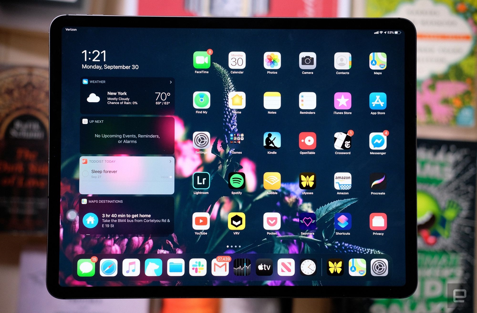
If you need even more information at all times, you can now lock the Today view and all of its widgets directly onto your home screen. I always sort of forgot those widgets were available in the first place because they were always tucked out of sight; because of that, they never really became part of my workflow. I’ve found myself relying on those widgets more now that I can integrate them into my home screen, I’d like to see Apple take a page out of Android’s playbook and let me just put those app widgets wherever I want, but who knows if that’ll ever happen?
A push for productivity
Of course, iPadOS doesn’t just look different — it feels different, especially when you’re using your iPad for more than just movies and games. While I still can’t recommend most people go all-in on the iPad for honest-to-goodness work, Apple’s refined approach to multitasking makes the prospect easier to stomach.
As I mentioned earlier, Apple’s path toward differentiating iPhone software and iPad software began with Slide Over and Split View, both of which have changed pretty dramatically this year. With the former, you can be putzing around in one app, long-press another in your dock and drag it to the side of the screen to stick that new app in a floating window. This year, all of the apps you stick in the Slide Over panel stay there; swiping across the bottom of that panel lets you thumb through them one by one. When you need to find something specific, just swipe up from the bottom to see all of them at once.
It’s particularly helpful when you’re focused on a task in the main window and need a little extra context. In my case, that usually means checking something in Slack or Gmail. Making the most of this change requires a little prep work though. Since you can only drag apps from your dock into Slide Over, you’d better make sure the ones you use frequently have a full-time spot down there.
With Split View, you can view two apps side by side, same as always. The difference is, iPadOS lets you break out parts of some apps into a second window. Imagine you’re catching up on news in Safari and you come across a link to a story that adds a little background. Just grab, drag it to the side of the screen and voila: Your original story and the new one are sitting side by side, no tab-jumping required.
Split View’s new capabilities came in especially handy when it was time to sit down and write this review on an iPad. I do most of my writing in Ulysses, not because it’s my favorite text editor, but because I can use it to access a pool of notes and drafts shared between Macs, iOS devices, and Android phones. As I write this, I have my long list of iPadOS observations sitting write next to this review; in the old days, I would’ve had to bounce in and out of different documents, and who has time for that?
Frankly, I was surprised I could use Ulysses this way because few apps seem to support Split View’s big new feature. The cases where you’d need this can be pretty niche, but once I got used to running one app in two windows, I wanted to do it all the time. What followed were a few days of trial and error, jumping into apps I used frequently, seeing what bits I could pull out into a separate window, and generally feeling disappointed by the lack of support. Now that this improved Split View is a core part of iPadOS — and by extension, every iPad — I’m sure app developers will start implementing their support for the feature soon enough.
I’m glad Apple finally got around to making this work, but I’m even more pleased Apple seems to have fixed my biggest issue with the beta software. Too often, I’d find myself holding an iPad in both hands, scrolling down a webpage, grabbing a link or an image by accident, and yanking it out into a window I didn’t want. Getting rid of it was never a problem, but because the software assumed so quickly that I wanted to do something with whatever my thumb was lingering on, the problem just kept happening. Thankfully, iPadOS now pauses for a moment before letting you drag content around. Those fractions of a second make all the difference.
What made early hiccups like those relatively easy to deal with was the fact that I’ve been testing iOS on iPads for years. If you’re new to this whole thing and have spent most of your life running multiple apps on a traditional computer, this is all going to feel strange for a while. And really, that’s the rub when it comes to these features — they don’t jibe with our (or at least, my) ingrained behaviors. Considering the power and polish going into new models, we’re fast approaching the point where you could get through your daily grind on an iPad instead of a laptop. It just takes a lot of getting used to.
Maybe that’s just my inner old man talking, though. Younger generations, those who’ve spent more time huddled around phones instead of PCs, won’t have nearly as much trouble wrapping their heads around these kinds of interactions.
There are, however, a lot of people out there who will upgrade to iPadOS and never really use these features. More immediately useful is the software’s improved approach to web browsing in Safari. It doesn’t matter whether you’re using the biggest iPad Pro or the diminutive mini — when you look at websites in Safari, you’re always getting the full versions, not some watered-down mobile views. (The trick: iPads running iPadOS tell websites they’re actually Macs running the desktop version of Safari.)
Getting to see the full-fat version of websites on your tablet is undeniably a good thing; you’ve presumably shelled out for another bigger screen, so you might as well see the internet the way it was meant to be seen. What’s even better is how well Safari manages to work with web apps and services that once totally flummoxed it. Google’s productivity suite is a great example: We use Docs for sharing and editing drafts and Sheets to flesh out scripts for Engadget Today. Thanks to Safari’s trickery and improvements to the way it dynamically interprets touch inputs, I’ve been able to handle most of a day’s work on an iPad. It’s not always easy, but it’s possible, and that’s a lot more than I could say before.
In my iOS 13.1 review, I mentioned that changes to the way this new software deals with downloads and file management matter more for iPads than iPhones. That’s mostly because we’re used to a certain degree of limitations on our phones — tablets, especially ones like that iPad that are being groomed to take over tasks from traditional computers, come with a different set of expectations.
Just like on iPhones, you can create folders, save files and organize them locally on your iPad. That’s a big deal. I can’t tell you the number of times I’ve tried to get through a day’s work using an iPad and groaning at the fact that I couldn’t just download a file locally and look at it again later. Yes, you’ve been able to store files directly into your iCloud Drive account for a while now, but not everyone wants to shell out more money for cloud storage, especially when they already use services like Dropbox or have plenty of room left on the hardware they’ve already paid for. Now, it’s not a problem.
It’s probably no surprise that managing all those freshly downloaded PDFs and MP3s is better on bigger screens, too. iPadOS’s Files app has a Mac-like column view that makes it easy to dig into all your nested folders, not to mention a much larger contextual menu for moving, copying and compressing your stuff. More interesting is how Apple allows the iPad Pros to really benefit from these changes — since they have standard USB-C ports, nothing is stopping you from plugging in a thumb drive, SSD or portable hard drive, and moving files to and fro as needed. Will most people do this? Probably not, but if you shelled out for an iPad with lots of storage space, you might as well use all of it.
Wrap-up
iPadOS is a big deal for Apple’s tablets — it’s been smoother and more stable for me from the get-go, and the extras Apple layered on top of standard iOS 13 go a long way in making it a more nuanced, capable platform. Can it finally help your iPad replace your computer? No. Not for most people, anyway. Still, iPadOS is such a strong, substantive update that it’s been making me wonder — if only a little — if I’m doing myself a disservice by clinging to old ideas of what my computer should be able to do.
(15)


