Look back at Apple’s decade of iPhones and you’ll see that, minor plastic surgery aside, they all basically stick to the same design formula. Even the company’s relatively new, larger Plus phones kept faithful to the traditional iPhone look. Those days are numbered. The iPhone X officially launches this Friday, and I’m not being hyperbolic when I say it drastically redefines the iPhone as we know it. You’ll have to wait a little longer for our full review — we’ve only been testing the phone for about a day — but there’s already plenty to get into.
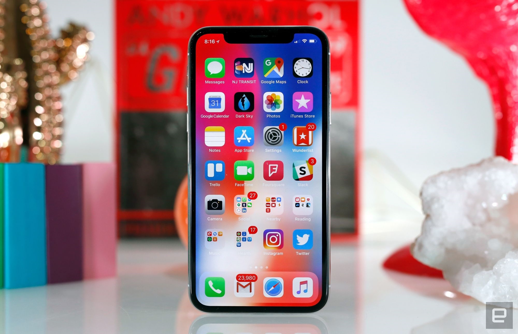
As you’ve already heard, the classic home button is gone, and the space that it used to take up is now all screen. It’s the most radical visual change the iPhone line has ever seen, and I sort of love it. Aesthetics aside, the iPhone X feels fantastic, with a level of fit and finish that’s highly impressive even by Apple’s standards. I particularly like the phone’s stainless steel frame — it adds just the right amount of heft, and the glass covering the X’s front and back melts into it seamlessly. Just look at the screen: The 5.8-inch OLED panel stretches almost completely over the phone’s face, ensuring iOS dominates your interaction with the iPhone X.

That screen, by the way, is easily among the most impressive I’ve ever seen in a phone. Apple says it tuned for accuracy over sheer punchiness, and the effect is unmistakable. While the Galaxy Note 8 delivers much more vivid colors, the iPhone X is more subdued and natural. The question of which one is “better” is ultimately a subjective one. I’ve grown used to Samsung’s lurid screens, but the iPhone X definitely punches in the same weight class, even if it seems a little dimmer.
Yes, a fine but noticeable bezel runs around the display, and yes, the notch above the screen that contains the elaborate camera cluster is a little strange. The latter is there for a reason, though: It packs a 7-megapixel front-facing camera, a speaker, the infrared camera and the dot projector that serves as the heart of the phone’s Face ID authentication system. The notch seemed like a clumsy design compromise at first, but after a few hours of using the phone, I naturally stopped paying attention to it. After all, most of the important stuff — especially in videos — tends to happen toward the middle of the screen.
Other than the notch, the rest of the phone sort of melts into the background. I’m told Apple wanted to build a device that made you feel like you’re holding software in the palm of your hand, and the X is a strong step in that direction. (Here’s hoping for smaller bezels next year, though.)
The screen isn’t just pretty, it’s a little more than twice as tall as it is wide. And a surprising number of the apps I use regularly have adapted to fill that extra space just fine. Twitter, Foursquare, Facebook, Instagram, Amazon, Bear, Dark Sky, Yelp, WSJ… the list goes on. Apple says it generally takes a few hours of work to make an existing app fully iPhone X-compatible, and I sincerely hope that wasn’t just some marketing fluff because jumping into a non-optimized, letterboxed app was more jarring than I expected. When you fire up, say, Gmail, it’s bounded on the top and bottom by empty expanses that frankly make the X look a little silly. Not exactly the experience you’d expect out of a $1,000 iPhone, but I suspect the App Store will be full of updated software by the time the X is widely available.
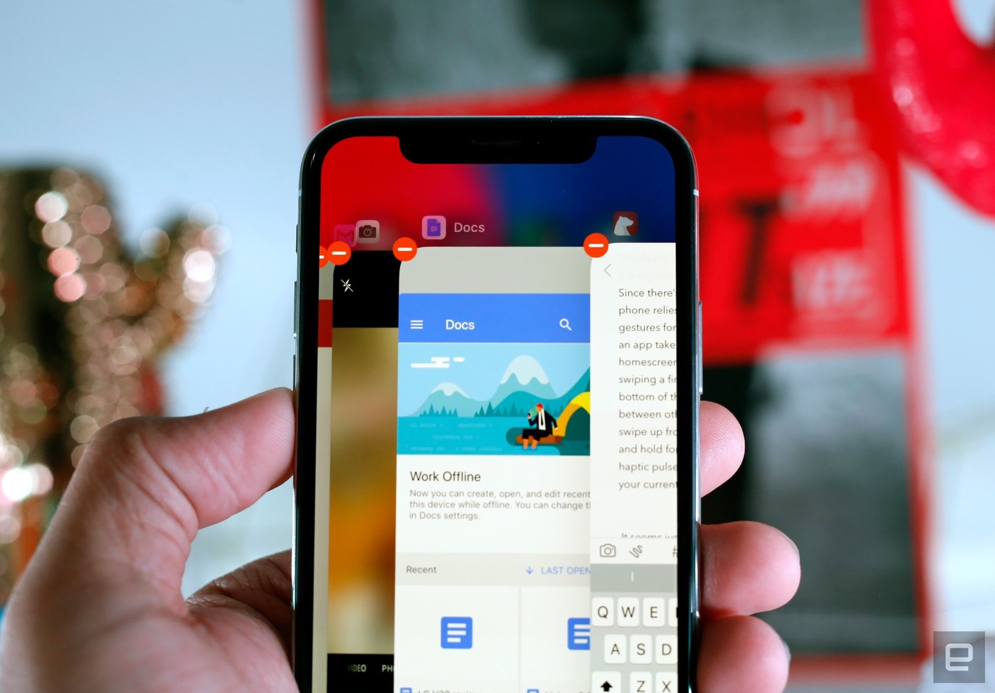
So yeah, some app experiences are a little less than elegant right now. Thankfully, navigating through the iPhone X’s interface is generally a breeze. Since there’s no home button, cruising through iOS happens with a series of swiping gestures. Slide a finger across a bar at the bottom to switch between running apps, swipe up from the bottom of the screen and hold for a moment (you’ll feel a haptic pulse) to display all of your currently running apps, or simply swipe up to go back to the home screen. Despite hitting the reset button on almost a decade of iPhone behavior, Apple has built a version of iOS that handily proves home buttons aren’t necessary anymore.

That said, it’s not perfect. Using the new app switcher seems just a hair slower than double-tapping the home button, and trying to close an app takes a little more effort than it should. Instead of swiping up on an app window to dismiss it, you have to press and hold the window, then tap a close button on the corner. The move was necessary since the swipe up does something else, but the process now takes an extra, mildly annoying step. The stock iOS keyboard also has a lot of empty space beneath it, and while Apple uses it for buttons that switch layouts and fire up voice dictation, it’s pretty ugly.
In addition to all the stuff that’s baked into iOS 11, the iPhone X packs two features that people haven’t been able to stop talking about: Face ID and Animoji. In case you somehow haven’t heard: The former replaces the standard iPhone fingerprint sensor with a clever infrared camera array that basically turns your face into your password. The latter uses the same camera system to map your face’s movements to one of nine emojis so you can, y’know, make pandas say cuss words and send them to friends.
Once my face was enrolled in Face ID — a process that took less than 20 seconds — unlocking the phone worked damn near perfectly every time. You still have to swipe up to view your home screen after you’ve unlocked the X with your mug, but the whole process is very nearly as fast as using a Touch ID sensor in a recent iPhone. Even better, Face ID works for verifying logins stored in your keychain, and every app I’ve tried that used Touch ID for identification now used my face without trouble. Since recent reports have called Face ID’s security into question, you’d better believe I’m going to spend this week trying to fool it.
And Animoji? Well, they exist, they work well, and they’re going to be unavoidable very soon. I don’t love having to say this, but I’ve accepted it: The age of talking poos is here. Oh, and fair warning: The longer you spend trying to see how those cutesy faces mirror your own, the warmer the phone gets. This theoretically shouldn’t be a problem after your initial curiosity wears off, but we’ll see how it goes.

(This, sadly, is a pretty good approximation of what my face actually does.)
Imaging-wise, the dual-camera around back is almost identical to the one in the iPhone 8 Plus. The only real difference is that the 12-megapixel telephoto camera has a wider aperture and optical image stabilization, so zoomed shots in the dark should look at least a little better. I didn’t get to test this very much, so you’ll have to have come back for the full review.
So far, what’s been most notable about the iPhone X isn’t how different it is from the models that came before it, but how soon all of the changes start to feel totally normal. Tim Cook has made clear that the X is the future of Apple’s smartphones, but the future doesn’t feel foreign at all — it feels surprisingly natural, surprisingly quickly.
The iPhone X shares a several fundamentals with the iPhone 8 and 8 Plus. They all use Apple’s A11 Bionic chipsets, so performance seems the same, and they’re all available with either 64GB or 256GB of storage. The rounded rectangular design also remains, though this is where the X’s path starts to diverge.
(45)