Apple Maps turns seven in September. When it launched, it was so bad at the basics of mapping—like getting you from point A to B—that it became an iconic example of an Apple failure. Yet in recent years, it’s moved closer to being what it always should have been: a Google Maps killer. And when the new version arrives as part of iOS 13, which is due in September, Apple Maps will be knocking at Google Maps’ door. It boasts brand-new features and massive improvements to the data that powers Apple’s mapping platform.
Perhaps the most jaw-dropping feature of the new Apple Maps is Look Around, Apple’s answer to Google Maps’s venerable Street View. Apple’s take on the idea moves so fluidly and looks so stunning that it leaves Street View looking like a relic of the early aughts.
The all new Apple Maps ‘Look Around’ feature in iOS 13 is stunning. Apple really killed it here. pic.twitter.com/9k5fmvDQ0h
— Jake Hansen (@jake_hansen_) June 26, 2019
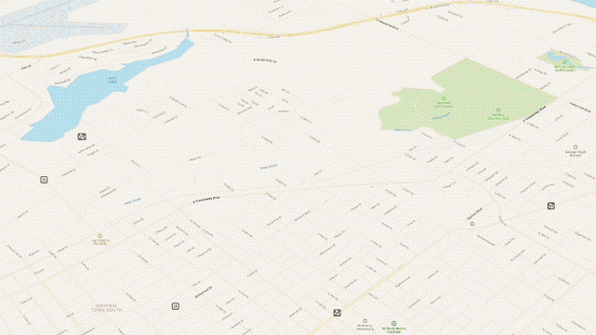
Another area where iOS 13’s Apple Maps finally surpasses Google Maps is in vegetation and building structure data. Check out the GIF below that shows Maps in iOS 12 and then Maps in iOS 13. Not only does it show how far Maps has come in just a year, but it’s also clear the new vegetation and structural data surpasses what’s available from Google.

That’s not to say Apple Maps is superior to Google Maps—yet. Google Maps still offers many more features than Apple Maps, with better design in some areas. Of course, it has a big lead on Apple, having turned 14 in February.
Here are a few places Apple Maps can learn from its older competitor:
Favorites
I’ve become a big fan of marking locations I frequent or want to remember in mapping apps. In Google Maps, you accomplish this by tapping on an establishment, then the Save button, then the heart or star icon. In Apple Maps, you tap an establishment and then its heart button.
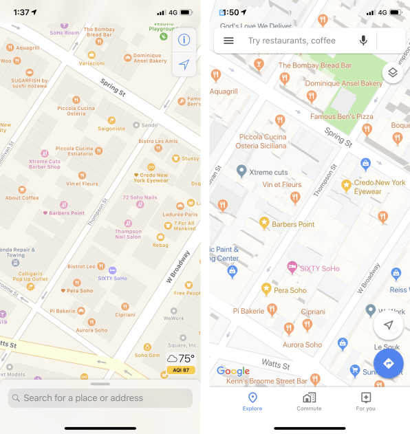
Favoriting various locations is a great way to mark places you’ve been on trips, so you remember them if you ever go back to that city. It can also provide spatial context that makes navigating a city easier, since both Google Maps and Apple Maps call out favorited locations on the map. But check out the difference between the markers of a favorite location in Apple Maps versus a favorite location in Google Maps.

Which mapping app makes it easier to spot your favorites when you’re viewing a map? Google’s. It uses a design that clearly differentiates your favorites with a star and bright yellow marker, making them easy to spot. On the other hand, Apple Maps shows your favorites with a tiny, tiny heart icon next to the establishment’s name, with the same color scheme as other non-favorited points of interest. This makes it hard to get visual context of where you are currently located by skimming the map for your favorite places.
The good news is that Apple could fix this design flaw in a day by simply making favorites easier to spot. All it would take is increasing the size of the favorite’s icon and giving it a unique color or shape.
City highlights
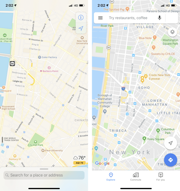
Speaking of design, Apple Maps makes no effort to call out notable or commercial areas of a city. Google Maps does this to great success by shading a city’s or neighborhood’s areas of interest in orange. That makes it immediately clear which areas of a city have a lot on offer.

Look at the comparisons above. Can you tell which areas of New York City have a lot on offer in Apple Maps? Nope. But in Google Maps it’s perfectly clear which parts of the city you should head to if you want a lot to do.
Establishment data
Many of Google Maps’ improvements in recent years have come from Google essentially turning its Maps product into a small-scale social network platform. Users are encouraged to leave reviews for and answer questions about places they’re at (“Does this establishment have parking?,” “Does this establishment have wheelchair access?,” and so on).
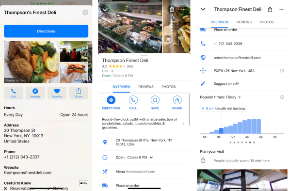
While some users find this annoying, it does help Google greatly enhance the information it can offer about establishments—and all this information is readily available on an establishment’s information sheet, including cool features like Popular Times, which shows you how busy an establishment is at any given hour, and how long people typically spend there.

By comparison, Apple Maps offers sparse information about establishments, usually limited to hours of operation, phone number, website, and whether the establishment takes Apple Pay.
Photos and reviews are another Apple Maps pain point. In Google Maps, you can browse them within the app itself. But in Apple Maps’ information sheet for an establishment, you only get a thumbnail preview of images and excerpts of the first few reviews. If you want to see more or read the full review, you’re taken out of the Apple Maps apps and to Yelp, TripAdvisor, or Foursquare (in a browser view, or their respective apps if you have them installed).
This is because Apple uses those third-party sites to source their reviews and images of an establishment and, unlike Google Maps, doesn’t offer Apple Maps users the ability to write their own reviews. If Apple has no interest in turning its mapping platform into a review service as Google has done, it should at least integrate third-party reviews and images inside the app so you aren’t kicked out whenever you want to learn more about a business.
These gripes aside, Apple Maps has made staggering leaps in recent years. It’s already as good as—or better than—Google Maps when it comes to a mapping app’s most important functions: directions and the basic accuracy of points of interest in terms of them actually being located where Apple has them. And as Apple has shown with its upcoming Look Around feature in iOS 13, it clearly has the ability to outshine Google Maps.
Most of the areas where Apple Maps needs to improve come down to small design tweaks and the need to beef up data on business establishments. If Apple puts its mind to it, it could soon have the best mapping app on the planet.
(62)