Apple Watch Series 7 review: For runners, this is the best smartwatch yet
Over the past week, I’ve been running with the new Apple Watch 7, which goes on sale today. While the new watch is a package of incremental improvements over the previous model, some of the changes impact its value as a running companion.
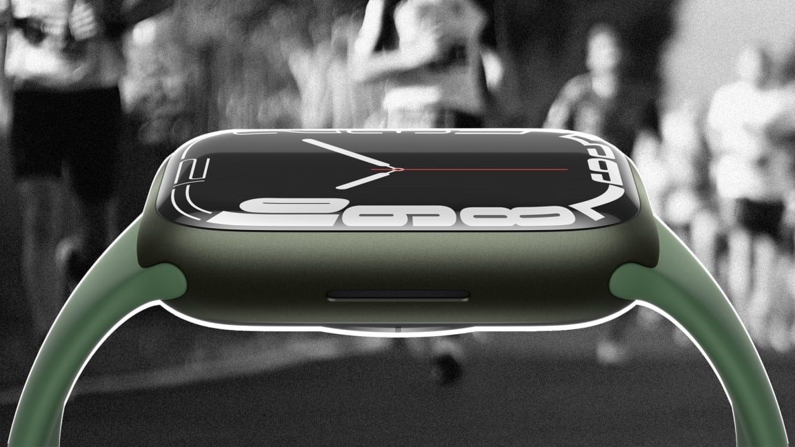
The marquee feature of the 7 is its screen size. Apple’s engineers did everything they could to expand the size of the usable display space on the watch face. The display has 20% more screen area than the Watch 6. And the bezel–the black strip that borders the screen–has been squeezed to a width of just 1.7mm.
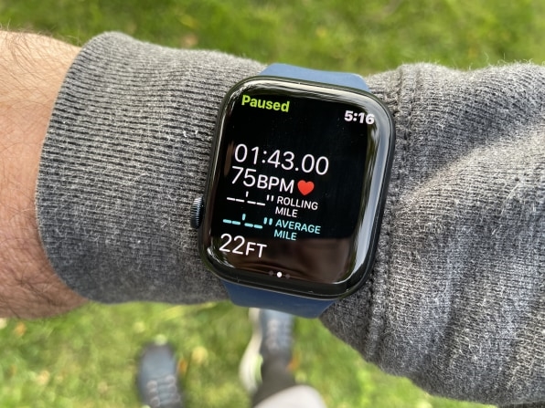
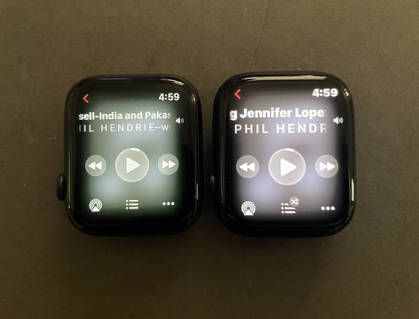
In general, Apple has enlarged the Watch apps to extend toward the new limits of the display, and they’ve made some of the text in the apps bolder and brighter. When you do a side-to-side comparison between the Series 6 and the Series 7, the 7’s graphics don’t look dramatically larger, but it’s enough to matter. I noticed the size increase most while I was running and wanted to glean information from my wrist with just a glance—the larger display made it somewhat easier to get the information I wanted. Also, I have less than perfect eyesight (I wear reading glasses), so not having to squint so hard to see the watch face is nice.
[Photo: Mark Sullivan]
There are times when I need to quickly tap on the screen while running or during walking intervals. Earlier Apple Watches have been a bit unforgiving when it comes to the accuracy of my taps. I had to deliberately hit the buttons straight and true in order for them to respond. But the Series 7’s touch screen seems easier to deal with. Many of the buttons on the interface are just bigger, so the target of your touch is easier to hit.
The app I use most during runs, Apple’s Workout app, didn’t get a redesign. But the features of the existing app are noticeably larger and more glanceable. For instance, I found it easier to quickly check my running time and heart rate while in motion, information that can be useful when adjusting my pace at different parts of the run. Also new in the Workout app is the voice which talks into my ear via my AirPods to give me my mile numbers and pace. My only complaint is that the screen doesn’t brighten fast enough after I flipped my wrist up; the screen stays in the dimmed, always-on mode while I’m not actively looking at it. (This dim mode is now brighter than in previous Apple Watches.)
[Photo: Mark Sullivan]
Both the Activity and Heart Rate apps got redesigned to take advantage of the additional screen space. I don’t often use these apps during workouts, but it’s certainly a more pleasant experience before and after. I do regularly use the Music and Podcasts apps during runs; Apple tells me that the buttons on those two apps are 9% bigger on the Series 7. The larger buttons help a little, but skipping songs or rewinding 15 seconds in a podcast during a run is still a bit of a challenge.
Bigger screen, same battery life
When I go for runs, I don’t want to be weighed down, which is why I leave my iPhone at home and depend on my Apple Watch as my only computing device. I want something on my wrist that’s compact and streamlined, not big and blocky. Still, I also want a big display. Apple’s design engineers have a hard job mediating those two ideals, but the Series 7 strikes an intriguing balance. Most of the display size increase is accomplished by decreasing the bezel space at the outside edges of the watch face, but the Series 6’s 40mm and 44mm watches grew to 41mm and 45mm in the Series 7.
Growing the display has implications for other aspects of the design. It takes more battery power to light up that extra screen space, which may be one reason Apple couldn’t deliver any battery life improvement in the Series 7 over the Series 6. Both devices promise the same 18 hours of use per charge, which means you’ll want to charge the new watch every day, either overnight or by topping it off at some point during waking hours. That’s a disappointment–it’s reasonable to expect new Watch generations to achieve better battery life by continually improving power efficiency. Apple made a trade-off here, and I’m not sure it was the right one.
On the other hand, the company has figured out a way to recharge the battery faster, a process that has Ben frustratingly slow on earlier Watches. The company says that it totally revamped the charging system inside the device, and switched to a new Magnetic Fast Charge USB-C cable, which allows the device to charge up to 33% faster and charge the battery to 80% in just 45 minutes. I didn’t do a timed test comparison between the old and new charging systems, but the 80% claim checks out.
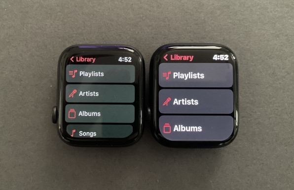
[Photo: Mark Sullivan]
This is a big deal for me and my running schedule. I don’t like to run without my Watch, because I want to measure my speed and distance and get credit for it in the Activity app. I also depend on the Watch to play music and podcasts through my AirPods to keep me distracted/entertained/psyched during runs. But there are times when I’m ready to run and I discover my Watch is undercharged, usually because I forgot to charge it overnight or because I removed its USB cable got jerked from the MacBook Pro to make room for something else. My choices at that point used to be either to run without music or a podcast, or to blow off the run. The faster charging shrinks that crucial time window when I may be tempted to go for option B. I found that even if the watch is completely dead I can wait around for it to charge up enough without losing my mojo.
More new features
I’ve never cracked or chipped the crystal on an Apple Watch, but I know it happens: My buddy Stephan banged his Apple Watch 4 against his surfboard and cracked the display. Apple says the crystal on the new Series 7 has been redesigned, and that it’s 50% thicker at its thickest point than the crystal on the Series 6. Stuff happens during runs, especially during trail runs in the mountains with hard rocks in your path. So the thicker crystal is good insurance. The Watch is also more resistant to dust particles, which could be a factor if you run on dirt roads as I sometimes do.
Finally, Apple made two brand new watch faces to show off the larger display area of the Series 7. One of them, Contour, simply jams the clock numbers into the additional space at the edges of the screen so that they refract through the bend in the glass. Another new watch face called Modular Duo is more useful, and potentially more relevant to runners. The design uses roughly the bottom 70% of the display to fit two large complications (which are something like widgets for watches) stacked one on top of the other. I’ve been using the Heart Rate and Activity complications. Across roughly the bottom third of the screen the Activity complication shows my exercise and movement levels on one-day timelines. Stacked on top of that in roughly the middle third of the screen, I can see my heart rate graphed over a similar one-day timeline. The presence of those graphs keeps me thinking about fitness during the day, and it’s also cool to see how a good run affects my heart rate and activity levels–another small reward for getting out there.
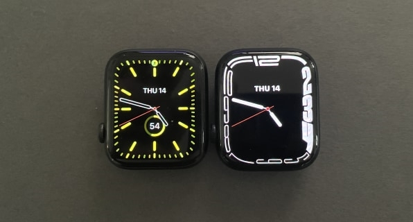
[Photo: Mark Sullivan]
The Apple Watch has come a long way since its debut in 2015. The displays on the first models looked like little squares in the middle of a lot of black bezel space. As Daring Fireball’s John Gruber points out, Apple used to make sure the backgrounds of its watch apps were black so as to obscure the limits of the display. These days, the Watch is undergoing the same process as the iPhone in covering the entire front of the device with display, so that the hardware recedes.
Personally, I like the Watch in darker colors because it understates the hardware. The new Midnight color (which is metallic black with just a hint of blue) in the Series 7 does the job nicely. The new dark green color (imagine a deep forest green integrated with metal) is equally understated, and perhaps my favorite Watch color to date. Apple also added a Starlight color (a mixture of silver and gold), brightened its blue watch’s color, and made the red watch’s color deeper and richer.
The Apple Watch Series 7 starts at $399 (41mm) and $429 (45mm) for the aluminum-cased versions. As other reviewers have said, these watches aren’t a huge leap forward; most Watch Series 6 or SE owners can probably stick with what they already have and not feel too left out. For people who have older Watches with smaller displays and weaker processors, upgrading to Apple’s latest and greatest may feel like money well spent.
And I’d say about the same for people who rely on their Watch for running. The added display size is nice, and the faster battery charging makes a difference, but these are still incremental improvements. And then there’s my beef about gaining no additional battery life. All in all, I’d probably have a tough time advising other runners who have relatively recent Watches to shell out $400 for 20% more display space and 33% faster charging.
Still, it’s worth saying that I don’t see myself switching from the Watch to some other running companion. The Watch is simply the best-designed, most accurate, and most versatile smartwatch I know of, and I don’t expect that to change anytime soon.
(34)

