When Apple hosts its annual WWDC event next week, let’s hope that we learn that one of its top priorities will be to overhaul the Apple Watch.
Unsurprisingly, Apple’s first smartwatch is far from perfect. That’s always true of first-generation Apple products. But what makes the Apple Watch different from previous rough drafts, like the original iPhone and iPad, is that it’s not merely limited in features or held back in hardware capabilities. Instead, it’s the Apple Watch’s existing functions that haven’t all proven useful.
Rumors have hinted at an upcoming Apple Watch 2 with a faster processor and standalone cellular connectivity. Those may address some complaints that the watch is too slow and too dependent on a nearby smartphone. Still, the bigger flaws are on the software side, where large swaths of the interface tend to go unused. It’s time to rethink major aspects of how WatchOS works.

1. Full-Blown Apps Should Go Bye-Bye
Currently, Apple Watch apps exist in one of four states:
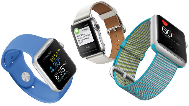
• Notifications, just like on your phone, pop up alerts in real time, often with the ability to perform an action such as replying to a text message or deleting an email.
• Complications are customizable slots on the watch face that provide tiny bits of information when you raise your wrist.
• Glances let you swipe upward on the watch face to summon a row of informational cards, letting you glance at the weather, sports scores, calendar appointments, and other tidbits by swiping left or right.
• Full-blown apps are anything not covered by the above three states. They support multiple screens of information, voice input, and fine-grained controls through the watch’s Digital Crown.
After using an Apple Watch on and off for a year, I believe full-blown apps should be eliminated or at least de-emphasized. While much Apple Watch app criticism fixates on slow loading times—a problem that faster processors would eventually fix—the real issue is with interaction time. Most full-scale Watch apps require swiping through multiple screens, invoking menus with 3D Touch, and making precise scrolling motions with the Digital Crown. Usually it’s faster and easier to just take out your phone.
“A lot of people use apps much more infrequently than we would have thought,” says Adam Grossman, co-creator of the popular weather app Dark Sky. “I find myself almost never going to the app screen and launching the app, and I think that’s true for most of the Apple Watch users I’ve talked to.”
Grossman notes that having to repeatedly swipe through different screens in an app is more annoying in practice than he first expected, and while Dark Sky has reduced the number of screens in its own app, he still tends to access the app through notifications, Glances, and Complications.
It might make sense, then, for Apple to enhance the capabilities of the Watch’s other modes of operation as a way of making full apps unnecessary.
For example, third-party Glances could support basic interactivity through on-screen buttons or the Digital Crown, just like Apple’s own Glances for Settings and Now Playing. That way, you could cycle through sports scores with the ESPN Glance, begin a workout in Strava, or give a thumbs-up or thumbs-down to the current track in Pandora. Because everything would have to fit on a single screen, apps would become much simpler and faster.
Complications could also become more useful by giving developers greater control over the available space. With Dark Sky, for instance, Grossman says he’d like to show a graph for upcoming rainfall, but that’s not currently possible.
“The way Complications work is, it’s not like you get a little square, and you can put anything in that little square or rectangle. There are a few templates you can use, and you can fill in those templates with data,” he says. “I would like to see a little more freedom in what you can put in a Complication.”
2. The App Launcher Needs to Be Blown Up
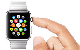
Whether Apple does away with full-blown watch apps or not, the home screen needs a better system than an unruly cluster of tiny app icons.

“It is very awkward to launch an app right now,” says Justin Ng, whose game studio Sneaky Crab developed an acclaimed Apple Watch game called Timecrest. “The interaction model is actually very challenging for an app designer, because it’s a big commitment to go searching for the app you want.”
One potential solution: Borrow from the iPhone, and replace the launcher with proactive suggestions based on context. With the iPhone, you swipe right from the home screen to see recommended apps, music, contacts, nearby places, and news items. On the Apple Watch, this could be the default way to launch apps.
Imagine, for instance, seeing a quick launch button for recent music when you get in the car, or a link to your smart home controls when you get home. A link to your favorite workout app could appear when the Watch detects movement and increased heart rate. The full app launcher may not have to go away completely, but would only serve as a last resort when Glances, Complications, and contextual suggestions aren’t enough.
3. Siri Must Get Smarter
None of this is to say that the Apple Watch shouldn’t allow for complex interactions—the kind that might require an app on a smartphone or tablet. But instead of flicking around on a tiny screen, users should able to dictate what they want through voice commands.

“I think one thing that is very unexamined and is very important on Apple Watch is hands-free,” Ng says. He imagines a scenario where he’s cooking, and voice controls would allow him to advance through instructions without touching the Watch.
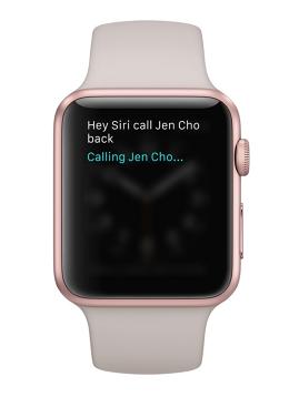
That dream might not be so farfetched. Ahead of WWDC, there’s been talk of Apple opening up Siri to third-party apps, and those expanded controls would feel right at home on the Apple Watch. After all, talking to the device on your wrist would be even faster than taking out your phone to do the same thing.
To be clear, the Apple Watch isn’t a terrible product. It’s great at notifications and fitness tracking, and it’s far more stylish than most other smartwatches. Those advantages have helped give Apple’s first-generation smartwatch more market share than all competing products combined.
Still, one study from last year showed that beyond those two uses, people are rarely turning to the Apple Watch for much else, and even Apple seems to have de-emphasized all other functions on the Apple Watch website. For the Apple Watch to become essential, it’ll need to get better at everything it’s meant to do.
Read More:
Fast Company , Read Full Story
(34)