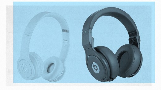
Beats By Dre Isn’t Great Design, Just Great Marketing
The headphones are designed to turn your head into a billboard for Beats by Dre.
Beats by Dre single-handedly brought mainstream appeal to high-end headphones, giving young consumers street-ready cans with plenty of street cred. But Beats isn’t great design—it’s just great marketing.

As an object, Beats Solo, the brand’s best-selling model, are simply average, bass-heavy headphones offered in a variety of bold colors. When young consumers save up $200 for them, they might even buy into the brand’s mythology that they’ll finally “hear what the artists hear.” But what they’re really buying into is a seductive brand image fueled by a massive celebrity endorsement strategy.
This strategy has worked, creating a powerful allure that helped sell four Solos every minute of 2013 and eventually inspired Apple to acquire the brand for a thumping $3 billion. The more adolescent part of me wants a pair, too, and Beats deserves credit for making headphones that are more inspired by fashion culture than audio culture. But, while the design isn’t bad, it is entirely overrated—more ubiquitous than iconic, with a chunky design language focused primarily on turning your head into a billboard for the logo.

Case in point: the color scheme. In marketing shots, the design language and bold colors of Beats look pure. When those headphones are on someone’s head, that purity is compromised, with nearly everyone having to expand them to properly fit. The visible metal band that appears awkwardly breaks the continuity of that signature color, an obvious design flaw that remains unresolved with the redesigned Beats Solo 2 model as well.
These headphones aren’t Tesla, they’re Hummer—more of a blunt status symbol than a thoughtful infusion of aesthetics to a product category which is typically under-designed. This has been enough to dominate the market, as most other high-end headphone brands have been far less capable marketers, slow to untether the product from its audiophile roots. If only Grados didn’t look so alien. If only Bose didn’t feel so corporate. If only Audio-Technica had a bit more edge. They might be able to tempt impressionable young consumers to listen more closely, to put on a pair of headphones that could turn down Beats’ shiny-sexy-cool hype machine pounding the bass in their heads.
More Essays On Overrated Design
It’s Time For The Minimalist Poster Trend To Die by John Brownlee
What Champions Of Urban Density Get Wrong by Inga Saffron
The Case Against Open Design Competitions by Kriston Capps
Hate Your Soulless Office Tower? Blame The Seagram Building by Martin C. Pedersen
No, Flat Design Won’t Save Your Garbage App by Adrian Covert
You’ve All Been Had, Keurig Coffee Is The Devil by Mark Wilson
Please Stop Making Stupid Smart Jewelry by Kelsey Campbell-Dollaghan
Delightful Interaction Design Needs To Die by John Pavlus
The Thinkpad Is A Lasting, But Overrated, Design by Mark Wilson
Fast Company , Read Full Story
(124)


