Beyond The iPhone: What Apple TV Reveals About Designing For Tomorrow’s Devices
Four principles for designing Apple TV interfaces
Apple TV is not an iPhone. You may think this is obvious now, but you’d be surprised how many expectations you subconsciously carry from one context to the next. Take a look at the state of the platform, and you’ll see that most of the tvOS App Store consists of poorly transplanted iOS apps that have no idea what to do on the big screen. I would argue that most developers have not yet learned that Apple TV is not, in fact, an iPhone.
This is troubling given that we are on the eve of a computing era in which consumers increasingly reply on input devices such as Apple TV to complete their digital experiences. Think about car plug-ins, smart-home gadgets, and other devices made possible by cheap, ubiquitous sensors. Tomorrow’s computing landscape will be littered with phone-like devices that aren’t as sophisticated as smart phones and therefore don’t subscribe to the same rules of good interface design. Apple TV is just the most recent example, but it certainly won’t be the last. What follows are four principles for designing Apple TV interfaces.
Credentials
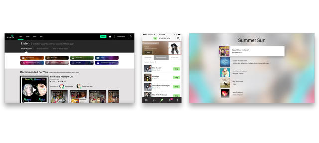
I designed Smule’s Sing! Karaoke, one of the first apps for the Apple TV, and the first to receive critical praise. At the moment of this writing, it is a popular app, ranked above Netflix and reviewed in the New York Times. Making a compelling experience on a fresh platform was no small feat. It involved a huge amount of experimentation, play, and self examination. In many cases, our greatest challenges included overcoming our own mindset about how people relate to technology.
Think Small, Make Big
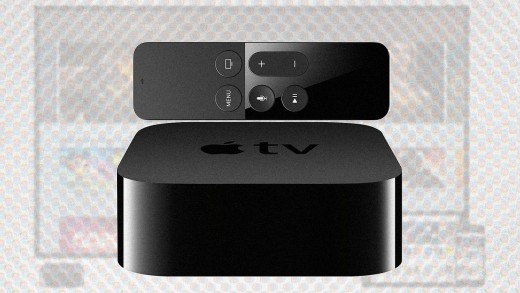
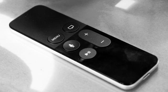
The most important thing about Apple TV is what it doesn’t do. No touch screen. No multitouch. No camera. No microphone access for developers. No keyboard. No haptic feedback. No pinch-zoom. No notifications. No 3-D press. No mapping of the touch surface to the screen. You do have six buttons, but they’re for OS tools like Siri or going home. What you do have is a small matte surface that you can drag your thumb across and press to click.
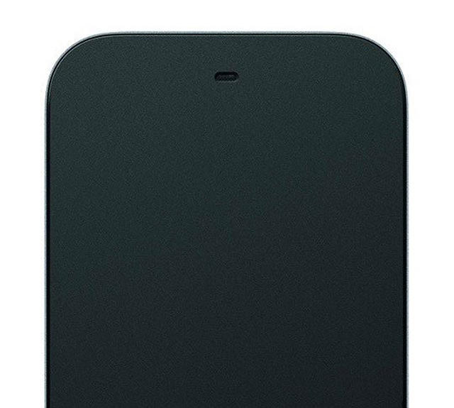
As a user of Apple TV, the single-touch remote feels like a godsend. It means that I never really need to think about where my thumb lands on the remote or how I touch it, it just tends to work. I can do big, lazy gestures like broad swipes and unaimed clicks, and that’s enough to get where I want to go. Most importantly, I can interact with the remote without looking at it, or often at the screen. It is a blunt, but effective instrument.
As a developer, the feeling is one of assuming zealous asceticism. It feels as if our hands are bound and our diet reduced to rice. The sheer variety of gestures on mobile devices lets us pack them with features and rich interactions. We’ve been spoiled by them. A hard press here, a long-press-leading-into-a-drag there, and so on. It’s as if major developers were in an arms race to see who could invent the most convoluted gestures. This is the world we are accustomed to, and it feels like we’re being set up for a malicious prank when a flashy ad tells us about the hot new single-touch device.
The only way to convert an iOS app to a tvOS app is to gut it and cut out everything that you cannot do blindly with your thumb. Features you may love need to go. Features you cannot do without may need to be broken and remade simple and foolish. No more sliders, no more toggles, no more options, no more customization. Just what you can do with your thumb, while looking elsewhere.
I developed some big ideas with my team—ambitious, brilliant, wonderful ideas that would be incredible on the big screen, except that they were impossible. tvOS works well for simple racing games, browsing grids, and rewinding videos. Don’t push your luck. It can be a hard pill to swallow, but tvOS forces you to make the absolute simplest version of an app.
Consider how the simplicity of mobile technology took many people off guard. Firms were accustomed to the web, where a page can be packed with dozens of links and remain usable and effective. A website can do many things for many people and remain useful for all of them. A mobile app, on the other hand, is generally specialized for one and only one function. It’s generally accepted that the least useful apps are the ones that do more than one thing. After years of informational glut, we were forced to focus, prioritize, and simplify for smaller screens.
tvOS pushes us to simplify again in much the way mobile phones did. This time it isn’t enough to focus on a single function that fits on a palm-sized screen, it’s necessary to distill it into something even more primitive and pure, that fits under your thumb.
So, think small. Whatever your idea is, cut away all of the layers until you have something that you can control with a finger-sized touchpad.

Once you have this sliver of an idea, make it as big as you can. Blow it up. Overflow the screen. Leaving a frame around the content implies that there is something else lurking in the negative space that you need to watch out for. It implies that what you’re looking at is not the full story. On the other hand, making content fill the screen from corner to corner tells you that there is nothing else, and it leaves you free to become absorbed and lose yourself.
Movement and Sound
Touch screens spoil us. We take it for granted that we can reach out and press a finger against an object of our perception and it will respond in some expected way. In a well designed app, we can interact as effortlessly and intuitively as if we were manipulating physical objects directly. Not so with televisions.
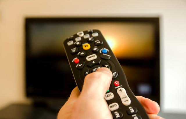
Most TV interfaces are just awful. We use little coded buttons to move boxes around, slowly and deliberately, from the other side of the room. The interactions are tedious, time consuming, and do not cultivate the feeling of direct interaction with objects of your experience. Your average TV software—be it Roku, older models of Apple TV, or cable—feels disembodied and contrived.
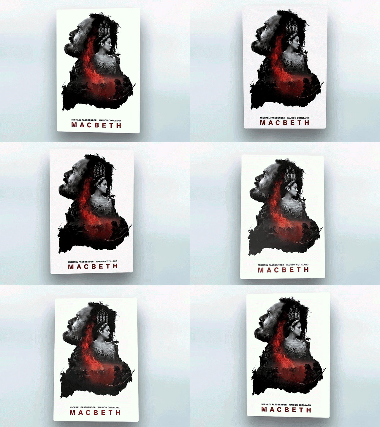
The new Apple TV takes a big step towards becoming an immersive interactive medium. The new remote uses a special “tilt” animation to rotate a piece of content in response to small motions of your thumb against the touch surface. Important elements often include parallax effects, to make this animation more vibrant, and little sound effects pop in every time you switch focus between objects. Together, these details contribute to a vague, but genuine feeling of direct manipulation. Your smallest intentional motions translate to visual and auditory feedback that helps you move around quickly and effortlessly. This works well enough that most people never even mention it, it just feels normal.
I bring this up because I think that many developers don’t appreciate how important these details can be. Apple gives you some of these tools, but I’ve certainly found many instances where it was necessary to create new sound effects or custom UI elements that move with just the right kind of responsiveness. There is no better way to make an app feel dead to the touch than to neglect these small flourishes.
Social Ergonomics

Technology has ways of bringing people together, but can also make us lonelier. Mobile phones in particular mean that we are never out of touch with each other, but we experience a dire cost when we share public space with other people absorbed in their own private experiences. These aspects of technology can be truly isolating.
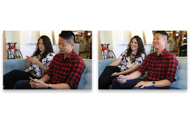
Apple TV is among first mainstream tech products designed for shared experience. It’s obvious that everyone gathered around it shares the same experience of the screen’s imagery and sounds. What is less obvious though, is the extent to which the tech gets out of the way when people are together. The remote is unobtrusive and fully operable with one hand while you make eye contact with someone, watch the screen together, cuddle, and so on. It is not only designed to create a shared experience, but it knows when to remove itself from it.
As a developer, you have some responsibility not to force users to interact with the remote too often or in ways that could disrupt their social flow.
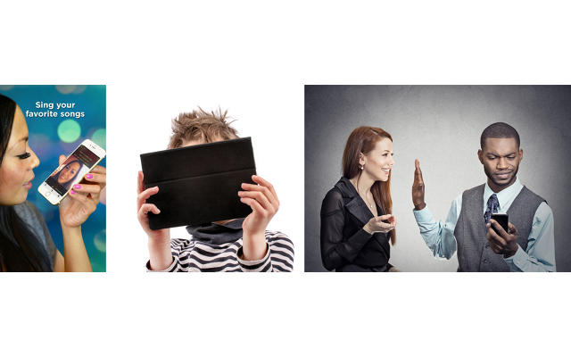
One dramatic example of this comes from my own app, Sing!, which can be supplemented by pairing iPhones with the TV to stream audio as high-tech microphones. Sing! is an existing app on iOS, in which you perform—typically as part of a duet—and upload your performance to our platform where other people can asynchronously join you in song. It’s an innovative form of social collaboration, but the ergonomics of it require that you hold your iPhone out in front of your face like a mirror to record. This closes your field of view, and shuts you off completely from everything and everyone around you. It embodies the paradox of technology that both connects and isolates us.
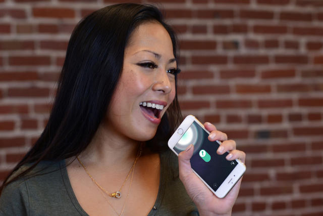
For the experience of pairing with Apple TV, I very deliberately designed the iOS app to encourage more open postures. Users are prompted to flip their phone and hold the microphone side up. This forces one to grip the phone as if it were a traditional stick mic, below their mouth and holding it with the edge in front. Holding the device sideways creates a slim profile that leaves more of the user’s face visible. Holding the device lower means that they can see lyrics on the screen, but also see and interact with the people around them. We support multiple paired iPhones for duets, naturally, and it works wonderfully for karaoke parties.
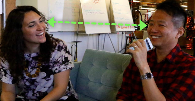
I’m sure that other developers will experiment with new ways of connecting devices to augment the platform’s limited hardware. It will be important to consider not only the added functionality, but also how it shapes the social dynamics around its use. Sensitivity will be the difference between something that creates positive shared experiences among friends and something that leaves you cold.
Heightened Reality
The television is not a new invention. It has existed for generations, and has largely served to extend a deeper tradition of theatrical performance that goes back as far as known civilization. At its heart, the big screen is about role play, storytelling, and drama.

Think about what we see on TV. Typically, we watch unrealistically good-looking people pretending to be other unrealistically good looking people, playing out fictional scenarios far more interesting than our own lives. Even mundane sitcoms rely on an air of heightened reality to remain interesting. Every week Jerry has a new girlfriend and Kramer has a new get-rich-quick scheme. Everyone one Wisteria Lane is either involved in an affair with everyone else or trying to kill them. JD and Turk somehow manage to spend more time playing games with medical patients than doing paperwork at a hospital. It’s not just TV shows. Video games rely heavily on roleplay and assuming dramatic roles. Every game has its own mythology to make you feel that the stakes are high. Televised sports are about exceptional athletes competing in scenarios contrived to elevate play to a level where the world itself may as well be at hazard. I won’t even touch on the news.

The TV fundamentally isn’t about to-do lists, sending emails or the mundane. It’s about larger than life ideas, people, and stories. It’s deeply mythic.
Apple TV is no different. The apps that succeed on the big screen are the ones that feel grand and play to the medium’s theatrical roots. Games and streaming apps completely dominate the App Store charts. More functional apps struggle to find their place.
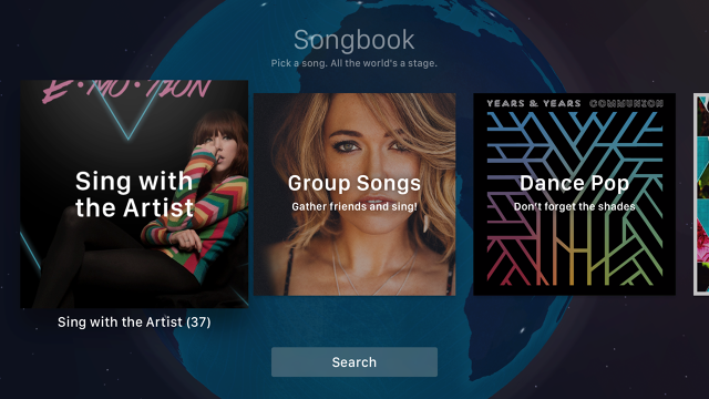
I struggled immensely to fit karaoke into a mythic framework. After many iterations and a trip around the world, it occurred to me to use the globe as the way in. Unlike other karaoke software that consists of tables of songs and scrolling lyrics, I created expansive songbooks that float through the cosmos above Earth. You literally dive into them to search for songs, and then find singing partners by tossing a paper plane around the world. Each person you meet feels huge and important, popping up from their actual geo location, and when you join them the stars themselves dance to your voice. We spent weeks developing the 3-D model of Earth, investing it with attributes of magical realism and subtle fantasy. Ghostly geometric figures drift through the sky, and a soft glowing sun moves around Earth—because Earth, and the people on it, are still the center of this story. There is no moon, because this is not the real cosmos. By adding these layers of beautiful but functionally superfluous details, I managed to elevate the experienced reality of the content. It’s still just karaoke, but you feel a sense of wonder and excitement.
This strategy worked. Many early reviewers have called out Sing! as one of the best-adapted apps to the big screen. Our community raved about it. I watched a friend’s child spend hours completely absorbed with it. I hope to see other developers raise the bar even further.
This essay was reprinted with the author’s permission. Read the original here.
Related: History of Apple in Under 3 Minutes
[All Images: Ben Hersh via Medium]
Fast Company , Read Full Story
(23)

