Comcast’s new remote control was designed for—and with—disabled users
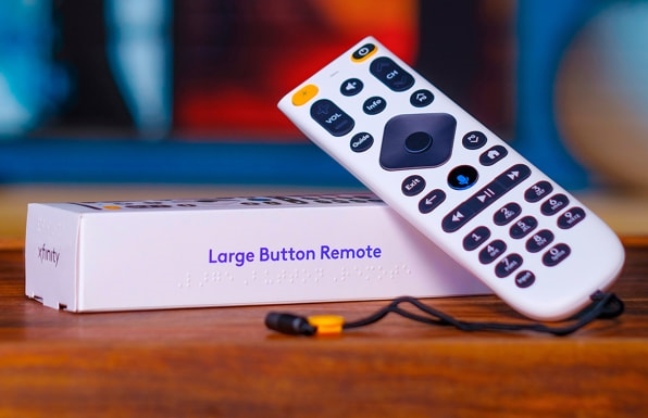
Measuring about the size and weight of a circa 2000 cordless phone, Comcast’s new TV remote control is quite a noticeable deviation from the slim, streamlined remotes of the smart TV era. Measuring more than 7 inches long and 2 inches wide, this new brick-size remote is different for a purpose. With larger buttons, bigger text, backlighting, and built-in voice command capability, this is Comcast’s first attempt at making a TV remote specifically for people with disabilities.

The remote is intended for a variety of users, including people with low vision, dexterity challenges, and those who use wheelchairs. For Comcast, it just may be the start of a new way of reaching customers.
“It’s a jumping-off point for us,” says Tom Wlodkowski, Comcast’s vice president of accessibility, who led the research and design process of the new accessibility remote. “We’re getting requests, as I’m sure others are, for remotes that work for people with dementia and other conditions, so I see this as our phase one.”
The remote is not the first designed for use by people with disabilities, but Wlodkowski says it’s the most comprehensively designed remote to date. Comcast’s Xfinity TV service previously offered a large-button remote to users upon request, and the standard issue remote included voice command controls as a default feature. This new remote, designed in-house, unites these features into a single device.

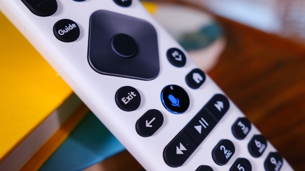
Holding a sample, the remote doesn’t feel all that different from the experience of using remotes of the recent past, but there are subtle design elements that set it apart. There’s higher contrast in the colors and materials, larger text, and backlighting on the buttons, which activates whenever the remote is moved. The buttons themselves are much larger than the typical remote, and require less pressure to push.
A haptic motor inside enables the remote to vibrate during specific commands like when an app is successfully installed or when an error is made, and an attached wristband makes it less likely to fall out of reach. There’s even a simpler process for opening the battery compartment, which slides down at the touch of a button, revealing easily manipulated rubber tabs to lift out dead batteries. “You don’t have to pry them out with your fingers like you do on other devices, including our standard remotes,” says Wlodkowski.
The remote also has a flat bottom, unlike many remotes which are curved to rest more comfortably in the hand. Comcast’s current standard remote also has a flat bottom, but this new version is wider, tapered, and weighted differently to ensure greater stability. This design is geared toward wheelchair users who often use remotes on trays or tables, and sometimes press buttons using sticks or other tools.
Several accessibility features, like voice control and button backlighting, have had iterations in past standard remotes. The company says it has been adding these elements to its devices over the past decade. But this new remote pushes them in a much more deliberate direction.

The design is the result of a year-long effort, with Comcast’s accessibility team working closely with its industrial designers to translate user feedback into a more usable device. The research included user tests and focus groups conducted with residents in an assisted living facility in Connecticut and attendees at a convention of the American Council of the Blind.
Wlodkowski says the team learned a lot from the ways people with different disabilities have hacked usability into preexisting devices. “People will put stickers on buttons, like channel up and channel down. Sometimes, you’ll see people covering up buttons that they didn’t want because they were too confusing,” he says. These findings helped the designers prioritize button sizing and location for users with dexterity limitations, and better lighting and color contrast for users with low vision.
Comcast’s industrial designers conducted multiple sessions with the residents at the assisted living facility, and would bring the latest 3D-print iterations to assess functionality. Wlodkowski, who was born blind, says he served as a kind of in-house focus group of one—or, as he puts it, a “lab rat”—for the design team. “They’d schedule meetings, and I’d show up and there would be three different 3D-printed models sitting on the table and three or four designers starting at me,” he says.
All this feedback informed both the big and subtle features of the design, which Wlodkowski says helped make the device much better. “There’s a saying in the disability community that comes out of the civil rights world: Nothing about us without us,” he says. “We can’t build any product, and companies shouldn’t, without people with disabilities involved in the process.”
There’s good business reasons to do so, as well. Wlodkowski says the user base for this new remote is growing. The company currently ships only about 800 large-button remotes per month but handles more than a billion voice commands per month. “Voice works for a lot of people, but we know that voice is not a one-size-fits-all solution,” Wlodkowski says. “Somebody with ALS can’t speak in many cases, as that condition progresses, so we have to have multimodal experiences.”
Wlodkowski says that beyond the disabled community, more and more older people will benefit from the design of this remote. “We know that as people age, dexterity challenges come into play, vision challenges come into play, hearing and motor capabilities all decrease in some ways,” he says. “There’s this intersection between inclusive design and the needs of older adults, most of whom won’t self-identify as having any kind of challenge or disability.”
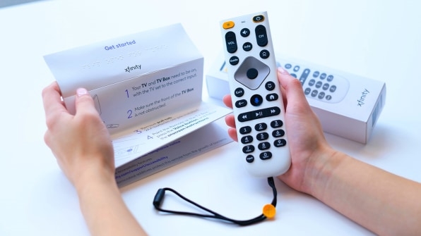
Accessible design considerations were even applied to the remote’s packaging, which has Braille on the sides indicating that the box holds a Large Button Remote (as well as the Braille for Xfinity on the box top). And a tactile tab helps users feel which side of the box to open. Braille is also on the accordion-folded paper instruction manual.
Unexpectedly, the instruction manual “speaks.” While unfolding the paper, a short jingle rings out, and then a voice recording announces: “Hi! This is your new Xfinity remote audio guide.” The audio briefly walks through some basics about the setup, explaining that batteries are preinstalled, and that the large, glowing button beneath the navigation pad is what users need to push to get started.
Wlodkowski adds that, as someone who’s destroyed a box or two when opening a new device, it was important to think through not just how people will use the remote, but also how they’ll maintain it, how they’ll set it up, and how they’ll have their very first interaction with it when it’s still inside the box. “It’s an end-to-end solution,” he says.
(51)


