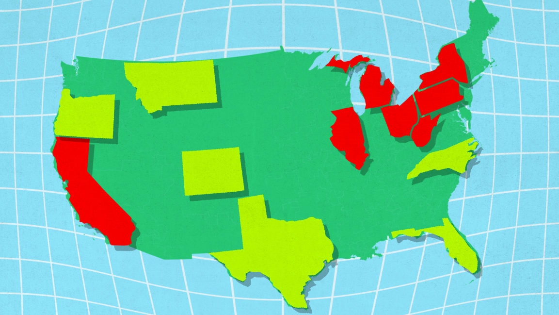
Congressional seats by state: These maps show who gained and lost after the 2020 census
The U.S. Census Bureau on Monday released new figures for 2020 that will determine the allocation of congressional seats, and not surprisingly, they caused a stir quicker than you can say Abolish the Electoral College.
Congressional districts are drawn according to population—the House gets 435 of them to divvy up—and so changes in the decennial census mean changes in where the seats end up. As Americans have migrated to warmer climates over the last 10 years, those patterns are evident. Texas, the decade’s big winner, is walking away with two additional seats, while reliably blue strongholds New York and California both lost a seat.
It’s not that New York and California have fewer people than they did in 2010. Quite the contrary: They’ve increased their resident populations by 6.1% and 4.2%, respectively. It’s just that other states are growing faster—Texas is almost 16% bigger than it was 10 years ago. Florida, which gained a seat, grew its population by 14.6%.
Spatial analytics company Esri has just released a few new interactive maps that visualize the current situation in which we as a nation find ourselves:
The second of those two maps shows you how many congressional seats each state now has, and it’s color-coded based on whether the state has gained or lost. You can see from the map that the majority of states broke even. Those are shown in grey. However, the population shifts are also clear, with six states in the Midwest and Northeast each losing a seat.
Granted, none of these population shifts predict how people will vote in future elections. Oregon and Colorado, which both gained a seat, went to Joe Biden in 2020. And people who migrate are probably going to take their voting habits with them. But with the House already up for grabs in 2022, there’s a lot at stake. Needless to say, you can expect next year’s midterm election to be even more of a nail-biter.
(30)


