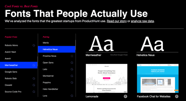
What typefaces do designers at top startups really use? According to some fun new research from the icon company Icon8, it’s not the latest, trendiest fonts. Instead, in practice, they used tried and true system typefaces–and that’s not all they discovered about the theory versus practice of these designers.
For the study, Icon8 analyzed data from ProductHunt, a popular tech website that has curated new mobile apps, websites, and hardware projects every day since 2013. They made a list of all of almost 1,000 of the top sites and apps featured on ProductHunt, and then snatched their CSS files–which, of course, describe the physical appearance of the sites, including the fonts used. Using that dataset, they built a landing page, called Fonts That People Actually Use, where anyone can browse the font combinations used by companies that range from up-and-coming startups to now-established juggernauts. The tool shows the most popular fonts sorted by popularity (Helvetica Neue wins). In the second column, you can see the most popular second typeface on the site, which gives you an idea of the most popular font combinations. Finally, in the third column, there’s the actual font samples and websites that use it.

One surprising finding: Designers tend to misspell font names. “Of 500 unique fonts that we scraped, only 126 had matches in any of three libraries [Google Fonts, Typekit, and Font Squirrel],” Icon8 writes. The culprit, in the majority of the others, was typos. But browsing the analysis, one major takeaway becomes clear: Designers may talk a big game about cool new font combos, but they actually don’t use them when it’s time to get the work done. Instead, they use a lot of system fonts, like Roboto, combined with Google fonts like Open Sans or old standard Helvetica Neue. Or, as Icon8 puts it, “People don’t look like their Instagram shots. True. People are not as happy as their Facebook profiles are trying to convince us. True. And designers don’t use all those trendy font combinations. True.”
(66)