Everything Everywhere All at Once won’t win the Oscar it should have won automatically
I call it “mundane surrealism.” He calls it “magical realism.” In any case, the work of production designer Jason Kisvarday is all about creating a sensation of quirky awe on budget-minded films such as Sorry to Bother You (2018), Palm Springs (2020), and, most recently, the mind-bending multiverse of Everything Everywhere All at Once.
“When you work on a film, most of the time people are wanting to create perfect, symmetrical, designed spaces, and I love the exact opposite: the wonky, weird reality of the world I live in,” Kisvarday says. “What makes it fun is when you layer the magic on top of it.”
Kisvarday, who radiates ’80s kid energy in his logo tee and flannel, joins me on Zoom from what appears to be a workshop-office. As he explains his design philosophy, I can imagine the wall of carefully organized boxes behind him—ranging from vintage radio-controlled cars to dozens of model kits he’s never built—opening to reveal another world.
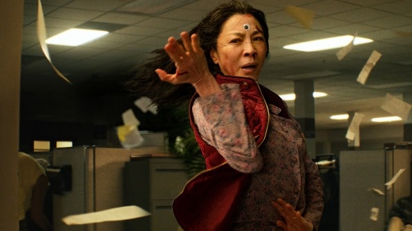
Everything Everywhere All at Once is full of worlds, after all. The film tracks a past-prime laundromat owner, played by Michelle Yeoh, who discovers that she has countless alternate selves living (better) parallel lives. To save the multiverse from destruction, she must hop into her other versions, borrowing their talents without fracturing her own mind, as reality as we know it melts away in 2 hours and 19 minutes of unbounded creativity.
While Everything Everywhere All at Once has swept awards season (and Kisvarday himself bagged an award from the Art Director’s Guild), the film was overlooked by the Academy Awards for production design in a year that’s prioritized historic re-creation in films including Elvis, All Quiet on the Western Front, and The Fabelmans over realities filled with hot-dog-handed humans, living piñatas, and subtitled stones.
Luckily for us, Kisvarday still shared some of his secrets to developing a magical world that nevertheless feels real.
Building a multiverse of stuff
Kisvarday’s designs are founded in his own highly observational worldview. He’s a self-ascribed student of everyday oddities and the real world’s ever-present grit.
“Instead of going to an art gallery, I’m more happy wandering round a neighborhood I’ve never been to, or walking through a dirty alley and seeing the garbage on the ground, because that real, day-to-day life stuff is more interesting and exciting to me than beautifully curated, perfect spaces,” he says. “[It’s like] when you walk into a building and the light switch is a little too high for some reason, and you wonder, Why is it 6 inches higher than it should be? But that’s the real world!”
Everything around us is a little bit strange, if you’re watching closely enough. Recently, Kisvarday was in a van scouting locations for a new project. He looked out the window at a stoplight, and sitting next to the vehicle was a baby carriage filled with palm fronds. “If we ever put that in a movie, people would say, ‘Why is there a baby carriage filled with palm fronds? That would never happen in the real world!’” he says. “My argument is, that’s what the real world is. It’s these wonky things!”
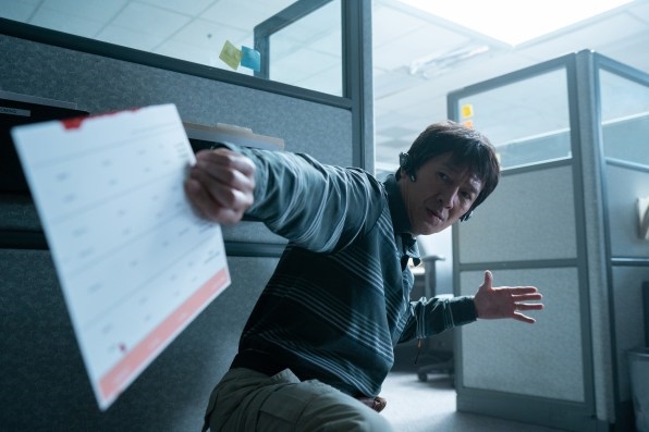
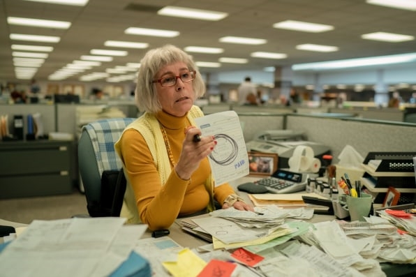
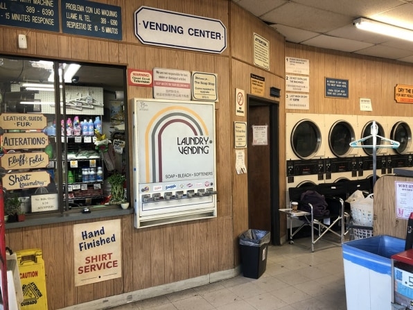
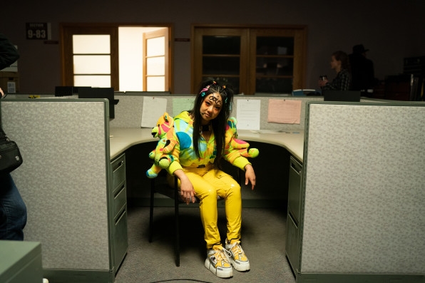
Kisvarday translated that sensibility to EEAAO by finding naturally eccentric locations to ground the film, like the movie’s vintage laundromat that seems to eat the quarters from your pockets as you watch, or the IRS office, which was actually an old Bank of America building filled with so many cubicles you feel like you’re being audited through the screen.
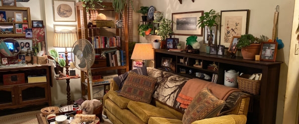
Just as important as the locations was how they were dressed and decorated: often with piles of objects that seem to have settled there like dust. That job fell to set decorator Kelsi Ephraim, who is also Kisvarday’s longtime collaborator and spouse. “We’ll walk through antique malls together and gravitate toward the same objects, like, ‘Look at this old weird chair!” Kisvarday says. “There is an extraordinary amount of time and effort spent on the projects we do together, curating the clutter.”
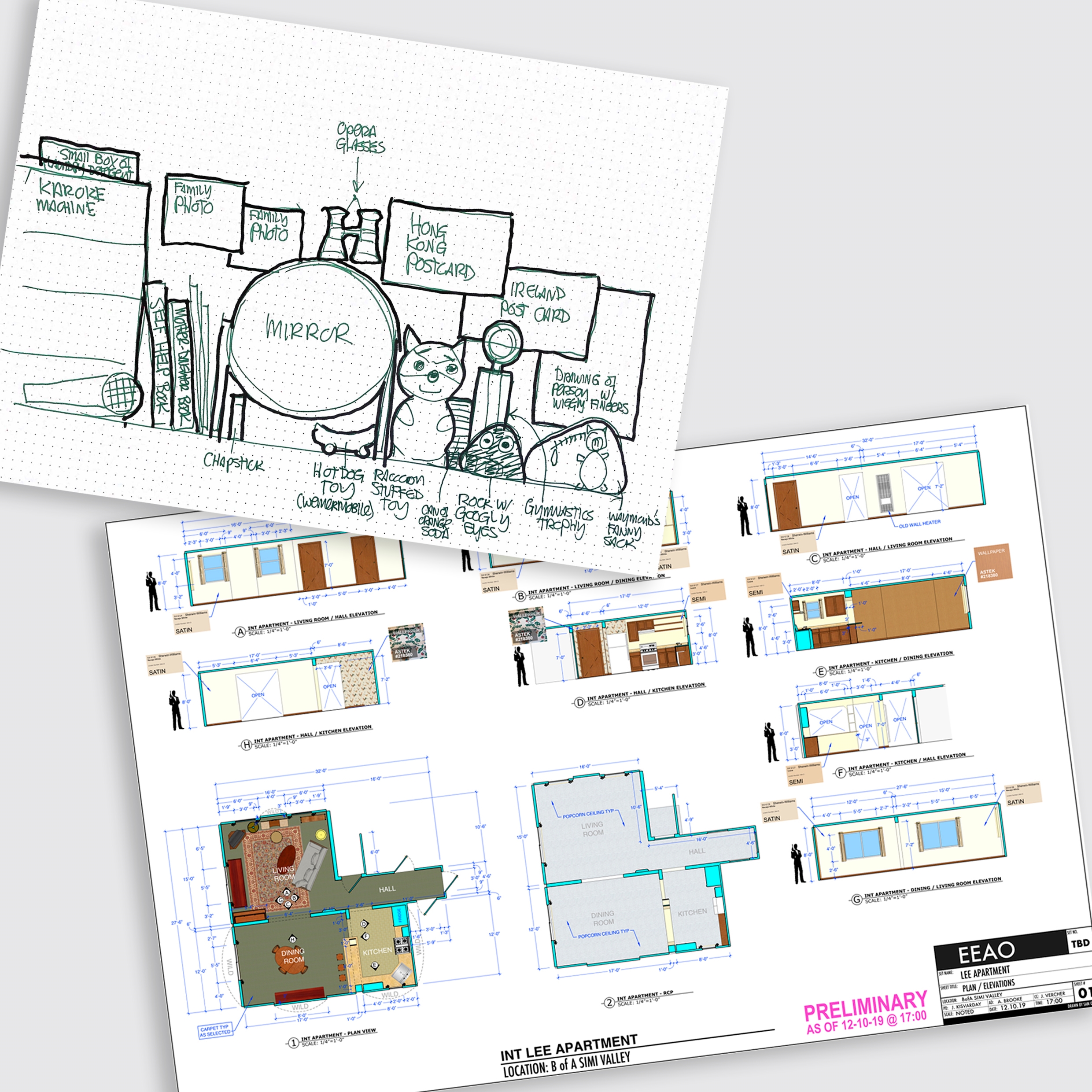
Take the Wangs’ apartment, which is the only big set that was built from scratch for the film. Kisvarday worried the apartment scenes would look like they were filmed on a set instead of in a real home, so he made some changes. Instead of the 9- or 10-foot ceilings typically found on film sets, which give extra space for shooting, Kisvarday lowered the ceiling to 8 feet to mimic a more standard American home. Then he sprayed it with popcorn finish and added water stains.
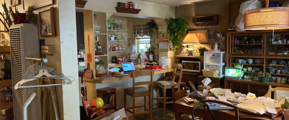
It’s evocative detailing, but what really defines the apartment when you see it on-screen at the start of the film, as Michelle Yeoh’s character laments the pile of receipts in front of her, is just all the stuff. Every square inch seems covered by tea settings, 50-year-old furniture, Rubbermaid containers, baskets, plants, fans, and one very bright and cheesy faux aquarium. My favorite detail might be a shelf hanging over the kitchen counter—far too high—nearly touching the ceiling, holding exactly four mugs.
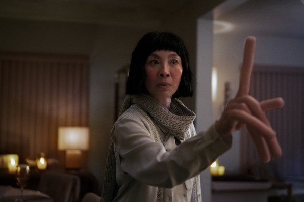
The objects are too many and too absurd, but Kisvarday and Ephraim based many of their decorating decisions in logic—where would the character have placed this thing and why? “Clutter is very hard to do well, and it takes a lot of effort,” Kisvarday says. “It’s identifying the little pieces that you start to add that tie it all together. Sometimes it can be a wadded ball of Kleenex on the stand. It feels real now, don’t touch anything else!”
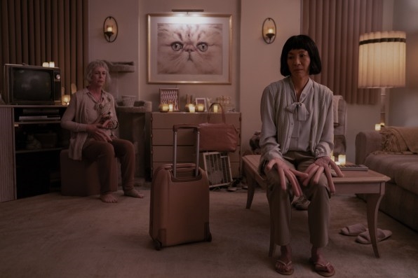
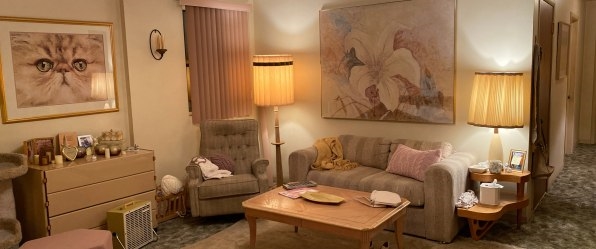
In EEAAO, this apartment set has two lives: one as the aforementioned cluttered space from the main reality, and a second as the apartment from what I only know to call the “hot-dog-hands universe.”
Yeoh’s character lands in this universe by accident, discovering a reality where everyone has useless, rubbery hot dogs for fingers. The bigger surprise is that here, she and Jamie Lee Curtis’s character live together as partners, navigating a particularly rocky relationship.
For this reality, Ephraim developed what she called a “hot dog meat color palette.” The apartment’s plush carpets and rose-blonde furniture subtly wrap the couple in visual bologna. Despite representing just an afternoon of shooting, this serene space helps ground the surprisingly sincere multiverse side plot.
Prioritizing practical effects
Kisvarday’s love for practical effects—special effects that happen right in front of the camera rather than being added by computers after filming—propel the magical realism of the film. “Early on [in my career], when I was working on a lot of music videos, I got good at doing gags and special effects: learning how to run an air cannon, different smoke machines, different breakaway props,” he says. “The stuff I started getting hired more and more on tended to involve some sort of a gag.”
In fact, Kisvarday actually met EEAAO’s cowriters-directors Daniel Kwan and Daniel Scheinert when they were planning a music video for Chromeo’s “When the Night Falls” and wanted his expertise. The Daniels wanted a group of women at a bar to be so enamored with rock ’n’ roll that they become pregnant. Instantly 9 months pregnant, I should say. (Kisvarday succeeded by rigging inflatable punching bags under their shirts.)
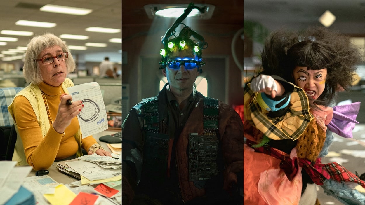
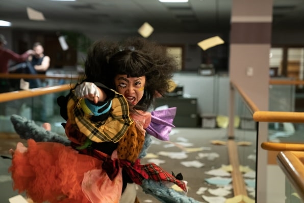
On EEAAO, Kisvarday snuck in all sorts of practical effects. (You’ve never known the power of a wind machine until you see Michelle Yeoh flex her pinkies and watch her hair fly back.) Toward the film’s climax, an exoskeleton donned by actor James Hong lifts his character from a power wheelchair. It’s crafted from a surreal collection of printer parts and office telephones. The design came from Kisvarday’s friend Calder Greenwood, a fine artist who works in sculpture, exploring 1980s ephemera.
And while practical effects don’t always work as intended—Kisvarday cringes at some of his rushed work in Sorry to Bother You—he notes that these effects are fundamentally real, so they add something to the project that a computer can’t.
“What I’ve learned more and more over the years is that it’s easier to clean the bits that aren’t working in post [production],” Kisvarday says. “But a lot of the convos with the Daniels are, ‘Let’s do this all for real, and if you need a stick here to puppeteer this, we can paint this out!’”
Staying on budget
Of course, perhaps the most incredible part of Kisvarday’s work on EEAAO is simply what he does all the time as a professional designer: solving all sorts of problems for the film while sticking to a strict budget. EEAAO was created with just $14.3 million. That’s a pittance by modern Hollywood standards—especially compared to the production design nominee Avatar: Shape of Water, whose budget reportedly ballooned to as much as $400 million.)
“The biggest challenge with this project was it really was done on a shoestring budget. Similar movies with similar budgets feature people in a coffee shop hanging out, going to a baseball game,” Kisvarday says. “Instead, we made a multiverse fam drama.”
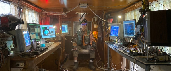
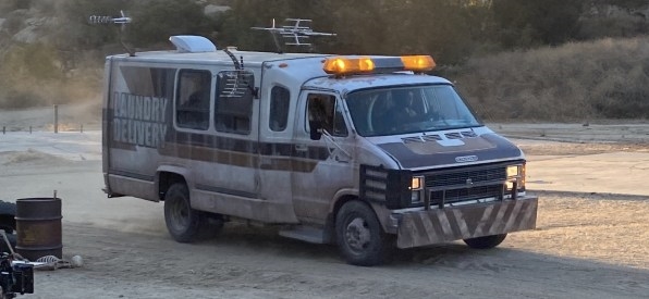
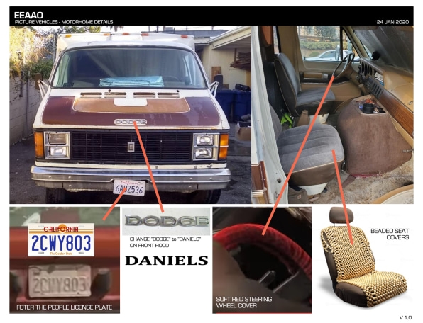
Each multiverse has its own climax that’s as much about space and place as it is plot. Yet even these grandiose moments in EEAAO tend to be physically small. The post-apocalyptic Alphaverse is essentially a single room: the back of a weird Winnebago that the team found on Craigslist (and duplicated with a small set for interior shots). The piñata world is literally two piñatas hanging from a tree. The world in which Yeoh’s character is a famed singer is nothing more than a stage.
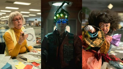
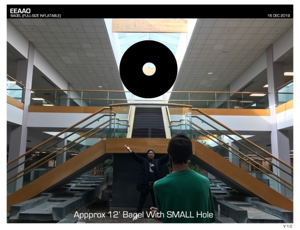
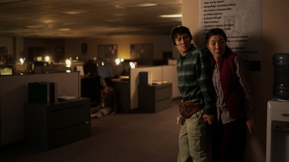
The impact of choosing the right space is most clear in the combination audit-fight scene that appears early in the film. When searching for the perfect IRS office, Kisvarday had originally wanted a relatively compact space. Less to move. Less to decorate. Less to film. “And instead, we walked into the biggest office space I’ve probably ever seen in my life—and it just keeps going,” he says, laughing. But this panopticon of cubicles won the team over all the same.
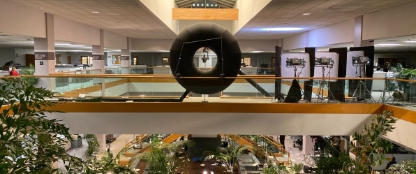
For as striking as the space is on-screen, it required custom maps to coordinate and all sorts of budget-friendly hacks to look believable. The first problem was filling an office where most fixtures had been removed but hundreds of empty cubicles remained. The team had only seven or eight working monitors in their arsenal, so they purchased dozens of broken screens, printed out spreadsheets onto card stock, and taped them to the monitors to replicate working computers. Then they chopped chunks of black foam core to place in cubicles to create the illusion of computers deeper into the frame.
They also brought in a couple of bulletin boards to add some clutter to the office. But bulletin boards are expensive! So the team also printed out a few bulletin boards, which they repositioned shot after shot to catch the sight lines of the camera. “When we’d finish shooting here, we’d load everything onto carts, push the cart to the other part of the building, and put it there,” Kisvarday says.
The efforts were worthwhile. Everything Everywhere All at Once is not just an Oscar favorite; it’s one of the most conceptually rich films in the history of cinema. And that remains true, even if Kisvarday won’t be taking home an Oscar statuette this weekend for his work. “Maybe we’re not in that timeline right now,” he says with a laugh. “There’s another timeline where all of that happened.”
(57)

